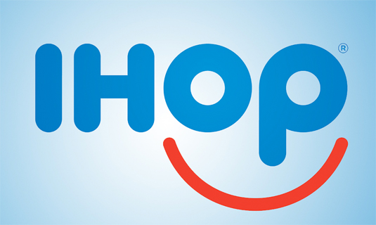
IHOP logo refreshed for the first time in 20 years
For the first time in 20 years, the restaurant chain have refreshed their look with a new logo design.
Sign up to Creative Bloq's daily newsletter, which brings you the latest news and inspiration from the worlds of art, design and technology.
You are now subscribed
Your newsletter sign-up was successful
Want to add more newsletters?

In this competitive market, companies across the globe are constantly trying to keep up to date with design trends and original branding. Earlier this year, Microsoft unveiled a brand new logo for its new browser – Internet Explorer replacement, Edge. Now it seems another institution felt it was time for an upgrade.
IHOP is an American chain restuarant, specialising in breakfast foods and founded around 57 years ago. For the past 20 years, they've had the same logo design but recently felt that said logo looked too much like a person's frown. So, instead, they've come up with a new logo design to showcase their 'commitment to smiles'.

"Our guests have told us for many years that coming to IHOP, and in many cases just thinking about our world famous pancakes, makes them smile," says IHOP Vice President of Marketing Kirk Thompson. "We believe this new logo captures the essence of the IHOP experience." What do you make of the new look?
[via Business Insider]
Liked this? Read these!
Sign up to Creative Bloq's daily newsletter, which brings you the latest news and inspiration from the worlds of art, design and technology.

Sammy Maine was a founding member of the Creative Bloq team way back in the early 2010s, working as a Commissioning Editor. Her interests cover graphic design in music and film, illustration and animation. Since departing, Sammy has written for The Guardian, VICE, The Independent & Metro, and currently co-edits the quarterly music journal Gold Flake Paint.
