Logo systems: the future of logo design?
Sign up to Creative Bloq's daily newsletter, which brings you the latest news and inspiration from the worlds of art, design and technology.
You are now subscribed
Your newsletter sign-up was successful
Want to add more newsletters?
Technology has changed the landscape of the design industry drastically over the past 30 years, but the theory and approach to logo design has remained somewhat the same, with most designers (thankfully) using tried and tested principles that work.
Trends come and go, but with the growth of smartphone use there's been a shift in the approach to how logos have been designed. This will certainly influence how designers think about brand identity design from now on.
The topic I want to discuss now is logo systems, which are on the upswing due to the opportunities they offer brands and individuals.
Article continues belowWhat is a logo system?
Historically a logo has always been a static object that was designed once and applied to all brand touch points. Different lockups may be designed for specific instances, but consistency was always a paramount focus to aid recognition. Prior to digital technology, logos and brand identities were only applied to physical objects, meaning change was not an easy or cheap option. This situation is a thing of the past...
Today, thanks to technology the most commonly seen instance of a logo is within an email signature, on a website, or on social media channels. Because these instances are digital they can be changed instantly. This has unlocked opportunities for designers and marketers, with logo systems being one of the most interesting developments I've seen so far.
Instead of having a singular static mark, a logo system acts as a 'graphical framework' that can shift and change for different situations, allowing brands to start a conversation beyond it's own name, pointing to other ideas and issues that are important to them on any chosen day.
Sign up to Creative Bloq's daily newsletter, which brings you the latest news and inspiration from the worlds of art, design and technology.
Logo systems are somewhat of an evolution of 'flexible logos' which have been around for some time. The first of its type was designed in 1973 for Belgium supermarket chain Priba, which used a series of changing backgrounds and textures. MTV and Tate Modern are other noteworthy examples. At the time this was somewhat experimental, and primarily a cosmetic feature, but now this concept has gone one step further evolving into a valuable communication tool for brands to speak to its audience in a unique way.
Lets look at a few noteworthy logo systems.
01. Google Doodles
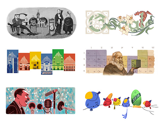
The most famous example and dramatic use of a logo system here today is Google.
Every day Google replaces its logo with a 'Google Doodle', an illustration, animation or game that's been designed to raise awareness of a specific topic or historical event every day of the year. This extends globally, showing differently around the world. By using a framework to design the doodles, even when dramatic changes have been made it remains familiar to us as the Google logo.
By using its logo in this way, Google is able to educate the world about important topics, and be seen as an authority on the worlds information. They are able to do this with the logo alone, without adding any additional marketing messages or images on its homepage.
02. The Hillary Clinton Logo
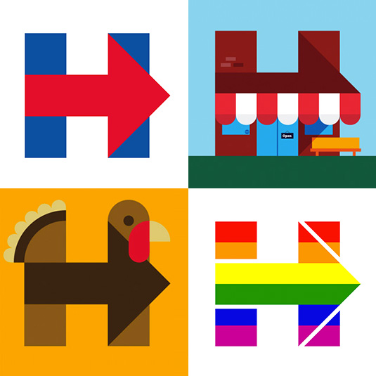
When the new logo for Hillary Clinton was released in 2015 it was mocked by many for its simplicity. Little did we know at the time of that it would act as an identifiable window to raise awareness of political issues and events.
It's a logo that can be drawn quickly by anyone, whilst offering endless opportunity to communicate bold statements. Even when big changes have been made, due to the simplicity of the underlying framework it remains very recognizable.
03. The shifting ZocDoc face
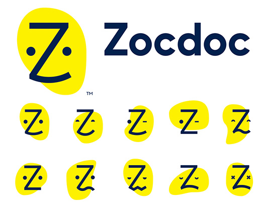
As a digital health marketplace ZocDoc introduced a fun, customer friendly logo that looks like a face. To add additional meaning to it's products and services the logo changes its facial expressions to suit the situation.
Although the logo appears differently across all touch points, due to its abstract and minimal form the logo remains very recognisable.
04. DC Comics
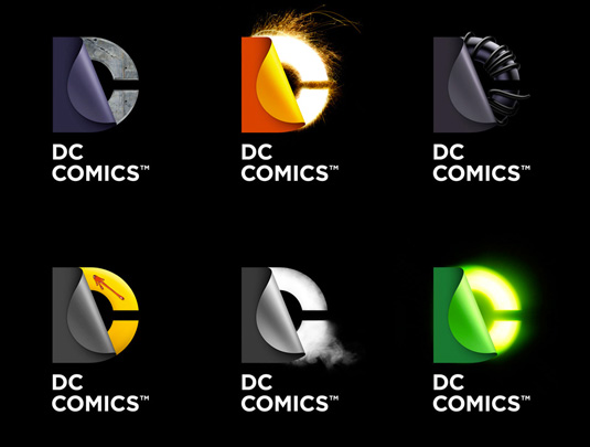
Once a platform that was only in print, comic books have boomed, now being seen on the big screen and in digital form. DC Comics took the opportunity by creating a logo system that would allow it to adapt its logo towards the story it was telling. With only a glance of the logo you know that character it's been designed for.
Reality check: Are logo systems sustainable?
Due to the amount of design time needed to create variation, the concept of an ever-changing logo is not sustainable for some businesses. To be reactive to current events also requires speed. Due to this I do expect this approach to be used primarily by bigger companies with bigger budgets. That being said logo systems are still in their infancy, and I feel there is a lot of room for experimentation.
The smartphone world we live in has opened doors for unique opportunities for designers around the world, and I look forward to seeing what happens over the next few years. Things have only just started, so it's an exciting time to be a designer.

Ian is an accomplished logo designer with over a decade of experience in the field. He is recognised for his ability to create striking and effective logos that communicate the brand's essence. Ian is also the host of the popular Logo Geek Podcast, where he shares his expertise and interviews other leading designers and marketing experts in the industry, as well as author of the book, Make a Living Designing Logos. Through his work, Ian has established himself as a respected voice in the design community, and his passion for the craft is evident in everything he does.
