McDonald's drinks concept given eye-popping packaging
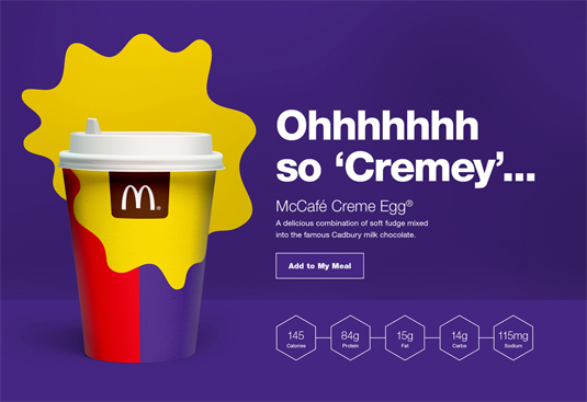
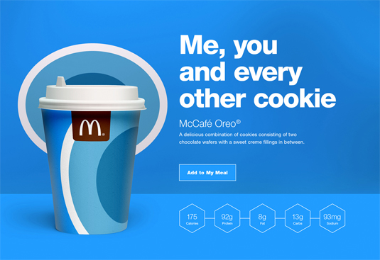
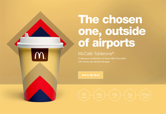
This concept design sees fantasy hot drink flavours given their own packaging designs.
Sign up to Creative Bloq's daily newsletter, which brings you the latest news and inspiration from the worlds of art, design and technology.
You are now subscribed
Your newsletter sign-up was successful
Want to add more newsletters?
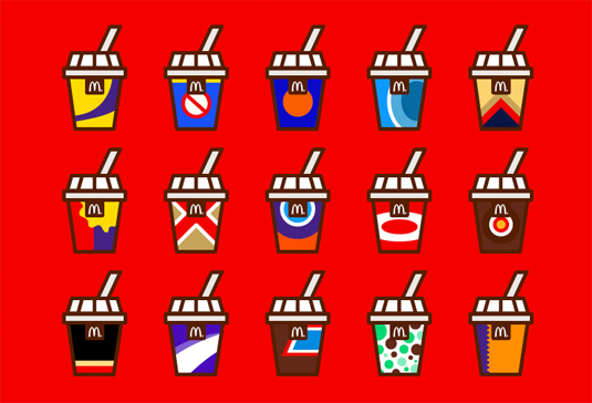
There's no denying that McDonald's is one of the most influential brands in the retail world; creating one of the most iconic brand mascots, the company are also a forerunner when it comes to an outstanding use of colour in branding. So, it's no surprise that their designs inspire many-a-concept, with this latest venture an example in eye-popping colour.
Discover the biggest logo designs of 2015 so far
"I thought it would be cool to develop some of my very own McDonald's hot drink designs but in a more abstract and simplistic style, developing flavours I would love to drink." explains graphic designer Jonathan Quintin.
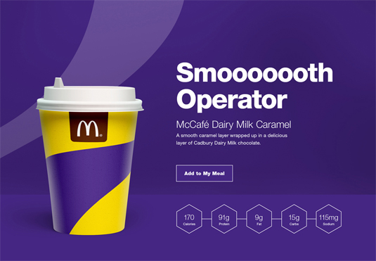
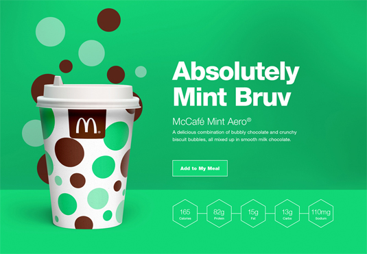
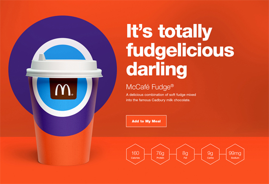
Article continues belowFeaturing UK chocolate bar favourites, Quintin has taken aspects of the bar's packaging, incorporating the colours and sometimes shapes into the hot beverage designs. We love the minimal inspiration throughout the concepts, with the cup designs very much in line with McDonald's usual executions. A few of our favourites are showcase below; you can see the whole series over on Behance.
Liked this? Read these!
- Clever site showcases McDonald's memories
- The story behind the McDonald's logo
- 12 top packaging design resources
Sign up to Creative Bloq's daily newsletter, which brings you the latest news and inspiration from the worlds of art, design and technology.

Sammy Maine was a founding member of the Creative Bloq team way back in the early 2010s, working as a Commissioning Editor. Her interests cover graphic design in music and film, illustration and animation. Since departing, Sammy has written for The Guardian, VICE, The Independent & Metro, and currently co-edits the quarterly music journal Gold Flake Paint.
