The story behind the McDonald's logo
We take a look behind the creation of the golden arches, and one of the most iconic marks in logo history.
Sign up to Creative Bloq's daily newsletter, which brings you the latest news and inspiration from the worlds of art, design and technology.
You are now subscribed
Your newsletter sign-up was successful
Want to add more newsletters?
McDonald's logo design is instantly familiar and represents more than fast food. One of the top brands on the planet, it's become a cultural icon synonymous with capitalism, globalisation and the wide-spread proliferation of American culture.
Here we took back at some of the early versions of the logo to show how the McDonald's branding got to where it is today...
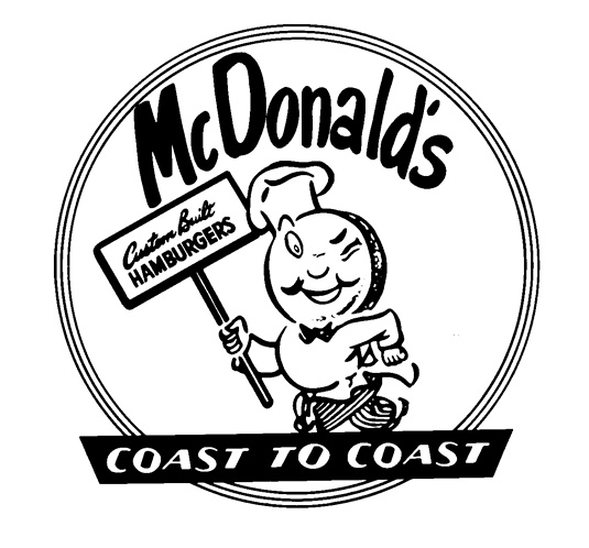
1948: Speedee service

Brothers Richard and Maurice McDonald opened the first McDonald's in 1940 in San Bernardino, California, serving barbecue alongside its burgers - fries weren't even on the menu.
Article continues belowBy 1948 the pair had perfected the art of fast food with a process they named the 'Speedee Service System'. Barbecue was dropped from the menu to improve service time, and the brothers designed this winking chef character, Speedee, to help communicate the message.
1961: Golden Arches

In 1952 the McDonald brothers asked architect Stanley Meston to design their first franchised outlet. According to architect Alan Hess, the initial idea for the golden arches came from a stylised sketch of two half-circle arches, drawn by Richard. The brothers brought in a sign-maker, George Dexter, to design two giant yellow arches that were added to both sides of the building.
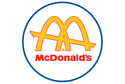
Viewed from a certain angle, the arches formed the letter 'M'. However, it wasn't until Ray Kroc bought the business in 1961 that the distinctive architecture was incorporated into a new corporate logo.
Fred Turner, then president of McDonald's Corporation, sketched out a first attempt before head of constructions and engineering Jim Schindler hit upon an 'M' with a slanting line running through the interlocked arches to represent the roof of the store, higher at the front and lower at the back. An icon was born.
Sign up to Creative Bloq's daily newsletter, which brings you the latest news and inspiration from the worlds of art, design and technology.
Further iterations

The franchise's success continued, aided by the expansion of the interstate highway system and America's burgeoning car culture. By the '70s, the Golden Arches had become an instantly recognisable icon and would remain the company's logo for decades to come.
The logo has had several iterations in since then. Between 1975 and 2006 they were framed by a solid red rectangle; a glass version was used on the windows of some newer restaurants from 1976, and from 1992-2009 the arches were given a brighter highlight and raised to stand on a red trapezoid featuring the brand name. A standalone shadowed version also came into circulation between 1993 and 2010.
2003: I'm lovin' it

The most successful advertising campaign in McDonald's history was created in 2003 by Heye & Partner GmbH. 'I'm Lovin' It' launched in Munich on 2 September 2003 ('Ich liebe es'), with the English-language phase introduced to the UK, Australia and USA soon after. Today the official logo exists in a few shapes and sizes, but all feature the stripped back yellow arches accompanied by the official motto.
Words: Julia Sagar
The 50 Best Logos Ever

This is an edited version of a chapter from The 50 Best Logos Ever, the definitive guide to the greatest identity work ever created. Over 180 premium pages, the book dissects the world's greatest logos, showing their origins, their evolutions and interviewing the designers behind them.
So where did the McDonald's logo come in the top 50? The only way to find out is to pick up the book at all good newsagents today or order it online. Or you can download a digital edition directly to your iPad from the Computer Arts app on iTunes.

Julia is editor-in-chief, retail at Future Ltd, where she works in e-commerce across a number of consumer lifestyle brands. A former editor of design website Creative Bloq, she’s also worked on a variety of print titles, and was part of the team that launched consumer tech website TechRadar. She's been writing about art, design and technology for over 15 years.
