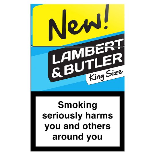
The Pantone colour that will stop you smoking
Sign up to Creative Bloq's daily newsletter, which brings you the latest news and inspiration from the worlds of art, design and technology.
You are now subscribed
Your newsletter sign-up was successful
Want to add more newsletters?
The success or failure of our design work often comes down to one or two fundamental decisions, such as colour. So you'll find plenty of advice on colour theory on Creative Bloq.
But most of these tips are about making your colour choice appealing. Sometimes, though, you want to go in the opposite direction. That's what the UK goverment is planning to do with a new law expected to be passed today, preventing the use of attractive colours in cigarette packaging.
Win clients & work smarter with our FREE ebook: get it now!
Colour has become one of the few tools in Big Tobacco's arsenal following the imposition of branding and packaging restrictions by governments worldwide. As this research found, "brightly coloured and attractive branded packs can reduce perceptions of the harmfulness of cigarettes". So, for example, in the UK Lambert & Butler Lights have become Lambert & Butler Gold and Superkings Lights have become Superkings Blue.

Pack shape has also been used in conjunction with colour to convey particular messages. For example, "narrow and thin cigarette packs have recently been introduced on the UK market. [They] feature a clean-looking package design, used to reflect purity ... lighter ('healthier') colours such as white, green, pink and purple, and often include flower imagery, symbolic of nature."
To fight back, the UK government plans to follow in the footsteps of Australia by making Pantone 448 C the only colour you can use on cigarette packs.
As you can see below, it's a pretty ugly hue. But is it ugly enough to make a difference?
Sign up to Creative Bloq's daily newsletter, which brings you the latest news and inspiration from the worlds of art, design and technology.

If Pantone 448 C doesn't work, we're not sure what's left to try. Maybe an image of a diseased lung stencilled onto the cigarette itself? Watch this space…
Like this? Read these!
- How to choose a colour scheme for your logo design
- The best collage maker tools – and most are free!
- Useful and inspiring flyer templates

Tom May is an award-winning journalist specialising in art, design, photography and technology. His latest book, The 50 Greatest Designers (Arcturus Publishing), was published this June. He's also author of Great TED Talks: Creativity (Pavilion Books). Tom was previously editor of Professional Photography magazine, associate editor at Creative Bloq, and deputy editor at net magazine.
