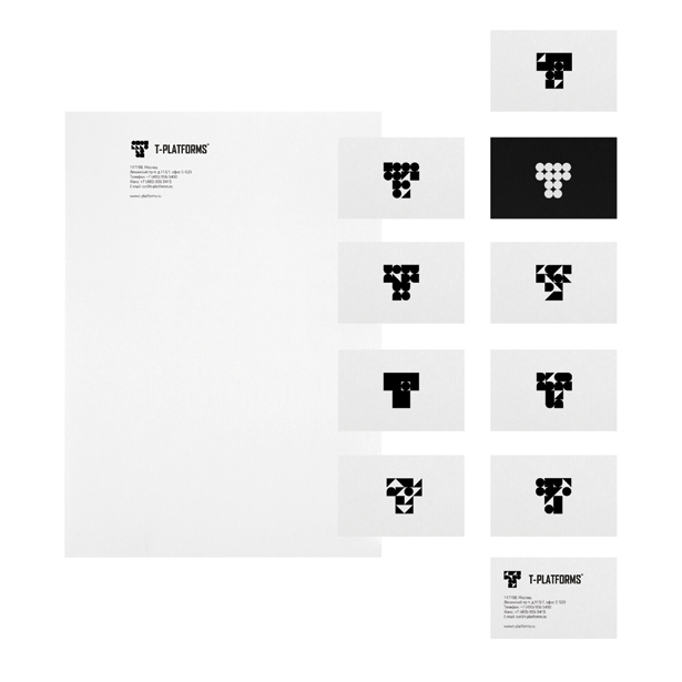
Tomatdesign's new logo for T-Platforms
The Moscow-based studio's striking new marque for the Russian IT firm
Sign up to Creative Bloq's daily newsletter, which brings you the latest news and inspiration from the worlds of art, design and technology.
You are now subscribed
Your newsletter sign-up was successful
Want to add more newsletters?
Moscow-based studio Tomatdesign has created a clean and striking new logo for T-Platforms, one of Russia's largest IT companies - or should that be trillions of new logos? "From the very beginning we wanted to create something that could clearly reflect their main business - supercomputers," says project manager Farkhad Kucharov. Briefed with renewing the company's visual identity to better associate it with high-speed systems, Tomatdesign's solution is a simple graphic, which lends itself to endless variation.

To start the design process, the creative team - Kucharov, studio head Andrei Tarakanov, art director and designer Denis Bashev, motion designer Anton Krivulia and technical designer Marina Vlasova - took an in-depth look at T-Platforms' products, including the Lomonosov supercomputer in Moscow State University, ranked as the 13th most powerful supercomputer in the world. "The Lomonosov makes up to 18 trillion operations per second," Kucharov says. "It's impossible to compare it with any normal computer, so the identity approach should reflect the same feelings."

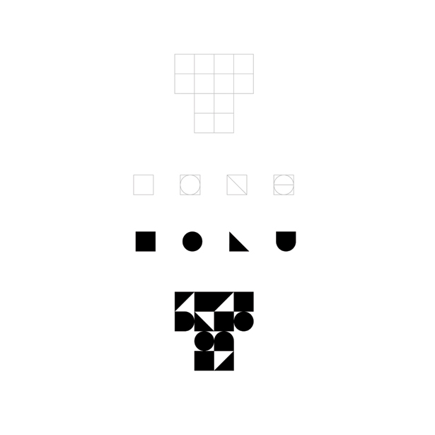
The black and white logo uses just four geometric elements: a square, circle, triangle and solid U-shape. Yet there are more than 10 trillion possible ways of placing these shapes into the 12 grid squares of the 'T'. "We made some visual analysis of the existing graphics, tried to formulate some positioning and so on. But the idea just came to mind. When we saw it on the screen, we understood it: bingo!"
Article continues belowAs well as lending itself to simple but eye-catching animations, the new logo looks dynamic and precise even when printed on paper, conveying supercomputing power down to a 'T'.
Sign up to Creative Bloq's daily newsletter, which brings you the latest news and inspiration from the worlds of art, design and technology.

The Creative Bloq team is made up of a group of art and design enthusiasts, and has changed and evolved since Creative Bloq began back in 2012. The current website team consists of eight full-time members of staff: Editor Georgia Coggan, Deputy Editor Rosie Hilder, Ecommerce Editor Beren Neale, Senior News Editor Daniel Piper, Editor, Digital Art and 3D Ian Dean, Tech Reviews Editor Erlingur Einarsson, Ecommerce Writer Beth Nicholls and Staff Writer Natalie Fear, as well as a roster of freelancers from around the world. The ImagineFX magazine team also pitch in, ensuring that content from leading digital art publication ImagineFX is represented on Creative Bloq.
