Volvic unveils radical new branding and logo
Sign up to Creative Bloq's daily newsletter, which brings you the latest news and inspiration from the worlds of art, design and technology.
You are now subscribed
Your newsletter sign-up was successful
Want to add more newsletters?

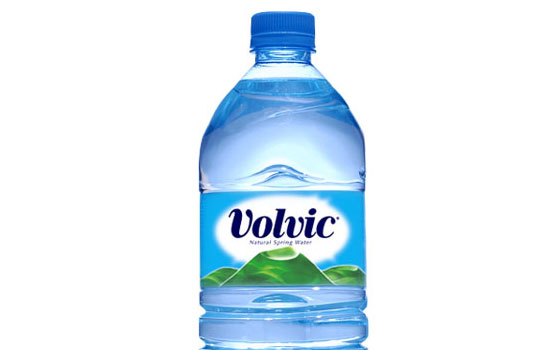
The French company behind one of the world's most popular brands of bottled water has unveiled new bottle design, packaging and logo. The new label design (above) takes the green volcano of the old design (below) and brings it front and centre.
The graphic has been enlarged and redrawn, giving it much more definition, in line with the brand slogan 'Filled with Volcanicity'.
Overall, the design is defiantly green, with blue now entirely absent from both the label and the bottle itself. It's a radical move, with blue the dominant colour in bottled water branding due to its association with coolness, tranquility, and clarity.
Article continues below 
The new bottle will be rolled out aross this month and the next, and be accompanied by a multi-platform advertising campaign, says Volvic.
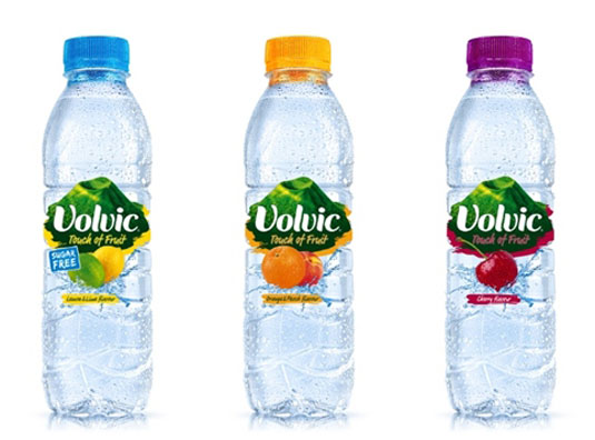
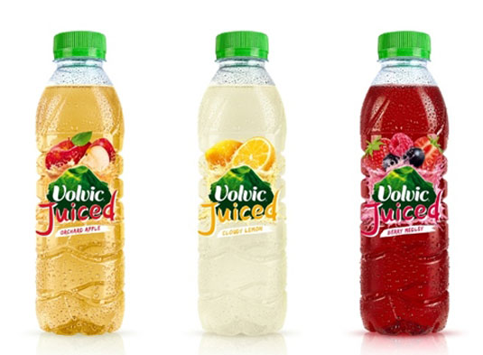
The new designs will also carry through to the brand's 'Juiced' and 'Touch of Fruit' ranges (see below):


What do you think of the new Volvic branding? Let us know in the comments below!
Sign up to Creative Bloq's daily newsletter, which brings you the latest news and inspiration from the worlds of art, design and technology.

Tom May is an award-winning journalist specialising in art, design, photography and technology. His latest book, The 50 Greatest Designers (Arcturus Publishing), was published this June. He's also author of Great TED Talks: Creativity (Pavilion Books). Tom was previously editor of Professional Photography magazine, associate editor at Creative Bloq, and deputy editor at net magazine.
