Exclusive access to Batman and Spider-Man logo creator's workspace
Iconic comic artist Rian Hughes throws open the doors to his ex-car workshop studio space.
Sign up to Creative Bloq's daily newsletter, which brings you the latest news and inspiration from the worlds of art, design and technology.
You are now subscribed
Your newsletter sign-up was successful
Want to add more newsletters?
It's fair to say that the British comic scene would look very different today had Rian Hughes not begun his artistic career working for 2000AD in the 1980s. Hughes' bold illustrative style was influential among fellow comics artists, and also provided the canvas for his early lettering experiments.
These days, Hughes pours that expertise into his illustration and type company Device, housed in a converted stables in the heart of Kew Gardens.
"We've been here for 12 years," says Hughes. "It was used as a car workshop before we moved in. There are other units with creative types around, and in the summer we have barbecues with them outside."
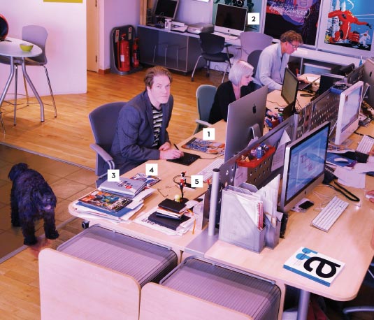
Article continues belowInside meanwhile, the vibe is distinctly Hughesian. Comic-like character illustrations and logo work adorn the walls, but a copy of Paris Hollywood magazine vies equally for attention (1).

"It purports to be a classy French 'artist's model' magazine," says Hughes, "but is actually thinly disguised erotica for overexcitable 1940s English gents who think anything French must be wildly exciting."
The issue in question has a shoot on a Parisian burlesque theme that inspired some of the images in Hughes' Soho Dives, Soho Divas book (2). "I've been taking life drawing lessons for the last few years," he reveals.
"Burlesque dancers know how to pose! The drawings were intended as a personal project, but Image Comics saw them and offered to publish them as a book." A sequel is almost finished, and prints of its most popular images can be purchased on Hughes' website.
Sign up to Creative Bloq's daily newsletter, which brings you the latest news and inspiration from the worlds of art, design and technology.
The curvaceous theme continues in the studio catalogue for Device Fonts Collection 15, which focuses solely on numbers (3). It's a self-publishing effort through digital print-to-order site Blurb that Hughes considers an experiment.
"I'll be interested to see how self-publishing develops," he says. "The quality has certainly improved dramatically, and in some cases is as good as lithography."
Quality is clearly in abundance where The Chaps Magazine is concerned (4). Each of its covers are designed by Device, setting the high standard for trouser creases, pocket squares and facial hair grooming within.
Hughes' thoughts are never far from comics however, as the prized Harley Quinn statue on his desk proves (5). "It's a prototype, given to me by DC Comics," he beams. "The design is based on Bruce Timm's animation style. The elegance of his work reminds me of Eisenberg's clean lines and direct storytelling."
This article first appeared in Computer Arts issue 233, a special issue with a photochromatic cover revealing the UK's top 30 studios, plus how to craft the perfect folio and make more money as a student...

The Creative Bloq team is made up of a group of art and design enthusiasts, and has changed and evolved since Creative Bloq began back in 2012. The current website team consists of eight full-time members of staff: Editor Georgia Coggan, Deputy Editor Rosie Hilder, Ecommerce Editor Beren Neale, Senior News Editor Daniel Piper, Editor, Digital Art and 3D Ian Dean, Tech Reviews Editor Erlingur Einarsson, Ecommerce Writer Beth Nicholls and Staff Writer Natalie Fear, as well as a roster of freelancers from around the world. The ImagineFX magazine team also pitch in, ensuring that content from leading digital art publication ImagineFX is represented on Creative Bloq.
