Brand Nu West End Show
Czech émigré Radim Malinic has created a series of posters inspired by one of his favourite parts of London - the West End
Sign up to Creative Bloq's daily newsletter, which brings you the latest news and inspiration from the worlds of art, design and technology.
You are now subscribed
Your newsletter sign-up was successful
Want to add more newsletters?
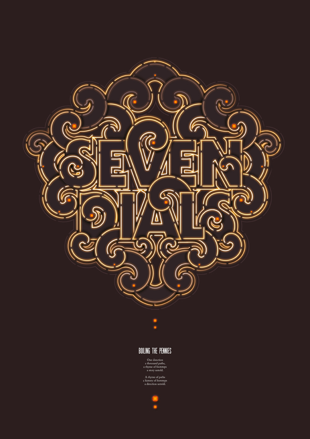
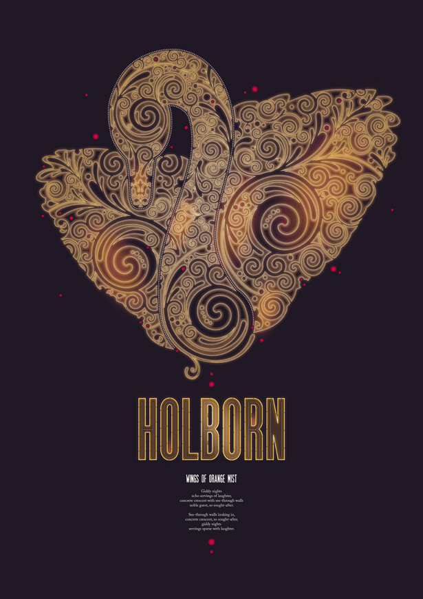
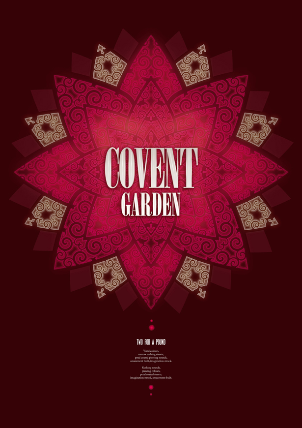
Today illustrator Radim Malinic - aka Brand Nu - opens his first solo self-initiated show in London. Entitled West End Show, it's inspired not just by the lights, glitz and all round cheesiness of the modern West End, but by the area's history too. He's created 10 posters, each of which celebrates a different part of the district in a unique way and includes a short poem that he's written.
"I wanted to draw inspiration from both obvious and obscure facts," he explains. "The Holborn poster and poem was inspired by The Holborn Restaurant which used to be one of the main landmarks on London's social map, established in 1874. The place once so important has been demolished and now there's Sainsbury's instead. It can be argued, but it's not as socially important to what it used to be."
While the show is taking place at the Nancy Victor Gallery in Fitzrovia until 2 March, Malinic is mirroring it with an online event. The Holborn poster has already appeared and the other works will be revealed online every few days throughout the month. So later on you'll see images inspired by Soho, Seven Dials, Covent Garden and more.
Article continues below 
"The Soho poster was inspired by the multicultural, bohemian and artistic population which has always dominated that part of the town. They've not always made it big, but they sure have tried. Seven Dials used to be one the poorest parts of the West End, with beggars dying on streets. Seven Dials posters plays a twist on the old typographical style in bright neon."
Malinic took a month off paid-for work to create the imagery for the event, along with a website and video trailer. He spent three weeks working in Illustrator and another week using Photoshop to perfect them. Then he laid the posters out in InDesign. While the art deco style and lighting seen in the West End even today is clearly an inspiration for the imagery, and he's done a fine job with the type and pattern work, the colour scheme was trickier.

"My original plan was to work with very kitsch colours which would fully reinterpret life in the West End," he says. "It was meant to be brash and loud but as I worked on it, I realised I wanted to find the right balance between all elements. The colours were therefore kept in earthy tones complimenting sometimes unpleasant qualities of some areas."
A limited edition of 150 prints is available for each poster. Visit the show, or see the website for more details.
Sign up to Creative Bloq's daily newsletter, which brings you the latest news and inspiration from the worlds of art, design and technology.


The Creative Bloq team is made up of a group of art and design enthusiasts, and has changed and evolved since Creative Bloq began back in 2012. The current website team consists of eight full-time members of staff: Editor Georgia Coggan, Deputy Editor Rosie Hilder, Ecommerce Editor Beren Neale, Senior News Editor Daniel Piper, Editor, Digital Art and 3D Ian Dean, Tech Reviews Editor Erlingur Einarsson, Ecommerce Writer Beth Nicholls and Staff Writer Natalie Fear, as well as a roster of freelancers from around the world. The ImagineFX magazine team also pitch in, ensuring that content from leading digital art publication ImagineFX is represented on Creative Bloq.
