Part three: the best logos of 2013 so far, as chosen by design experts
The third instalment of our series looking at the 2013's best and most inspirational logo designs, as chosen by our panel of industry experts that includes Michael Johnson, Uri Baruchin, Joe Duffy and more
Sign up to Creative Bloq's daily newsletter, which brings you the latest news and inspiration from the worlds of art, design and technology.
You are now subscribed
Your newsletter sign-up was successful
Want to add more newsletters?
The third part in our series of blog posts looking at 2013's best, most inspirational logo designs takes in the year's biggest trends, most creative branding work and biggest identity projects, as chosen by our panel of world-leading logo designers
Ben Marshall, creative director, Landor Associates
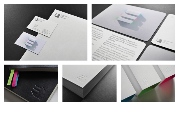
This was actually done by Landor – but not me personally, before my narcissism starts to show. The identity for the Queen Elizabeth Award for Engineering features an abstract E. It has a depth to it: a physical construction, with an energy within. This sounds like 3D frippery, but is done with a degree of restraint suitable for a Royal commission. Having said that, engineering can be, literally, awe inspiring. What goes into constructing a new bridge or engine is mind-boggling to a dunce like me, so the identity also has an unleashed side that demonstrates this. I must say, it has a rather nice old school, one-colour version too, for the purist in me.
As an appendix to that identity creation, the design of the award itself came from the same idea: tasked with making engineering more visible and engaging to a young audience, the solution was to create an online space for them to design the award itself. Again, the logo and its inner particles became the tools from which aspiring engineers could construct their creations. As such, the identity literally gets people involved.
Article continues below 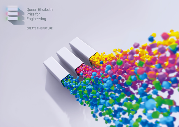
Joe Duffy, creative director, Duffy & Partners
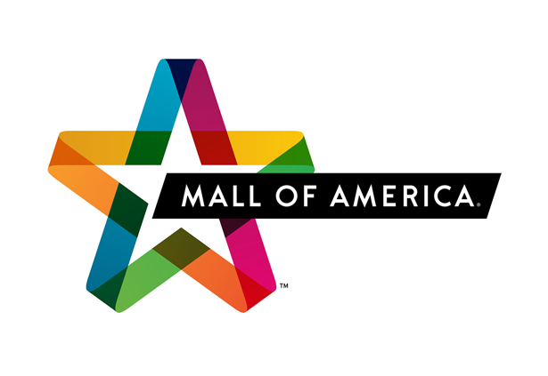
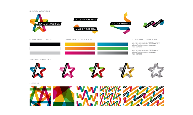
Our design for Mall of America is a logo that evolves into so much more. It's a symbol that respects their 20-year history, while evolving into a brand language that speaks to their complex brand experience. It’s always different, yet always the same.
Chris Kline, design director, the Partners, New York
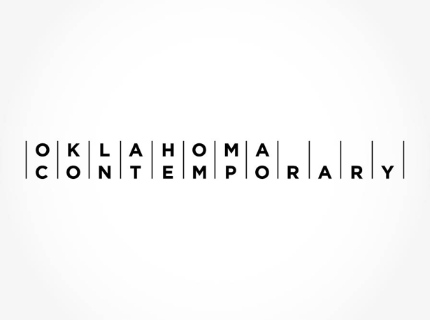
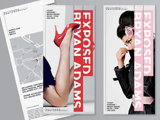
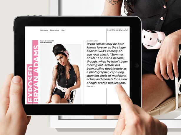
In my opinion, this year has been a little dull in logo releases. Nothing that's ground-breaking has made an impact here in the States ( or, at least, a positive impact). My favorite for the last six months is Oklahoma Contemporary by Saffron Consultants.
I come from middle America, a state similar to Oklahoma. So this is a surprising rebranding considering the typical approach to identity design and branding in these areas. This identity is a confident, bold step for an organisation that's connecting with its audience in a uniquely provocative way for this region. The subtle concept of connections is interesting, and it references how the museum is connecting its audience, to great art and design from around the world.
If you want to see more of the best logo designs of 2013, check out part one and part two in our series covering the most inspirational logo designs, as chosen by our panel of experts.
Sign up to Creative Bloq's daily newsletter, which brings you the latest news and inspiration from the worlds of art, design and technology.

The Creative Bloq team is made up of a group of art and design enthusiasts, and has changed and evolved since Creative Bloq began back in 2012. The current website team consists of eight full-time members of staff: Editor Georgia Coggan, Deputy Editor Rosie Hilder, Ecommerce Editor Beren Neale, Senior News Editor Daniel Piper, Editor, Digital Art and 3D Ian Dean, Tech Reviews Editor Erlingur Einarsson, Ecommerce Writer Beth Nicholls and Staff Writer Natalie Fear, as well as a roster of freelancers from around the world. The ImagineFX magazine team also pitch in, ensuring that content from leading digital art publication ImagineFX is represented on Creative Bloq.
