World Cup soccer team logos get the flat design treatment
With the FIFA World Cup only a few months away, this project sees the national teams' shields recreated in minimal, flat design.
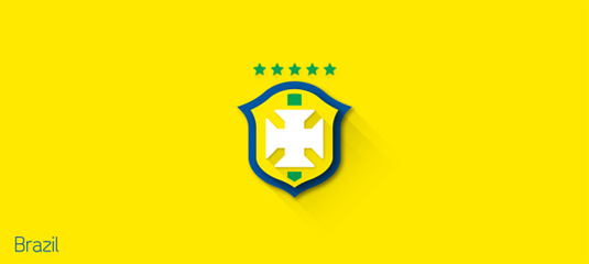
Last year saw the rise of flat design, with the method taking over icons and more. The trend doesn't look like it's going anywhere soon, with plenty of superb examples of flat design done right and continuous flat design projects - one of which is this latest offering from Brazilian designer Leandro Urban.
So, what is flat design? Basically, it's a minimalistic design approach that emphasizes usability. It features clean, open space, crisp edges, bright colours and two-dimensional/flat illustrations. This latest project sees those aesthetics applied to the World Cup team shields.
Including every team taking part in this year's competition, Urban has showcased the likes of Brazil, Argentina, England and France in the minimal flat design style. Do you think the design is improved from the original or would you like flat design to disappear? Let us know!
Article continues below 



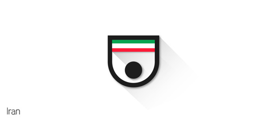


See more flat design World Cup shields over on Behance.
What do you make of this project? Let us know in the comments box below!
Sign up to Creative Bloq's daily newsletter, which brings you the latest news and inspiration from the worlds of art, design and technology.

Sammy Maine was a founding member of the Creative Bloq team way back in the early 2010s, working as a Commissioning Editor. Her interests cover graphic design in music and film, illustration and animation. Since departing, Sammy has written for The Guardian, VICE, The Independent & Metro, and currently co-edits the quarterly music journal Gold Flake Paint.
