
We all know Aardman's Wallace and Gromit and Shaun the Sheep. But the animation studio also has a forty-year heritage of crafting playful, inventive and memorable commercials for television, as we saw in our roundup of 10 famous Aardman adverts.
The studio’s work in the commercials space continues with today's (2 May) premiere of the the latest in its recent series of ads for Thatcher’s cider. It uses vibrant 2D animation with a refreshing hand-crafted look to launch Juicy Apple Cider – perfect for summer weather (see our pick of the best adverts of all time and best animation software for more inspiration).
Aardman's previous Thatcher’s adverts were for the brand's main line. Since this is a new spin-off product, they took a different approach. We had a conversation with the creative leads, Dan Binns (director) and producer (Joseph Bell) to learn how they chose the direction to create a unique style for piece.
"The previous [ads] were stop motion and were realised if not 100 per cent realistically, but quite a detailed and beautiful stop motion world was created," Dan notes.
"For this product, called Juicy Apple, it seemed like a reasonable opportunity to do something a little different. The artwork and packaging around it, was all quite different to the main Thatcher’s product, and so there was a little bit of room to play. They were thinking of a few different things but 2D seemed most appropriate for this new commercial.”
Joe recalls that “Dan started the whole thing: the pitch which was single-frame illustrations and design key frames showing moments from the ad that gave us the base and we continued to iterate on that. There were lots of conversations about how much do we push the surreality and the kind of world of the juice apple? As we went along, we kept iterating: the colour of the cider, how much fizz.
"Once we had the design frames, we did do a rough animatic so that we could get timings, because the whole concept is a journey and working out how the movement works was really important, and so quite quickly we did a full After Effects 3D test, flying-through-a-world version of the animatic because that felt like the best way of actually showing ‘OK, here’s what it actually feels like moving through a 2 ½ D / 3D world’.”
Of Aardman’s creative decision on what would be the most engaging animation approach to take, Dan says “there’s always the journey of it, so to speak. We worked with the ad agency Bray Leino and they did the (story) beats."
"The core idea of a graphical journey through the world of the product was there from the beginning and so then it was much more about teasing out the finer execution of that and we added the moments of magic," he adds. "By the time that it got to us, they were already thinking of a possible route of 2D and then a possible route of stop motion. We pitched a 2D route and then got to develop it a bit as we went.
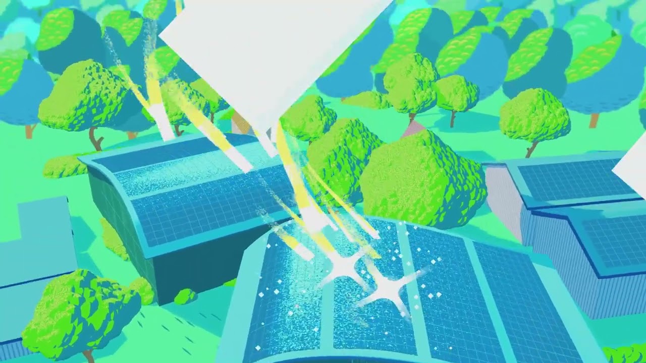
"The packaging of the new product has quite a graphic style; there’s literally only an apple and a leaf, but it does imply something that feels different to previous Thatcher’s projects. We started off very graphic and then we went very real and then pulled back to something a bit more graphic.
"We at Aardman are always jumping in to add character and charm on what is a kind of journey through the making of a product, and I know that Thatcher’s were really keen that it was all about sustainability and the fact that they have sun-soaking apples and solar panels to make the product.
"In terms of the product, they kept talking about crispness and refreshment and Dan’s illustration work does give it that arresting, refreshing kind of look and that was something that Thatcher’s really wanted to dial up, versus the more handcrafted, stop motion stuff.”
Joe notes that because the commercial is fundamentally about understanding how this product is made "there’s lots of obvious lines and messages that need to be in there."
"Dan had some really nice ideas about how Nature is involved in the process and there are some really nice moments with a dog in a beer garden," he says. "Each time you watch the new ad you smile and say ‘Oh, I’d not noticed that before.’ There are some really nice moments in it that make it feel alive.”

With an aesthetic for the Juicy Apple commercial established, Dan and Joseph set about producing the animation for the project with a small team over a period of several months.
Dan says the commercial “ends up being a bit of a mix of styles in order to get you back to a moving version of that still image (from the start of the process) that works. Right at the start, we were thinking ‘OK, it’s going to be 2D and have that hand-crafted feel.’ But then ideas change and different things come up, and all of a sudden we needed quite a lot more camera perspective and 3D objects, so we played a little bit with After Effects, handling 3D objects a bit more.
"There was a bit of jumping from Maya into After Effects and bringing 3D objects into it. So, each shot is a combo of 3D objects and more traditional 2D flat-planes, in After Effects, with hand drawn animation created on an iPad.”
Of the combination of ‘new’ and ‘traditional’ approaches, Dan doesn't think there's a "traditional way of doing it and a new way of doing it". "Everything’s just varying degrees of a blend of all of them," he says. "We did the concept art as 2D drawing and paintings, but that’s still done on an iPad. It’s a total mixture but hopefully the idea, at the end, is that you don’t see the workings too much.”
Joe notes: “I know there’s always that Aardman thumbprint and I feel like we had the digital equivalent of that. Dan did get into it in After Effects with hand-drawing a little bit. Even though we were doing some experimental stuff, we could still get our hands dirty, which is why it felt like Dan was always able to make sure it felt true to those original drawings.
"Another nugget to share is that we animated on threes. With the stop motion it’s on twos, and that gives it that step feel, but some of it is on threes and that gives it a stylisation and moments of that handmade touch. After Effects gives us a hand tailored feel.”
“We were trying out stuff," Joy says of the experimentation through the project. "There were a few plug-ins that we played with, and there were a few approaches that we played with, and I think that we landed on a great solution and it gave us an energy and focus.”
We were intrigued by the subtle texture in the piece, giving it an authentic, 'human-made feel. Dan explains that “When there’s a lot of texture boils, I’ll spend a couple of days drawing endless bumps and speckles and that’s like being back at art school.
"Like with stop motion or hand drawn things, that kind of ‘noise’ or, as we refer to it ‘wonk’, where things are a bit off- kilter, I think human begins like to see the evidence of human beings having done something; whether it’s stop motion or 2D. We’re trying to leave the evidence that’s there’s been a human hand, and even in cg there are ways to give it that feel and craft.”
Joe and Dan note that like any Aardman ad the piece also belongs to the studio's long heritage. “The core of Aardman projects is the creativity and craft," Joe explains. "It’s that Aardman magic, even if – aesthetically - it doesn’t aesthetically look like what people expect from the studio.”
Dan adds: “It goes to what I think Aardman is: it’s about characters and comedy and craft and doing things with your hands. You can still do all of those things but come out with a completely different look.
"The important thing from our end is that we try and get to the root of what the client and agency are after, and for this project it was all about that light and fizzy and summer-timey feeling, and so we were thinking about summertime and holidays and the sparkling water on the sea and that matched so well 2D for depicting everything boiling and everything’s got a bit of life in it. Everything got a bit of sparkle. It was about trying to keep that feeling.”
Joe brings our conversation to a suitably sunny close by noting: “You feel like this commercial has had a focused burst of love and attention to get made.”
If you're looking for new programs to realise your own vision, see our pick of the best animation software. For more advertising news, see Nintendo's surprise throwback Paul Rudd Switch 2 ad.

