10 things every designer needs to know about forms
There are a lot of badly designed forms out there, but whether you like them or not, forms are essential. Joe Leech, user experience director at cxpartners, presents the lessons he wishes he'd learnt before he began designing forms
Forms, there's nothing many designers hate more than forms. They don't necessarily bring the creativity out, or do they? Maybe it's time we looked at forms again and understand that a form, at its most basic, is a conversation between the user and the software.
Forget point and click, forms represent the richest interaction we as digital designers will face. Next time a form comes your way don't think it's just a matter of applying some nice CSS effects or adding a nice jQuery flourish. There's much more depth to designing forms.
I've user tested hundreds of forms and designed some complex forms for insurance companies, holiday booking interactions and many more. Chances are you've used one of my forms in the last few months.
Article continues belowHere's the lessons I wished I'd learnt before I began designing forms.
1. Don't mark mandatory fields
You know the little asterisk that denotes a mandatory field? I've seen that fail many times in user testing. As a concept, mandatory fields don't make much sense, they have no offline equivalent. They are great for developers because they offer a nice black and white approach to completion. The asterisk and mandatory field fails because it is a learnt behaviour. Typical behaviour I've seen in user testing is the user completing the form at the top and finishing either when there is something to stop them or they hit a button.
The solution is simple, mark optional fields, mark the place where our nice user has to stop and think about if they need to complete that field.
2. Don't use spinners
HTML5 is brilliant isn't it? It offers loads of exciting new shiny tools to play with. We need to think about the appropriateness of our new toys. The number field now includes little up and down arrows to allow the user to cycle through numbers.
Sign up to Creative Bloq's daily newsletter, which brings you the latest news and inspiration from the worlds of art, design and technology.

There are two problems here. Firstly the default browser display of the arrows makes them really small. Very fiddly to click and the fat fingered amongst us are going to struggle on an iPhone. It's called Fitt's Law, the smaller something is the harder it is to click on it.
But I hear you shout, you can just type the number directly into the number field. Yes, you can, but let's look at the browser display, the up/down spinner arrows resemble our trusty friend the select box. A user presented with a spinner for the first time is going to assume, as it resembles a select box, that they can't type into it.
My advice is to steer clear until they become more common place or the browser developers sort the default design out.
3. Have only one type of button or better still just one button per form
There's a little known psychology principle called Hick's Law. Hick's Law states the more options we are offered the harder it is to make a choice. Not rocket science I know, but a rule worth keeping in mind.
You can help your nice user by helping them make a choice. By making all primary buttons one colour, and having only one of them per page makes choice easier. Which is the button I should be hitting? Oh, it's easy, it's the big coloured one.

4. Chunk fields
I studied neuroscience in a previous life and so studied the psychology of memory – specifically short term or working memory. Now before you say it; no, short term memory capacity is not 7+/-2, 4+/-1 or in human speak three to five chunks. We as humans are great at evaluating visual stimuli, the constraint is we are better when the number is smaller. Chunking a form into smaller groups makes evaluation easier, as often what the user has to enter into the form comes from their memory.
Make sure your groups of fields are about four in length.
5. Think why you are asking something and how it feels to the user
This is probably the most straight forward piece of advice I give but is often the least utilised.
Let's take the following:

Question every question you ask. Is it necessary? How does it feel to be asked this?
More often than not there is a business need to ask a question and we as designers can argue about necessity until we are blue in the face. The question has to be asked. In understanding the business need for this data we can often compromise.
We can help by telling our nice user why we need to ask that question. Reassure about the usage and sharing of that data and just generally be nice.
Taking our example again:

It's still a tough ask but hopefully we've sweetened the pill.
6. Dates are squirmy little fellas
Entering dates can be a real challenge and there a few pitfalls you can avoid. The single biggest problem is dealing with errors.
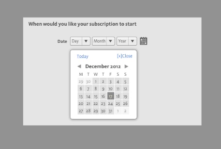
The easiest approach is to launch a calendar. It's worth noting that weeks start on a Monday in the UK and a Sunday in the US. If your user isn't concentrating they may well select a Sunday when they mean a Monday.
It's also worth mentioning international date formats. The US places month first, in Japan it's year first. So a date like 4/5/12 could be interpreted in three ways.
That's why it's best to use select boxes.

7. Forms as developer craft
Forms are craft for developers as well as designers. Understanding what possible mistakes could be made with entering data and designing your back-end code to cope is a challenge.
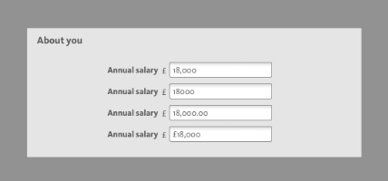
Here's a simple one. Entering a currency value. The possible mistakes the user could make are huge. Forcing data formats that users have to meet is frustrating for your user and, let's face it, a little lazy on the developers part.

What better challenge for a developer than building a bullet-proof form.
8. Don't use columns in forms
The big problem in using columns in forms is flow. We start a form at the top and end at the bottom. In introducing columns the flow of the form can be broken.
Don't assume users tab through forms and therefore focus is a way of navigating forms in columns. It's rare that I've seen that in user testing. Most of the time we see enter details, click to the next field with the mouse/trackpad/finger then enter details and so on.
9. Don't use two fields when one will do
Most people are not touch typists. In user testing we see people looking at the keyboard as they type.
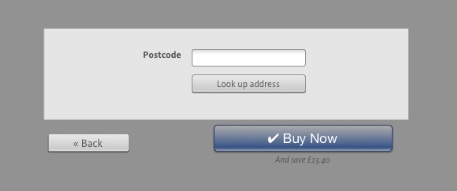
When entering a telephone number splitting the form field, say to add area code and number, causes real issues. Users don't see or indeed remember that there are two fields so enter the full number in the first field, worse if the field is limited to a certain number of characters.
Use just one field for phone number, the same is true of house number/street – use just one text entry box.
10. Be nice
You'd be surprised about how many rather quite rude error messages there are out there.
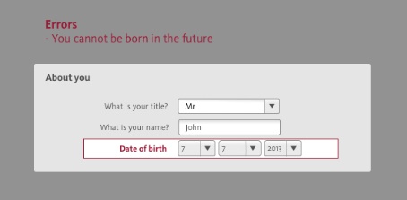
Here's an example of one I came across recently.

The very fact they are suggesting you would willingly enter a date in the future and then a rather facetious response, well, it isn't very nice.
Again put yourself in the place of the user, how would you feel seeing this error? Annoyed? Maybe even worse. Being nice is easy.
I've produced a downloadable crib/cheat sheet to help you design better forms. It includes many more best practise ways to design better forms.

The Creative Bloq team is made up of a group of art and design enthusiasts, and has changed and evolved since Creative Bloq began back in 2012. The current website team consists of eight full-time members of staff: Editor Georgia Coggan, Deputy Editor Rosie Hilder, Ecommerce Editor Beren Neale, Senior News Editor Daniel Piper, Editor, Digital Art and 3D Ian Dean, Tech Reviews Editor Erlingur Einarsson, Ecommerce Writer Beth Nicholls and Staff Writer Natalie Fear, as well as a roster of freelancers from around the world. The ImagineFX magazine team also pitch in, ensuring that content from leading digital art publication ImagineFX is represented on Creative Bloq.
