10 things you should know about designing for Windows 8
The launch of Windows 8 on 26 October will provide an exciting new platform for designers and developers. Brent Schooley introduces the key things you need to know to start creating Windows 8 applications
Microsoft caused a stir in the design industry with the release of Windows Phone. With its Bauhaus-inspired minimalism, strong focus on typography and use of subtle but impactful motion design, Windows Phone showed that there is definitely room for innovation in the mobile space.
Windows 8, due for release on 26 October, brings the same design goals and ideals to the desktop and tablet market. Given the focus on creating beautifully functional applications – not to mention a much larger potential market than iOS – this is definitely a platform designers should get involved with.
In this introductory guide to the subject, I’ve come up with 10 things you should know about designing for Windows 8.
Article continues below- The market for Windows 8 apps will be huge
- Developers need designers for Windows 8
- Take inspiration from Windows 8’s design roots
- Content before chrome
- Typography is king
- Design for touch
- Photography makes your app stand out
- Charms bar and contracts
- Use subtle animations
- Design a good Live Tile
1. The market for Windows 8 apps will be huge
Market size doesn’t determine success for an application platform, but it certainly does help. Every machine that runs Windows 7 today is capable of running Windows 8 when it is released. Even if only half of those computers are upgraded this still represents hundreds of millions of computers. Any traditional computers purchased after Windows 8 is released will add to that total. Then, taking into account the various tablets and touchscreen netbooks that will be introduced and these numbers start to add up very fast. Microsoft has estimated that there will be more than 400 million devices running Windows 8! Other than the web, this could be the single largest platform for designers to create great things.
2. Developers need designers for Windows 8
Let’s face it, many classic Windows applications do not have a heavy emphasis on design. The reasons for this a varied, but mainly it comes down to many developers not having design skills and the platform they were developing for did not have a strong cohesive design language to adhere to. The Windows 8 design guides provide a very detailed view of how applications on the platform should look and behave. That solves the one of the two issues. The other is a void that can only truly be filled by designers. Most app developers do not have the skills or the desire to design things. They need good designers to help them succeed. There is a growing number of developers targeting the Windows 8 platform and most of them will need designers to truly succeed.
3. Take inspiration from Windows 8’s design roots
The design language behind Windows 8 takes its inspiration from a variety of classic design movements and concepts. Understanding the fundamentals of these inspirations will help you see how they helped shape Windows 8 and might give you ideas for your app designs. In Bauhaus and the Modern Design movement you will find the motivations behind the minimalist concepts that inspired the strong focus on the content in apps instead of the chrome surrounding them. Studying International Typographic Style, or Swiss Design, will reveal the roots of the focus on beautiful typography aligned to a grid, bold colours and clean iconography that are present throughout Windows 8 applications. Taking a look at cinematography (for instance, opening credit sequences for movies) and motion design will provide you the cues that led to subtle animation being used across the operating system. Since each of these played a big part in the creation of the Windows 8 design language, it’s worth spending some time learning more about them.
Here are some links to get you started:
Sign up to Creative Bloq's daily newsletter, which brings you the latest news and inspiration from the worlds of art, design and technology.
- Bauhaus on Wikipedia
- International Typographic Style on Wikipedia
- International Typographic Style examples on Flickr
- Saul Bass opening credits sequences
4. Content before chrome
In traditional application design, we spend a lot of time worrying about how the buttons, tabs, menus, and windows are going to look and where they should be placed. A lot of times this 'chrome'-centric methodology is at the expense of focusing on how to best represent the content of our application. Windows 8 design turns that concept on its head with a concept the design guides refer to as “content over chrome”.
The goal of applying “content before chrome” is reducing the amount of chrome that is always present on the screen and using the full screen to present the content of the application. Common actions will be placed in the App Bar at the top or bottom of the screen, hierarchical navigation can be shown in-line via group headers, and common interactions such as searching, sharing, and settings will be placed in the Charms bar that is available just off the right edge of the screen (more on this in point #8). The result is a cleaner looking interface that allows the content of your app to shine.

5. Typography is king
Windows 8 applications that aren’t games (and maybe even some that are games) feature designs that are heavily based on clean typography. The font that is used predominantly in Windows 8 is Segoe UI, which is a Humanist typeface that has been updated for Windows 8 to take on an even more sans serif style than in Windows 7 (details on the update here). Microsoft has specified what font style and weights should be used for various parts of a Windows 8 applications in its 'Guidelines for fonts' document. Perhaps even more important than the type ramp is the typographic grid that all application elements should align to. The grid is made up of 20-pixel units with 5-pixel subunits. A guide to laying out app pages using the typographic grid can be found here.

6. Design for touch
In addition to classic laptops and desktops, Windows 8 will also run on tablets and ultrabooks that include touchscreens. Since the OS will be running on so many touch-enabled devices, the app platform has been designed touch-first. When designing applications for Windows 8 it is important to design for touch. This means that elements need to provide ample room for touch targeting and provide immediate feedback when pressed. Content on the screen should also be laid out in ergonomically friendly locations.
Thankfully, following the typographic grid guidelines should help with the ergonomics since the grid has been developed takes hand size into consideration. It is also important to not design custom experiences when keyboard and mouse are used. Design for touch and the same interface will be usable with mouse and pen inputs. Windows 8 also provides a touch language which defines common interactions that can be performed.
More details on designing for touch can be found in the Microsoft design guidance here.
7. Photography makes your app stand out
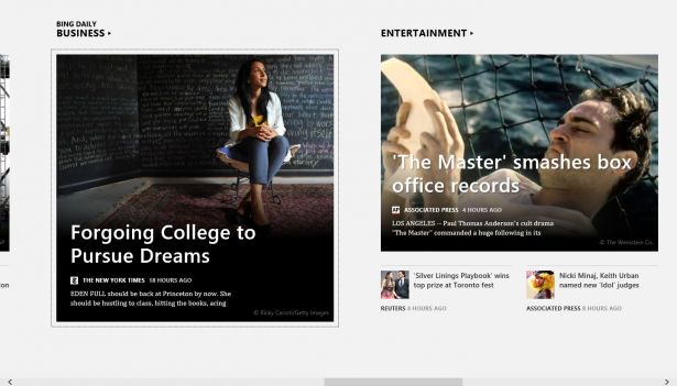
Windows 8 applications run fullscreen in a predominantly landscape orientation. This means there is a lot of room within which you will lay out your content. The most expressive and beautiful applications on the platform so far make liberal use of photography. For instance, the News application that is provided by the Bing team and ships with the operating system uses a very large image on the main screen of the application. This image represents the top story at the time the application is launched. The large imagery is very engaging and adds personality to the app.
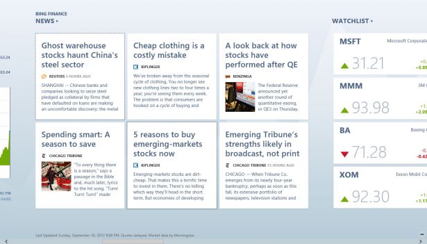
The use of photography is carried through the application as varying image sizes are used alongside the item previews and in the articles themselves. This use of imagery is also present in the other applications developed by the Bing team: Weather, Finance, and Travel. All of these apps, with the exception of Weather, also use photography in the updates they push to the Live Tile for the application (more on Live Tiles in point #10). Effective use of imagery will also help your application stand out in the Windows Store.

8. Charms bar and Contracts
The Charms bar is a toolbar that lives just offscreen on the right side of the display. The Charms bar contains buttons, or Charms, for Search, Share, Devices, and Settings as well as a Windows button that mimics pressing the Windows key or pressing the Windows key on a keyboard. When using a touchscreen, the Charms bar is activated by swiping in from the right edge. Using a mouse, the charms can be activated by moving to a corner on the right hand side of the screen and then mousing into the Charm region in the center of the bar. Keyboard users can activate the bar by pressing Win+C. Each of the Charms represents functionality that can be added to your application through what are called contracts.
Enabling the Search contract in your application will allow the contents of the app to be searched from anywhere within the system via the Search charm. You can design a custom page for the search results returned by your app. For more details on the Search contract, read 'Guidelines and checklist for search (Windows Store apps)'.
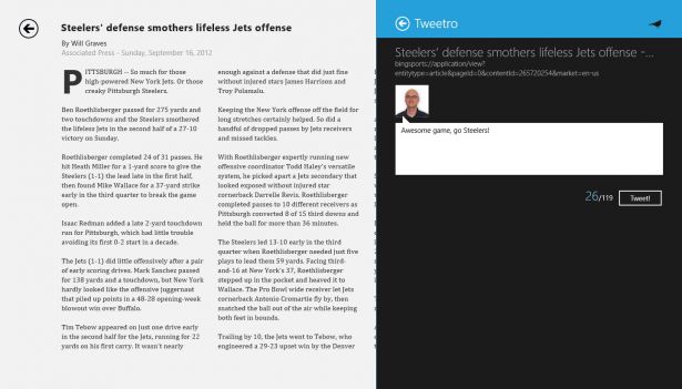
The Share contract allows your application to share content from the app with other apps on the system or receive items to share through your app from other apps. From a design perspective, the latter scenario is one where you will need to design the interface for sharing content from other apps through your app. For more details on the Share contract, read 'Guidelines for sharing content (Windows Store apps)'.
The Settings contract is where all application configuration should go for a Windows Store application. From a design perspective, you will be able to design the Settings pane that is activated for your app through the Settings charm. For more details on the Settings contract, read 'Guidelines for app settings (Windows Store apps)'.

9. Use subtle animations
One of the defining aspects of Windows 8 is how fluid the user interface is. Every transition between applications and between pages within an application occurs with a subtle animation. Rather than immediate pop on the screen, elements enter and exit with consistent animations across the platform. Microsoft has made the task of adding these animations to your application easy by providing an Animation Library with most of the Windows 8 animations preconfigured.
As a designer, you can review the guidelines and choose the animations that are appropriate for your design. You can then tweak the timings if necessary to achieve the desired effect. You also have the ability to define custom animations if there is not a preconfigured animation that meets your needs. For more details on using animations in Windows 8 applications, see 'Animating your UI'.
10. Design a good Live Tile
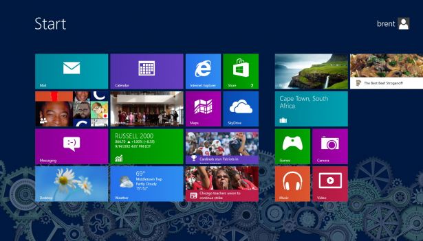
Live Tiles allow your application to have a constant connection with your users. Instead of the traditional application icon that platforms of the past have offered application developers, Live Tiles enable you to update them with information that will be displayed on the tile. If your application will need to provide updates to your users, you should definitely take advantage of Live Tiles. Live Tile notifications will keep you application feeling alive even when the user is not using it and will encourage users to return to the app. Another advantage of providing good information on your Live Tile is that it increases the chances that the user will move the tile for your application closer to or onto the first page worth of apps. Applications are much more likely to be used frequently when they are constantly in view.
To get more details on designing a good Live Tile, read 'Windows 8 Live Tiles: Top 10 Dos and Donts' by Ratio Interactive.

An exciting time
Windows 8 represents a great opportunity for developers and designers alike. It is a new platform with a fresh design-centric focus. The potential market is huge and the Windows Store has a relatively small amount of apps currently compared with other major app platforms. Getting familiar with the design guidelines will help you design applications that will be successful on Windows 8. It’s an exciting time for developers and designers.

The Creative Bloq team is made up of a group of art and design enthusiasts, and has changed and evolved since Creative Bloq began back in 2012. The current website team consists of eight full-time members of staff: Editor Georgia Coggan, Deputy Editor Rosie Hilder, Ecommerce Editor Beren Neale, Senior News Editor Daniel Piper, Editor, Digital Art and 3D Ian Dean, Tech Reviews Editor Erlingur Einarsson, Ecommerce Writer Beth Nicholls and Staff Writer Natalie Fear, as well as a roster of freelancers from around the world. The ImagineFX magazine team also pitch in, ensuring that content from leading digital art publication ImagineFX is represented on Creative Bloq.
