Applying micro-level design criteria
Writing micro-level design criteria for individual features can help you invent better solutions. In this example leading user experience specialist Robert Hoekman Jr explains how he established design criteria for Myspace and applied them
Sign up to Creative Bloq's daily newsletter, which brings you the latest news and inspiration from the worlds of art, design and technology.
You are now subscribed
Your newsletter sign-up was successful
Want to add more newsletters?
It was during a talk delivered by Adaptive Path's Sarah B Nelson in 2009 that I first learned about the notion of "design criteria". I had used a variation of this approach many times in the past, but never realised it had a name, or that it would completely change the way I take on a design. Since then, I've made such a list standard practice in the initial strategy documentation for client projects, but far more important, I've started writing them for each and every design I work on.
If you don't, you should start.
Design criteria are a mesh between business objectives and UX objectives that describe the goals for a given design. In short, they're a simple list of principles to apply when making design decisions that form a picture of what must be achieved by the result. And they don't only apply at the project level – they also apply to individual features and screens.
Article continues belowWorking with design criteria
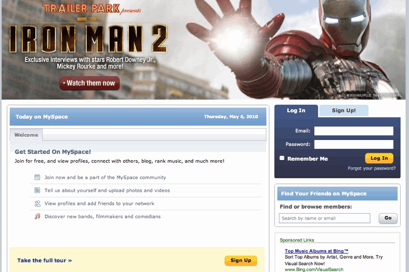
Last year, I worked on several projects for Myspace, a social networking site in dire need of an overhaul. In this case, my task was to establish a strategy for the site's homepage, which at the time was among the Top 20 most trafficked pages on the web and, remarkably, had no prior strategy.

To establish my list of design criteria, I interviewed stakeholders, talked to internal teams about what was possible and what wasn't, and defined a vision for the page, which would then be translated into wireframes to show what the page should achieve for users in multiple phases of the lifecycle (first-time visitor, repeat visitor, a signed-in user, and so on).
The vision statement was as follows:
"The Myspace homepage communicates the why of Myspace — why it exists and why you want to be part of it. It tells you what's interesting about this site, that there are people here you may know, that you'll find things here that you like and want, that it offers ways to share those things with your friends, and that it offers a better way to express yourself online and connect with others."
Sign up to Creative Bloq's daily newsletter, which brings you the latest news and inspiration from the worlds of art, design and technology.
The design criteria that followed from this vision mostly hinged on relevancy, but we had a few other notes to hit along the way. Here's a look at a few of them. (Note: during the actual project, I maintained separate lists of criteria for users in each lifecycle phase. What follows is a sampling from each.)
Make it relevant
In conjunction with a relevancy engine the company had in the works, the new homepage would eventually make strong recommendations for new friends, artists, and content of all kinds based on a wide range of user inputs used throughout the site (such as the aforementioned social actions). This, above all, would be the primary driver behind most of the design decisions.
No billboarding allowed
The page would also offer up relevant ads rather than "billboarding" its visitors by showing the same ad to every single user regardless of relevance. Taken to the extreme (which was certainly my intent), this would mean making the homepage ad-free for first-time visitors. For repeat visitors and signed-in members, this change would require soliciting multiple ads to be run for the same time period rather than just one, but would make each ad more effective, which could lead to increased revenue.
Further, we would eliminate the requirement to sign in from the homepage with every visit and instead aim to make the page useful even for those who were authenticated and therefore able to bypass it.
Be transparent
We would feature entry points to major points of interest on the site for two reasons: first, to provide quick access to these sections, and second, to show off the breadth of the site for those who didn't know what Myspace had to offer.
Make a promise
We would communicate, whether explicitly or implicitly, the purpose of the site and the benefits of joining.
Make it mobile
Americans already spend more hours per day staring at mobile devices than desktop screens, and this shift is only going to become more widespread in the coming years. To accommodate iOS, and because there was no real need for it in the first place, we would disallow Flash content from the homepage. We would also increase the hit areas for buttons, make the design more flexible so as to work with a variety of screen sizes, and set stricter boundaries around what could and could not be included on the page in the interest of bringing the message and content into better focus.
Bring the site to life
As a response to those who assumed that, in the era of Facebook, Myspace had become a ghost town, we would add elements that highlighted the immense level of activity happening on the site.
Putting principles to work
With these criteria driving the project, we we were able to redesign the page in a way that supported these goals, and only these goals. In other words, if an idea didn't serve at least one of these criteria, it was killed on the spot. The ones that made it? There were justified. Vetted. Right.
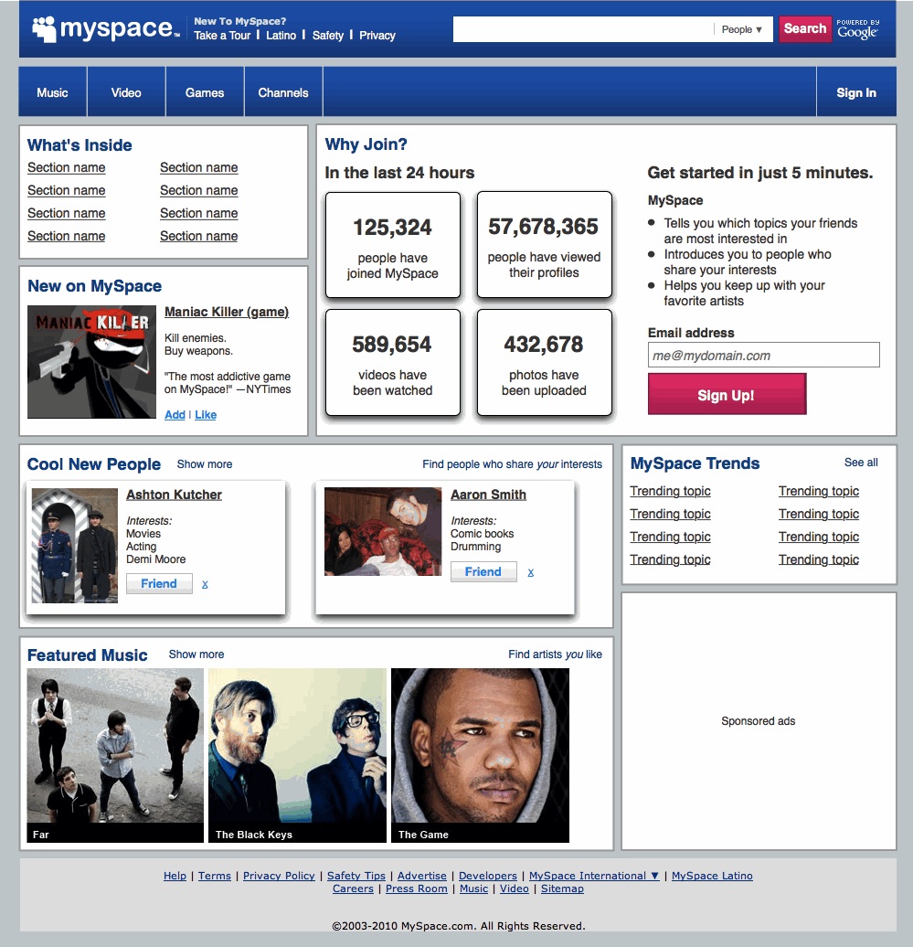
Here's the wireframe I pitched to the president of Myspace a week after writing the list of design criteria. (This wireframe, like the previous screenshot, addresses first-time members. I presented other versions for repeat visitors and authenticated members.)

In this design, we offer several clear reasons to join, a simplified sign-up process, and numbers that show how much has happened on the site in the past 24 hours. We recommend new connections based on what we know about you (which for first-timers is admittedly very little), and we show what information we're basing it on. We offer links to major site sections that are relevant based on your prior activity (when applicable). For signed-in members, we feature a list of topics trending among your friends and site-wide. We dish up a hero banner ad based on your interests. We show artists we believe you'll like based on your activity. We work to turn the page into a compelling destination, but still bypass it completely if you're already signed in. And to let you know we're serious about getting you to your most crucial information, we offer a link straight to your own content stream.
Due to overwhelming financial problems, shortly after this project was completed, Myspace was forced to lay off almost half of its staff, but I'm at least pretty sure this wasn't the fault of our overhauled homepage design. (These problems had been developing for quite a while before I got involved.) Some of these changes were in fact later woven into the homepage. Time will tell if the rest will make it in as well. Hopefully, Mr Bringing Sexy Back can pick up where we left off.
Going micro
The important thing to notice here? All these criteria were for a single page. By defining the goals for this single aspect of a Myspace user's experience – and for the business – we were able to swing our proverbial machete through a forest of ideas and cut a clear path to what should and shouldn't be included, and how those things should appear. Beyond that, these design criteria established a set of rules the company could apply in the future to keep out the bad ideas that would complicate the design without serving its purposes, and to vet the good ideas that would help My Space become the company it wanted to become.
Design criteria: they're not just for strategy docs anymore.

The Creative Bloq team is made up of a group of art and design enthusiasts, and has changed and evolved since Creative Bloq began back in 2012. The current website team consists of eight full-time members of staff: Editor Georgia Coggan, Deputy Editor Rosie Hilder, Ecommerce Editor Beren Neale, Senior News Editor Daniel Piper, Editor, Digital Art and 3D Ian Dean, Tech Reviews Editor Erlingur Einarsson, Ecommerce Writer Beth Nicholls and Staff Writer Natalie Fear, as well as a roster of freelancers from around the world. The ImagineFX magazine team also pitch in, ensuring that content from leading digital art publication ImagineFX is represented on Creative Bloq.
