DESIGN CLASSICS: Illustrator Stanley Chow
Stanley Chow has worked with everyone from M&S to the White Stripes. We discover why sticker albums, paintings, an album cover and a mini radio are amongst his top sources of inspiration.
Sign up to Creative Bloq's daily newsletter, which brings you the latest news and inspiration from the worlds of art, design and technology.
You are now subscribed
Your newsletter sign-up was successful
Want to add more newsletters?
Last week, art director at global digital agency Huge Yuji Sakuma kicked off our weekly 'design classics' feature. Continuing the series, and knowing that artists find inspiration in all manner of places, we've delved into another leading creative's mind to find out the items that inspire him the most.
Stanley Chow

This week, we spoke to Manchester-based illustrator Stanley Chow. His career began as a fashion illustrator for the likes of Just Seventeen, Sugar and More magazines and storyboarding Head & Shoulders adverts.
Since then, Chow has gone on to work with clients including Marie Claire, Elle, GQ, Marks & Spencer, BT, Vodafone, Pfizer, Yahoo, Clarks, BBC and Channel 4. He also received a grammy nomination for his work with The White Stripes in 2008.
Article continues belowChow is now better known for his caricatures and can be seen regularly in the Sunday Times and The New Yorker magazines.
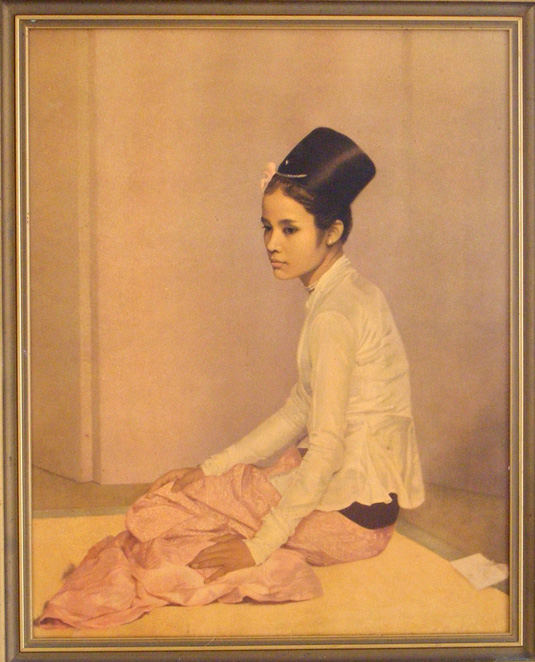
Saw Ohn Nyun by Sir Gerard Kelly
"I first saw this picture in an old school mate’s dining room about 20 years ago. I know it’s a bit kitsch, but I loved it so much I took a photo of it and kept in the sketchbook I used when I was doing A-level Art.
"It made me want to try harder at life drawing class. It made me want to draw girls. For years, I had knew nothing about it, and I'd almost forgotten about it until I came across a print of it on eBay. I later saw it in my friend’s shop, and I just had to buy it. It was like marrying your childhood sweetheart after being reunited on Facebook."
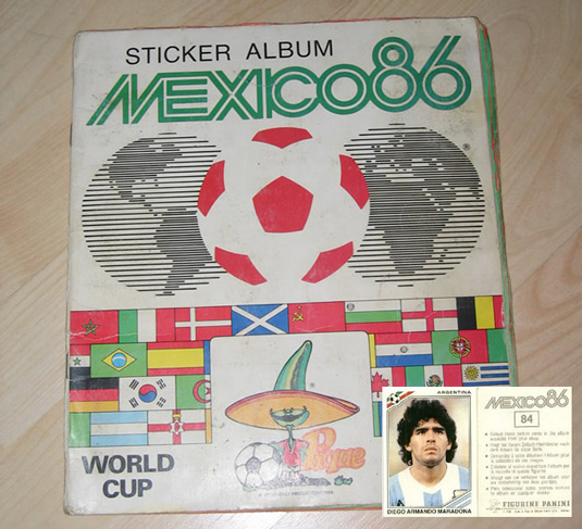
Mexico 86 World Cup Panini Sticker Album
"This sticker album is my pride and joy. I had a whole plethora of sticker albums but this was the only one I completed. I also loved the design of 'Pique', the mascot on the front. Looking back over the years at World Cup mascots, Pique is probably the most memorable.
Sign up to Creative Bloq's daily newsletter, which brings you the latest news and inspiration from the worlds of art, design and technology.
"The actual Mexico 86 logo is beautiful too. I love the geometric design and the fact that it looks so 70s, despite the tournament being held in the mid 80s.
"A few years ago I was very much in need of inspiration after a good few months of no work and no money. I was going through my old books and magazines and came across this sticker album. Looking at the stickers of the football players reignited a love of portraiture and caricatures I had when I was younger. I started illustrating footballers and then other pop culture figures, and this pretty much kickstarted my career again."
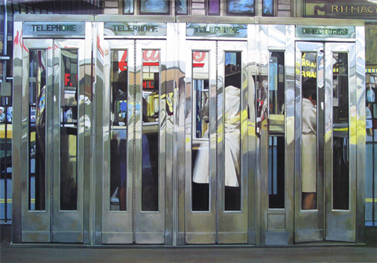
Telephone Booths by Richard Estes
"I first saw this painting at the Thyssen-Bornemisza Museum in Madrid on an art trip at school back in 1994. It was the last painting to see on the way out. I remember it looking absolutely massive. There was a bench in front of the painting. I sat down, looked at it and cried for half an hour. I've never been so overwhelmed by a painting before or since.
"I have no idea why it affected me this way but it did fuel the growing fascination I have with my now-favourite city, New York. I think it's also influenced the way I illustrate street scenes and buildings too. The image is very flat, geometric and two-dimensional and, despite it being a photorealistic painting, I see it as more of an abstract piece of art because of the composition."
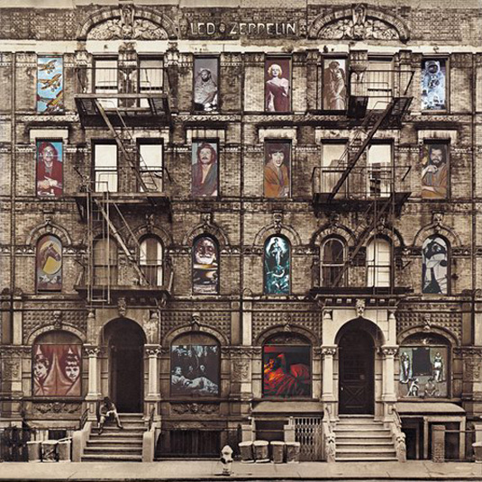
Physical Grafitti by Led Zeppelin
"Led Zeppelin are one of my favourite bands. This sleeve designed by Peter Corriston is the reason I picked this album up and listened to them in the first place.
"It was in my Dad's record collection. I was about 13 years old when I was first allowed to touch my dad's record player, let alone his records. Going through his collection, this was the only record that jumped out at me.
"I just found the sleeve absolutely fascinating. I loved the randomness of the images within each window, and on the back if you took out the inner sleeve slowly, it would create a burlesque striptease through one of the windows. Hours of fun, and this was before I even listened to the record. Visually I think I like this for the same reasons I liked the Telephone Booths and the fact that the building on the sleeve is in New York too."
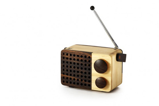
The Magno wooden radio mini
"I have a small collection of radios and this wooden radio designed by Singgih Susilo Kartono is my favourite. It embodies everything I like about my own work and art and design that I like in general.
"It has a retro feel without being able to put a finger on the date it was created. It's as cute as a button, very easy on the eye but above all it's sheer simplicity. It doesn't have a display, no on/off light...it's a fully functional radio designed with as little detail as possible."
What do you think about Stanley's choices? What inspires you? Let us know in the comments box below...

The Creative Bloq team is made up of a group of art and design enthusiasts, and has changed and evolved since Creative Bloq began back in 2012. The current website team consists of eight full-time members of staff: Editor Georgia Coggan, Deputy Editor Rosie Hilder, Ecommerce Editor Beren Neale, Senior News Editor Daniel Piper, Editor, Digital Art and 3D Ian Dean, Tech Reviews Editor Erlingur Einarsson, Ecommerce Writer Beth Nicholls and Staff Writer Natalie Fear, as well as a roster of freelancers from around the world. The ImagineFX magazine team also pitch in, ensuring that content from leading digital art publication ImagineFX is represented on Creative Bloq.
