Designers start 'contrast rebellion'
Manifesto to scrap low-contrast text, aid readability and usability
Sign up to Creative Bloq's daily newsletter, which brings you the latest news and inspiration from the worlds of art, design and technology.
You are now subscribed
Your newsletter sign-up was successful
Want to add more newsletters?

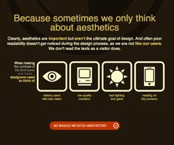
UX expert Zoltn Gcza and interactive designer Richard Gazdik have created Contrast Rebellion, in an attempt to put an end to low-contrast text on websites. With a snappy slogan of “to hell with low-contrast fonts,” the site is a simple, straightforward manifesto that aims to put an end to grey-on-grey font action.
The pair revealed to .net that the site was created as “a reminder of the true purpose of typography and, in our opinion, the most often overlooked aspect of it: contrast”. Too many websites, they argue, sport unreadable, low-contrast text and so it was time to say enough. “And the message seems to resonate with fellow designers: in a couple of days we received over 60,000 visits and thousands of retweets.”
According to Gcza and Gazdik, design comps are largely to blame, since low-contrast text looks good in mock-ups and doesn’t steal attention from imagery. Clients tend to be happy with this, since they, by definition, aren’t like their users and don’t read the text. But Gcza and Gazdik are keen to point out that their argument isn’t that aesthetics don’t matter, stating that “beautiful products are even perceived as more usable”. It's just that aesthetics and usability should both be considered.
Article continues belowOn the argument that black-on-white text can be dull, the retort is that real users don’t ever argue that content should be less readable, and nor do they find content-rich sites dull. “And high contrast doesn’t mean black on white anyway,” the pair adds. “There’s ample room for creativity.”
When it comes to working on your own designs, Gcza and Gazdik recommend plenty of testing: “Site a cheap monitor next to the calibrated professional IPS monitor, because it’s an eye-opener to see the difference. Also, do checks on different operating systems and browsers, because they differ in font rendering. What may look nice and readable in Safari might be bordering on unreadable in IE9.” Designers should also check out the WCAG guidelines for further options for testing contrast.
However, the Contrast Rebellion has come in for some criticism, with Mozilla developer evangelist Christian Heilmann saying: "So the markup of contrastrebellion.com is interesting: http://bit.ly/oHNTsg - no alternative text? No linking of the URLs and the screenshot". On this, Gazdik told us: "We will try to fix these problems in the coming days. There was a small update a few days ago to get a better result on a browser with JavaScript turned off, but we still have some minor bugs to work on."
Sign up to Creative Bloq's daily newsletter, which brings you the latest news and inspiration from the worlds of art, design and technology.

The Creative Bloq team is made up of a group of art and design enthusiasts, and has changed and evolved since Creative Bloq began back in 2012. The current website team consists of eight full-time members of staff: Editor Georgia Coggan, Deputy Editor Rosie Hilder, Ecommerce Editor Beren Neale, Senior News Editor Daniel Piper, Editor, Digital Art and 3D Ian Dean, Tech Reviews Editor Erlingur Einarsson, Ecommerce Writer Beth Nicholls and Staff Writer Natalie Fear, as well as a roster of freelancers from around the world. The ImagineFX magazine team also pitch in, ensuring that content from leading digital art publication ImagineFX is represented on Creative Bloq.
