Five killer ways to use buttons on your site
They may be a small part of site design, but buttons are important. So, says Gene Crawford, you should ensure they’re perfectly formed
Sign up to Creative Bloq's daily newsletter, which brings you the latest news and inspiration from the worlds of art, design and technology.
You are now subscribed
Your newsletter sign-up was successful
Want to add more newsletters?
Gestalt is the German word that can be defined as the ‘essence or shape of an entity’s complete form’. We use the term in graphic design to refer to the idea of how a person will recognise and react to an element of something we’ve designed.
There are several guiding principles applied against this concept; Similarity, Continuation, Closure, Proximity, Figure and Ground. We can use these to our advantage when designing web page elements – specifically with the design of buttons.
What’s in a shape?
Buttons are incredibly important to any call to action or transactional process. The button is the end point in submitting a form or completing a transaction, so we shouldn’t treat them as casual factors when we’re designing a page or form as a whole. Their shape and form are very important so that the user immediately recognises them as such and can clearly complete the action they desire.
A user also needs to feel confident that the button is a button and that the thing they expect to happen will indeed happen. If we ignore giving the user this important feedback it can lead to lost conversions and sales.
Button design patterns
There are existing design patterns for buttons across the web. The look built into the operating system or browser is the most basic and readily usable you can find. There are also other looks with rounded edges or a 3D appearance that can send the user the signal ‘I am a button’. This may seem like a simple point to make, but keeping things simple is the way to win conversions.
Article continues belowFive examples to check out
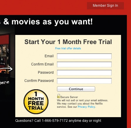
1. Netflix The movie streaming service Netflix uses a simple system button for its signup form. This is great in this instance since the page is busy and needs this clarity.
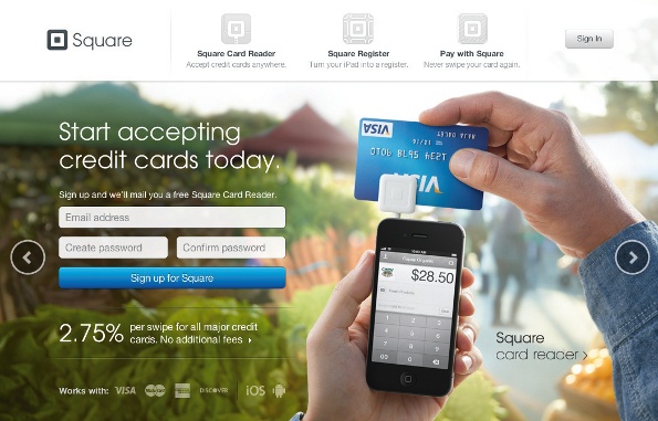
2. Square The gestalt of important buttons on the home page of the Square credit card scanner app website straddle the line between system and stylised buttons. Visually they read clearly and cleanly as buttons.
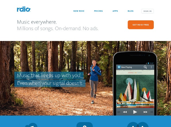
3. rdio The site for the on-demand music service rdio uses colour, shape and proximity for its main button so it stands out and sends the ‘click me’ signal to users.
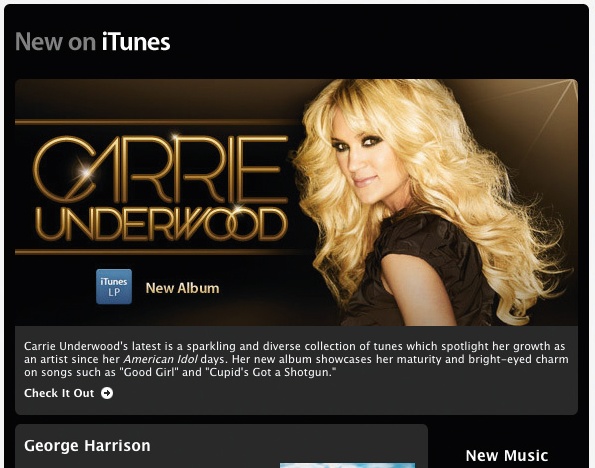
4. iTunes The iTunes weekly music sales email is beautifully designed, but uses a now common pattern of making the large central image a link for the desired action. This is a fine solution, yet it loses the clear gestalt of the button or call to action.
Sign up to Creative Bloq's daily newsletter, which brings you the latest news and inspiration from the worlds of art, design and technology.
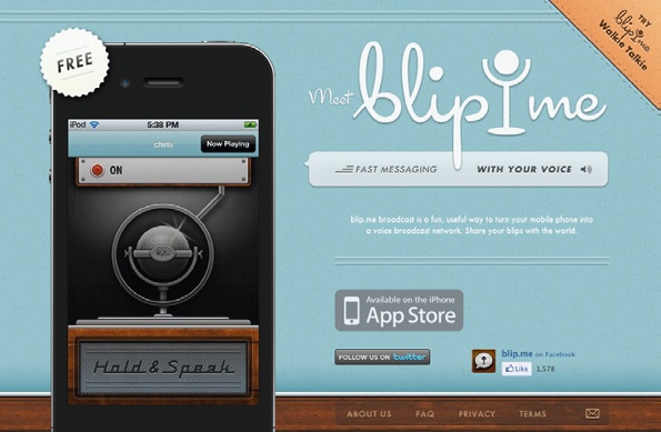
5. Blip Me The website for the voice broadcasting iPhone app Blip Me uses what is becoming a standard ‘app store’ button. This is interesting: by itself it may not read like a button, but given its popular adoption across the web it’s building a gestalt all its own to users.
If you've seen any examples of sites using buttons to great effect, why not mention them in the comments?

The Creative Bloq team is made up of a group of art and design enthusiasts, and has changed and evolved since Creative Bloq began back in 2012. The current website team consists of eight full-time members of staff: Editor Georgia Coggan, Deputy Editor Rosie Hilder, Ecommerce Editor Beren Neale, Senior News Editor Daniel Piper, Editor, Digital Art and 3D Ian Dean, Tech Reviews Editor Erlingur Einarsson, Ecommerce Writer Beth Nicholls and Staff Writer Natalie Fear, as well as a roster of freelancers from around the world. The ImagineFX magazine team also pitch in, ensuring that content from leading digital art publication ImagineFX is represented on Creative Bloq.
