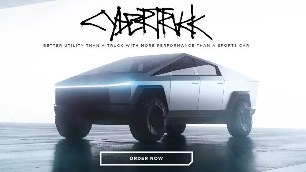
I'm sorry, but somewhere along the way we seem to have missed out on the vital discussion that is the Cybertruck logo. We've talked about the truck's launch, design, Tesla's slightly odd social media marketing of a Cybertuck-filled parking lot, and countless other quirks, but the actual logo remains uncommented on. And I can't let it go by for a moment longer (yes, I know I'm a bit late, no I don't care).
A few years ago I happened across a version of the logo that hasn't actually made it through the extended pre-production time. It was a futuristic design that appeared to contain an Easter egg (one that got Tesla fans quite excited). This logo actually made some sense with the angular, dystopian typography. But the real logo? The real logo is wild (also see our history of the Tesla logo).
See it below and consider: Is this the best they could do with a graffiti font?

It's a hot mess, let's be honest. The graffiti style is reminiscent of the slightly urban, dystopian environment the Cybertruck brings to mind, I'll acquiesce. But the execution? Yeesh. It's sort of futuristically angular, but isn't leaning into that aesthetic any further than that C that looks like a V on its side. And the letters are completely chaotic (not in a good way).
The dripping is unconsidered and unrealistic. And most importantly, you can't read what it says. The whole thing is completely smushed together – has the design team not heard of our ultimate guide to kerning?
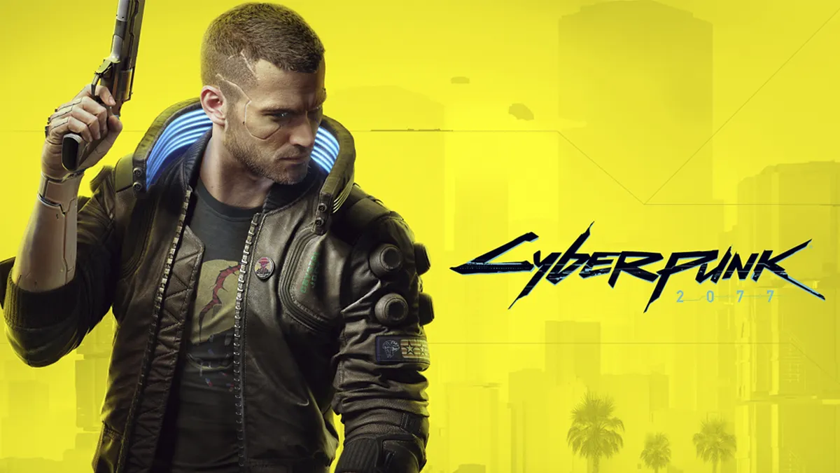
Is it meant to echo the Cyberpunk logo (above)? It certainly has the bones of the design, with that paint effect against a city background. But then again, maybe it's just the fact the words are similar.
Though car logos are universally heading towards the same design tropes – flat, minimalist and, dare I say, slightly bland, this logo is the opposite extreme. Normally I'd praise the out of the box thinking, but the execution just isn't there – and I seriously don't believe the style matches that of the uniquely designed Cybertruck. Though we've spent years lightly mocking the build of the truck, we have to commend it for being a truly different design amongst a sea (road) full of cars that mostly fall into a few different styles. So I think it deserves better.