Make a scalable newsletter with Fireworks
There’s a preconception among designers that email clients’ lack of support for web standards means you can’t get creative with newsletters. James Parker is out to explode this theory
Sign up to Creative Bloq's daily newsletter, which brings you the latest news and inspiration from the worlds of art, design and technology.
You are now subscribed
Your newsletter sign-up was successful
Want to add more newsletters?
This article first appeared in issue 224 of .net magazine – the world's best-selling magazine for web designers and developers.
In the current economic climate, firms across the globe are looking to maximise their return on investment from slashed marketing budgets. With customer information databases bulging, and the ability to target people genuinely interested in what they’re selling, it’s no surprise email newsletters have become the marketers’ new weapon of choice.
But even with demand at an all time high, there are still a vast number of designers hesitant to offer newsletters to their clients. Put off by the lack of support for web standards in email clients, many feel restricted as to how creative they can be.
I want to put that theory to bed. Designing in this format can be great fun, and the technical limitations of working on emails can be a blessing in disguise because they get us back to thinking about basic design principles.
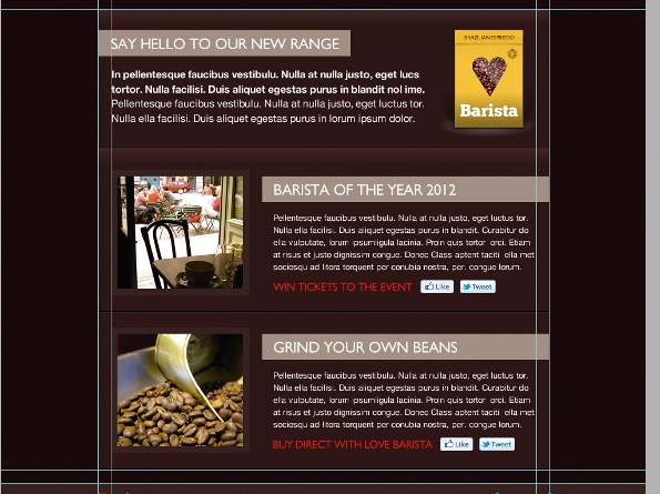
In this tutorial we’ll use Fireworks to design an email newsletter for Love Barista, a social project for coffee lovers. Focusing on a sleek, scalable layout, and by considering the weight given to core elements in the design, you’ll build up an email that’ll stand out of any mailbox. At the end of the tutorial you’ll be ready to build, and as our layout would be perfect for a Campaign Monitor template, I’ll give you a few tips to help get you started.
1. Wireframe
Open up the file Wireframe.png that I’ve pre-ruled to help get us started. In the properties panel set the canvas colour to #210000 and draw a rectangle 1000px wide and 365px high. Give it a colour of #300000 and position it at the top of the page.
Article continues below 
2. Masthead
Using the Pen tool draw two lines, each 1px thick and 1000px wide. Stack them on top of each other and sit them on the first horizontal guide. Set the top line colour to #000000 and make the bottom line #FFFFFF with 10% opacity. Group the strokes together.
3. Logo
The top left corner is generally the first part of the email the receiver will see, so let’s reserve this area for branding. Open the logo file LoveBarista.png, position it 22px from the top and left align it against the 150px vertical guide.
4. Date fob
In the top right corner draw a rectangle with a short linear gradient. Make the start colour #BF0202 and the end colour #F70000. Inside the fob draw a text box and type the date in caps. Choose Gill Sans in white at size 19px. Refer to the expert tip for help choosing fonts.
5. Social media
Draw a text box directly beneath the date fob, and in caps type your social media and other external links. Set font size to 16px, colour to #451A1A, and allow 17px padding between each. Add 10px high dividers using the Pen tool and set the stroke colour to #451A1A.
Sign up to Creative Bloq's daily newsletter, which brings you the latest news and inspiration from the worlds of art, design and technology.
6. Feature banner
All newsletters need a leading feature. The space above the 365px horizontal guide can be used for clients to add a master photo or creative promotion. Open PromoBanner.png and position it in the centre on the 365px guide. Supporting text will sit below.
7. Feature info
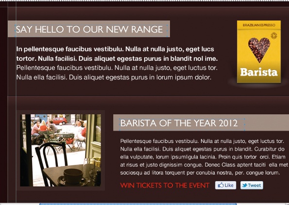
From the 385px horizontal guide draw, and centre, a rectangle 700x215px. Add a short linear gradient with a start colour of #452929 and end colour of #301C1C. Draw another rectangle for the title box 40px high and any width. Put it 33px from the top of the 385px guide.

8. Add content
Draw a text box against the 20px padding guide in the title rectangle. Add your title in 24px white caps. Draw another text box, 500px wide and place it 20px below the title. Add a few lines of ‘lorum ipsum’ and make the text white, 16px, with a line-height of 140%.
9. More detail
Repeat the grouped strokes from step 2 with width altered to 700px. Place it in the bottom of the Feature Info box. Empty space in the box can be used for extra images relating to the main article. Open Packshot.png and right align it against the 20px padding guide.
10. News articles
Duplicate the rectangle from step 7. Position it directly below the Feature Info box and change the height to 499px. Draw a rectangle 215x194px, set the colour to #3A2625, align it against the 20px padding guide and move it 33px from the Feature Info box.
11. Image mask
Draw a white rectangle 195x174px and centre it within the rectangle from step 10. Open Article01.jpg and position it underneath the white rectangle in both the layers panel and on the canvas. Select both items and create the mask by going to Modify>Mask>Group as Mask.
12. Article copy
Duplicate the title box from steps 7/8. Set the width to 445px and align it to the top of the article image and against the 850px vertical guide. Create a new text box beneath the title that’s 410px wide, with size 13px white text. Add five lines of ‘lorum ipsum’.
13. Call to action
Draw a text box below the article copy and type a short call-to-action in caps. Change the text colour to #F70000 and set the size to 17px. Open fblike.png and tweet.png to add social media icons. Line them up alongside the call-to-action with 10px padding in between.
14. Add another article
Create an article divider by duplicating the grouped strokes from step 9 and moving them 25px below the image frame. Now duplicate the nine most recent items in the layers panel and position them on the canvas 25px below the stroke divider.
15. New content
Un-mask the new article image to reveal the white rectangle. Delete the image and open Article02.png. Repeat the masking process from step 11 and change the title and call-to-action. The layout here shows two articles implemented, but you can amend this to suit.
16. Footer
Draw a rectangle 100x57px and set the colour to #3A2625. Duplicate the logo from step 3 and shrink down the size to 73x17px. Left align the logo against the 150px vertical guide and allow 15px padding from the top of the footer.
17. Important links
Newsletters can be long, so it’s good practice to re-introduce important links in the footer. Draw a text box alongside the logo to include your social media links. Set the colour to #9F8C83 and the size to 13px. Add any links and then duplicate them, right align them and re-type for your Unsubscribe button.
18. Text shadow
CSS3 text shadow is supported in many email clients, so let’s include it. Select all the main titles and in the properties panel filters choose Shadow and Glow>Drop Shadow, applying these attributes: Distance=1, Opacity=35%, Colour=#000000, Blur=0, Angle=90 degrees.
19. Finishing touches
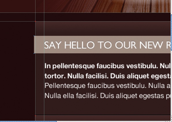
Add perspective to the newsletter by offsetting the title boxes. For the main feature title, nudge the boundary box to the left by 3px and for article titles push the boundary boxes to the right 3px. The design’s now complete and ready to be built!
Discover the top 10 online tools for web design training at our sister site, Creative Bloq.

The Creative Bloq team is made up of a group of art and design enthusiasts, and has changed and evolved since Creative Bloq began back in 2012. The current website team consists of eight full-time members of staff: Editor Georgia Coggan, Deputy Editor Rosie Hilder, Ecommerce Editor Beren Neale, Senior News Editor Daniel Piper, Editor, Digital Art and 3D Ian Dean, Tech Reviews Editor Erlingur Einarsson, Ecommerce Writer Beth Nicholls and Staff Writer Natalie Fear, as well as a roster of freelancers from around the world. The ImagineFX magazine team also pitch in, ensuring that content from leading digital art publication ImagineFX is represented on Creative Bloq.
