Drawing gruesome battle wounds: how to sharpen your skills
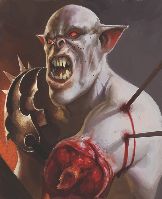
"Think of ground beef with strawberry syrup." Illustrator Paco Rico Torres explains how to realistic recreate battle wounds.
Sign up to Creative Bloq's daily newsletter, which brings you the latest news and inspiration from the worlds of art, design and technology.
You are now subscribed
Your newsletter sign-up was successful
Want to add more newsletters?

First of all, consider your colours. If you really want to make the wounds stand out, you should use the colour as an accent. Red is the colour of blood and pain, but also is a striking colour choice that can be used to enhance the intensity of whatever you’re trying to paint.
The problem is that if you use too much red on the rest of the image, or apply colours that are too saturated, the red of the blood is going to lose its visual strength. The solution is to use desaturated colours for the rest of the image, and limit the intense ones for the injuries.

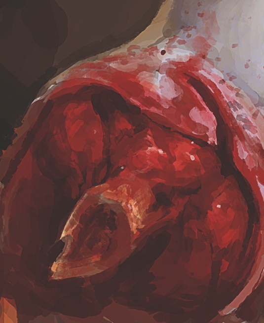
In addition, try to achieve a gruesome texture. Think of ground beef with strawberry syrup. A natural look is important, so don't paint clean-edged wounds.
Article continues belowPortray splintered bones leaking bone marrow, torn pieces of flesh and skin hanging loose. If you're in doubt, search for photo references – although this might put some people off the topic completely!
Words: Paco Rico Torres
Paco Rico Torres is a freelance illustrator living in Spain who’s produced art for several card games, magazines, books and role-playing games. This article originally appeared in ImagineFX issue 103.
Sign up to Creative Bloq's daily newsletter, which brings you the latest news and inspiration from the worlds of art, design and technology.

The Creative Bloq team is made up of a group of art and design enthusiasts, and has changed and evolved since Creative Bloq began back in 2012. The current website team consists of eight full-time members of staff: Editor Georgia Coggan, Deputy Editor Rosie Hilder, Ecommerce Editor Beren Neale, Senior News Editor Daniel Piper, Editor, Digital Art and 3D Ian Dean, Tech Reviews Editor Erlingur Einarsson, Ecommerce Writer Beth Nicholls and Staff Writer Natalie Fear, as well as a roster of freelancers from around the world. The ImagineFX magazine team also pitch in, ensuring that content from leading digital art publication ImagineFX is represented on Creative Bloq.
