10 logos from 2019 that defy design trends
Anyone who’s kept an eye on logo design in 2019 knows the score. When it comes to redesigning a major brand’s logo, the standard route is to take the existing design and simplify it in as many ways as you can.
If it features multiple colours, reduce that to just one. If it has ornate, expressive or cartoony typography, change that to a more streamlined font. If it has graphic elements, remove them, or at least make them look more geometric and app icon-like. If there are serifs, swap them out for sans-serifs. You get the idea.
In short, if you end up with something that looks like all the other logos around right now, then you’re going in the right direction.
This most pervasive of all the logo trends of 2019 can be seen in the redesigns of Volkswagen, Android, Sydney Film Festival, Toyota, Scotiabank, City of Vienna, Bristol CIty FC, Staples, Airarabia, All4, and many more. But it has not been entirely dominant.
Some brands have decided to buck the groupthink, and dare to go in a different direction. Here we bring you 10 new logos from 2019 that stood out from the crowd, in a number of striking ways.
01. Western Sydney Airport

New logo

Old logo
The work of Australian design agency Traffic, the new logo for Western Sydney Airport is a world away from the clean but unexciting wordmark of its predecessor (click the right arrow above to see the previous design).
Stacking the text and adding a bold new graphic element, crafted from a disjointed combination of triangles and an eye-catching gradient, this new logo has certainly divided opinion. You can learn more about the thinking behind it here.
Sign up to Creative Bloq's daily newsletter, which brings you the latest news and inspiration from the worlds of art, design and technology.
02. Wind Mobility

New logo
Old logo
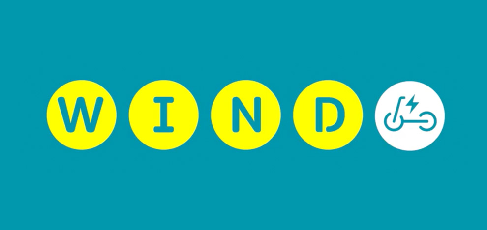
WInd (full name: Wind Mobility) is a Berlin-based startup that offers dockless e-scooter and electric bicycle rentals, and its latest logo was designed by London studio Ragged Edge.
The new design is a bold approach that calls to mind superhero comic typography. And overall there's a clear sense of dynamism and speed to it, particularly seen in the off-key serifs on the 'W' and 'N', which befits the brand nicely. Check out the full identity and learn more about the thinking behind it here.
03. Sheffield Theatres
New logo

Old logo
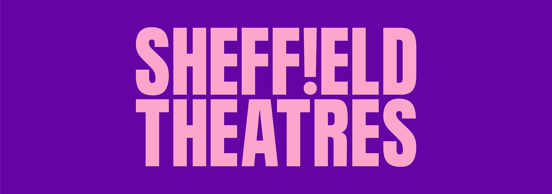
Here's another logo design that takes inspiration from headline-style typography. Sheffield Theatres is a group of three theatres in Sheffield, England, namely The Crucible, The Lyceum and the Studio. And its new logo, created by local agency Cafeteria, is brimming with confidence and assertiveness.
With its bold typography, vivid colour, and inspired use of an exclamation mark (which nicely flips on itself in the animated version), this logo design may be clean and simple, but it's certainly not bland.
04. Access
New logo
Old logo
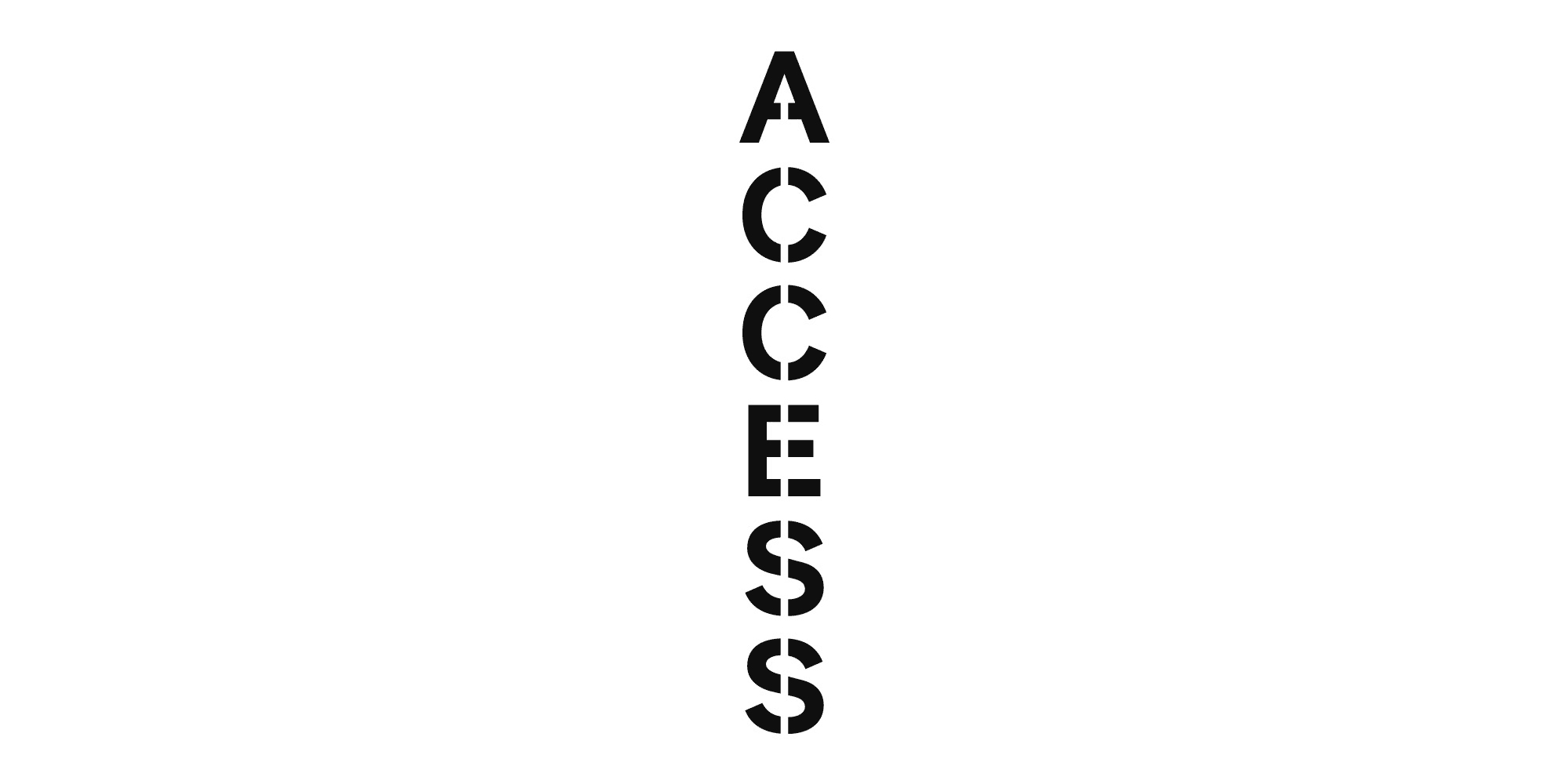
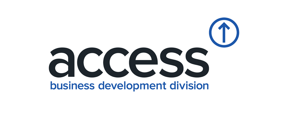
Based in Teesside, UK, since 1976, Access is a leading company manufacturing startlifts for home use worldwide. It's not an industrial sector you'd normally connect with a sense of youthful dynamism. But this new identity, designed by Middlesbrough studio Better, takes an unusual approach that manages to tick a lot of boxes.
Stacking the letters vertically is an obvious reference to the product in question, while the custom lettering, created in-house, reflects the innovative nature of the company's engineering. The negative space down the middle, meanwhile, recalls the crisp stencil-like silhouettes of industrial manufacturing. See the full identity and learn more about the thinking behind it here.
05. Teach First

New logo

Old logo
Teach First is a social enterprise registered as a charity, which aims to address educational disadvantage in England and Wales. Its previous wordmark was pretty standard, but London studio Johnson Banks recently gave it a dramatic makeover.
Centre-stage is the attention-grabbing T/F monogram, with its clever use of triangles and negative space, while the wordmark is now stacked, and cast in a spiky new serif. See the full identity and learn more about its creation here.
06. Desigual

New logo

Desigual is a global clothing brand, headquartered in Ibiza, Spain, that's known for its use of graffiti art, asymmetry and flamboyant splashes of colour. This June it excitedly announced that it was "becoming the first brand in the world to permanently reverse its logo".
What was the point of that, you might ask? According to a press release, this in-house redesign was "a tribute to the rebellious, disruptive and fresh spirit that inspired filmmaker Isabel Coixet to give us the name Desigual in 1984 because we were 'not doing the same' thing as everyone else."
You can read more about the controversy surrounding this redesign in our article, Is Desigual’s new backwards logo a step forwards? .
07. M Capital

New logo

Old logo
M Capital is a private equity firm in France; the kind of enterprise you'd expect would favour a staid, formal and strictly corporate logo. So it raised a few eyebrows when they released this new design, crafted by Parisian studio Brand Brothers.
These jagged, angular and disjointed letterforms are a world away from those in the previous logo, which evoked precisely zero personality. You can learn more about the new identity and how it was created here.
08. OBV

New logo

Old logo
Formed in 2014 from the merger of Flanders' opera house and main ballet company, Opera Ballet Vlaanderen (OBV) is the largest cultural institution in the Dutch-speaking part of Belgium. This new logo, designed by London-based Pentagram partner Marina Willer, uses distorted type to turn the institution's capital letters into an instantly recognisable icon.
Like it or loathe it, it certainly conveys the contemporary feel the client was aiming for, and avoids any hint of cliche. Check out the full identity here.
09. Zoo de Granby
New logo
Old logo
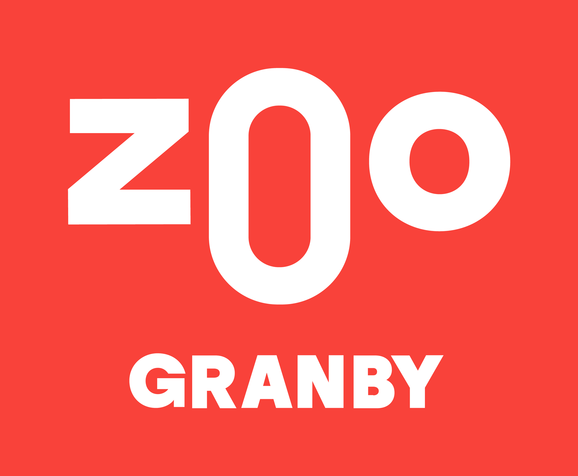
Zoo de Granby is a Quebec institution: a non-profit zoo that's also home to an amusement park and a water park. In a world of boring, samey logos, its bright new wordmark is a real breath of fresh air.
Designed by Montreal studio lg2, there's a real sense of fun to its playful typography, well befitting a space devoted to amusing children and families. Learn more about the thinking behind it here.
10. Vrbo

New logo
Old logo
Our final example of a bland and uninspired logo being transformed into something more enticing comes from Vrbo, the most popular vacation rental site in the US. With every website logo looking very similar these days, this redesign by Texas studio FODA goes in a very different direction.
It's inspired, apparently, by stripes; namely those in "the clothing we wear on vacation, from board shorts to ski clothes to the classic French breton" and "in the destinations we visit, from umbrellas on the beach to log cabins in the mountains".
Visually the result is spectacular and eye-catching, although we wonder how well it reduces down on small screens. You can learn more about the redesign here.

Tom May is an award-winning journalist specialising in art, design, photography and technology. He is the author of the books The 50 Greatest Designers (Arcturus) and Great TED Talks: Creativity (Pavilion). Tom was previously editor of Professional Photography magazine, associate editor at Creative Bloq, and deputy editor at net magazine.

