5 steps to planning a successful website
It takes more than creativity to design a great site. These tips run down five critical steps leading up to the design phase.
Sign up to Creative Bloq's daily newsletter, which brings you the latest news and inspiration from the worlds of art, design and technology.
You are now subscribed
Your newsletter sign-up was successful
Want to add more newsletters?
Five times a week
CreativeBloq
Sign up to Creative Bloq's daily newsletter, which brings you the latest news and inspiration from the worlds of art, design and technology.

Once a week
By Design
Sign up to Creative Bloq's daily newsletter, which brings you the latest news and inspiration from the worlds of art, design and technology.
Once a week
State of the Art
Sign up to Creative Bloq's daily newsletter, which brings you the latest news and inspiration from the worlds of art, design and technology.

Seasonal (around events)
Brand Impact Awards
Sign up to Creative Bloq's daily newsletter, which brings you the latest news and inspiration from the worlds of art, design and technology.
The clock reads 1:30am and you just want to go to bed. You’re working from home, sitting at your computer, drawing shapes, editing filters and experimenting with typography but the design just isn’t coming together. You move a box to the right. You move it back. You’ve built a career on creating beautiful and user-friendly websites, so why is the design always a struggle?
It’s a problem that most, if not all of us have come up against many times in our careers. We call it creative block. And therein lies the problem. Because making websites that people will find easy to use – websites that encourage people to convert – is not about creativity. It’s about planning. And research. And putting the end user ahead of the design.
I was a web designer and frontend developer for several years before I truly began to understand the importance of process. I have watched web designers – whether they are freelance, working for a large agency, or somewhere in-between – follow the same general sequence of events over and over again. They have some sort of kickoff meeting, and then go back to their computers and work up site designs.
Despite the popularity of this approach, it never really works. Even if you manage to create something visually compelling, there is a 100 per cent guarantee that you’re missing opportunities to connect with and convert users. By implementing real processes from which to inform decisions as you work on a website, you can create superior products, elevate the user experience and increase conversions. Next time you’re banging your head against the wall in an effort to summon a beautiful web design from your creative genius mind, try following the five crucial steps outlined here.
01. Sitemap and user flow
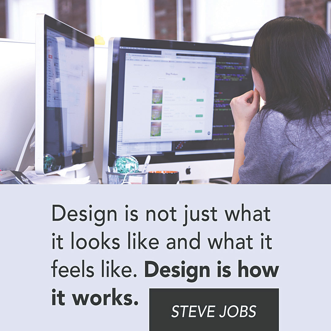
You’ve had your kickoff meeting. You’ve conducted industry research, done a competitor analysis and developed user personas. You’re ready to get started, but there are two important questions you should always ask clients first.
First, ask them to identify their top one-to-three priorities for the website. This gives you a good picture of what’s important to them. It requires that they begin thinking in terms of priorities, which helps to develop and keep focus. It also opens the door for discussion about what those priorities mean, and if it makes sense to adjust them.
The second thing you should ask is this: What does a successful website look like to you? This question is enormously important as you start to plan the user flow and conversion goals. Once you have that information, you can begin to create a plan for the website: the sitemap.
Sign up to Creative Bloq's daily newsletter, which brings you the latest news and inspiration from the worlds of art, design and technology.
A plan for the website
A sitemap is the first visualisation of the content that will be included on a website, and how it will be organised. It is the first step towards a user-focused, content-centric product. There are two perspectives to examine. First, look at the goals of the company you are working for. What are they trying to achieve? Next, determine what their customers are looking for. It is the marriage of these two perspectives that will ultimately mean success.
Start thinking about the types of information that need to be present to accommodate both the end user’s and the company’s goals. Put the user goals first – it never hurts to remind companies that what is best for their users is also best for their business.
For example, if ABC Company has invented a new technology, it makes more sense to prioritise information about the user’s problem the technology solves than to lead with ABC Company’s history and mission statement. You’ll probably also want to include contact information and an industry-specific blog as a resource to users. Suddenly, you have the beginnings of a sitemap.
Navigating through information
As you start to answer questions about the general hierarchy of information across the website, you’ll also begin to anticipate how users might navigate through that information. This is your user flow.
By creating a theoretical user flow at the beginning of a project you can start to see how the sections of information interact to create the ideal user experience. Who are your users? Does the hierarchy of information make sense for various use cases? Will users naturally be able to move through the website to find content that is relevant to them?
At the top of a blank page, identify your user personas. Below each one, start thinking about how they might move through the site. Consider what they might be looking for and how one section of information might lead them through the site to the next.
02. The customer acquisition funnel
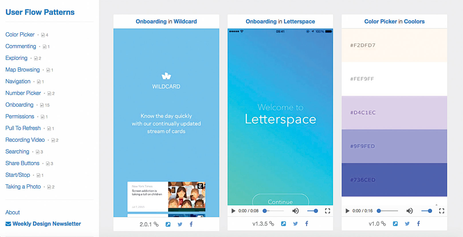
At this point you have already begun to theorise about the journey a user will take through the website, and have probably started thinking about how that will lead them to convert. This is your customer acquisition funnel.
Using the user flow diagram you created in step one, consider how you might be able to direct users through the site to a point of conversion. To create a customer acquisition funnel, put yourself in the user’s shoes. Use specific personas rather than a broad audience, and target your funnel to a particular person. What are their goals? How can you help them achieve those goals?
Imagine we are creating a website for a shoe store. If a user arrives at our website with the goal of buying a pair of shoes, our goal is to make it as easy as possible for them to do so. An online shoe store should quickly and efficiently funnel the users through the shopping process to checkout.
Create a plan to engage users with relevant content, ask them to convert with a compelling call to action, make the conversion process easy, and follow up regularly. Create focus to help guide the user. Developing the customer acquisition funnel is what makes a website a business tool rather than just a pretty picture. Design that does not drive results is not good design.
03. Content development

Content is the heart of the website. It’s how you connect with people. It’s how you sell. It’s what you base the design on. Designing a site without content is like trying to put together a jigsaw puzzle without any puzzle pieces; you’re just grabbing random items nearby (a fork, a light bulb, maybe a coffee mug) and trying to make them fit together.
Understand that the design is the fun part for the client. The content is the hard part. Largely because of this, it’s also the number one thing that can hold up a project. These are the reasons that a complete version of website content should be developed before the designs begin.
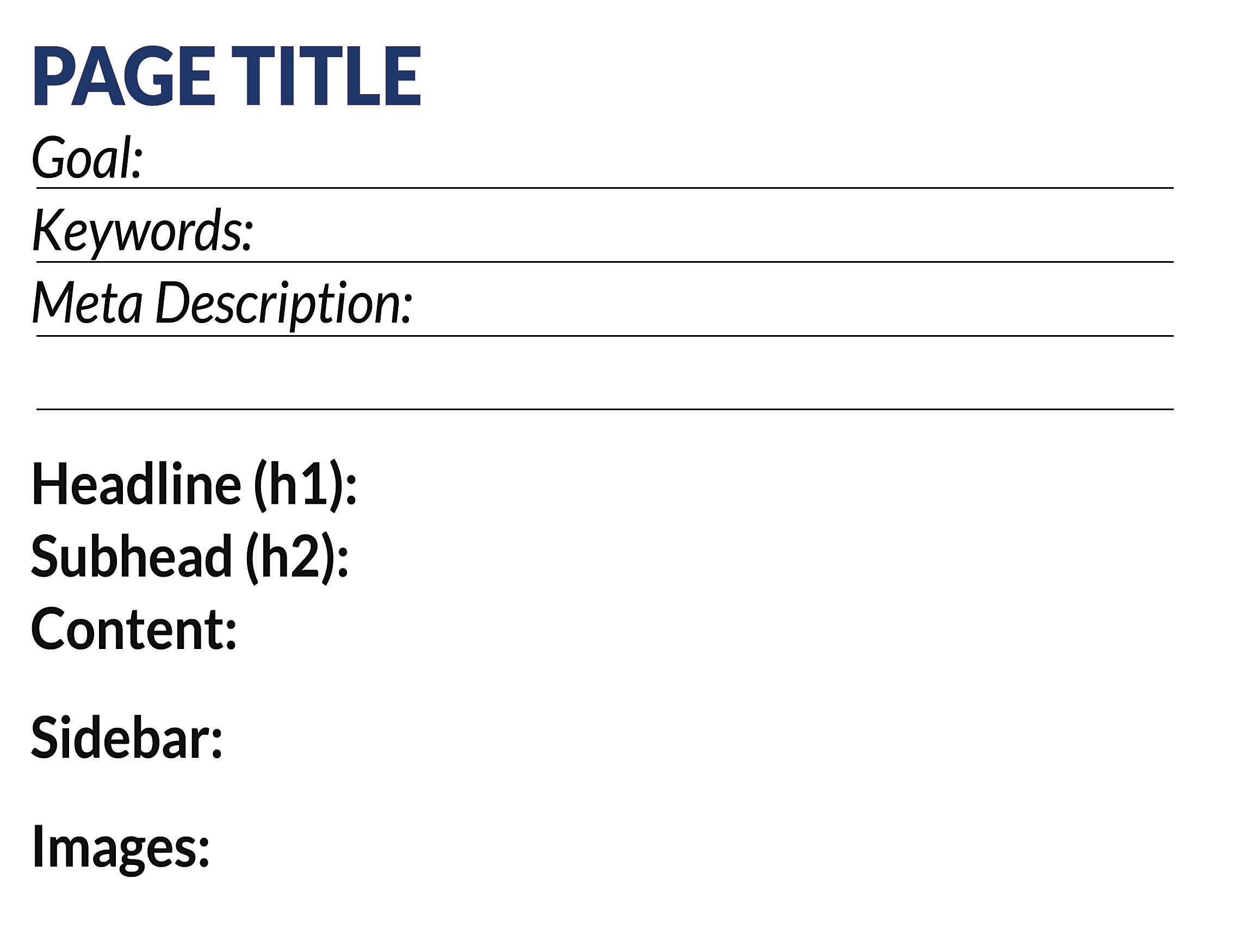
So how do we generate content? The perfect way to start is by taking a look back at your sitemap. This is where you have identified the types of content you want to present to users. Use the pages or sections you outlined here to create a blank copy document. For each section include the page title, the goal of the content, keywords you would like to target, headlines, and body copy. Include the types of content you anticipate living there and how you expect it to be broken up for easy readability and mental digestion.
Keep in mind that the ideal reading level for website content is pretty low. Homepage content shouldn’t exceed a 6th grade reading level (around age 11-12), and sub-page content should hover around the 8th grade level (age 13-14). Million-dollar words don’t earn points here, they lose users. You can test your copy with the Flesch-Kincaid readability formula to be sure it will be easy for users to comprehend quickly.
Simplify and streamline
Another great way to make your copy easier to read is with easily-digestible content. Using smaller paragraphs and including icons and images to break up your content makes your website infinitely more readable. Rather than presenting large bodies of text that require an attention commitment you’re not likely to get from users, simplify the content and make it easy to skim.
After you’re done writing, go through and cut out every single nonessential word or phrase for optimal clarity. After you’ve completed this process, go back and do it again – there’s more you can remove. The brilliant Antoine de Saint Exupery, author of The Little Prince (a children’s book that everyone should read) said, “It seems that perfection is attained not when there nothing more to add, but when there is nothing more to remove.”
The last and most important tip for creating website content is this: If you are not a copywriter, hire one. It’s what they do every day. They can do it better and faster than you can. They can create copy that is optimised for search engines, engaging and grammatically correct.
04. Wireframes
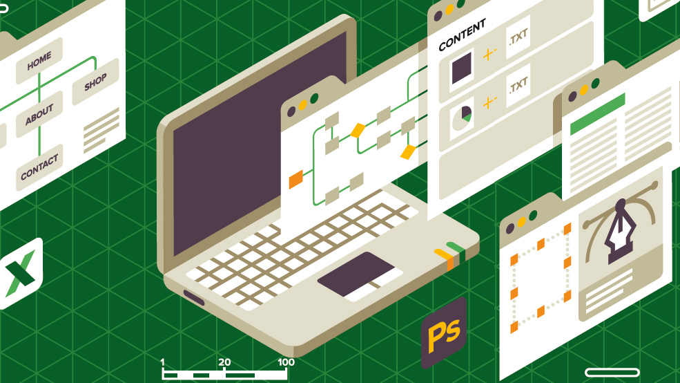
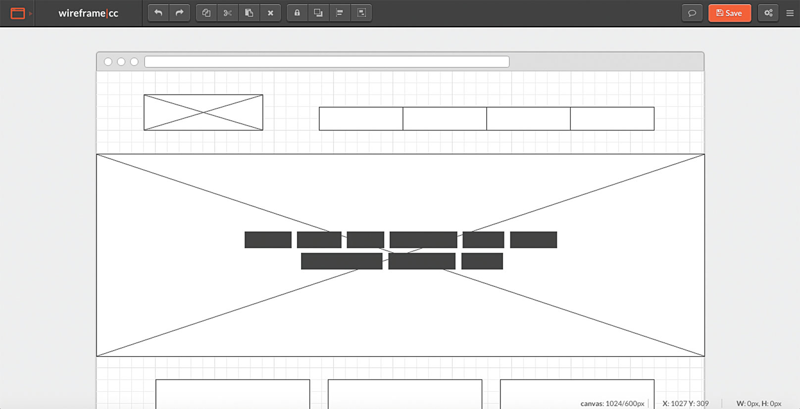
Now the content is completed, it’s time to start thinking about layout. Where the sitemap is a plan for the overall architecture of the site that informs the content; wireframes represent the architecture of that content.
A wireframe shouldn’t include any colour, font choices or design elements. It is a tool for organising content from a structural standpoint, to ensure it is presented in a way that makes sense for the user. Wireframes are no longer about pixel-perfect renderings of page layouts. They are about taking a more granular approach to the plan you’ve been building up to this point. In this step, you are discovering how information should be organised, and solidifying the hierarchy from a visual standpoint.
In what order should content be presented? How will the hierarchy present on mobile? Desktop? In-between or over and above? Responsive web design has necessitated that wireframes, along with every other step of our process, become less concrete and a little more flexible.
Creating hierarchy
How you generate your wireframes is entirely up to you. There are a lot of great wireframing and prototyping tools out there, but a simple pen and paper can work just as well. The goal of wireframing is to use the decisions we have made through the previous steps to establish an order for the presentation of content.
If you look at the content you have already created, it should be an intuitive process. Is there a clear hierarchy that is inherent to your content? Look at headlines, paragraphs, callouts and sidebars. Take stock of what types of information should appear, and where the focus should fall. Ask: What is the main point of this information?
It’s easy to skip wireframing. They often don’t mean a whole lot to the client, and can seem like a superfluous effort – especially after completing every other step so diligently. Can’t you accomplish the goal of the wireframe while you’re creating the design elements? In short, no. Wireframes are the bridge from content to design. They are as important to the overall success of a website as each other step in the process.
05. Design
Now for the fun part. The part that you’ve been working for, and your client has been waiting for. And you are ready. You are entering the design phase armed with a plan of attack that is based on informed decisions, not just aesthetic preference. You know where elements need to be placed for maximum effect. You are now prepared to design a conversion machine!
But how are you designing for the responsive web? Every designer has a different workflow, and you have to find what suits you. Still, there are a few methodologies and tools that are effective and easy to adopt across the board.
Responsive methodologies
If your website will work on mobile, you should be designing mobile-first. This simply means beginning with a mobile layout and building from there. It is far easier to do this than to try to stack elements onto a screen that’s a fraction of the size of the one for which they were designed.
You should also be using a pattern library. This is a collection of design patterns that feature in your interface. You can move back and forth between your library and designs; when you add a new element to your design you add it to your pattern library, and vice versa. With this approach, regardless of any variables, a button is a button; both in code and the way it looks.
This will establish a consistency in detail that will make a remarkable difference to the perceived level of professionalism of the company. Consistency builds trust and improves usability. There’s also an efficiency benefit, because we can easily adjust elements and update styles.
Plan of action
By following this guide, you arrive at one step after another with a fully-formed plan of action. Each step is informed by the steps that came before it. The entire process is focused on delivering the most useful and relevant content in the best way possible.
You may find that you need to revisit parts of your plan during the process or after the site launches. Dwight D Eisenhower said: “In preparing for battle, I always found that plans are useless, but planning is indispensable.” It is this sentiment exactly that sums up the importance of the process – you are planning for a successful outcome. You’re not guessing. You’ve established a foundation upon which you can create a website that works.
This article was originally published in net magazine issue 286. Buy it here.
Related articles:
