From hidden navigation and pop-out menus, to wearables and split screen, these are the web design trends we expect to shape 2017.
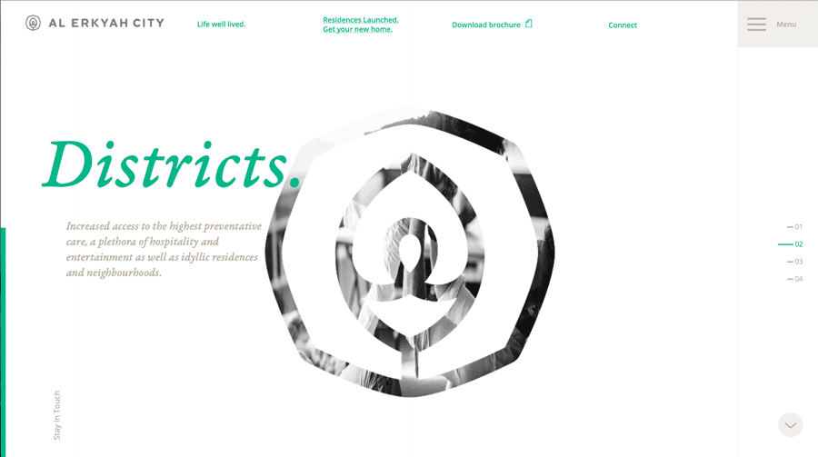
01. Hidden Navigation and Pop-out Menus

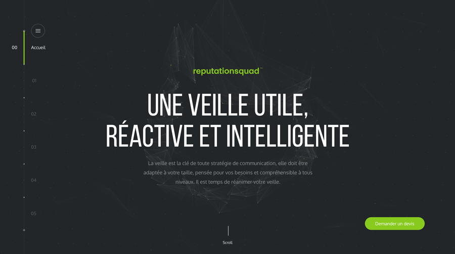
At a time when browsing on mobile devices is more prevalent than on desktop, screen space is a valuable commodity.
Hiding features and menus until they’re needed frees up the screen for the more enjoyable elements like images or videos, and creates a sleeker, minimalist design that makes it easier to focus.
A near-necessity for mobile, hidden navigation also improves the UX for devices with larger screens. Oddly enough, hiding a navigation menu actually adds more emphasis on navigation; users can focus on one thing at a time, and when they open the menu as needed, it takes central focus over the rest of the site.
Benefits:
- Conserves screen space
- More emphasis on navigation
- Minimalist design makes it easier to concentrate
- Improves appearance of first screen
- More flexibility in overall design structure
Best Practices
Single-color overlay. To maximize the benefit of simplification, most pop-out menus use a single-color background or overlay, rather than a distracting or cluttered background. You don’t want the users to spend time figuring out the menu itself – save the good stuff for the site pages.
Large, simple typography. Echoing the points from above, large, bold, and easy-to-read typography makes the navigation menu clearer and more effective, plus helps fill the space. Designers often take this a step further with all caps.
Hamburger and X icons (preferably with MENU label). By this point, the standard accepted UI pattern for signifying a pop-out menu is the hamburger icon, which turns into an X icon when activated so users know how to close it (typically it appears in the top-left corner). We always recommend adding a “MENU” label for the sake of clarity.
Push or overlay content. Pop-out menus rarely take up the entire screen. Leaving a little of the original content visible allows easy return for mobile, and creates a nice effect for desktops that mimics mobile browsing.
02. Inspiration from Wearables

Just as mobile browsing is influencing desktop design, so are wearables influencing web design as a whole. With tens of millions of wearables sold in 2015, users are coming to appreciate the same streamlined style of UI on their other devices.
Even though wearables can’t afford to waste space, the same minimalist principles still make browsing on other devices faster and with less effort. The “less is more” ideology doesn’t limit itself to any one screen size.

Benefits:
- Streamlined UX
- Less confusion and distractions
- Minimalism reduces loading times
Best Practices
Containers and cards. While cards have been a persistent trend for awhile now, wearables are breathing new life into them. The wearable style of structuring involves self-contained containers or cards, which leads to improved scannability on larger screens.

Large, SVG icons. Keep them scalable to look good on HD devices, and simple enough to be understood at a glance.

Disciplined color palette. Color palettes are now going back to basics. Two-color palettes — or a single color in addition to black and white — are becoming more and more popular.

Ample white space. For the sake of consistency among multiple devices, designs are favoring more white space, or to put it another way, extreme minimalism. This isn’t just an aesthetic choice: it saves screen space on smaller devices, reduces loading times, improves visibility, and creates a more sophisticated atmosphere.

03. Material Design Lite (MDL)

Material Design Lite, or MDL, optimizes the paper-like design language for the web. With guidebooks, six pre-existing templates, and open-source components, MDL makes Material Design accessible to any website or web app designer.
The same physics-based interface still applies: layers, motions, shading, etc. are all used practically to show usability in a way that mirrors how we interact with the real world.

Benefits:
- An improvement on classic Material Design, retaining its original benefits
- Better learnability from “lifelike” interface
- Usable on all devices with cross-platform accessibility (not JavaScript-based)
Best Practices
Physics-based mechanics. Play on MDL’s strengths by keeping in line with real-life physics principles, namely:
- Shadows should appear as if coming from the same natural light source
- Elements should have a consistent weight and thickness
- Motion is a reaction to user interaction

Customize. Take advantage of MDL’s diverse component library to mix and match what works for you.

Flat color palette. MDL works best with a flat color palette: bright and bold colors, usually one primary and one accent. This also suits the minimalist aesthetic encouraged by the first two trends.

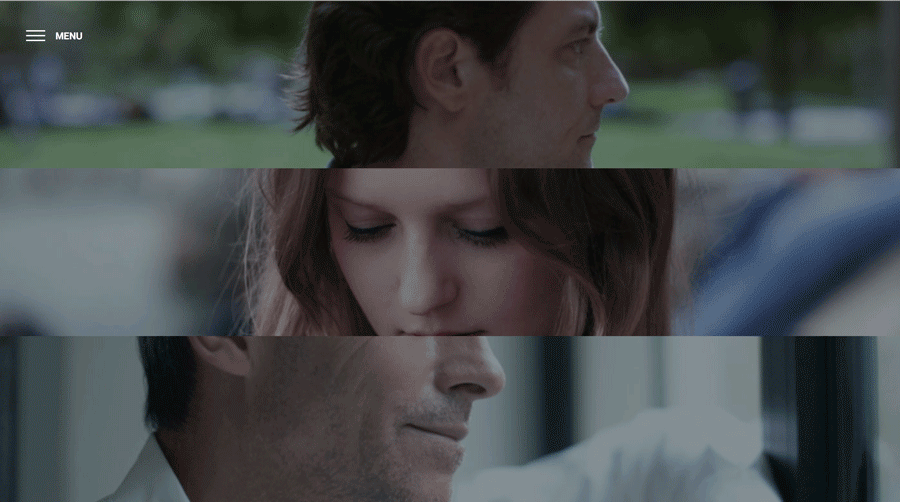
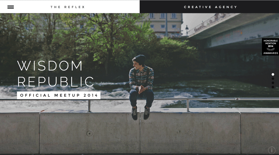
04. Split screen

Split screens are like opening your site with two separate and self-contained cards (one of which may contain smaller, traditional cards).
Split screens allow for content diversity: one half might be an attention-grabbing photo and the other half a navigation menu (like above). The layout creates a pleasant aesthetic with natural visual hierarchy.

Benefits:
- Add more visual weight to two categories of content without overwhelming users
- Communicate a stronger connection between two pieces of content
- Creates an enticing and dynamic first screen
Best Practices
Use paired content. Split screens always suggest a relation — cooperative or contrasting — between the two chosen pieces of content, so choose carefully. This includes two elements of equal importance, two opposing elements, or two main user options.

Vibrant visuals. Lively photography, bright colors, and flamboyant typography all enhance split screens, as long as they’re not used excessively to become distractions.
A common pattern is to have one side dulled or grayed out when the other is hovered over, so the user can focus on one side’s visuals at a time.

Create a flow between screens. Each screen should be self-contained, but not isolated from the other. Remember the core principles of visual design to guide the user’s sight between the two screens. Try unifying the halves by using a single element that overlaps both sides, like the site’s title. Alternatively, use the same catchy color accent on both sides, like Bump below.

05. More Video

Already a well-established trend, video maintains popularity, both as content and hero-sized backgrounds.
The big difference in video for 2017 is quantity, not quality. We’ll see the same styles of videos used more often on more sites, taking the format from a pleasant surprise to a baseline expectation. However, the future still offers some new applications for videos, such as interactive storytelling, described below.

Benefits:
- Enticing to users
- Great capacity for emotional connections
- May increase time on site
- More versatile than static images
Best Practices
High quality. The visual significance of videos goes both ways, and minor blemishes attract more attention. Use HD video where possible, with skilful mastery of cinematic techniques.

Create contrast. Especially if you’re using a video background, play up the contrast with the other elements on the screen. Overlapping text must contrast enough to be noticed, usually through an opposing color. Likewise, limit animations and other motions or else the screen becomes too busy.

Interactive storytelling. Combine video with another emerging trend, interactive storytelling, where a “story” progressives as the user clicks or scrolls through one or multiple options, reminiscent of gamification. The cinematic and emotional characteristics of video enhance everything that this storytelling technique tries to accomplish.

Auto-mute. Nobody likes the jarring experience of sudden and unexpected sound. Use auto-mute as your video’s default, with the option to turn it on.

“Non-video.” If you want to find a happy medium between static images and video, try the “non-video,” when a predominantly still image features only slight movement to distinguish it as a video. Think of a nature scene where the only movement is falling snow or rustling leaves, or a couple that only moves after some time, as BUNDY BUNDY below.

06. Anticipating Virtual Reality

Looking ahead to the trends of 2017, we can see that elements of virtual reality (VR) are already seeping into modern web design.
We don’t need VR equipment to replicate some of its immersive elements, as we’ll see in the upcoming year in web design. The flat screens of mobile and desktop devices are now being manipulated as best they can to reap some of VR’s benefits.

Benefits:
- Immersive and engaging UX
- Ahead of the curve
- Visually impressive
- Intuitive and realistic interface
Best Practices
Appropriate scale. The difference between VR and web design is that, for VR, elements must be scaled according to real life perspectives. Images such as people should not only appear life-sized, but their size should change as they or the user “moves.”

The importance of distance. In VR, distance dictates how a user can interact with certain elements. Without the conveniences of a flat, 2D screen, VR designers have to incorporate a rounded, 360-degree viewpoint with realistic spacing between objects.

Mind the details. VR may be young, but it’s old enough to have its own established best practices (so far):
- Avoid overly fast motions, which tend to induce nausea
- Use the horizon as a consistent frame-of-reference
- Create views where the user doesn’t need to look around too much to get the big picture
- Embrace either absolute realism or absolute fantasy – avoid mixing them.
Next steps...
If you’d like to learn more about these 6 web design trends, check out our free e-book Web Design Trends 2017. You’ll find even more practical advice and best practices.
Related articles:
