8 common portfolio mistakes (and how to fix them)
Whether you’re looking for freelance work, seeking a new job, or just wishing to build your personal brand, an online design portfolio is a must-have for any creative. But is yours letting you down?
In this post, we provide a simple checklist of common portfolio mistakes, and how to fix them, quickly and easily. You might also want to check out these excellent design portfolio examples and our expert portfolio tips.
01. Addressing the wrong audience

When you first launch a portfolio website, your first feedback comes from family, friends and co-workers. So there’s always a natural impulse, conscious or subconscious, to fashion something that these particular people will go ‘wow!’ at.
Article continues belowBut that’s not the audience you need to be worrying about. You need to consider what a potential client or employer will be looking for and how they’ll be viewing your portfolio, which will usually be completely different from a friend or colleague. The former, for instance, will probably spend a long time looking at different aspects of your site; the latter will be seeking much more specific information, much faster.
Once you start thinking along these lines, what you need to include on your portfolio site and how you organise it becomes a lot clearer.
02. Too much work on show
You’re proud of everything you’ve done, and people want to see as much of your work as possible, right? Wrong.
Potential clients and employers don’t wish to spend ages trawling through your back catalogue until they find something they like. They’re more likely to glance at one or two pieces, and make a snap decision. So you need to be ruthless in selecting only your absolute best work and putting it front and centre.
Sign up to Creative Bloq's daily newsletter, which brings you the latest news and inspiration from the worlds of art, design and technology.
While people are willing to rummage for cheap items at a jumble sale, when you enter a high-end store you see much smaller collection of carefully curated items. Apply the same logic to your portfolio site and you won’t go far wrong.
There’s no 'ideal' number of examples to exhibit; that’s going to vary from creative to creative. But one thing’s for sure: the more work you do include, the more organised it needs to be, with a clear hierarchy and everything categorised in an easy-to-understand manner. Our list of 6 famous agency websites and what they can teach us has some examples of good portfolio organisation.
03. Lack of context

There’s no point in just posting visuals by themselves, with no explanation of the context for which they were created.
Let’s return to our potential client or employer. Ask yourself: what will they want to know? At the very least, probably a combination of the following: When was the work created? How was it created? Is this entirely your work, or a collaboration (in which case, who else was involved, and what part did you play?). What was the brief? Was the client happy? What was the timeline? What elements of the project are not shown here?
That’s the bare minimum you need, but it doesn’t hurt to provide more. Remember in maths at school when you were told not just to give the answer, but “show your working”? That’s a good rule to apply to portfolio sites too.
So if it’s possible (check with the client first!), consider writing a full case study, including notes on the design process; early sketches; rejected concepts and designs, and so forth.
04. Too little work on show
While including too many examples of your work is the most common portfolio mistake, designers at the beginning of their careers can often make the opposite mistake: showing too little.
Put simply, if the Work section of your website is too sparsely populated, it doesn’t give a great impression. Not had enough commissioned work? Then there’s nothing wrong with posting student projects, as long as you clearly explain what the brief was and how you fulfilled it.
Don’t have enough student projects? Then just do some designs of your own, label them as ‘personal projects’, and again, explain the thinking behind them.
Real-world commercial work is always preferable of course, but demonstrating that you can deliver something to a brief, even an imaginary one, is much better than leaving a blank space.
05. Vague and incomplete personal information

As well as providing information about the work itself, you also need to provide a clear explanation of who you are and what you do, normally in an ‘About Me’ section.
There’s a current trend to just add a ‘snappy’ or ‘witty’ tagline under the designer’s name, something like “Designer of things for money”. You might be able to get away with this if you’re extremely well known, but if not, this is a massive turn-off for clients or employers.
Another common portfolio crime is making your contact details hard to find, or even non-existent. Again, if you’re a world-famous designer then refusing to give an email and saying “The best place to find me is on Twitter" might be acceptable. For the rest of us, it’s not, so just provide a damn email address. If you’re worried about spam, you can always write it in ‘code’, eg recast 'myname@gmail.com' as ‘myname [at] gmail [dot com]’.
06. A lack of purpose
Many portfolio websites avoid making the previous obvious mistakes but are still failures because it’s just not clear what they’re trying to achieve.
Often that’s because the designer doesn’t know themselves, beyond a general ‘well, you’ve got to have a website, haven’t you?’
But if you don’t think about what you want your website to achieve, how will you know if you’ve achieved it? So before you start, sit down to have a long, hard think about what your main goals are.
For instance, if you’re looking to get a job, have you made that clear? People are not telepathic so if you don’t say, people will assume you’re happy to remain a freelancer.
Alternatively, maybe you already have enough freelance work, but wouldn’t mind getting some better paid commissions? In which case, why not make your preferred rates clear, and avoid long email conversations with time-wasters who just want to lowball you?
Or perhaps you don’t want more work right now, but just want to steadily build up your name and reputation. In which case, you’ll want to think about including testimonials, press reviews and other ‘social proof’ to bolster your standing.
07. It doesn’t work on mobile

The best way for someone to view your portfolio is always going to be on a big, beautiful widescreen monitor (see our best ultrawide monitors). But you can’t guarantee that’s what will happen.
These days, it’s increasingly likely that potential clients and employers will be viewing your portfolio site on mobile devices. So you need to make sure it’s not going to look awful on a small screen.
Most importantly, can you view the images properly, or do they reduce down to tiny, formless thumbnails? If the answer to that question is yes, then your site is not fit for purpose.
08. It’s out of date
Once you’re happy with your portfolio site, don’t just ‘set it and forget it’.
Potential clients and employers may well look at your site a number of times over the course of a year. If nothing new is added, they may assume you’ve had no work. So think about how you can refresh the site on a regular basis. Could you add new work examples, refresh the design or maybe even add a blog?
Also, sign on with Google Analytics to find out how many people are visiting the site, and which bits they’re most interested in. Don’t jump to unwarranted conclusions, but do use this information to improve the site and its content, bit by bit, over time.
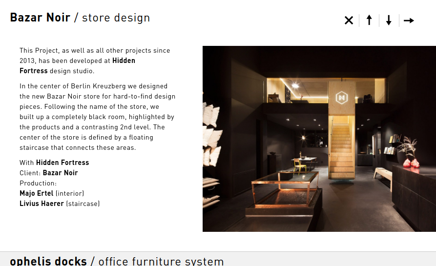
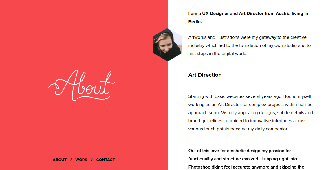
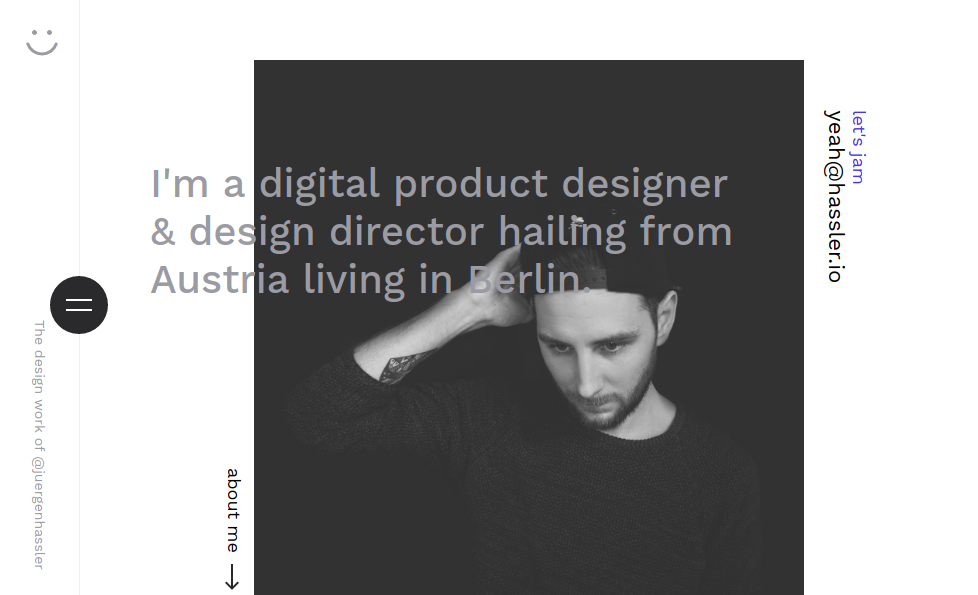
Finally, it’s always helpful to check out what other creatives have done with their portfolio sites to get inspiration for improvements to yours. Start with the great examples we’ve featured here, from Nic Stauber, Bjorn Meier, Melanie Daveid and Jürgen Hassler, then check out our full selection of the best design portfolios.

Tom May is an award-winning journalist specialising in art, design, photography and technology. He is the author of the books The 50 Greatest Designers (Arcturus) and Great TED Talks: Creativity (Pavilion). Tom was previously editor of Professional Photography magazine, associate editor at Creative Bloq, and deputy editor at net magazine.
