How to use colour to make your illustrations pop
Inject a sense of emotion and vitality through the application of strong colours.
Colour treatment in illustration is a personal affair, and no two illustrations should be treated the same. Colour, if used correctly, can pull some strong visual punches that will take an illustration from bland to bold.
We're going to talk through a few tips and tricks to use regularly and give an insight into how bold colour can be used to create maximum impact in an illustration. For more tips on colour, see our ultimate guide to colour theory and our tips for using illustration to create colourful worlds that tell a story.
01. Be careful when using complementary colours
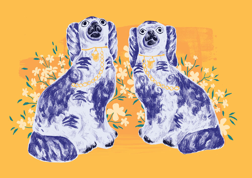
These colours are the ones directly opposite each other on the colour wheel – for example, orange and blue. However, using these direct combinations can result in slightly garish and unconsidered colour treatments. To create a more sophisticated and intentional contrast, it may be worth looking to the left or right of one of the two colours. Sticking to the example of orange and blue, if you choose an orange-based yellow instead and pair it with the blue they would still sit happily as complementary colours, but have a more considered intention behind them.
Article continues below02. Go with analogous colours
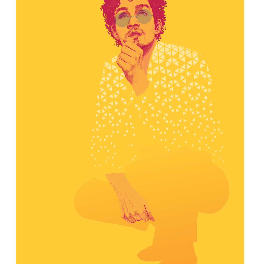
Sometimes an illustration doesn't require a direct contrast of colours and a good way to have a harmonious yet still impactful colour treatment is to go with analogous colours. Simply put, they are the colours that are directly next to each other on the colour wheel. It’s a less visually jarring technique than complementary colours and is easier on the eye because of its natural cohesiveness. If done with confidence an illustration can be impactful if coloured this way.
03. Use the best of both
It's possible to use both complementary and analogous colours in the same illustration. Starting with two colours, say yellow and blue again, these are the main blocks of positive space for the illustration. The details for these sections would then be rendered through analogous colours; so red, pink and orange for the yellow, and purple and teal for the blue. It might sound a little complex, but it adds details and depth without changing the colour profile and impact too drastically.
04. Play with a limited colour palette
These types of colour palette are highly efficient and are best executed when using only two to four colours. It forces a more critical use of colour that's both graphic and eye-catching. When starting out with limited colour palettes it's a good idea to take inspiration from design around you or one of the useful online generators available. After playing about with this style of colouring for a while it'll become easier to select the colours and will result in clever and sharp illustrations with a delightfully retro visual voice.
05. Deploy cool tones
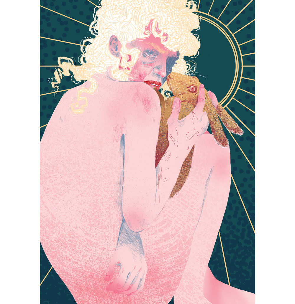
Cool tone colours are generally blues, greens and purples. Because of the way the eye processes and sees colour, cool tones fall back and create depth. Using cool tones across a whole illustration is a great idea and can be effective in illustrating environment, but it can also be used to highlight temperature. Imagine an illustration of an ice-cold drink on a hot day: a cool-toned glass against a warm toned background would have the most impact simply due to the factors visually associated with the colours.
Sign up to Creative Bloq's daily newsletter, which brings you the latest news and inspiration from the worlds of art, design and technology.
06. Use the drama of warm tones
The opposite of cool tones, warm colours don't fall back into an image but pop visually. They can create a dramatic illusion of depth when paired with their cooler counterparts. This a great tool to show hierarchy of information or to encourage the viewer to engage with a section of the work first.
However, there's no need to go wild, because just a subtle use of warm tones can create a bold sense of depth in an illustration.
06. Don’t let reality define you

The mind doesn’t need every detail to process visual information. An illustration can end up looking boring and bland if real-life colours are stuck to too closely. A character's skin tone can be any colour whatsoever: as long as tone and form are consistent, colour choice can be adventurous! For the hesitant, just adding a colour tint over the true-to-life colour can lift an illustration and create a stronger visual.
07. Provoke emotions through colour
Looking back at warm and cool tone colours, they can also be effective in generating emotions in the viewer. Colours are great signifiers of feelings. Sadness is culturally blue, much like how anger is red [in the West, at least]. A whole illustration can hold an emotion or just a single section. One effective way of using colour for emotions would be to pick out a character in a crowd: the expression could be neutral, but they could represent a whole range of feelings based simply on how they've been treated with colour.
08. Know when more is more
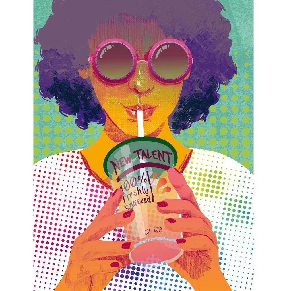
Using lots of colours on a piece of work can be amazingly effective. However, to prevent it from becoming confusing to look at, it's a good idea to think of how much to use. If you apply the same amount of each colour there’s a chance the illustration will be visually intense and hard to look at. One way to avoid this is to stick to, say, three or so colours and use the rest in smaller amounts to add details and engage the eye. The result is colourful work that isn't difficult to digest.
09. Be mindful of saturation
Having an illustration's colours ramped up to maximum saturation isn't always a sure-fire technique for creating impact. Duskier and softer colours can still have a strong and clear appearance in an illustration if used in the correct way. Keeping extra details and textures to a minimum is the key to using it effectively, as the artwork can become lost or muddied up if mixed with too much visual information. Think limited palettes and a screen print-style colour lay-down, and it'll pop just as much as brighter colours.
10. Use negative space

Negative space in an illustration is just as important as the positive (see these amazing examples of negative space, which prove it). Not every image needs a background; a clever use of a block of colour can ground an illustration while creating striking visuals at the same time. It's not easy to get right because a block colour background may change how the colours in the worked-up areas look to the eye, but just play about with it. Even a colour that's a few degrees warmer or cooler can create the right contrast that takes an illustration from bland to eye-catching.
This content originally appeared in Computer Arts magazine.
Read more:
Hazel graduated from the University of Cumbria University with a degree in illustration, and was the winner of our New Talent 2019 cover competition.
