Designing for the web's most vocal users
We chat to CTO Chris Stowe about the perils of redesigning Reddit.

Sign up to Creative Bloq's daily newsletter, which brings you the latest news and inspiration from the worlds of art, design and technology.
You are now subscribed
Your newsletter sign-up was successful
Want to add more newsletters?
Around a year and a half ago, Reddit embarked on the first major redesign the site had seen in a decade. With a dated and convoluted codebase and a reputation of being overwhelming to new users, the decision seemed unavoidable, but with a 330 million-strong, highly opinionated and vocal user base, the new look was both highly anticipated and a big risk.
Reddit decided to open up the process, and build the new look based on feedback from moderators, long-term users, and other redditors. 18 months later, the redesign is being rolled out.
At The Next Web, CTO Christopher Stowe spoke to a packed audience (many of them 'Redditors' themselves, an early show of hands revealed) about taking the high-stakes project. We caught up with him afterwards to find out more.
Article continues belowWith such a big userbase with a huge variety of interests, it seems like there is no 'typical' Reddit user. Did this make it difficult to know who to design for?
It definitely makes it more complicated. Part of the point of the redesign was to start addressing the concerns of users we don't necessarily even have yet. That was where having the dedicated UX team helped a lot. We did user interviews with people who are much more casual users. 'Lookers' - who just read - are actually a very large fraction of the community.
The nice thing is, voting is a core competency of comments. So we generally addressed concerns in order of the number of votes they got, which is a pretty good way of determining who feels passionate about what. In those threads we do dive pretty deep into the deep, dark nether regions at the bottom.

You spent a lot of time getting users' opinions. How did you choose which views to listen to? Was it literally based on the ones that got the votes?
Sign up to Creative Bloq's daily newsletter, which brings you the latest news and inspiration from the worlds of art, design and technology.
No. It's complicated. We're trying to balance addressing concerns that we can fix quickly and basically trying to assuage everyone else that 'no, we hear you, were working on this, it's a moving target. It's going to take us months to get this straight.'
We've launched this current product and it's mostly done, it's pretty far along. But mostly done is the first 90 per cent and the remaining 10 per cent is everything else that you don't expect. When it comes to things like user requests, there's that old joke that users don't actually know what they want. Well, they do, sometimes! But they don't know what they need.
Reddit is necessarily quite text-heavy. How do you go about making that volume of text appear welcoming?
One of the things we wanted to build into the redesign was a card view that actually made sense with our aesthetic. It was one of the first things we launched on our mobile apps: we had not just the text view but a card view.
For the web, we've found that over the years there's been a drift towards more images and videos, kind of unsurprisingly because there's more of it available. In the last couple of years we've launched our own video hosting and image hosting, which also fits a lot more cleanly with the experience.

You launched a redesigned mobile app in 2016, which introduced a new look to the website people were used to. Did you have the web redesign in mind when you were working on designing the mobile app?
It was something we'd talked about a lot, for sure. If anything we knew it was going to be much more of a beast than doing the mobile app. The first thing we did was to launch a mobile app we actually liked and wasn't something we'd just cobbled together. Then we went in and attacked our mobile web experience next.
We rebuilt that stack and it gave us an opportunity to test out new redesigns on the web stack and also to test out new technology. Those two things together gave us enough confidence to say: Okay! Let's do this. Rip the band aid off... over the course of 18 months!
So the mobile app wasn't a strategic way to get users used to a different look?
I think what happens is users break into these relatively clean cohorts. There is a lot of overlap between our core engaged user base and the mobile apps, but we also have a rather large group of people who mostly engage with the web. Still.
Where there's been some tension is in addressing the concerns of that group, who don't care about aesthetics and they don't like the apps. The way I've heard it described is almost like ... the most powerful way to use a computer is the terminal. And its also the most user-unfriendly part. But if you know how to use it, you're a super power user. Reddit has a tendency to lean towards that. A very steep learning curve, but if you've made it over the top you're sorted.
You spoke in your talk about 'structured styles' - tell us a bit about that.
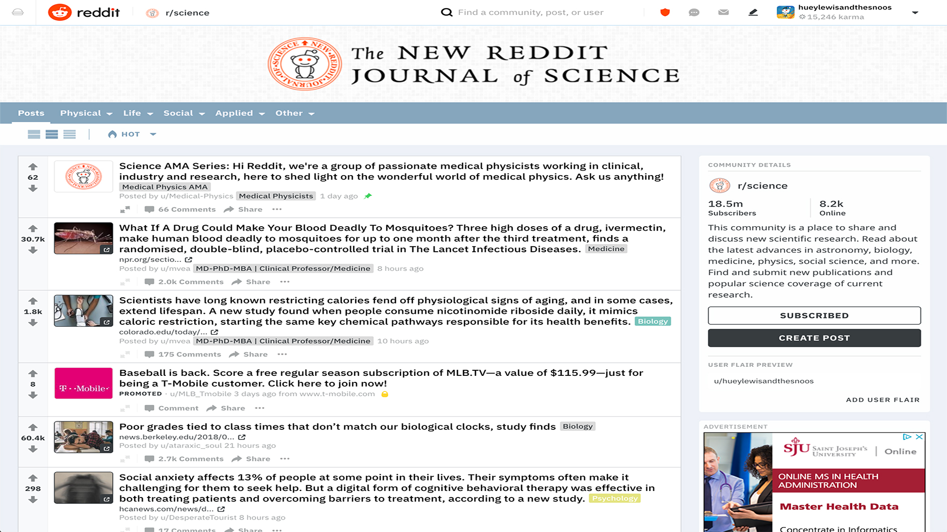
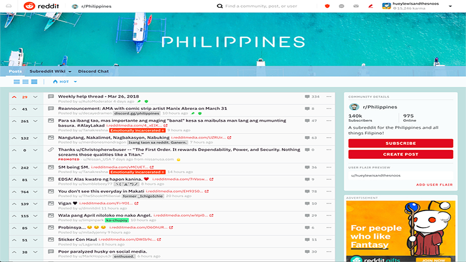
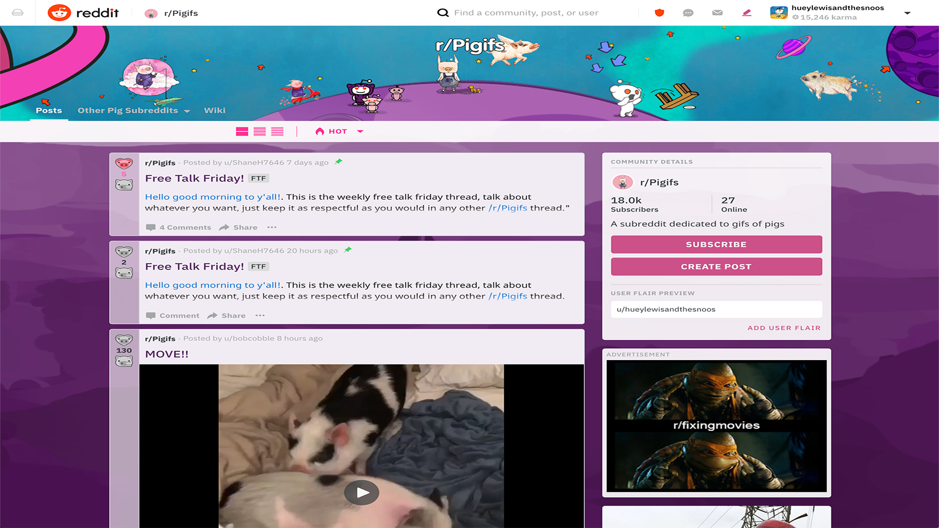
Community moderators have permission to create style sheets for their community that users can opt out of using. It gives an opportunity to have a very customised aesthetic for your community, and it also meant that the community independently developed things - like when hero images became a thing, they started plopping them on the top bar.
Structured Styles was a response to that. CSS is still a very tricky tool for a non-expert to use. It's a tricky tool for an expert to use! We found there was basically a set of about 10 distinct, almost like CSS packs that had been generated by the community over the years by a handful of users, and these were just being copy-pasted across the site.
So we built out a styling system in React where you can make copy edits and styling changes with colour pickers, and see live updates. And that's Structured Styles. We covered what we thought was the majority of features required to make it complete.
But there's no real way to test whether or not we hit everything until we launch it, and find out all the places that it breaks. Or the cases that some intrepid community has gone and made something either really beautiful or terribly horrible. There's some really awful layouts that people actually like. Like R/ooer. They optimise for aesthetically offensive I think.
It's interesting that you let users change their styling so much. Is having a coherent brand identity important to you?
We have two main guiding principles. One of them is 'let the humans do the hard part'. So we have moderators, we have people involved in the interaction. The other one is 'Reddit should always feel small'. And that necessitates a certain ability to carve off a chunk and have your community feel like a small piece of the pie.
We're still going to take the best across the communities and surface it on the front page because the font page to us is a major product surface by itself, and it accounts for a good chunk of our pageviews. And it's where people can start to engage and see the styles of the communities and feel the different flavours that are available.
Read more:

Ruth spent a couple of years as Deputy Editor of Creative Bloq, and has also either worked on or written for almost all of the site's former and current design print titles, from Computer Arts to ImagineFX. She now spends her days reviewing small appliances as the Homes Editor at TechRadar, but still occasionally writes about design on a freelance basis in her spare time.
