How to win a D&AD Award
With the deadline for entries approaching, get inspired by the best of last year's Pencil winners.
Sign up to Creative Bloq's daily newsletter, which brings you the latest news and inspiration from the worlds of art, design and technology.
You are now subscribed
Your newsletter sign-up was successful
Want to add more newsletters?
If you're hoping to snag a prestigious D&AD Award this year, you'd better get your skates on. The deadline for entering this year's awards is 14 February, which gives you less than a month to register, prepare your entries and send them off to be judged by the best in the business.
Need a little inspiration? Last year we spoke to some of the D&AD judges at the Computer Arts-chaired Design panel, a couple of hours before the Awards ceremony, and discussed seven projects that would later go on to win Pencils. Here are some of our video and written interview highlights – there's a lot to be learned from these projects.
Talk us through your choice of Landor Paris' [triple Graphite Pencil-winning] campaign, To: A New Kind of Support. Why is it so strong?
Article continues below 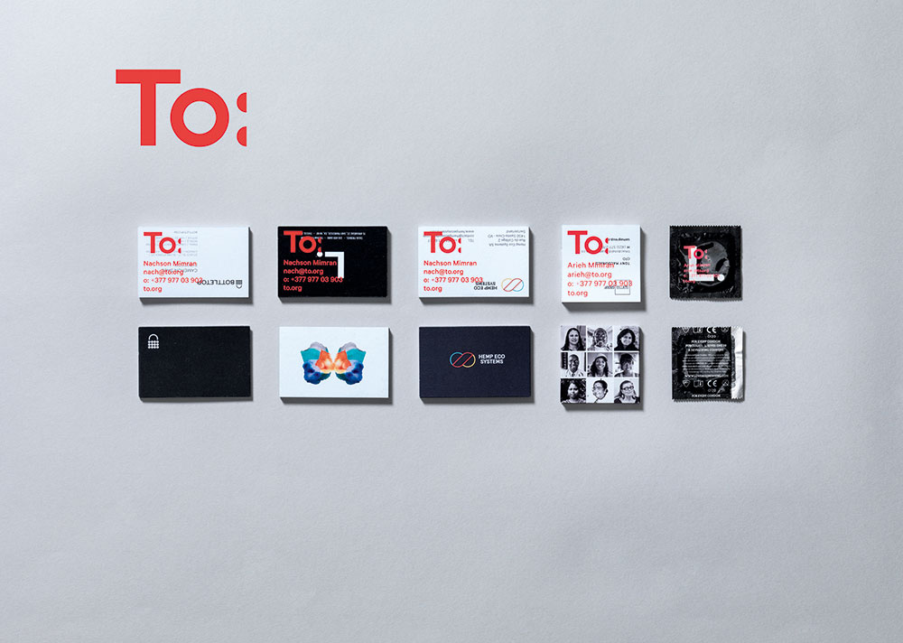
Su Mathews Hale: To: was started by two guys who are financial partners. They find companies that are contributing in some way to kindness and good, and partner with them. They created this co-branding programme that we liked because it was simple and bold, combining photography with bold fluorescent colour.
They use materials supplied by their clients, so don't create any new images and graphics as such – the identity is superimposed on top. It's a cool juxtaposition, and we thought it was very unusual – because of the concept, but also because it was executed quite beautifully.
Alan Dye: It's jolly, fun, exciting and vibrant.
By contrast, your next pick is very subtle and understated: a Christmas card by RRD Creative [also Graphite Pencil-winning]. How did that manage to catch your eye?
Sign up to Creative Bloq's daily newsletter, which brings you the latest news and inspiration from the worlds of art, design and technology.
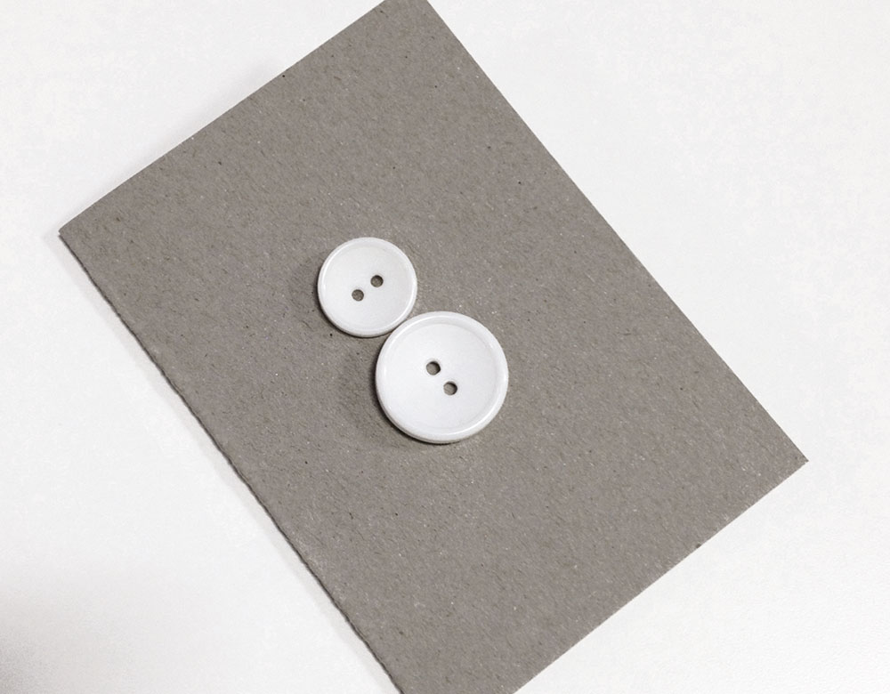
AD: We saw lots of stuff. Some whizzy technical data. Amazing little videos. A lot of print. It was probably late Sunday afternoon that I came to item number 678, this little Christmas card, and it just made me smile.
You see projects where they've spent a lot of money and it still isn't good. This was great. The snowman is made from two buttons, and inside it says, 'Brief: Christmas card. Budget: buttons.' Made us all laugh, and that's why it got through.
It's refreshing to see something low-budget has got through purely because of its wit…
AD: Absolutely. You see a lot of big agencies cross-entering everything, so you see a piece of work in data visualisation, leaflets, posters… it gets a bit tedious, and you think they must have a budget of £100,000 because you go into these other rooms and see the same piece of work over and over and over again. It makes it a bit unfair for smaller design companies.
SMH: Controversially, there were discussions too around people being dismissive of projects by larger corporate companies. Just because something's done for a not-for-profit doesn't mean it's a great design, and spending lots of money on it doesn't make it great, either.
Which leads nicely into a campaign for a global corporate client: Dentsu Japan's Life is Electric campaign for Panasonic [two Wood Pencils, one Graphite Pencil]. Why did you pick this?
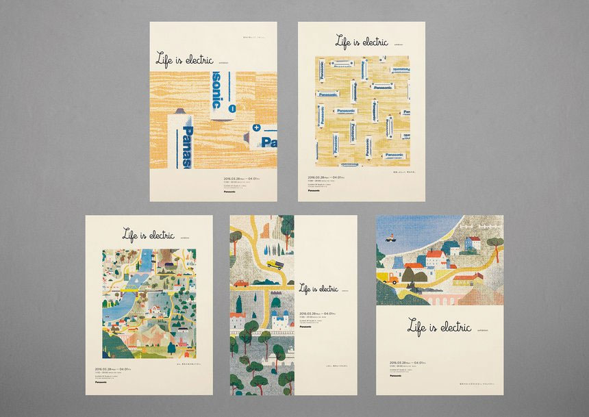
AD: You think, huge organisation – there'll be loads of money. It's actually a really brave creative response, and it's beautifully executed. I'm surprised the packages for the batteries are still here; everyone wanted to pinch them.
SMH: Each pack had a lovely illustration, and a line about how much energy it took to charge this battery. It encourages people to 'see' electricity.
AD: Each battery got its energy from something quite natural. It could have been from the front of a fire, or a hamster wheel…
Moving on to some digital work, you've picked F37 Foundry's [Yellow Pencil-winning] type testing tool. What impressed you there?
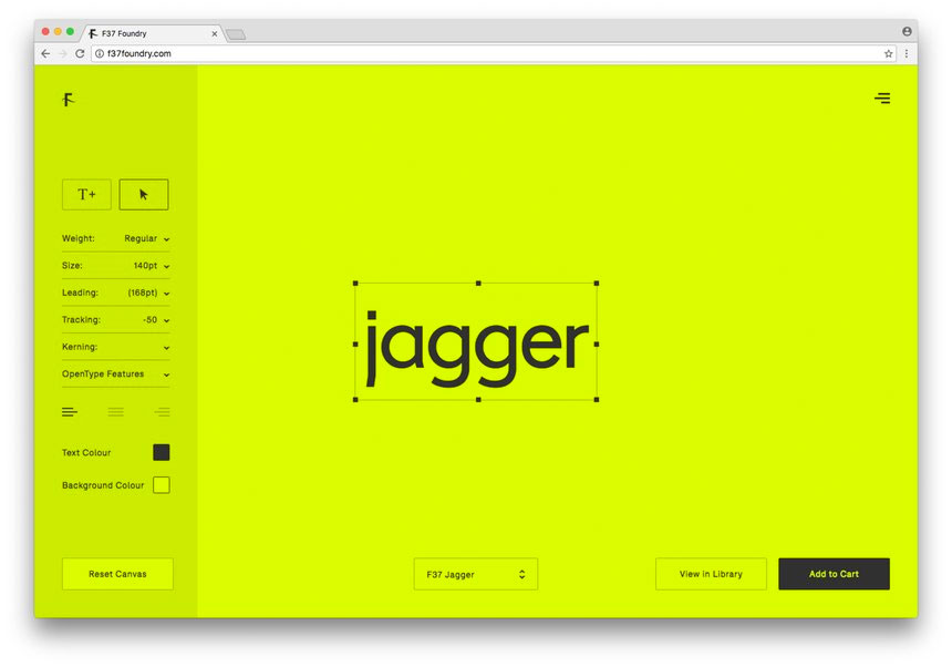
AD: It's beautifully simple, but there are all these different fonts to play with. You can tap in anything, and put it into any form you want. It's perfect for type designers and graphic designers – it's the tool we've been after.
SMH: Typesetting tools are usually based around typing in one word, or that crazy 'brown fox jumping' thing. It's really hard to get an idea of how it works, and this was pretty innovative in that it actually helps our profession.
Some of the digital guys thought there were some quirks that weren't quite fleshed out, but us designers thought it would help make the process simpler, easier and more beautiful.
Did the fact it was created by designers for designers give it an unfair advantage, as it appealed to the judges' personal sensibilities?
AD: Sure, graphic designers are the audience, but my mum could use this.
SMH: If anything, there could be an unfair disadvantage. When it's something for your audience, I think you're more judgemental and critical.
When a project is for a different audience, we're a bit more open. If you dislike something about a project aimed at children, people might say: 'But you're not the audience,' and I'd reply, 'I know I'm not a child, but I don't think my child would like this either.'
AD: As a tool, this is just beautiful. I pinged it on to the studio, and just said: 'Use this.'
Your next pick, Zaans Medical Centre, features some beautiful environmental graphics [and also won a Yellow Pencil]. Talk us through it…
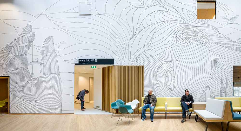
AD: We saw a lot of incredibly boring way finding systems. And here was this huge illustration with beautifully studied detail. It got us really excited.
SMH: There were 3,500 hand-drawn illustrations created specifically for this, and it took 2.5 years. There's so much detail, ranging from the giant hand-drawn numbers for the floor signage, to the individual icons, all of which have some concept related to that particular room.
AD: No Helvetica in sight. Huge numbers, made out of thousands of birds and creatures.
SMH: It was also really well integrated with the architecture itself. Quite often architects design a space, then graphic designers are brought in and it looks slapped on. Here, the environmental graphics played a huge part of how we felt in the space and experienced it. It brought the architecture to a new level.
Fiona, how did the Packaging category shape up? You've picked out this [Yellow Pencil-winning] Jägermeister Coolpack, for a start…
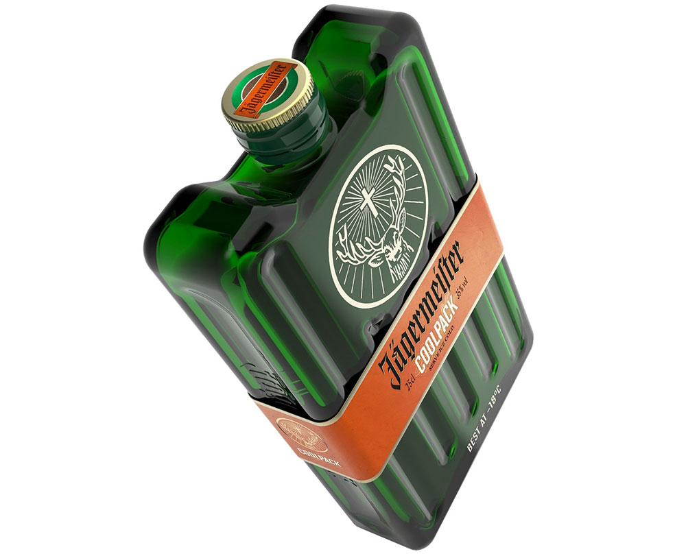
Fiona Curran: Jägermeister wanted to promote the fact that it's best drunk ice cold, at minus 18 degrees. Apparently a lot of people put their bottle in the freezer. So we just loved how they redesigned the bottle to look like a freezer pack.
It feels really relevant to the brand. They could have slapped on this big label, but it's printed on a band, so it just slides off. The concept and the craft just work together really well.
Your second pick is Edible Six Pack Rings, by We Believers for Saltwater Brewery [one Wood, and one Yellow Pencil]. How did this one catch your attention?
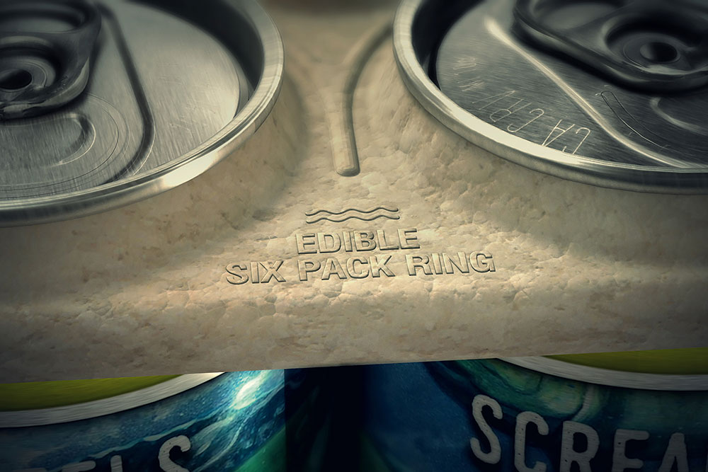
FC: We all know that six-pack ring packaging is normally made of plastic that's non-recyclable, and it kills wildlife. This one is sustainable, and it's made by a beer company out of the residue from the beer-making process, so it's edible to marine life. As the jury, we were like: 'Why hasn't this been done before?' It just felt so right.
The first thing to factor in is that it actually uses something like 100 per cent biodegradable materials. It saves waste, and just seems like a great idea. It's also a good example of a concept that doesn't have to be beautiful. Sometimes things are just a bit ugly. This is design in its purest form – you've got to keep that shape to put around the cans, and there's nothing else. But from a conceptual point of view it's so simple, and just right and sustainable.
This article was originally published in issue 267 of Computer Arts, the global design magazine – helping you solve daily design challenges with insights, advice and inspiration. Subscribe to Computer Arts here.
Related articles:
Nick has worked with world-class agencies including Wolff Olins, Taxi Studio and Vault49 on brand storytelling, tone of voice and verbal strategy for global brands such as Virgin, TikTok, and Bite Back 2030. Nick launched the Brand Impact Awards in 2013 while editor of Computer Arts, and remains chair of judges. He's written for Creative Bloq on design and branding matters since the site's launch.
