Paint realistic smoke: 3 top tips
Understand how to paint smoke in Photoshop with these three expert tips.

Sign up to Creative Bloq's daily newsletter, which brings you the latest news and inspiration from the worlds of art, design and technology.
You are now subscribed
Your newsletter sign-up was successful
Want to add more newsletters?
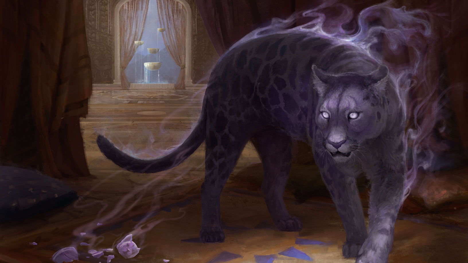
Smoke is a prevalent visual effect in fantasy art. It can help to potentially reinforce both your composition, and your narrative. It’s important for any fantasy artist to not only learn how to paint smoke, but also to understand how it works, and how to integrate it within your setting.
Smoke will vary visually depending on the cause. Billowing clouds of smoke from a roaring forest fire will look very different to tendrils of smoke rising from a slowly burning piece of parchment. Using reference and real-life examples will help you to identify what kind of smoke you should be aiming to replicate in your paintings. The appearance of smoke is also affected by its surroundings. Is it a still day, or is it windy? Will there be any floating debris or embers rising with the smoke? These are all good things to consider.
While learning how to paint smoke, it’s best to avoid the overuse of photo textures or custom brushes for a couple of key reasons. First, they can be potentially limiting when it comes to appearance; and second, this will enable you to properly understand the shapes and forms involved without taking any tempting shortcuts.
Article continues belowIn this example I’ll be talking about how to paint coloured smoke in Photoshop, with the help of some adjustment layers.
01. Block in mid tones

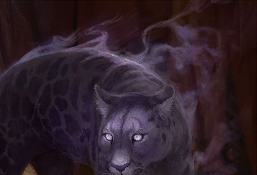
Begin by blocking in your smoke. It’ll help to use a brush that’s not too textured, and choose a mid-tone for this step. Sometimes painting extremely abstract shapes can be a bit of a mental battle, as our brains love patterns and symmetry. Look at some images of smoke to get an idea of just how twisty and random those shapes can be.
02. Add shape and definition

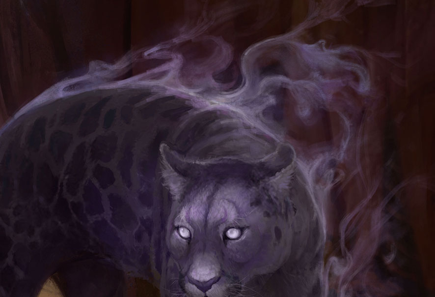
Start to define those shapes. This kind of rising smoke has more sharp edges than you might expect. One side of a plume of smoke can be sharp, gradually fading to a softer edge. Reduce your Brush Flow in Photoshop for more control over this subtle gradient. Don’t forget to softly add some thinner tendrils of smoke, breaking away from the main shapes.
03. Build up brightness

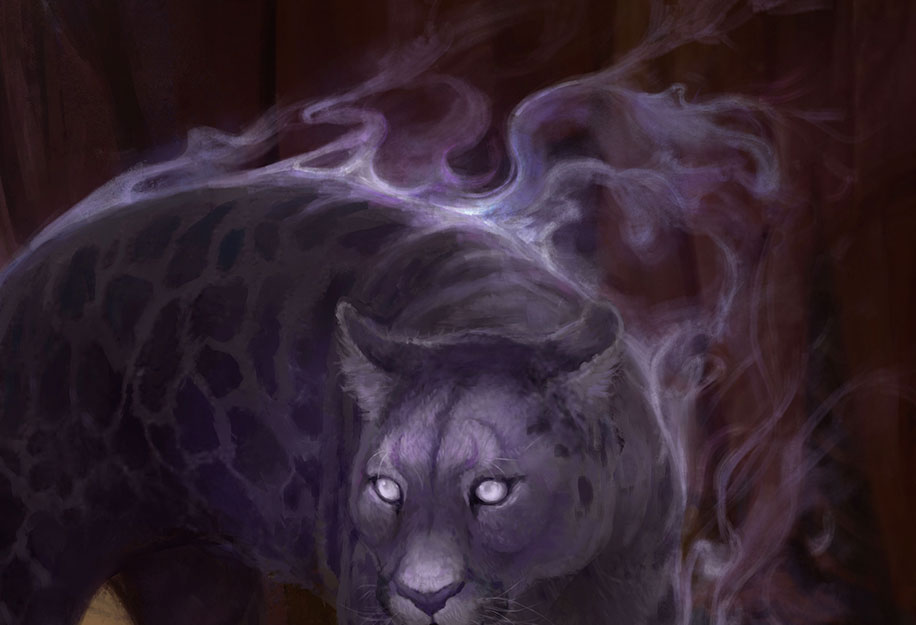
It’s time to add some highlights. Rising smoke tends to be thick when close to its source, or intersecting with other smoke tendrils. Choose a bright colour and gradually build up the brightness in these areas. I like to use a Color Dodge layer for this. Try double-clicking your layer and toggling off Transparency Shapes Layer to create slightly different effects.
Sign up to Creative Bloq's daily newsletter, which brings you the latest news and inspiration from the worlds of art, design and technology.
This article was originally published in ImagineFX magazine issue 139. Buy it here.
