Photoshop tips: next-level lighting advice
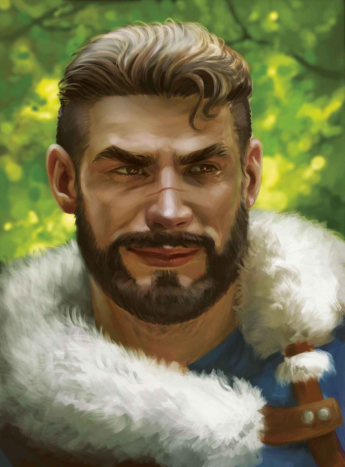
Give your art an extra level of realism with these lighting insights.
Sign up to Creative Bloq's daily newsletter, which brings you the latest news and inspiration from the worlds of art, design and technology.
You are now subscribed
Your newsletter sign-up was successful
Want to add more newsletters?
Lighting is one of those things that can make or break an illustration. It can set the mood, establish a sense of photorealism, tell a story, and even guide the viewer towards certain areas in your work. To fully understand how light works, you have to study it in detail, and a great way of doing this is by creating your own lighting reference.
Because I tend to paint a lot of warriors, both for clients and personal work, I always end up having my fellow HEMA (historical European martial arts) friends pose for me. The references you see here come from those photo sessions.
Whatever your photography skills, you can do this yourself with pretty much any camera – in most lighting situations even your smartphone camera will do. Find the perfect lighting conditions for your reference folder and start snapping those photos with your friends. Once at home you can use the Eyedropper tool to sample a colour palette.
Article continues belowWhile doing so, try to capture every angle possible. Parts of the body that are exposed to the sky can have wildly different shadow colours than those areas facing down. Even in the tiny curves and wrinkles of the face you’ll find that light scatters, reflects and bounces around.
I’ll be showing you my process and point you towards the right direction. Work with it or adapt it to your own process – the choice is entirely yours!
01. Prepare your lines

Create a line art sketch in a style that works best for you. I like outlining areas that indicate which parts will come forward or get pushed back. This helps me determine how to shade the character later on. None of this line art will be seen in the finished image, so there’s no need to make it pretty or clean.
02. Create your own reference

Have one of your friends pose for you. I’m lucky to have a group of very photogenic friends who enjoy posing for me. I often go out and do photoshoots with them for my Gumroad reference packs. When taking these photos it’s good to have a plan about what you’d like to paint. If your character is in a forest, go on a trip to the forest for the correct lighting conditions.
Sign up to Creative Bloq's daily newsletter, which brings you the latest news and inspiration from the worlds of art, design and technology.
03. Understand your reference
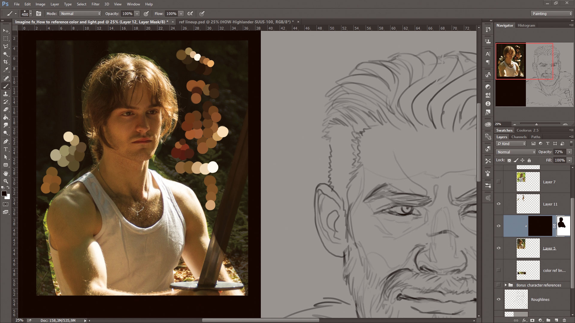
I study my reference and create a colour palette based upon the colours and lighting. Consider the bounce light in the shadows. A shadow under the chin will have a different colour than one on the forehead or cheekbone.
04. Use flat colours as a guide to painting
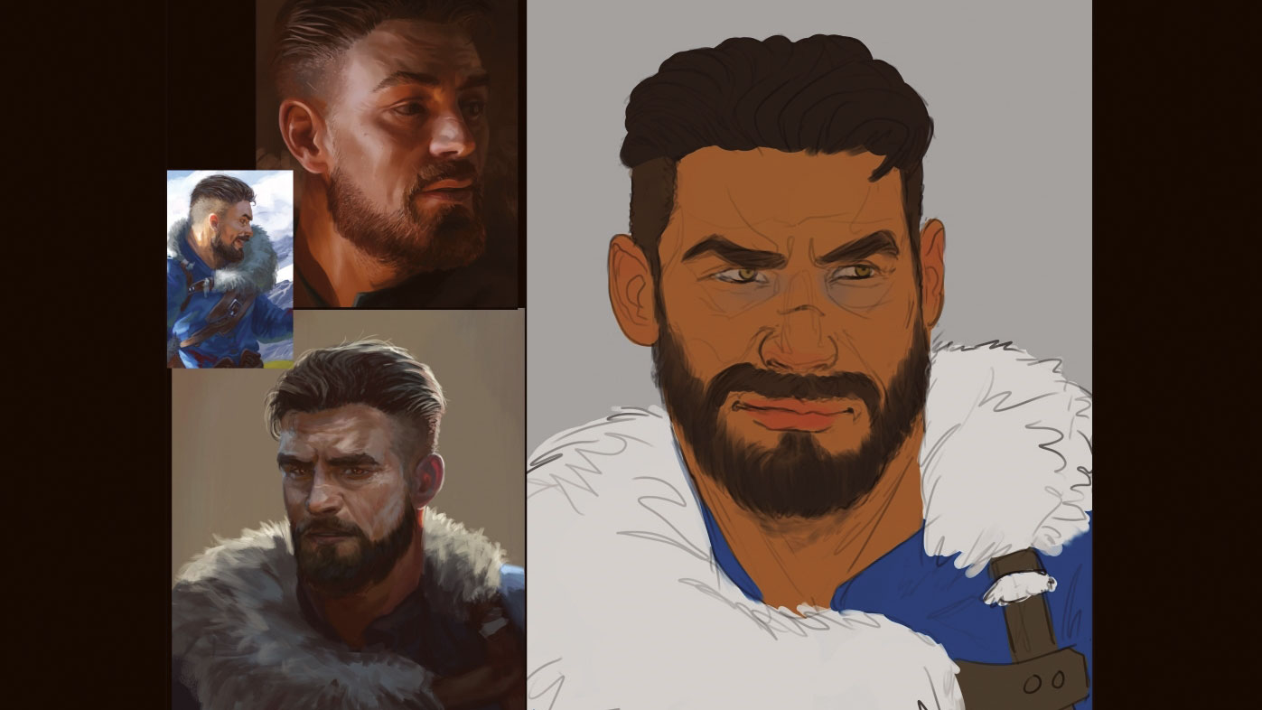
As an intermediate stage, I usually create a flat colour version of my work before applying the lighting. This means that I simply give everything its neutral object colour. This might come in handy later on, when you might have to blend colours together.
05. Tackle the most prominent shapes
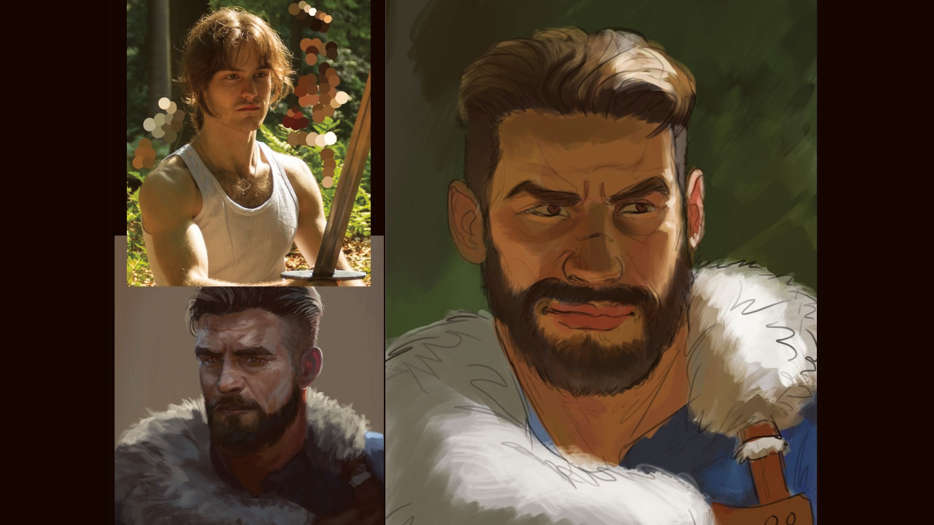
I begin by using a big brush to roughly paint the most important shadows and lights. Don’t get stuck on the small details like tiny hairs, eyelids or wrinkles just yet. Keep it simple. In addition, make sure to paint while zoomed out. Have your whole illustration visible on screen at all times during this early stage.
06. Check the likeness
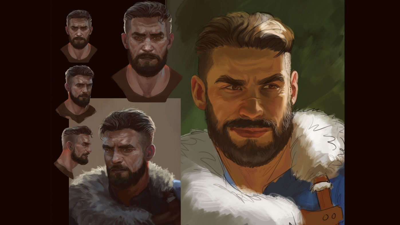
Keep an eye on your character reference (if you’re using one), to ensure the likeness is on track. Sometimes while applying light and colour to a line sketch, the essence of your character can become lost. This is why I begin by working underneath the line art. For this stage you can start working on a new layer, above your line art.
07. Check your values
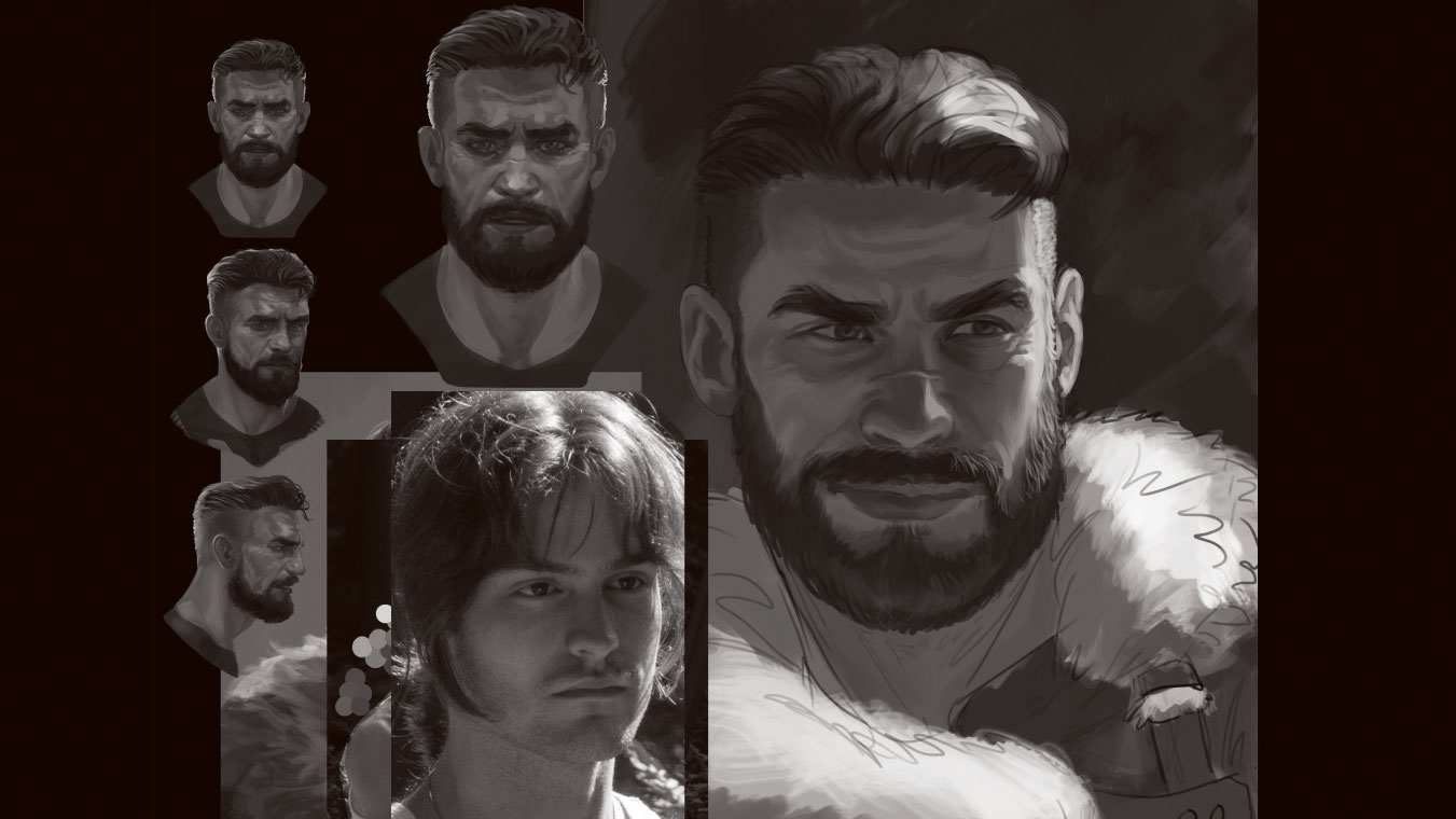
Go to Image > Adjustments > Black & White. Make sure this effects layer is above all the layers. This black and white or greyscale view enables you to compare the values in your painting with that of your reference photo. If there’s a big difference in a particular area where it shouldn’t be, you should be able to spot it.
08. Bounce light on white
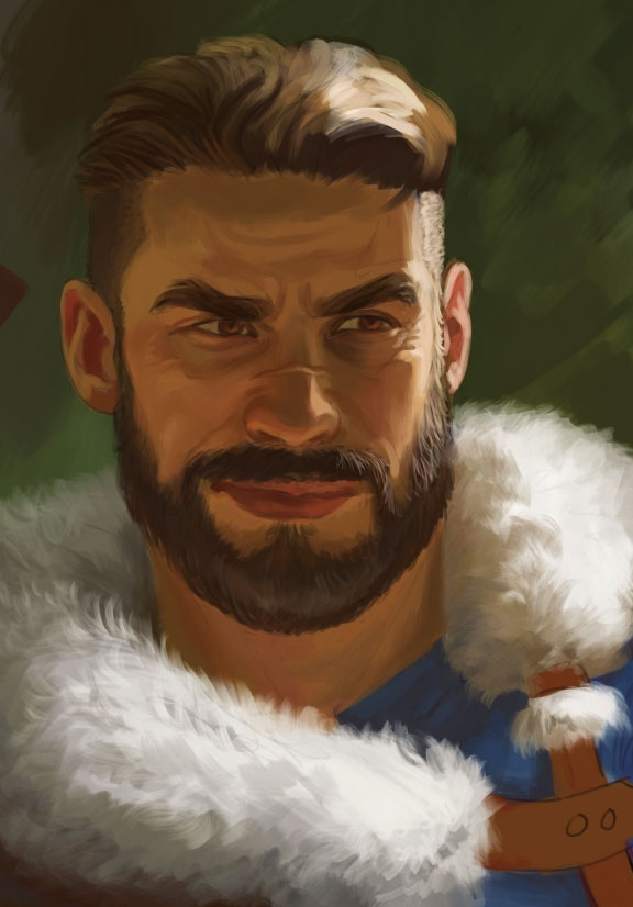
White, and other light colours, react differently to a light source compared with dark colours. In the highlights they usually maintain the original object’s colour.
09. Bear in mind the qualities of hair
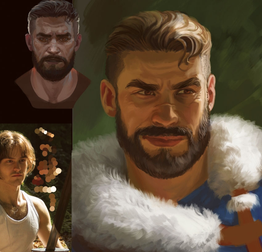
Hair is always interesting to paint. Whether it be dark or light, healthy hair is shiny and also has a translucent quality to it. The darker the hair, the more pigment it possesses and this usually means it’s less translucent, too. Yet when light hits someone’s hair, it’ll scatter through it. So whenever you paint hair, think about its translucency, shine and possible bounce light.
10. Create realistic eyes
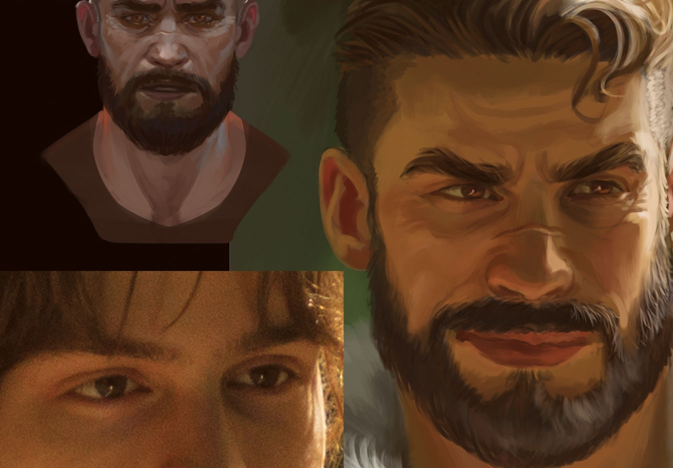
Unless make-up’s involved, the eyes will lack defining dark lines. Even dark lashes will more likely be painted with some interrupted brushstrokes. Look at your photo reference and take note of the gradients that shape the curves and wrinkles of the eyelids. The eyeball itself has a glossy texture to it, so it won’t be made up of just a singular colour. Light-coloured eyes can even appear quite dark under certain lighting conditions.
11. Balance the look of the lips
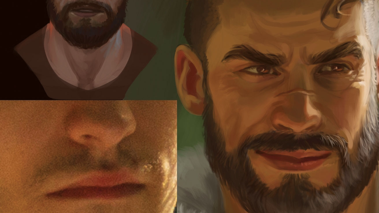
Depicting lips can be tricky, especially when painting ones with a natural skin tone. They can easily end up looking like the person is wearing lipstick! That’s why gradients play a vital role. With either the bottom, or top lip, or even both, blend the edges with the skin tone. Start from the corner of the mouth and paint towards the centre.
12. Apply a mix of approaches to edge work

I always make a conscious effort to place sharp edges and soft edges correctly in my paintings. My usual strategy is that strong, brightly lit edges receive a soft bloom, whereas very dark edges are gently blended in with the background colour. Anything between dark or light can either be soft or hard, depending on the mood that I’m in.
13. The finer details
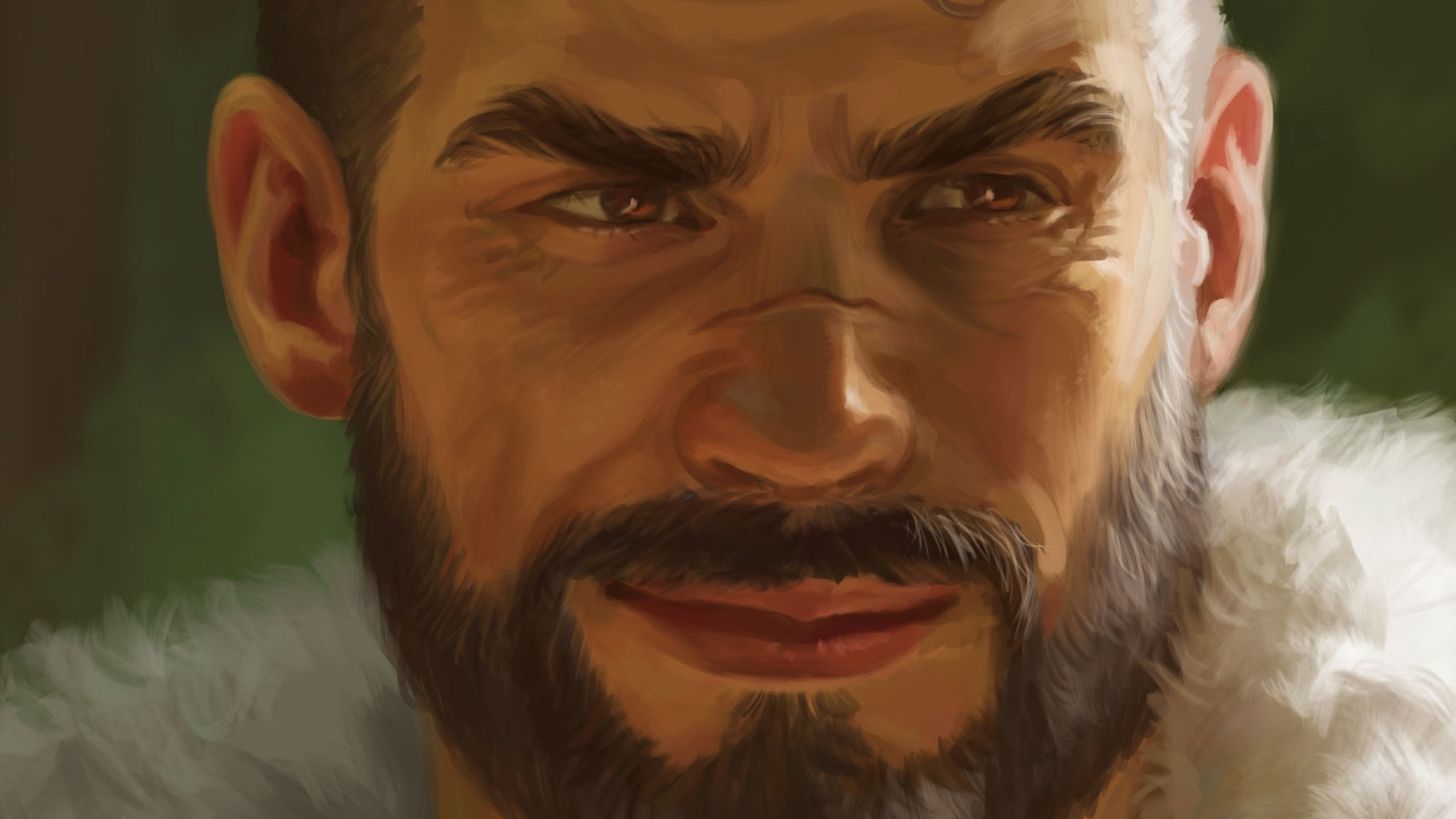
This is where I commit to painting the textures of the skin, the eyeballs, the clothing and any other material that may be included in the image. I keep in mind that a smart painter keeps the highest detail ratio and the tiniest brushstrokes in the area of most importance (the focal area) and leaves the more unimportant parts loose and free from causing a distraction.
14. Carry out one final check
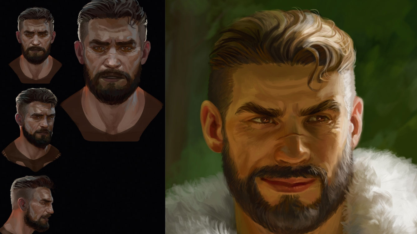
Before calling a painting finished, go through all these steps. Is the likeness correct? The contrast? The bounce light coming from the environment? The colour gradients? The material expression? The detail ratio? These days we’re often too eager to share our newest piece with the world. Keep it to yourself for a week and trust me, you’ll find some elements to improve before you’re ready to show it off.
This article was originally published in issue 159 of ImagineFX, the world's best-selling magazine for digital artists. Buy issue 159 here or subscribe to ImagineFX here.
Related articles:
