How to paint like Matisse
This step-by-step guide takes you through Matisse's world of vibrant colour and sensual line.
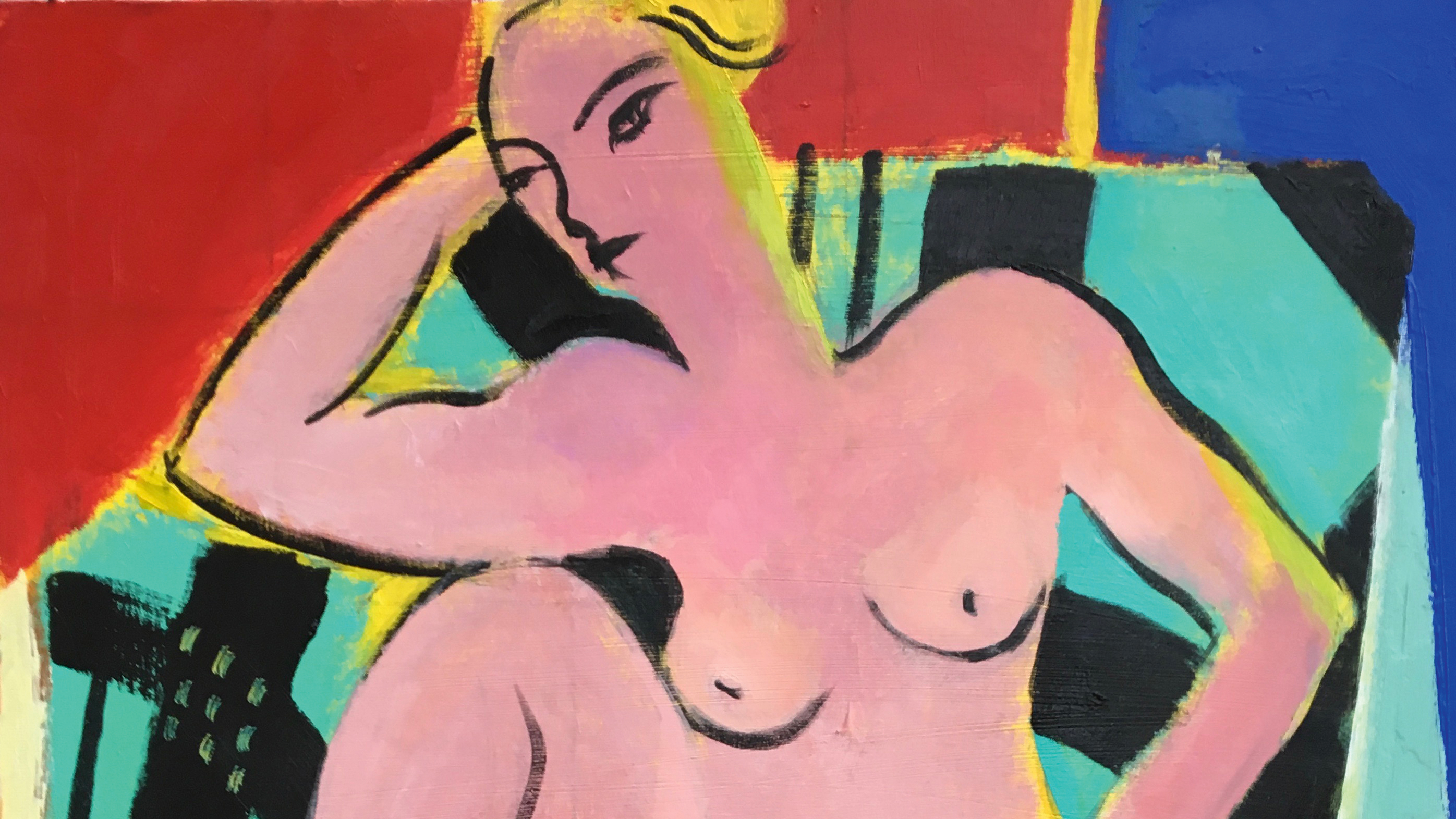
As a young painter, Matisse’s subject matter of languid women, artful objects clustered about them, pretty colours and decorative fabrics all felt way too middle class and bourgeois for my young and rebellious eye.
But then I discovered that it was Matisse who goaded that other 20th century master, Picasso, into his experiments with Cubism. And while Matisse may have called Picasso ‘the boss,’ Picasso referred to Matisse as ‘the magician.’
Magician, he certainly was. Matisse’s handling of colour and space had cast a spell on the world of art and design and influences us to this day.
Article continues belowBut how did he do this? Matisse said that he didn’t paint a subject literally, but rather he relayed the emotion it evoked for him; a very liberating idea if, like me, you’ve ever become bogged down in realistic portrayals that ticked all of the boxes but failed to stir the soul. So let’s dive into Matisse’s world, to create a free-flowing masterpiece in his style.
01. Pick an existing sketch with Matisse potential
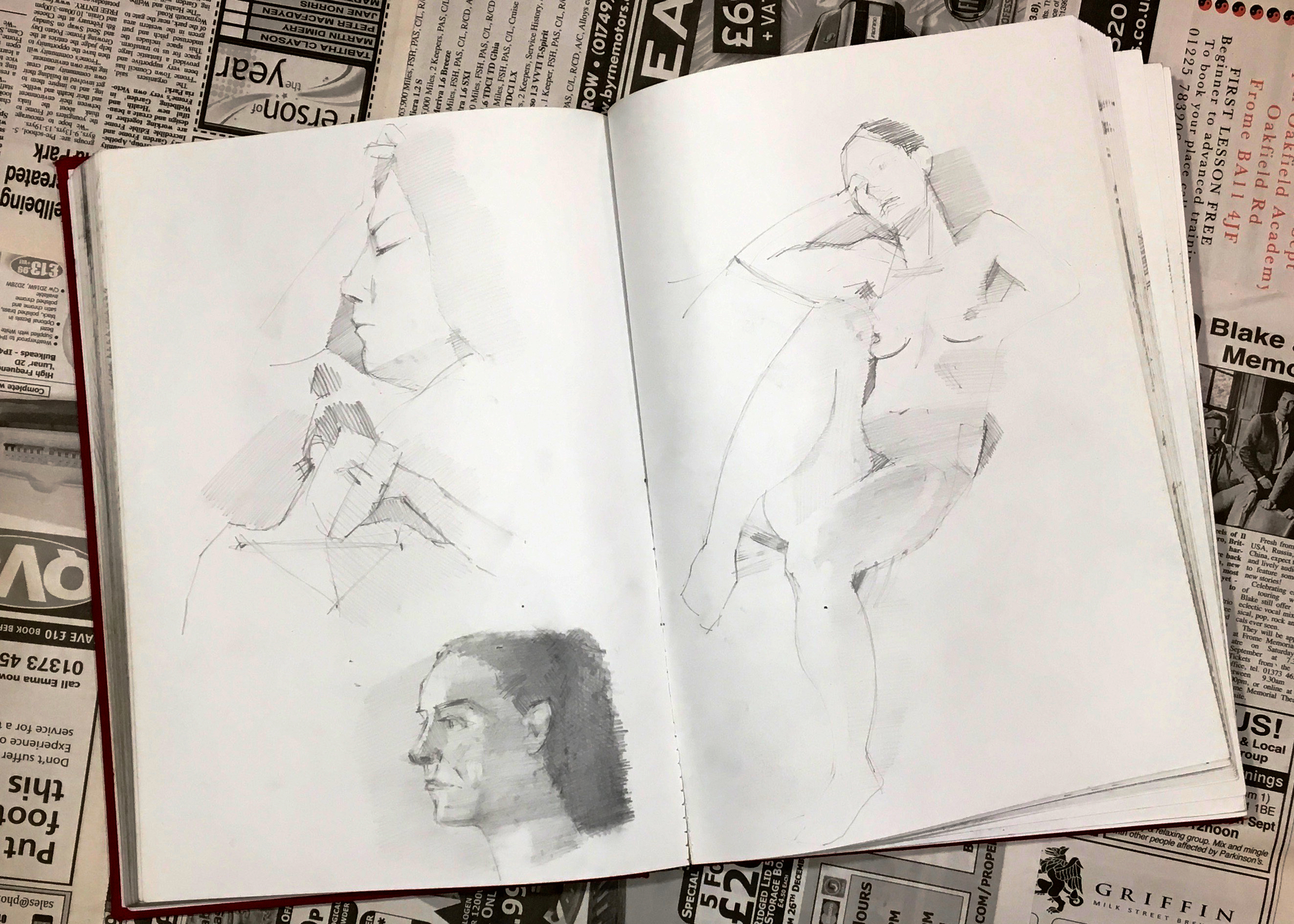
If you want to paint like a master artist, getting into good sketchbook habits is essential. For this painting, pick a nude study from your sketchbook. If you don’t have any, or none that are quite right, sketch a few different poses, then pick one with potential for the Matisse treatment.
02. Paint a bright layer

Paint a thin acrylic coat of Hansa Yellow all over your canvas board and set it aside to dry. The Hansa Yellow may be eye-wateringly bright, but it will prompt you to use other colours to match its saturation and brightness to make your painting pop.
03. Sketch carelessly
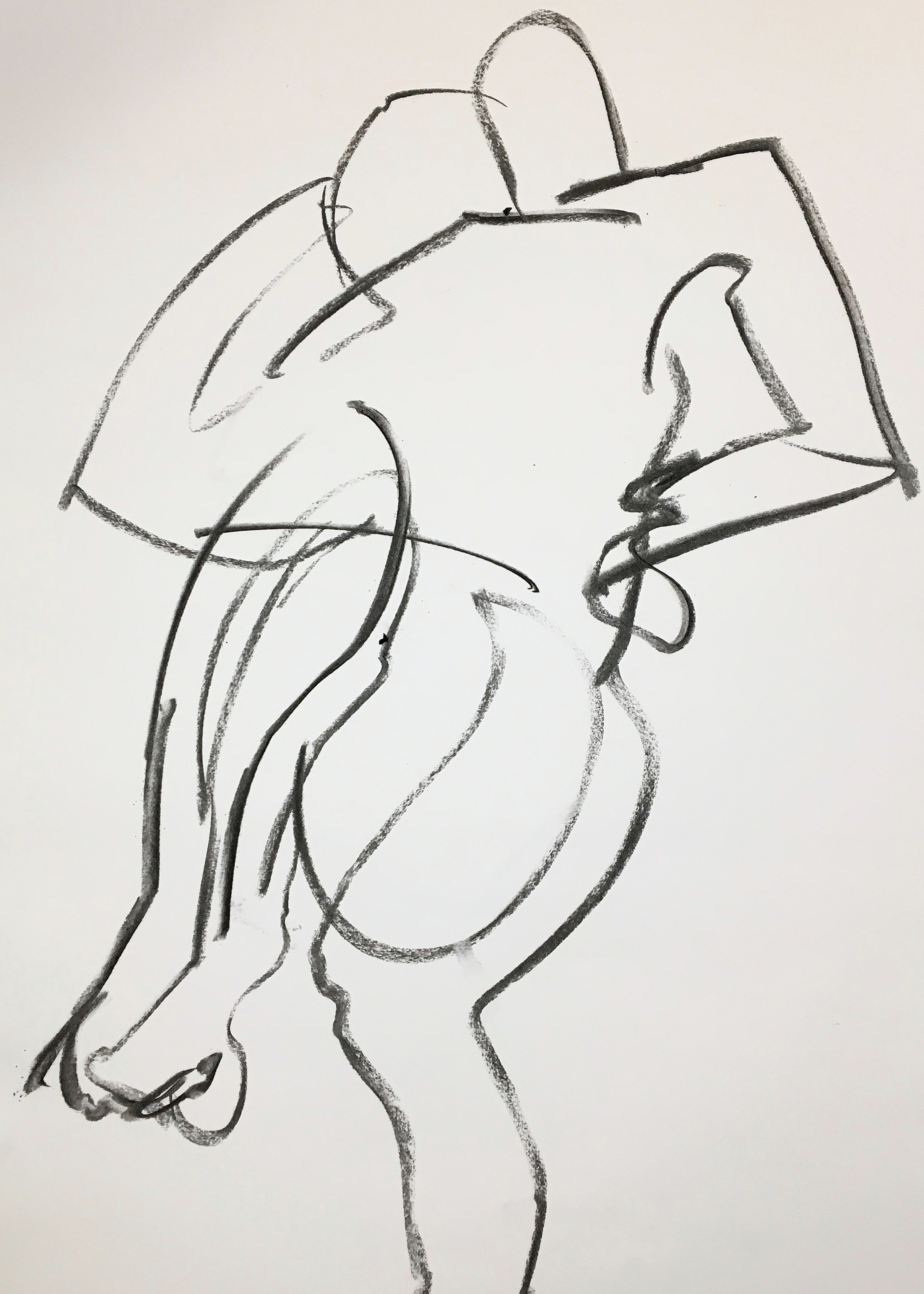
Working on a sheet of A2 cartridge paper, rapidly sketch your chosen form using charcoal. Try to get this new drawing to fill the paper, and to make it as carelessly as you can. It’s easy to lose your nerve at this stage, but if the work is too tight now, there will be little hope for it later. “Exactitude,” said Matisse, “is not truth.”
Sign up to Creative Bloq's daily newsletter, which brings you the latest news and inspiration from the worlds of art, design and technology.
04. Sketch again
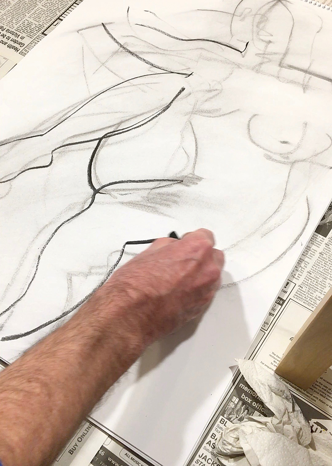
Before you even get a chance to be critical of your first charcoal sketch, wipe it off with a rag or a piece of kitchen towel and start again. You can’t force the marks you need for this type of work, they have to arrive in their own time – even if they take all day. Although it’s a sublimely simple painting, Matisse was occupied with The Dream for a whole year.
05. Join the sketches
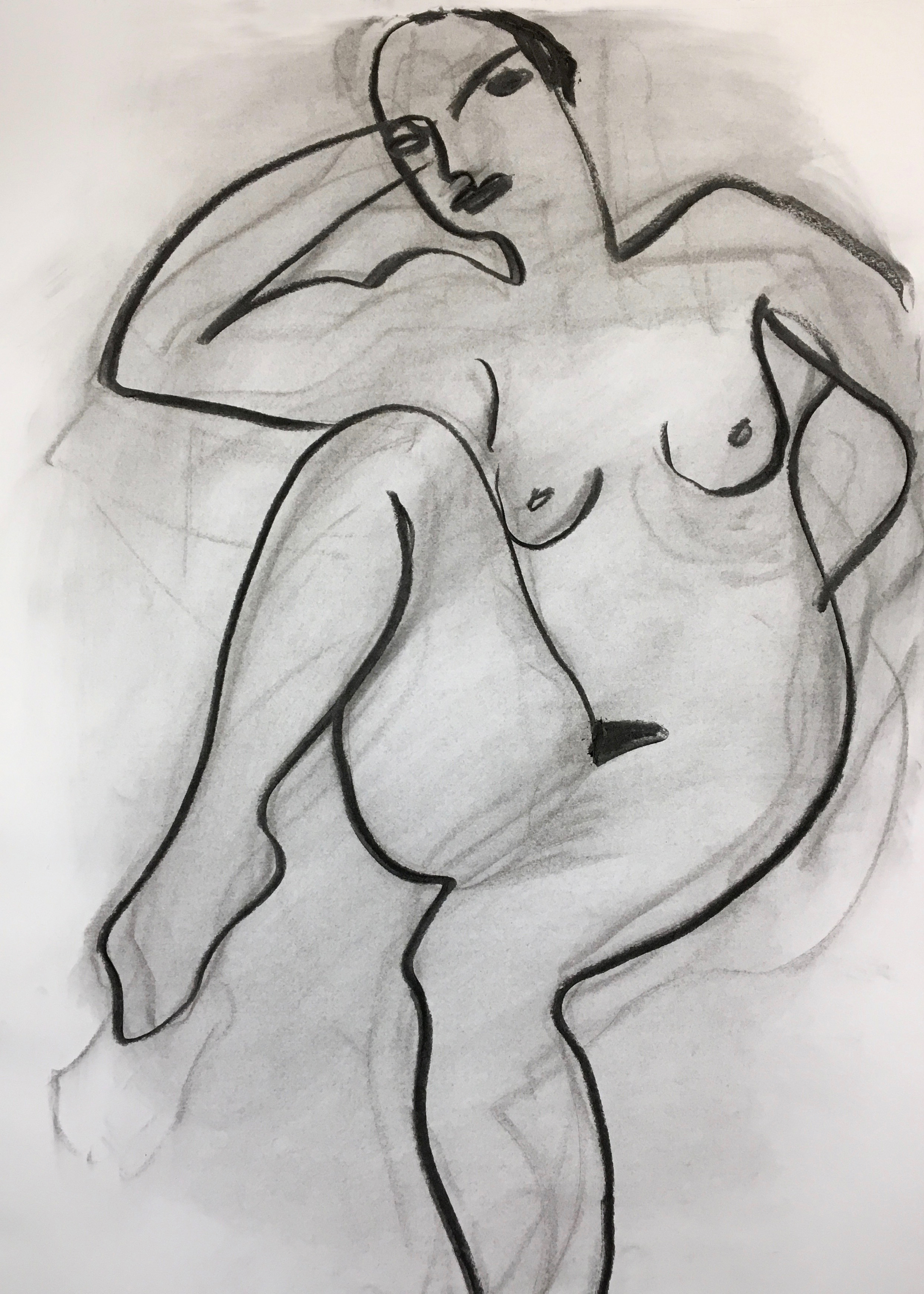
After sketching and rubbing the figure out several times, your last drawing should be a distillation of all of the previous ones, and executed in less than 10 lines. I got this tip from the magician himself, when I visited the chapel he designed in Vence. The adjoining gallery is filled with his drawings for the Stations of the Cross; each one worked and re-worked in this manner, with progressively fewer and fewer strokes.
06. Transfer with a square
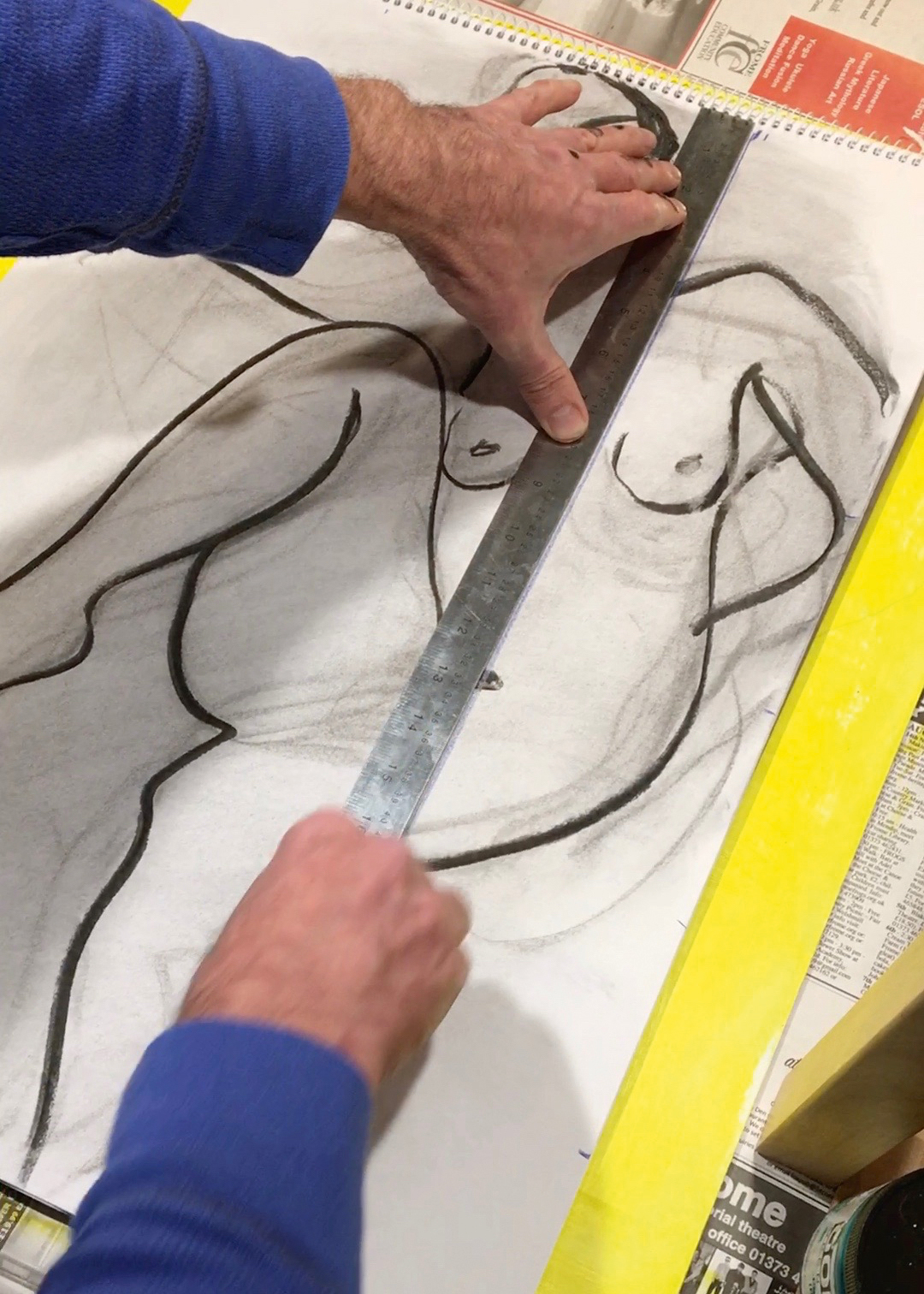
Square up your drawing so you can transfer it onto the now-dry canvas board. It’s a painstaking but essential step to make sure you get your composition right and preserve the simplicity of your original idea. Use a grid made up of 10cm squares and transfer your image using a large, soft pencil or charcoal.
07. Paint freely
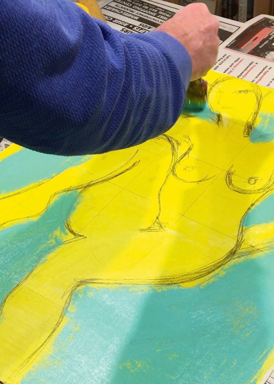
Mix up a colour like this combination of Phthalo Green with plenty of Titanium White, and apply it to a part of the background. To help keep your brush strokes loose and expressive, use a large varnish brush with splayed hairs. It doesn’t cover properly, and as it’s too big to go neatly up to the edges and into the corners – it’s ideal!
08. Build up skin tone

Mix a pink flesh colour by using Quinacridone Magenta and a smidgin of Hansa Yellow, then Titanium White, and a tiny dab of the turquoise mix to make it look less like candy floss. Include more greens and blues to make a darker skin tone.
09. Balance your colours’ harmonies and contrasts
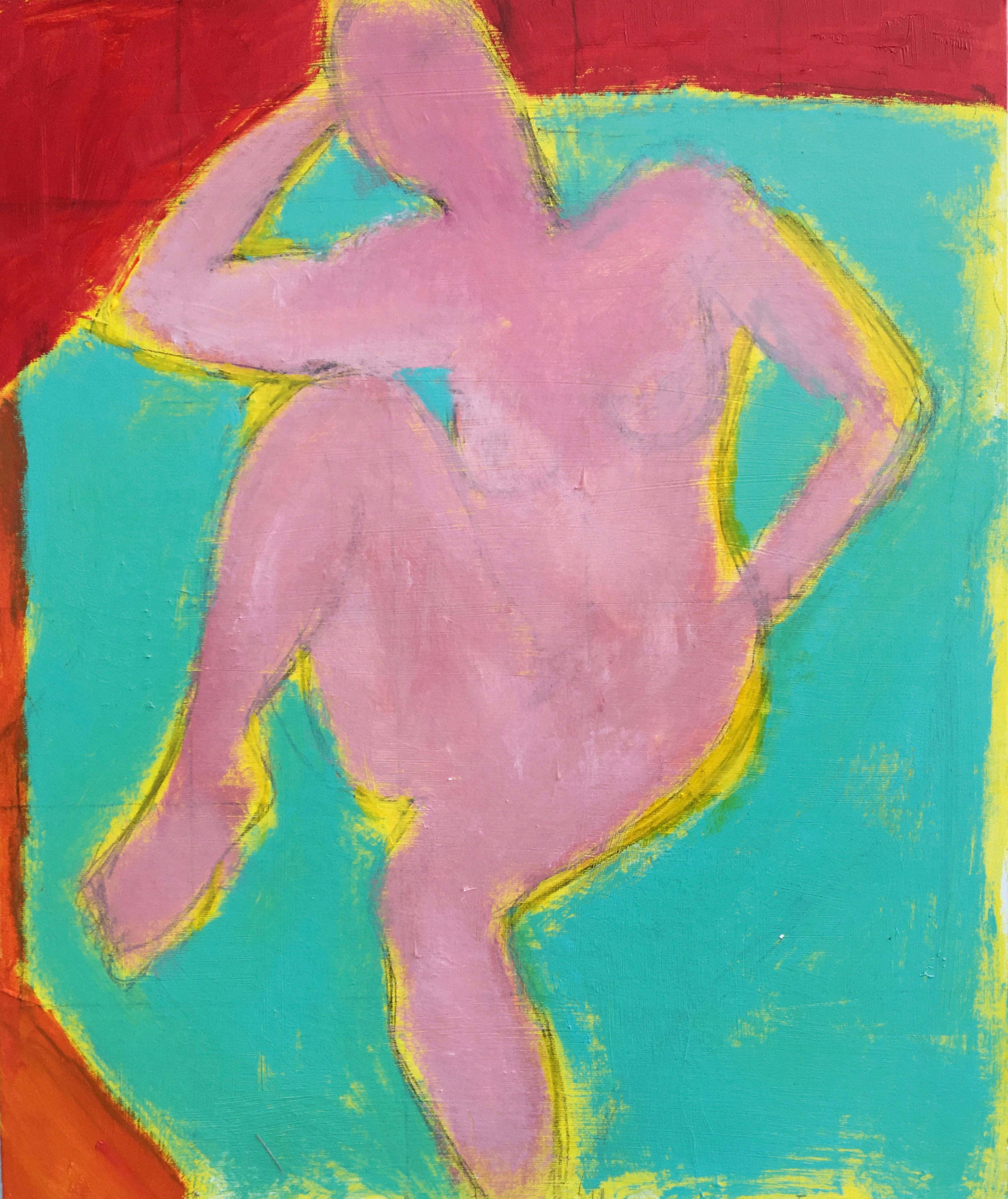
The Cadmium Red Medium across the top doesn’t quite harmonise with my pink, and really jars against the turquoise. The idea is to try to get your colours to contrast without being too different tonally.
If you’re not sure if you can achieve this, try taking a picture of the colours on your phone, then desaturating the image to greys. If the main colours (the pink, yellow and turquoise here) become pretty similar greys, then their tones are similar too.
10. Add patterns
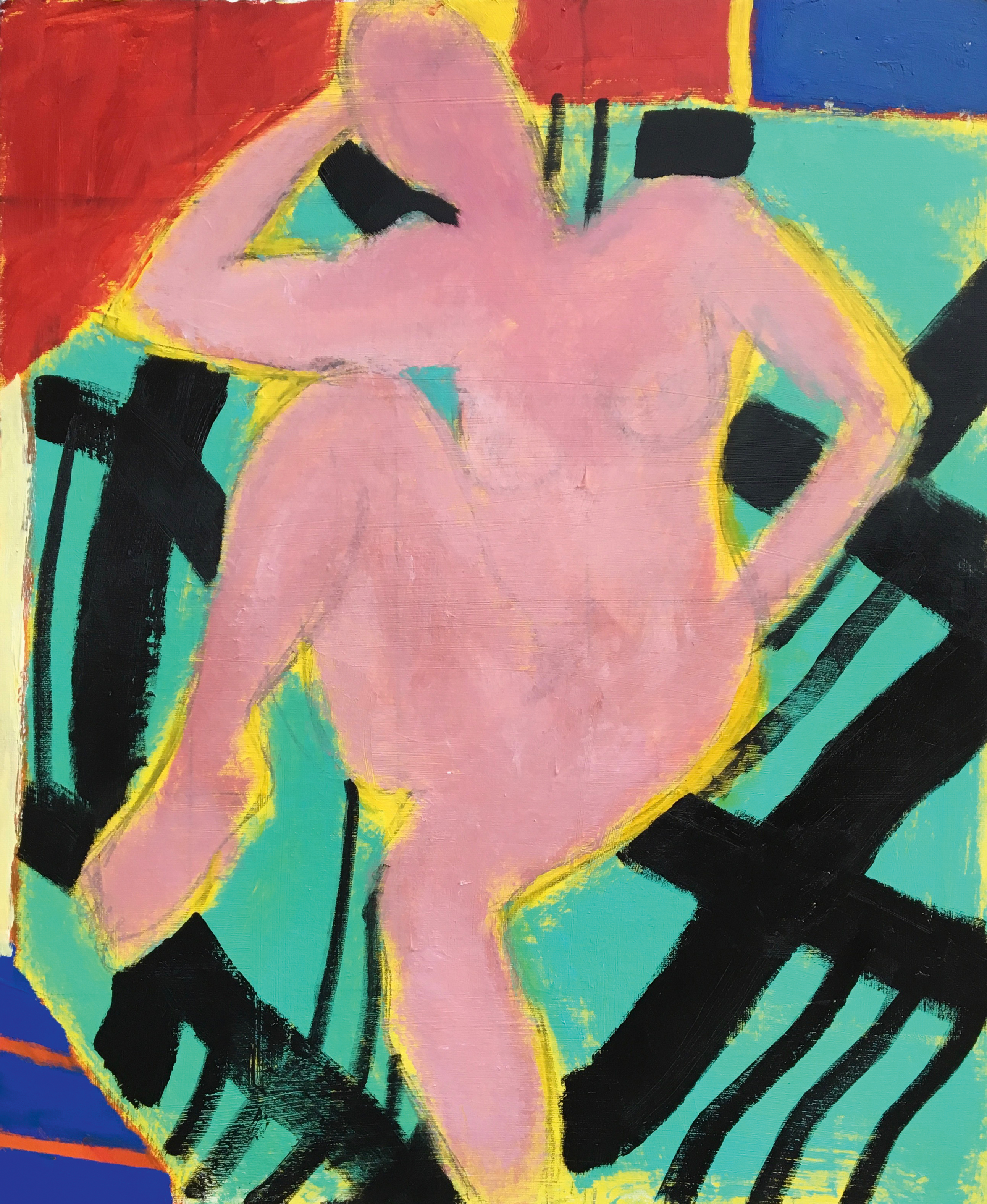
Take inspiration for fabric designs and patterns from other sketches, roughly painting them on and scratching out details from the wet paint using a palette knife. Your painting really can be this crude, because it’s Matisse’s signature simplified nude and colours that ultimately hold everything together.
Keeping the yellow ground energises the entire composition and the Cobalt Blue, top right, echoes the bottom left.
11. Outline the figure
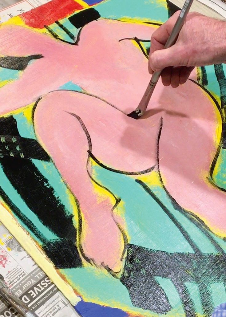
Now for the tricky part! Adjust the pressure on your size 8 Filbert to try to accentuate the figure’s form in black lines without tightly delineating it. You’re aiming for a sense of rhythmic sensuality, using a line that comes and goes, not an exact design. The line should unite the figure with the whole composition. “An expressive gesture with the advantage of permanence,” is how Matisse described it.
12. Make adjustments
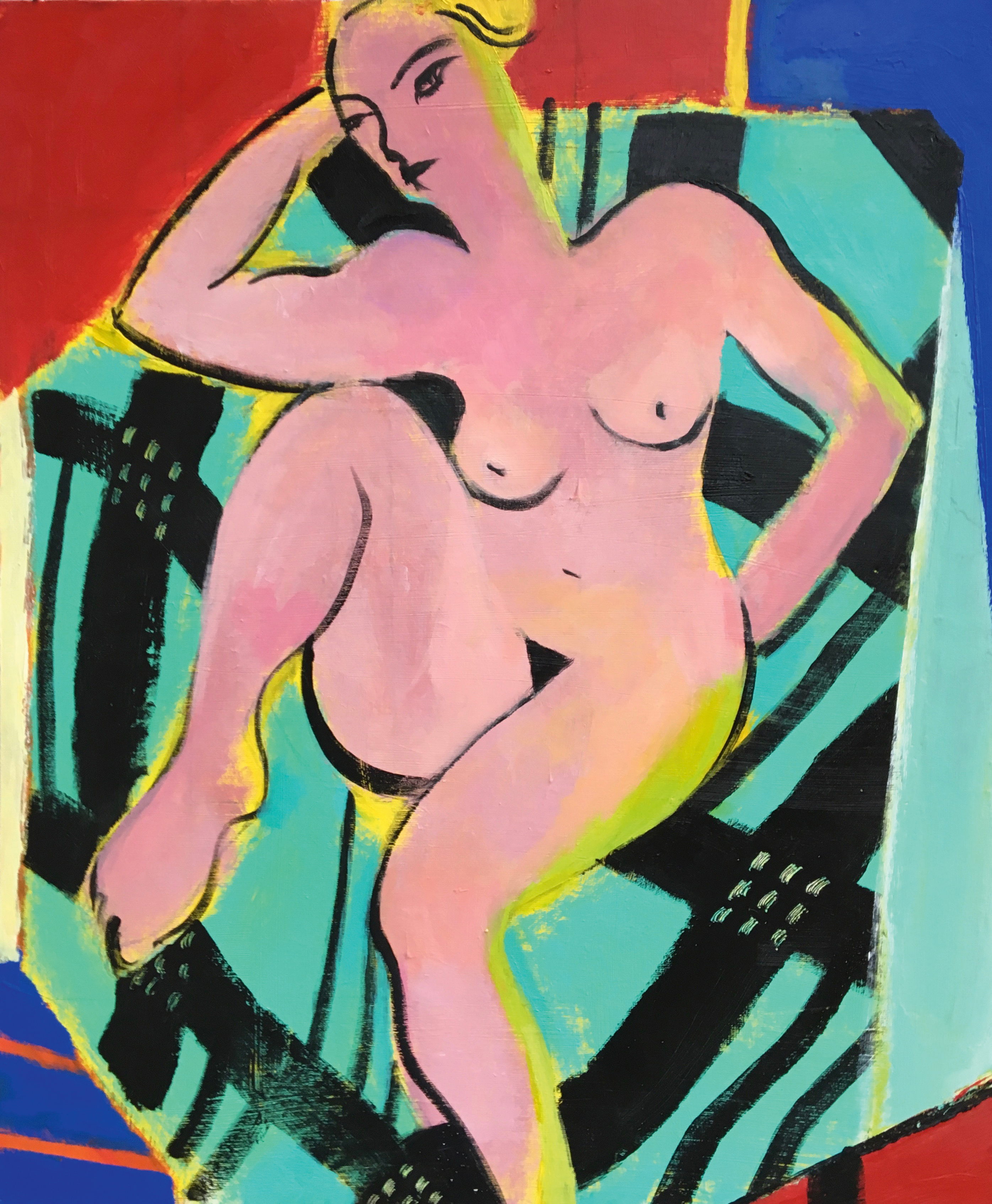
Down tools and put the painting out of sight. A few days later, you can return to it with a fresh eye and renewed energy to make any necessary alterations. I adjusted the line, added more red, varied the flesh tones and highlighted the pink with a complementary lime green. There are no shadows in Matisse’s world, only colour. “Colour,” he said, “exists in itself, possessing its own beauty.”
This article was originally published in Paint & Draw magazine issue 3. Buy it here.
Related articles:
