Paint an epic New York scene
Expressive strokes capture the mood of this epic, impressive structure.
Sign up to Creative Bloq's daily newsletter, which brings you the latest news and inspiration from the worlds of art, design and technology.
You are now subscribed
Your newsletter sign-up was successful
Want to add more newsletters?
For this workshop I'm painting one of my favourite subjects: a New York City bridge. I've painted the Brooklyn Bridge many times now in different light, so for this project I've chosen the Manhattan Bridge.
When painting these magnificent structures, I look for angles that best fit a certain format. Some subjects work best in a more horizontal format, and some look better in a vertical one. I take many photos to pre-compose paintings in my viewfinder, knowing that I have a great layout for one format or another.
01. Select an image
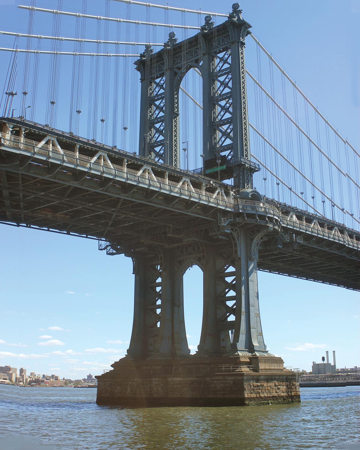
First, pick a photo to work from that contains an element that would be fun to paint, such as reflections on water, or the massive feeling of an object within the scene. Then, use Photoshop to crop, adjust and compose the image to fit the aspect ratio of your panel, to make the laying in and adjusting the drawing much easier. With this identically proportioned reference image, you can more easily decide if your drawing is correct.
Article continues below02. Set up your palette
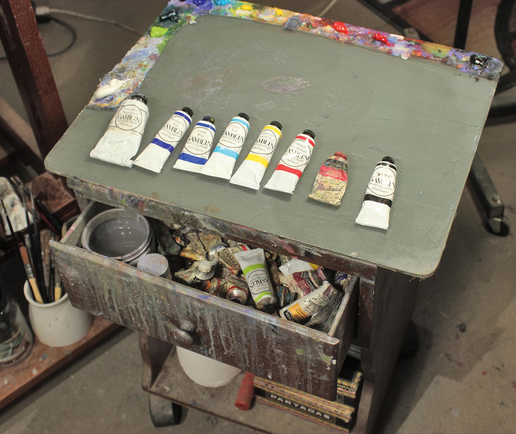
Arrange your palette to suit you. I use white the most, and then greens. The greens blend with blues, which I keep in the corner, and then to create cooler yellows I place those hues next to the blues. Beside the yellows I have a warmer red and then a cooler red. I hardly ever put browns on my palette, although it depends on the image. I often use black but I try to limit it, so I put it as far away from me as possible.
03. Choose your brushes
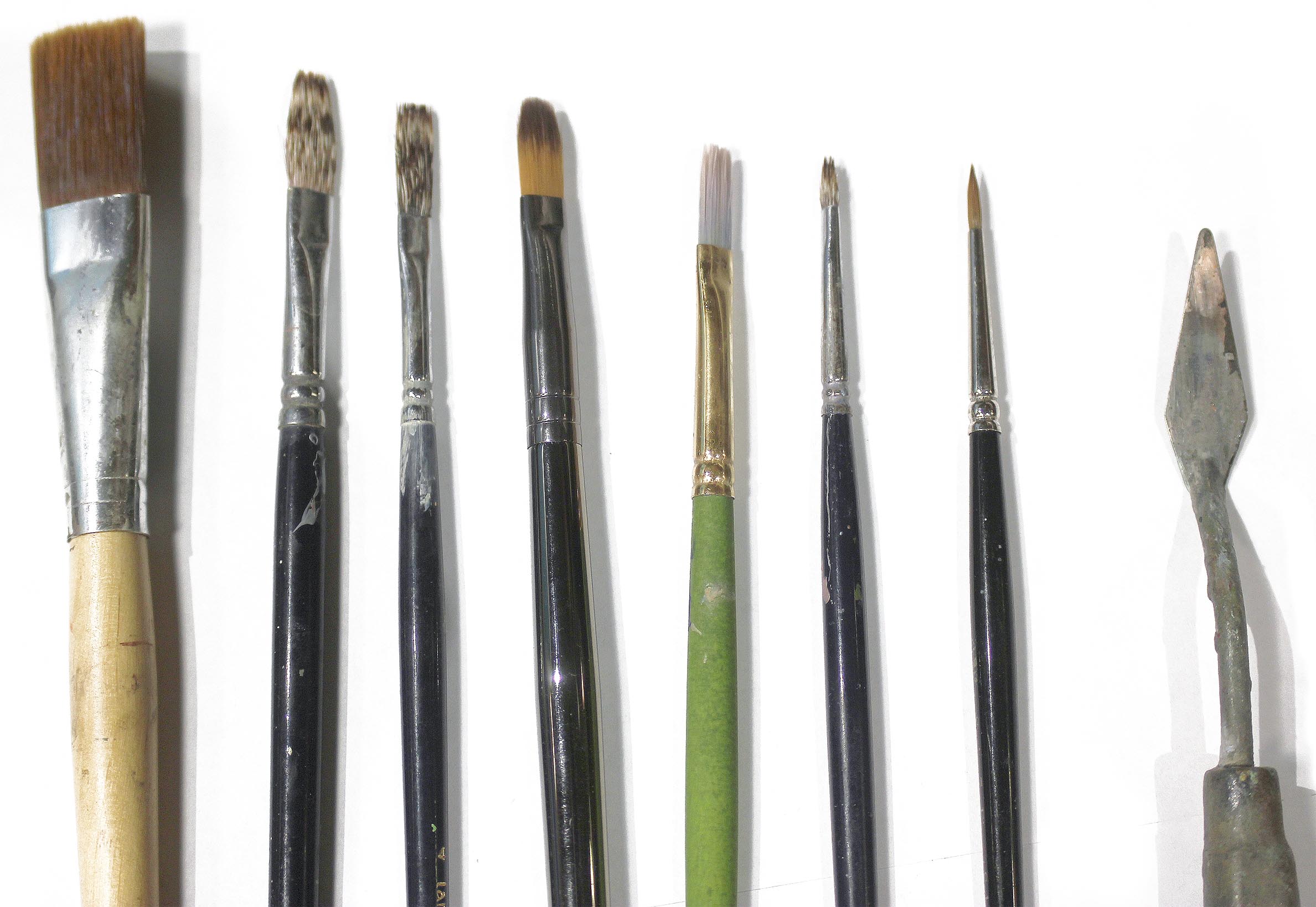
Depending on the size of the panel, choose different sizes of brushes. Soft sable flats are ideal for loading up oils thickly on the panel and for dragging colour across a shape, and the bristles create texture within the paint strokes. Sable filberts are my favourite brushes for any kind of blending.
04. Prepare your paints and media
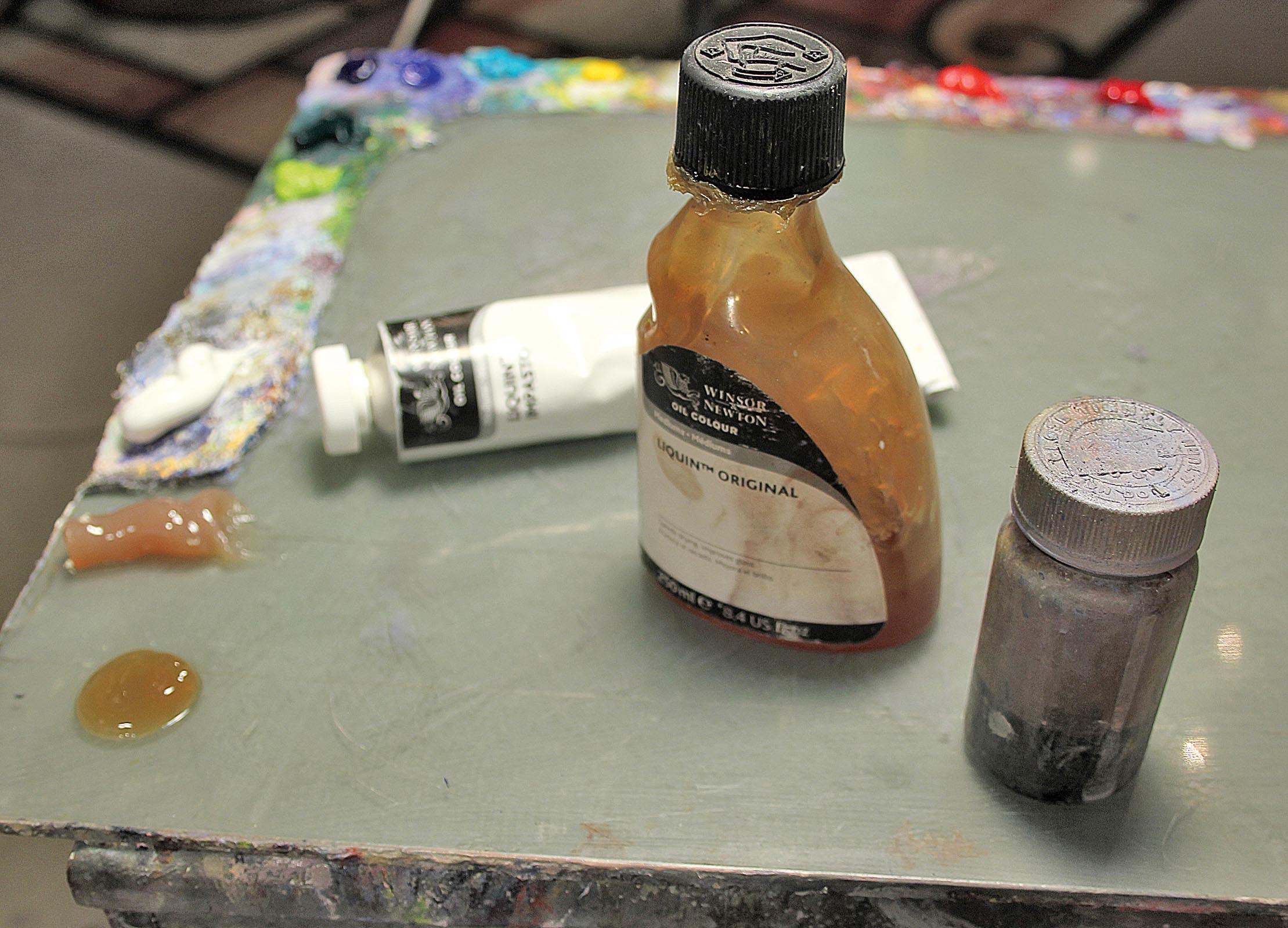
Beside the ordinary odourless paint thinner to clean your brushes, make sure you have a puddle of Winsor & Newton Liquin Original nearby. The Liquin speeds up the oils' drying time and also adds a deeper wet look when the paint is dry. You can't use a lot of Liquin because it makes the mix too soupy, so it's a real balancing act.
Also, Gamblin Flake White Replacement colour is great for its sticky texture and super-opaque quality. It's also a very cool white – Titanium White has always been too warm and too transparent, in my opinion. Winsor & Newton Liquin Impasto Medium is great for adding body to your mixed colours.
Sign up to Creative Bloq's daily newsletter, which brings you the latest news and inspiration from the worlds of art, design and technology.
05. Prepare the panel
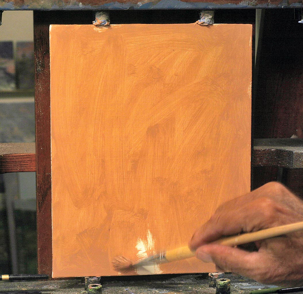
To calm the white of the panel, lay down an undertone by mixing a little of a warm colour – such as an orange – with white and black. Add a drop of Cobalt Drier to this mix (be careful not to get any on your skin, because it's toxic).
Don't wait for it to dry, so when you start to sketch in the shapes and landmarks, your brush will pick up some of the drier and help to dry the sketch in place within 10 minutes. Always put down the faster-drying paint first. Adding faster-drying paint on top of slower-drying paint can make it curdle, because the top layer is drying up on top of still-wet paint.
06. Sketch your lay-in
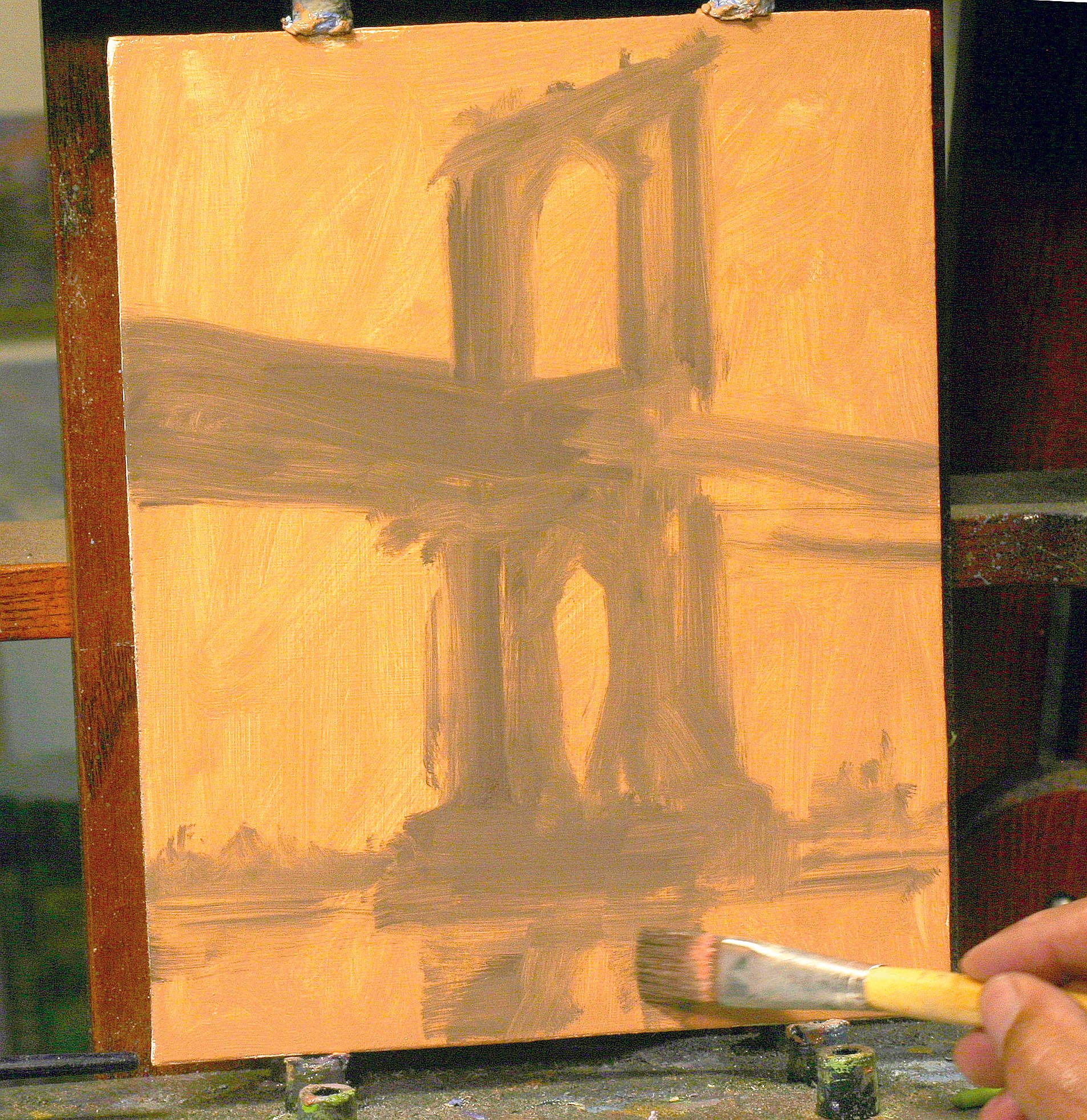
The lay-in sketch indicates shapes and acts like a blueprint. This drawing has to be solid, to save you from the frustration of having to make corrections later. To sketch it, take advantage of having your prepared image cropped to the same dimensions as your panel.
Study and understand the lines within this reference. Are they horizontal? Vertical? Where is the most important line, the horizon? All the lines of perspective need to meet somewhere on that horizon line, and understanding the perspective of every object will greatly affect the beauty of your design.
07. Establish a focal point
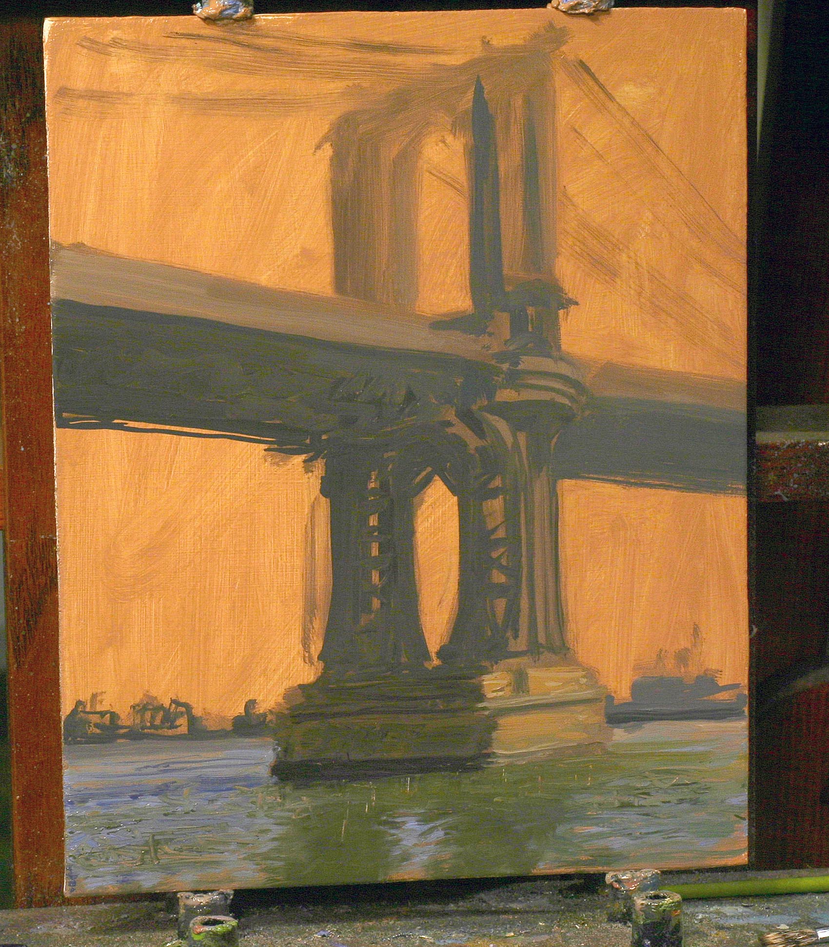
Placing each object with the correct structure in your composition is important. There are lots elements in most scenes and you should strive to establish a main focus (what many artists call a centre of focus). This is the element you want your viewer to see first.
The most detailed structure should appear there. The other elements become support. They should be less detailed or have weaker value or colour, so the object of focus can be fully appreciated.
08. Emphasise the main areas
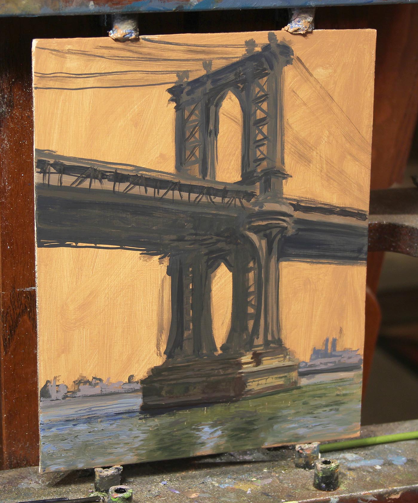
Know where your darkest darks are, as well as your lightest lights. One way to make your centre of focus stand out more is to put your lightest tone right next to your darkest tone, to lead the viewers' eyes straight to that spot.
Try not to have too many areas of high contrast in your compositions that may compete for attention, though. There are bound to be some, but there are also ways to lessen their impact (we'll look at these as we go). Besides wanting to emphasise your main objects, you also want to control the other areas so they support, but don't overwhelm, the elements you want the viewer to see first. Creating a value pattern that is less contrasting is important too.
09. Edit out unnecessary details
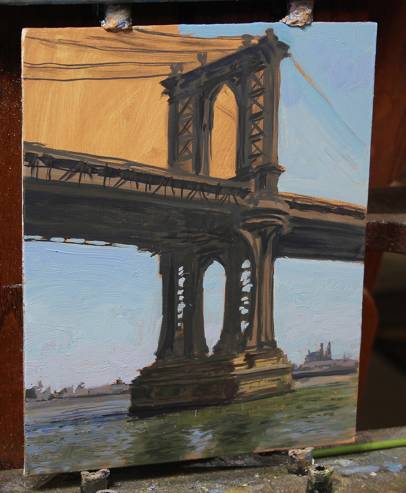
Don't depict the scene exactly as it appears in a photo or as if you are viewing it in real life. I can see detail everywhere, and it is sometimes hard to resist putting it all in. But it's editing out unnecessary detail, and instead painting the essence of the object and the key details only, that gives paintings their charm, mood and subtle beauty.
John Singer Sargent could paint a subject's hand in a portrait in just seven brushstrokes. He didn't have to indicate knuckles, wrinkles or even fingernails to give you a beautiful and elegant hand, and as a viewer you didn't miss or want them. Don't paint details that distract or weaken the big picture.
10. Develop colour harmony
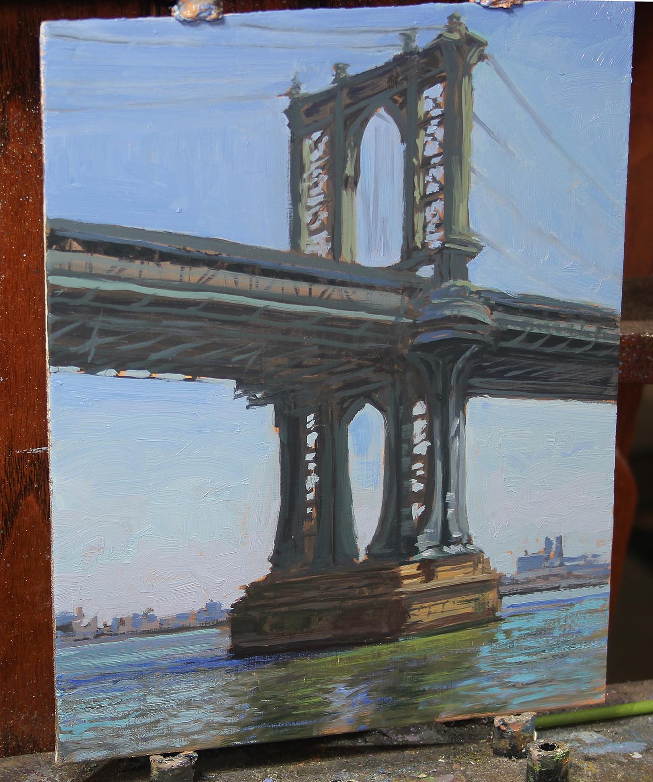
They say if you get your values right, the colour doesn't really matter. It's true that this will ensure the subject of your image is recognisable, but it's the colour that sets the mood. You need to cover the whole panel to be able to analyse all the colours and values.
Analysing your reference in minute detail is the key here. Know the direction of your light source and really seek out the bounce lighting and local colour of all the objects within your image.
11. Build up textures
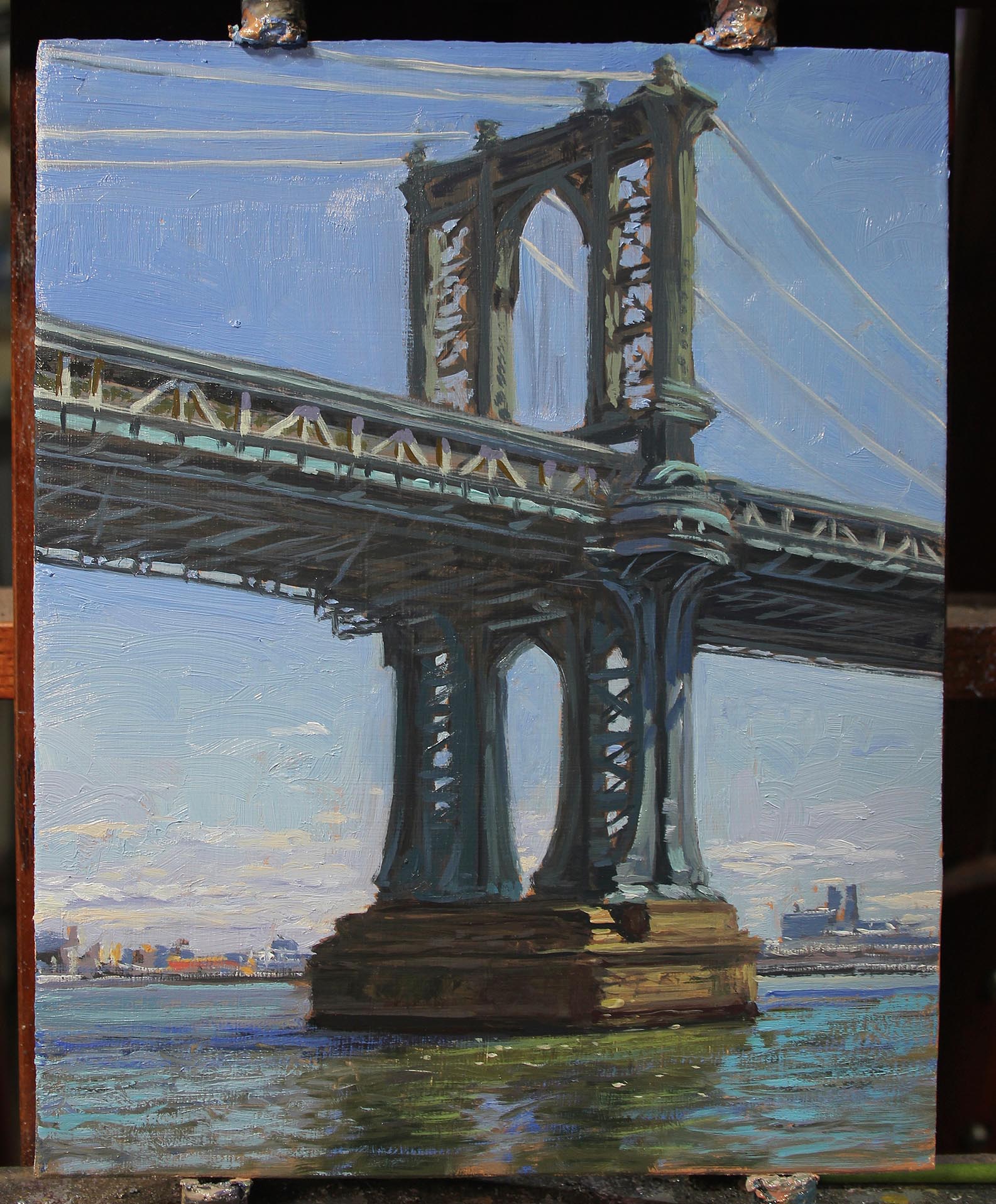
I like a lot of body in the final oil application, so don't thin the paint with turps in these later steps. Where you started with thin, fast-drying applications in the laying-in process, now finish off with thicker, slower-drying applications of paint. If everything goes perfectly, your darks should be close to what they were in the beginning; thin and fast-drying areas, and lighter areas should be heavy applications of stiff, thick colour.
12. Add the finishing touches
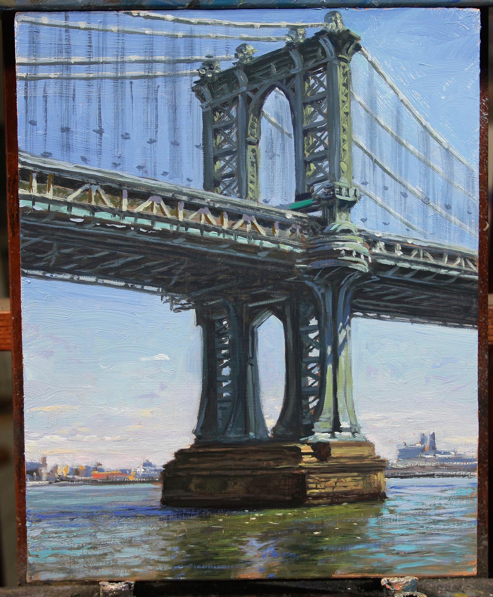
In this final step, make any last-minute corrections and then go beyond the reference to brush in touches of colour or texture that will add interest to what could be a boring space or shape. These marks may help it look like a painting instead of a straightforward depiction of the subject – so you could include off-colour marks to the sky or bridge in places that don't distract but will add interest and break up any monotony.
This article was originally featured in Paint & Draw magazine issue 4; buy it here!
Related articles:
