Transform your type online with variable fonts
These super-adaptable fonts can help streamline your sites.
Sign up to Creative Bloq's daily newsletter, which brings you the latest news and inspiration from the worlds of art, design and technology.
You are now subscribed
Your newsletter sign-up was successful
Want to add more newsletters?
Typography on the web has come a long way. About a decade ago it was still woefully underused and done very poorly – damaging user experience. Text wasn’t very readable online and the same typefaces were used over and over again. People were throwing their hands in the air, claiming you couldn’t do typography on the web well.
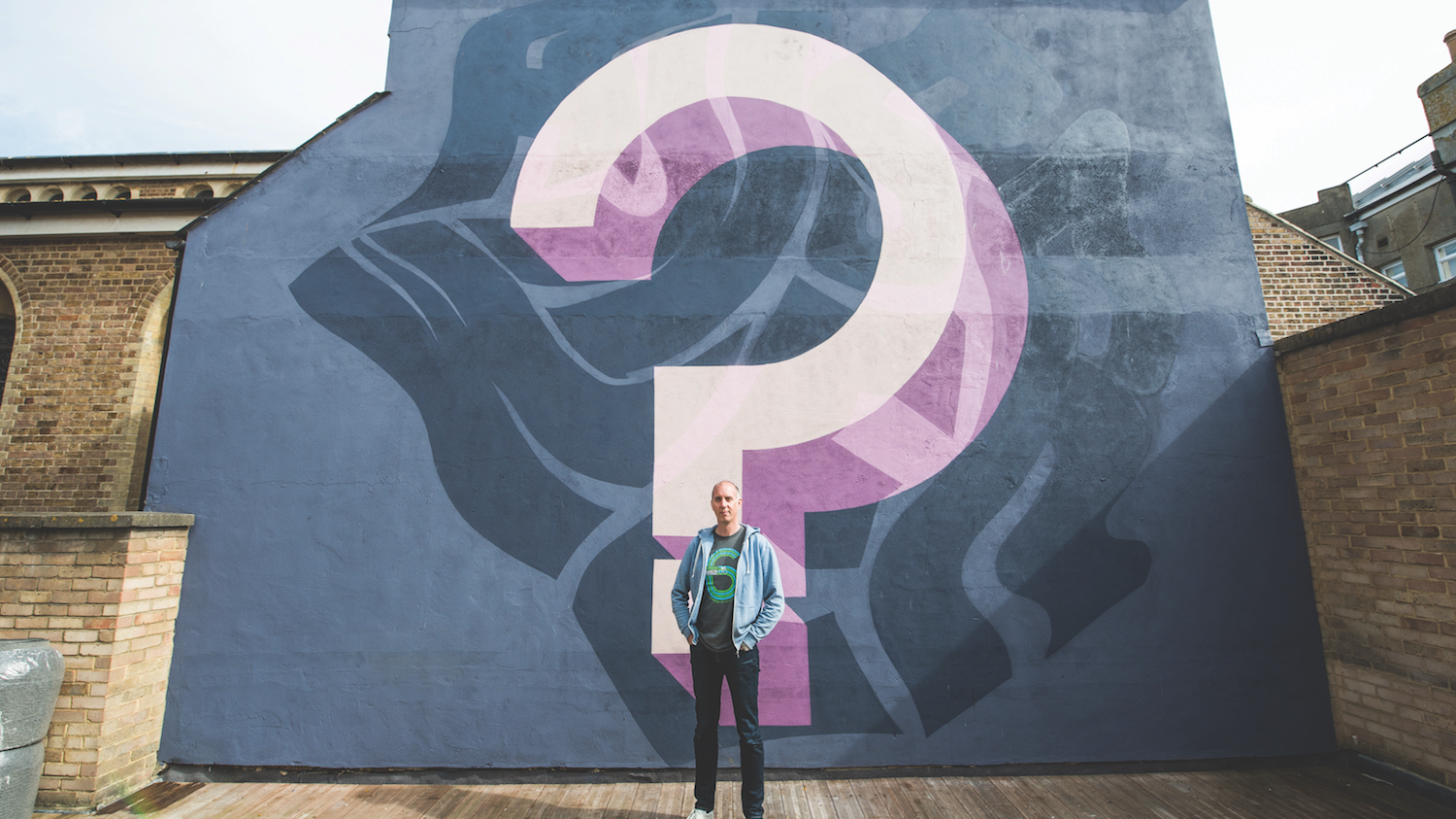
But there’s one man that has been trying to convince people otherwise and that's Richard Rutter, co-founder of influential UX consultancy Clearleft. Now there’s a real surge of excitement about web fonts and typography and he’s at the centre of it.

One of the biggest game changers right now is the advent of variable fonts, a technology that enables a single font file to behave like multiple fonts. “It’s really interesting how quickly this has come out of nowhere,” Rutter explains.
Article continues below“Adobe, Microsoft, Apple and Google have all thrown their collective weight behind variable fonts and they all have their slightly different reasons. Google’s in particular will be one of performance because you can save an awful lot of space.
You can radically cut down the file size because you can have a regular and a bold wrapped up together
Richard Rutter
"If you deal with Chinese, Japanese and Korean languages in particular, font files will be a few megabytes in size as opposed to Latin-based font files, which are much smaller," Rutter continues. "You can radically cut down the size of these files because you can have a regular and a bold wrapped up together. You’ve just got one font file for an infinite number of variations. It’s also going to be really interesting to see how type designers will provide stylistic variations in their fonts that are really unusual and that we wouldn’t have seen before.”
Variable fonts can be used in real projects now. Browser support has reached over 65 per cent. Both Safari and Chrome already support variable fonts and Firefox and Edge will follow shortly. The latest versions of Photoshop and Illustrator also support them and they’re included in the latest Windows and Mac operating systems as well – Apple’s system font San Francisco uses font variations extensively.

Clearleft has used a variable font on the website for Ampersand, the web typography conference. It’s one of the first commercial sites ever to do such a thing, something that Rutter explores in his article, how to use variable fonts in the real world.
Sign up to Creative Bloq's daily newsletter, which brings you the latest news and inspiration from the worlds of art, design and technology.
“We set the word ‘Ampersand’ in six different weights,” Rutter enthuses. “Each individual letter is set at a slightly different weight to give it a slightly more hand-drawn feel. There’s no way you would have done that in the past! You would have served it up as an SVG but now it’s real text, and we can do that with a variable font, which is tiny in size because it’s got a very small character set. It’s got the full alphabet and very little else but that’s all we needed for one word.”
Rutter initially studied chemical engineering and, long before founding Clearleft with Andy Budd and Jeremy Keith in 2005, began his career designing bits of oil rigs. He first discovered his love for typography in the mid-1990s. The web came along and anyone could build a web page if they could type some simple HTML. Rutter found it very rewarding, so he got into design and with that came typography.

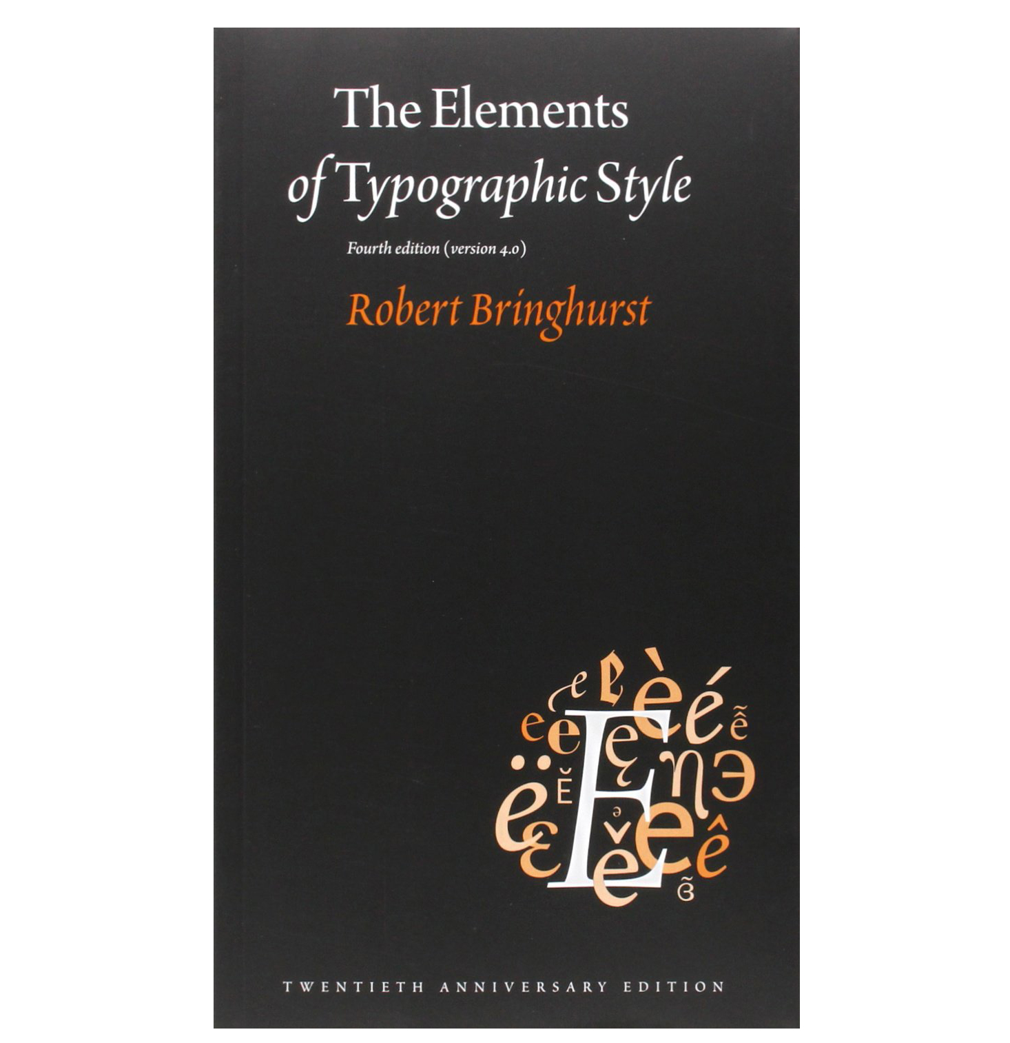
“In my first proper job as a designer at an agency in London, I was introduced to Robert Bringhurst’s book The Elements of Typographic Style,” Rutter remembers. “It was a revelation. I was fascinated by the way he was typesetting pages and the thought processes behind it. I realised – and fell in love with – the fine detail that he was putting into his work. It really resonated with me. There’s a wonderful geekiness to it.
"There are a lot of tiny, seemingly meaningless, details that sometimes only you or other typographers can see. It’s your own special code in a way but if you get enough of them right, then the whole thing comes together to be something beautiful and enjoyable. They all improve the reading experience.”
There are a lot of tiny, seemingly meaningless, details that sometimes only you or other typographers can see
Richard Rutter
The discovery of Bringhurst’s book prompted Rutter to start writing about typography on the web. He wanted to show people how to apply Bringhurst’s guidelines using techniques available in HTML and CSS and became a self-appointed web typography evangelist. Ultimately, it led to Rutter’s own book, Web Typography, a handbook for designing beautiful and effective responsive typography.
Originally it was meant to be co-written by Mark Boulton and fellow typographer Jon Tan, who Rutter co-founded pioneering web font service Fontdeck with (now closed down). It was also going to be published through Boulton’s Five Simple Steps, which shut down when his agency was acquired by Monotype. Despite the setbacks Rutter was committed to the project and decided to go ahead on his own, without a publisher and with the help of Kickstarter; his campaign reached its target in less than 48 hours.

Web Typography is aimed at both designers and developers and blends together typographic theory with the practical and technical. Rutter tried to include everything he could possibly think of that would be relevant to web typography. One of the theories he covers is how you can’t have a good user experience without good typography.
“Looking at words is the vast majority of what we do on the web,” he points out. “Millions of people do it every day and the type is the experience much of the time, which is why it’s so important to get right.
A few years ago a study done by Microsoft in collaboration with MIT tried to compare the difference between what was deemed to be good and bad typography. There was no significant difference in terms of the speed of reading, retention of information or even comprehension. The core thing they found was that with good typography the speed of reading felt faster and there was an overall sense of relaxation and enjoyment. With bad typography, people were frowning more, so essentially they found that good typography puts you in a good mood. If that’s not the ultimate user experience, I don’t know what is!”
This article was originally published in issue 308 of net, the world's best-selling magazine for web designers and developers. Buy issue 308 or subscribe to net.
Want to learn more about making the most of typography online?

Richard Rutter has a love and fascination for typography and co-founded Fontdeck, a pioneering web font service. As a self-appointed web typography evangelist, Richard is chief organiser of Clearleft’s Ampersand web typography conferences.
At Generate London 2018, his workshop will help you create websites with engaging, appropriate, distinctive, expressive and readable web typography, which adapts for screens of all shapes and sizes. You will learn how to combine centuries-old craft with cutting-edge technology – including variable fonts – in order to design and develop the best experiences for your readers.
Generate London takes place from 19-21 September 2018. Get your ticket now.
Related articles:

Oliver is an independent editor, content consultant and founder of Pixel Pioneers. Formerly the editor of net magazine, he has been involved with the web design and development industry for more than a decade and helps businesses across the world create content that connects with their customers. He is passionate about content, user experience, accessibility and designing for social good.
