How to make HTML5 sites run faster on mobile
Maximiliano Firtman on measuring and optimising mobile performance.
Multiple platforms, browsers, web app platforms, experimental features and unreliable wireless networks: the mobile web world is a far more complex environment than the typical web world that we were used to for years.
Performance on mobile is such an important issue. Because of unreliable networks, radio packet latencies, smaller screens and battery limits, users expect faster experiences. We need to understand the problem, measure it and apply some best practices to improve the performance or, sometimes, just the perception of it.
In this article, we will cover the most important things you need to understand and do for speeding up your HTML5 experiences for mobile devices.
The mobile jungle
We have dozens of browsers and web app platforms available. These platforms allow us to create out of the browser experiences with HTML5, both hosted-based solutions (usually known as web apps) and store-based solutions (usually known as native web apps or hybrids) such as Apache Cordova apps. Performance measurement and problems on each platform may not be the same. Besides that, there are a couple of issues that will affect everyone.
Article continues belowNot every user has the latest multicore smartphone. CPUs and GPUs are, on average, still limited in performance terms. Wireless connections are a problem because the network is so unreliable; bandwidth differs from 100-400Kpbs (2.xG), 0.7-5Mbpx (3.xG) and 1-50Mbps (4G).
Even if a lot of users are browsing the web using 3G or 4G, is the bandwidth an important advantage for web performance? Well, not always. Bandwidth may be important for a video streaming or a large file download, but for a typical HTML5 experience, we are dealing with just small files.
Wireless networks have two issues that affect web performance more than bandwidth: latency and radio state. Latency can take up to one second on 2G, up to 450 milliseconds (ms) on 3G and 180ms on 4G, per request. A home-wired connection in US takes up to 45ms. Therefore, even on 4G, latency can be four times larger.
The radio state is also an issue. When not using the network, the phone will idle the radio to save battery. Therefore, the next request forces the radio to re-activate, which takes up to to 2.5 seconds on 3G, while on 4G is below 100ms.
Sign up to Creative Bloq's daily newsletter, which brings you the latest news and inspiration from the worlds of art, design and technology.
Measuring on mobile
We can't optimise what we can’t measure. There are plenty of articles talking about performance on mobile giving you a list of techniques as a cookbook. The reality is that, while there are some tips you must always apply, performance tricks will be different per project. For example, it's not always true that a data URI image is better than a PNG external file. The answer is: it depends on your project and resources, and sometimes when you gain on network traffic, you loose on decompression or memory consumption. You need to measure the final result, not just one part.
Emulators and simulators, while good for other testing purposes, are not ideal for performance measuring. They may be useful to detect and solve some general bottlenecks but they're not useful for the final performance measurement.
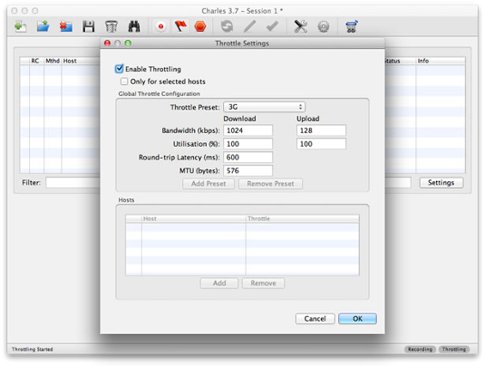
If you don't have any other option, at least you can analyse the usage of a bandwidth simulator on your host computer, such as Charles Proxy, Net Limiter for Windows or SlowyApp for Mac. You will be able to throttle your desktop internet connection to simulate a 3G or 4G connection, including latency times.

At this point, you may have a good idea of what we need: real devices. When you have a real device, the next question is how to measure performance. The answer comes with remote inspector solutions available on some platforms, such as Chrome on Android, Safari since iOS 6.0, Firefox and BlackBerry Browser.

From iOS 6 we can enable remote inspection on Safari. It allow us to remotely inspect, debug and profile from the Mac host computer
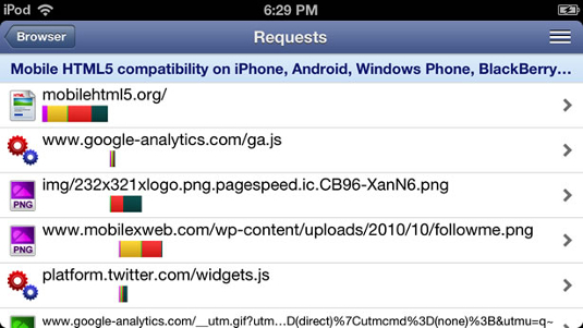
With these tools we can connect our desktop computer with a real device using USB or the WiFi and access performance reports, such as network waterfalls and profiling reports. With these reports we can find bottlenecks, measure transfers, JavaScript execution, CSS selectors, CSS styles and render paint times.
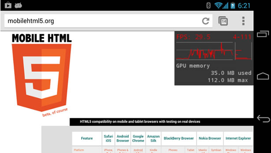
One of the most complete performance analysis tools comes with Chrome on Android where we can enable FPS rate on the screen and force a repaint on every frame. This is useful to compare two different solutions, such as using a background image vs a CSS gradient.

For browsers without any remote inspection tool, we can use proxies and network sniffers, such as Fiddler or the suite of tools known as Pcapperf. Some on-device solutions includes jsHybugger for Android and HttpWatch for iOS. Finally, a couple of mobile browsers support the Navigation Timing API such as Android Browser 4.0+, Chrome, BlackBerry 10, Internet Explorer 9+ and Firefox that exposes a list of important values on the global window.performance object, such as the number of redirects or timestamps on important values.

The most important problems
Now that you know how to measure performance, let's talk about all the things that you must avoid.
An HTTP redirect is common when creating separate mobile devices. For example, when we access mydomain.com, we redirect to m.mydomain.com. While it seems innocent, a redirect is one of the most harmful operations on the most important moments of your website from a performance perspective point of view: the first load.
Every redirect will consume from 150ms to one whole second of just a white screen on the browser and that includes DNS resolution as well as HTTP requests and responses going forward and backward.
URL shorteners and analytic software make this worse for users reaching the final server via a social network. Therefore, you should keep redirects to the minimum.
For example, the American Airlines website. When typing aa.com on my mobile browser, the redirection process is: aa.com to www.aa.com to www.aa.com/homePage.do to mobile.aa.com to www.aa.com/mt to finally www.aa.com/mt/homePage.do. That's six redirects to get to the homepage on your mobile phone with a minimum of a one second of delay on the fastest networks and up to six seconds on some others.
There are ways to make your architecture so you don't have any redirect or at least just one.
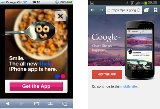
Plenty of websites are stopping the user from accessing what they want by trying to force you to download a native app. That's a terrible experience. You're not only adding one redirect, you are adding seconds of time for the user to understand what is happening, to close the banner, or say "no", and start the final download.

There are other ways to market your native app without harming the performance of the first load. If you still think it's a good idea, please check this website.
Too many requests
When using HTTP 1.0 and 1.1, each request is really expensive in terms of performance. The latency is one of the guilty suspects in them. Therefore, you should apply different techniques to reduce requests at all cost, including embedding elements and external files, CSS spriting and so on. But be careful: don’t take measures without measuring them. Your web experience is unique and best practices could differ per project, so don't rely on magic cookbooks. You may find yourself applying practices that are harming the performance instead of helping it.
HTTP request problems may be solved with HTTP 2.0 in the future and implemented partially today with SPDY protocol on some specific browsers, such as Chrome on Android and iOS.
Too much JavaScript execution
JavaScript is expensive on mobile devices. This doesn't mean that we shouldn't use it, of course. It means that we need to take more care.
By default, JavaScript may block responsiveness and, if we are changing the DOM, it may affect the performance while we are repainting. As a general rule, try to avoid frameworks if you are using good portion of them. It's common to use frameworks just because we are used to them, but modern browsers don't need them so much. This will improve performance.
Plenty of websites are just downloading unused code on the homepage, or misusing frameworks and plug-ins.
Don't get me wrong, the final advice depends on your case. For example, we can say "lazy load all the JavaScript code for when you need it". However, knowing that radio state change may take time, in some situations, the best decision can be downloading it at the beginning but parsing it later.
Performance is your top priority
Performance is so important that it should be your number one priority. That means: 1) relying on the desktop site for mobile devices is a really bad idea 2) some effects, animations, blending layers may look excellent on paper but they affect performance without big improvements from a user's point of view, 3) responsive web design (RWD) should not be implemented just because it's cool.
I know that the last item needs a bit more explanation. RWD is a good idea and, in some cases, it's the best decision. However, it's terrible in other situations due to a lack of server-side logic. Sometimes, delivering the same document for desktop and mobile means you use the same JavaScript frameworks and all those hundreds of plug-ins you love. It's the worst step you can make for our final goal: provide the fastest possible experience for the user.
As Brad Frost said, "Your visitors don’t give a sh** if your site is responsive." And that is true. That being said, I'm not against RWD. You just need to be clever to decide where to use it and where to use a server-side logic that will maybe help you maintain one code base from a development perspective and will deliver just the necessary code to each client.
Conclusion
You now understand that performance on mobile is a big topic and we have a lot more to talk about it. Don’t rely on magic cookbooks. Measuring will help you discover that your project and resources are unique, and that you will need your own cookbook per project.
Remember: understand the whole ecosystem, performance should be your primary concern, sometimes perception is more important than the real measurement, don't redirect, be careful about HTTP requests and JavaScript, and don't make an enemy of your final user.

The Creative Bloq team is made up of a group of art and design enthusiasts, and has changed and evolved since Creative Bloq began back in 2012. The current website team consists of eight full-time members of staff: Editor Georgia Coggan, Deputy Editor Rosie Hilder, Ecommerce Editor Beren Neale, Senior News Editor Daniel Piper, Editor, Digital Art and 3D Ian Dean, Tech Reviews Editor Erlingur Einarsson, Ecommerce Writer Beth Nicholls and Staff Writer Natalie Fear, as well as a roster of freelancers from around the world. The ImagineFX magazine team also pitch in, ensuring that content from leading digital art publication ImagineFX is represented on Creative Bloq.
