18 great HTML APIs – and how to use them
HTML is more capable than ever before. Here are the elements you should be making use of today.

Sign up to Creative Bloq's daily newsletter, which brings you the latest news and inspiration from the worlds of art, design and technology.
You are now subscribed
Your newsletter sign-up was successful
Want to add more newsletters?
HTML is more capable than ever before. In this post, we run through the best HTML APIs around right now. These are the elements you should be making the most of in your website layouts. Read on for an in-depth look at the <dialog>, <details>, <picture> and <input> HTML APIs, plus your guide to Web Components.
Alternatively, jump to the second page for a roundup of sectioning elements you can use to accurately define page structure and each element’s role, and a selection of inline elements to use instead of <span>.
Want to explore some more APIs? We also have guides to the best JavaScript APIs, HTML APIs and Google APIs. Or keep things simple with a website builder. However complex your site, you'll need decent web hosting.
Article continues below01. <dialog>
- Use it to: Display a popup or modal window without the overheads
- Read the <dialog> web docs
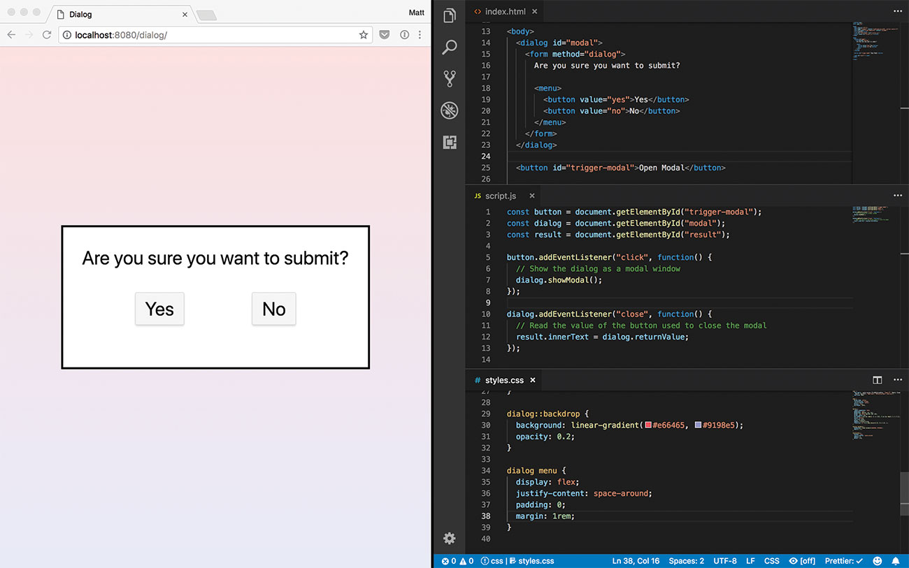
A common design pattern on the web is to have an extra window display to provide more information or options for a complicated interaction. Adding a confirmation as an extra step is also a good way to make a user aware their action will have consequences.
These windows have been around for years through the help of libraries such as Bootstrap or jQuery UI. While they can be easy to implement, they often require heavy scripting and extra styling to match the look and feel of the site they are implemented into.
One of the few elements added in HTML5.2 is <dialog>. This new, semantic element is designed to denote a supplementary, interactive component that displays out of the main flow of the document.
<dialog open>
  <p>Dialog Content</p>
</dialog>
The <dialog> element itself is designed to be as simple to use as possible. Any content within the tags will become part of the window and do not appear on the page by default. When the element has the open attribute applied, it then appears centred based on where it appears in the DOM.
Sign up to Creative Bloq's daily newsletter, which brings you the latest news and inspiration from the worlds of art, design and technology.
While dialog boxes can request a response, a user can still navigate the page without having to interact with it. A modal window is similar to a dialog, but has the aim of requiring an action from the user before proceeding. This makes it useful for potentially destructive actions, such as deleting an account.
const dialog = document.
getElementById("modal");
dialog.showModal();
Modal windows can only be triggered using JavaScript. Once opened, the window
appears completely centred within the user’s screen and dims the rest of the page. The only way to close it will be by either pressing the escape key or by calling the close method on the element.
Non-native modal implementations often forget about the content behind the modal. For keyboard users, their browser can start focusing and interacting with elements underneath the modal that cannot be seen. Native modals make the rest of the content inert, making sure the focus stays within the window before being dismissed.
Browser support is currently limited to Chrome, Opera and Samsung Internet browsers. As unsupported browsers treat unknown elements like a <span>, it makes it possible to add in this behaviour when needed. The Chrome team have put together a dialog-polyfill to solve the problem.
02. <details> & <Summary>
- Use them to: Show/hide content under a collapsible heading without using JS
- Read the <details> and <summary> web docs
The accordion is a common user interface pattern. It serves as a way to fit potentially lengthy content in a small space, providing only some of it needs to be immediately visible. These work best for a table of contents, a set of frequently asked questions or any other accompanying information such as directions to a location.
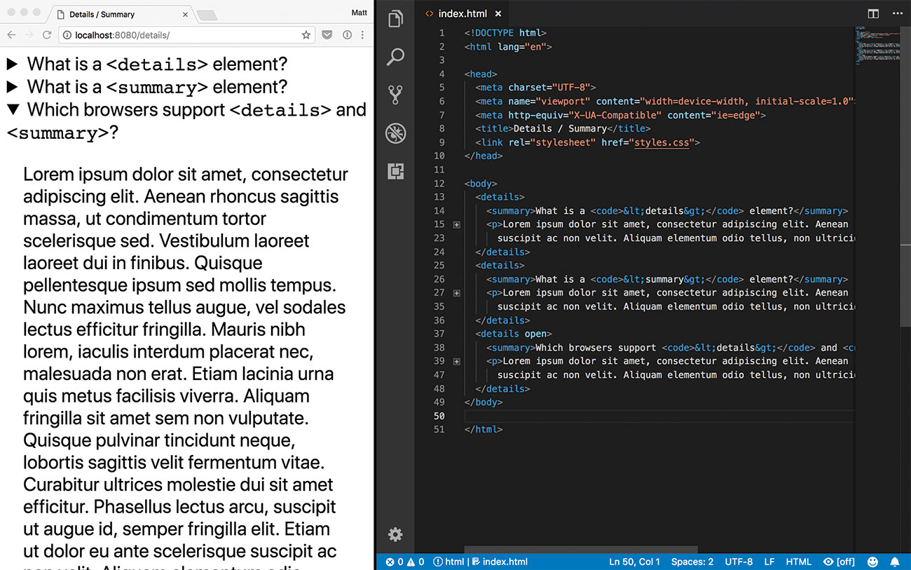
While many libraries exist to help solve this problem, it can also be achieved without any JavaScript at all. Content can be hidden inside a <details> element and therefore be toggled visible when clicked.
<details open>
  <summary>Heading</summary>
  <p>Some extremely long content…</p>
</details>
Each <details> element denotes a single collapsible area. Any content inside that block will be hidden by default until the 'Details' heading is clicked.
Adding an open attribute will expand the block. This can also be triggered through JavaScript as a way to reveal certain information to the user, such as an answer to a specific question. Adding a <summary> to the top of the block will replace the default heading to the contents of that element. That heading then becomes interactive, which makes the contents inside keyboard accessible.
While it can have almost any value, adding other interactive or clickable elements such as <label> or <button> will override the collapsing behaviour and break the element. Multiple <details> elements can also be nested without issue. This could make it useful for nesting sub-links or hiding supplementary information within a block.
According to the specification, <details> should be limited to additional information or controls rather than anything considered important to read. In some instances, a more semantic element such as <dl> for key-value pairs may be more suitable.
Both <details> and <summary> are available in all browsers apart from Edge and IE. For these, information will display expanded by default, or a JavaScript fallback can be used.
03. <picture>
- Use it to: Respond to different viewports and serve specialised content
- Read the <picture> web docs
When images need to be responsive, sometimes it isn’t enough simply to resize an image at certain breakpoints. On larger screens, the image can show as distorted and blocky but on smaller screens it could result in downloading a much larger image than is required.
Where images are used for informational purposes, it may make more sense to show an image adapted especially for a certain screen size or type. For example, larger screens may benefit from a fully annotated diagram, while smaller screens can get away with using coloured labels instead.
<picture>
  <source srcset="paris.webp" media="(max-aspect-ratio: 2/3)" type="image/webp">
  <img src="paris.png” alt="Eiffel Tower"/>
</picture>
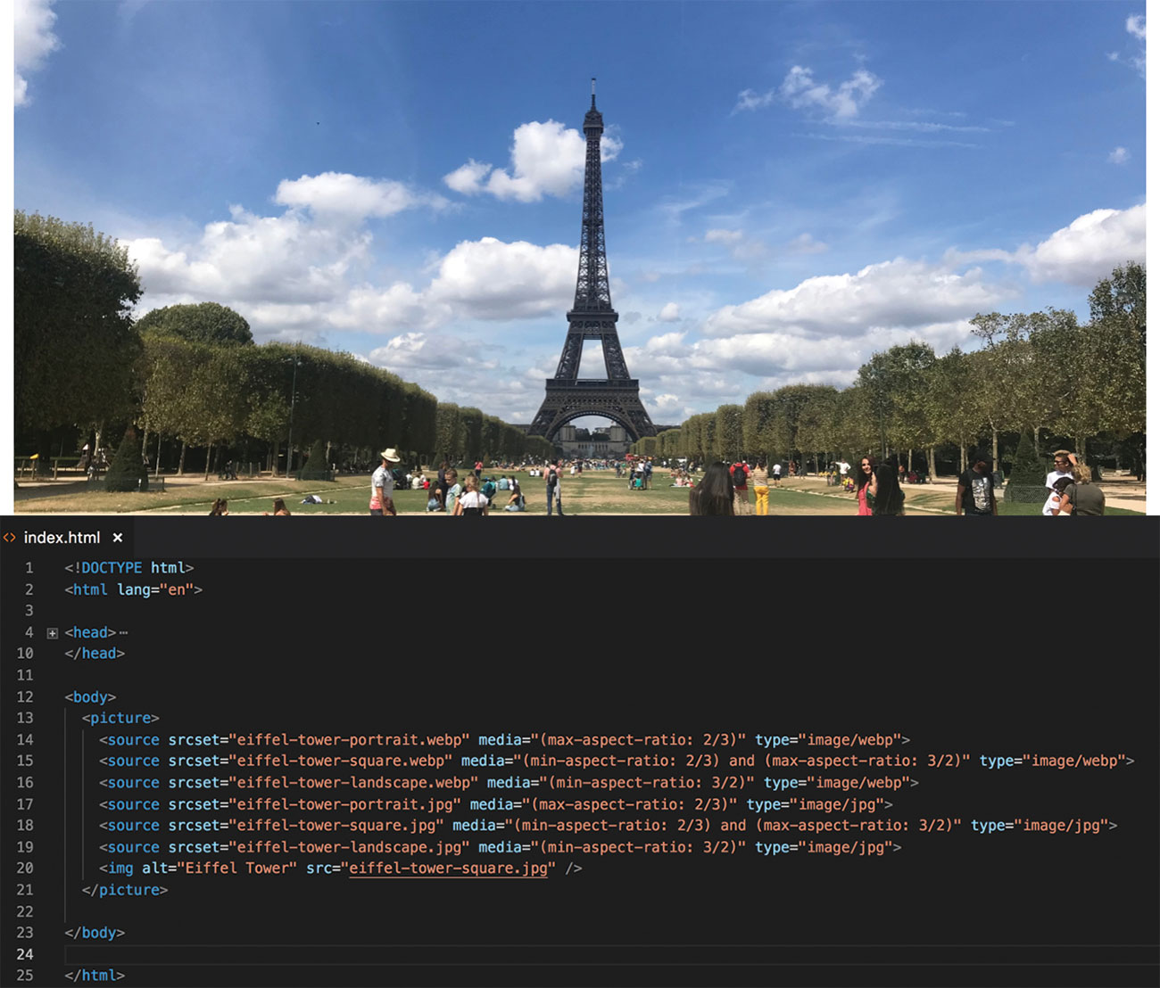
The <picture> element allows developers to define different sources for the same image. Based on the attributes passed to those sources, the browser determines which image to download and use.
Each source defines a potential image to display. These can then optionally have different attributes to define when to display that image. The media attribute works much like a media query in CSS, whereas type defines the MIME type of the file. If a browser doesn’t meet the media query, or does not understand the file type, it moves on to the next <source> in the list.
The block ends on a regular <img> element. This will display if none of the other images can be displayed based on the conditions, or for browsers that do not understand the <picture> element at all.
The element itself acts more as a container for the elements inside. By itself it has no visual appearance and will be distorted when the fallback image is used. Be sure to style this element for this use case.
Got a lot of images to store? You need roomy cloud storage.
<img srcset="paris-160.jpg 160w, paris-320.jpg 320w" sizes="80w" src="paris-80.jpg"/>The <picture> element is best used in diagrams and informational images rather than simply supplying different resolution photos based on width. For that, use a regular IMG with a srcset attribute. Using these hints, the browser can then decide which image to display.
04. Web Components
- Use it to: Create custom HTML tags
- Read the Mozilla Web Components notes
The introduction of HTML5 in 2014 brought with it lots of useful elements to browsers. Special components like progress bars used to mean misusing <div> elements in order to achieve the right visuals. These features are now native to the browser and elements like <progress> can be added where needed without having to worry too much about the inner workings.
Thankfully, new web standards have been in development for some time to allow developers to make their own elements as part of the platform. Web Components are a set of specifications that let developers create their own custom HTML tags and use them anywhere on a webpage. As long as they are registered using JavaScript, they are just as capable as any other element.
Building a Web Component uses three different specifications in the browser to construct, configure and generate their inner workings. Let’s take a look at them.
Custom elements
The most important feature of web components are the use of custom elements. These allow developers to use their own tag to render something specific to the browser wherever it appears on a page.
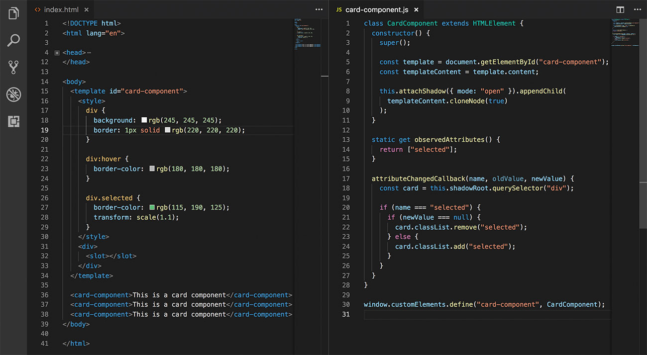
Each one is an ES2015 class that defines its behaviour, extending from an existing HTML element. These can contain any methods required for the operation of the component, but must use a constructor in order to set up any visuals or interactive elements such as event handlers.
In order to behave like a native element, it is important that elements react to external changes. Every custom element can tap into callbacks, such as connectedCallback or attributeChangedCallback, to detect when an element needs to update.
The customElements window property will allow an element to be registered with the browser. Until it is registered, a custom element will be treated like any other unknown tag so it is important to design its behaviour with progressive enhancement in mind.
The shadow DOM
The Document Object Model – or DOM – represents each page as a set of connected elements. The shadow DOM is a hidden subset of further connections within a specific element of that DOM. Nothing inside the shadow DOM can affect anything outside.
For example, a page may have a <video> element in its DOM, but the shadow DOM inside <video> houses the internal controls such as the play button and volume slider.
While this behaviour has been in browsers for a while, the shadow DOM API allows developers to create their own. When used together with custom elements, they allow a full range of visuals to be displayed without worrying about affecting other parts of the page.
HTML templates
Page structure elements are often repeated to make sure each one works the same as the last. To save time and reduce errors, developers can opt to make a function to generate HTML for an element, adjusting the contents as they go.
HTML templates bring that ability natively to browsers through use of the <template> element. The contents of a template stay inert and invisible, but JavaScript can access it like regular content without issue.
Extracting the contents of a template is as simple as selecting the template and getting its content property. It can then be used wherever needed and acts just like any other HTML content. All three specifications are designed to work together. A template can be used with the shadow DOM to produce the visuals for a custom element.
Cross-browser support
The best part about Web Components is that the support is almost there in every
major browser. At the time of writing the latest versions of Chrome, Safari and Opera all support all Web Component specifications.
As it stands, Firefox and Edge are both lacking full support for custom elements and shadow DOM, but polyfills are available to work in these browsers while these features are being developed.
Mobile browsers have a wider level of support, with all features being available in the latest versions of Chrome for Android, Samsung Internet and iOS Safari. You'll find updates on support and any new features here.
05. <input>
- Use it to: Give instant feedback on form inputs
- Read the <input> web docs
Even the simplest of forms need some kind of validation. A contact form, for example, needs to check if a name and email have been filled out. Users now expect instant feedback on what has been entered. This used to be the role of JavaScript.
If a website needed a date entry JavaScript would need to check a text value looked like a date. This required the developer knowing all the different formats that could be valid and implementing that check correctly.
All of that changed with HTML5. The new specification introduced a host of new input types that could be added as needed without the need for scripted validation. When given a certain type, a browser renders an appropriate interface geared towards that input. On touchscreen devices, this also meant a contextual keyboard that merited itself to the input in question.
If used within a form, the validation occurs on submission. Browsers will show an inline error message for each field that is wrong, so users know what is happening. An invalid form will not submit.
Colour inputs
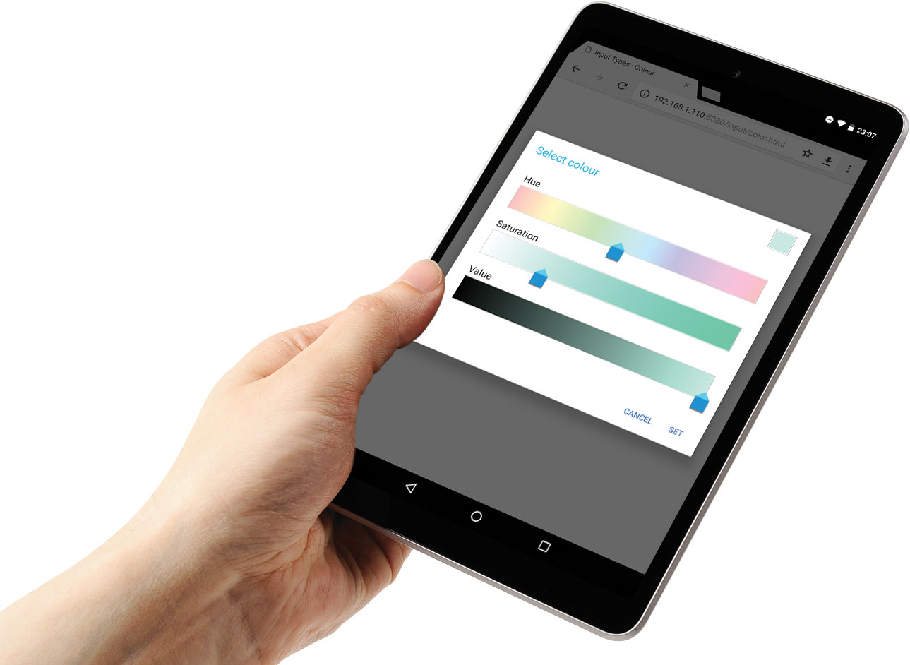
<input type="color" />In forms where colour input is required, the color type provides either a colour picker or a hexadecimal text input to provide a value. The display of the colour picker can vary depending on the browser, which may only supply a limited subset of colours by default.
A site using this input should provide an alternative method of input in this case. A default colour can be applied by supplying a value to the field, but this must be a valid hex colour and not a CSS colour name or function like linear-gradient. If an invalid colour is added, it will default to black.
Number inputs
<input type="number" min="0" max="99" />When a form requires a number, it makes sense to use an input specialised for that purpose. A number field get automatic validation to be sure the value is numerical. Most modern browsers will also render stepper buttons, which allow the user to increment or decrement the value inline. On a touchscreen device, the keyboard will update to show numbers by default and may even allow users to swipe to increase and decrease the value.
Extra attributes on the input can limit the value being entered. For example, an age field may have a min attribute to stop a negative value being added.
<input type="range" min="0" max="10" />When a specific value is not necessary, a range input may be more useful. In this case, browsers can render a more appropriate slider to allow the user to select a value more easily. These are useful for simple components such as volume sliders.
Modes on any input
While these type inputs are great for their typical use case, it can become a hindrance for others. For example, a credit card number is numeric but does not need the increment and decrement behaviour that the number type provides.
<input inputmode="numeric" pattern="[0-9]*" />Most forms would fall back to regular text input in this case and use a pattern attribute to define what is required. This requires the developer to know the right pattern for their input, which can cause a similar issue to before. An inputmode attribute is coming to browsers that aims to tackle this issue. It hints to the browser what kind of interface would help the user add data to this field. Having a value of none will ensure no virtual keyboard is displayed, allowing for a custom keyboard within the page itself.
Server validation
As great as these input types are, they are not without flaws. Browsers may not support a specific type or can have unexpected valid inputs, such as ‘e’ for number inputs. At the very least, a user can still edit the HTML on a page and remove validation altogether. It is important that any data submitted to a server is also validated on that side to avoid any issues. Include client-side validation to help.
Next page: 13 more top HTML APIs

Matt Crouch is a front end developer who uses his knowledge of React, GraphQL and Styled Components to build online platforms for award-winning startups across the UK. He has written a range of articles and tutorials for net and Web Designer magazines covering the latest and greatest web development tools and technologies.
