How to create a retro logo with Affinity Designer
Add a touch of vintage style to your logo designs with this easy-to-follow tutorial.
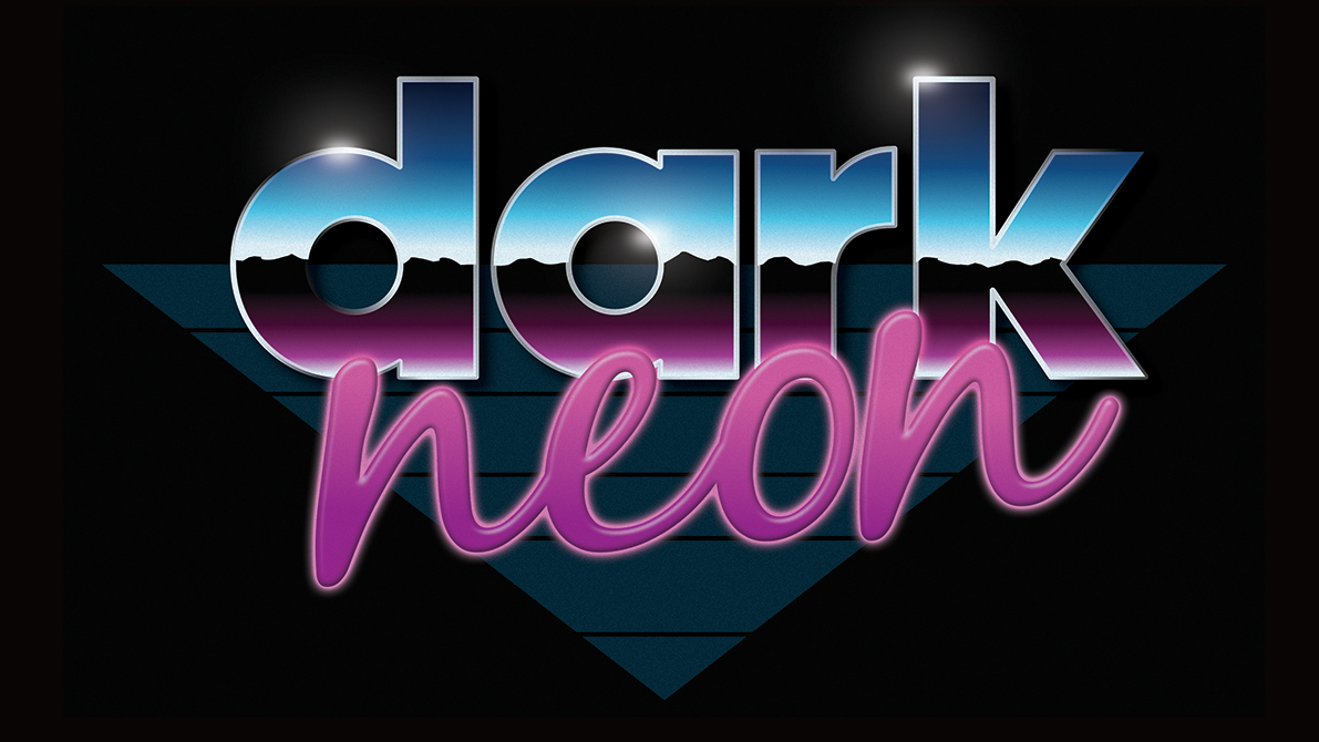
Easy to use and with a number of creative tools under its belt, Affinity Designer is a great alternative to Adobe Illustrator. So, if you're working on a new logo design, for example, it has everything you need to create a unique and striking design.
In this tutorial, I will show you how to go retro, using gradients and layer effects to create a 1980s-style logotype in Affinity Designer. Need the perfect font? See our pick of top free script fonts.
01. Set up your base text
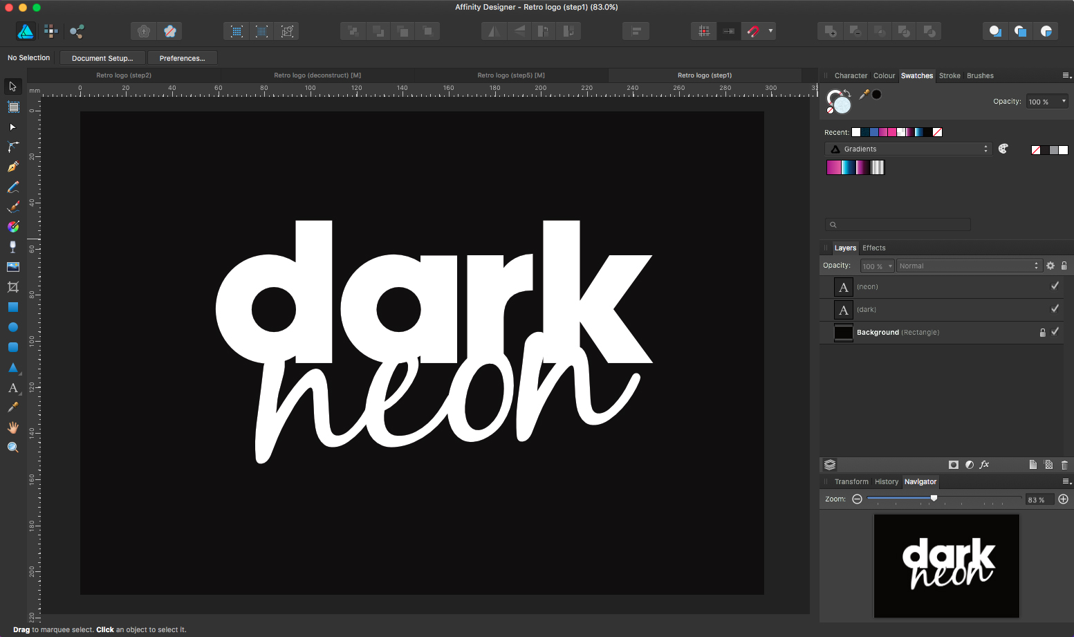
First, create a new document (Cmd+N) giving yourself enough space for your typography. Select the rectangle tool (M) and draw in a black background. The Fill and Stroke tool can be found top right of the interface. Select the Artistic Text tool (T) and set your copy. Type a decent slab sans serif and script font to get the 80s feel (check out our best free fonts for designers post for inspiration).
Article continues below02. Add a gradient
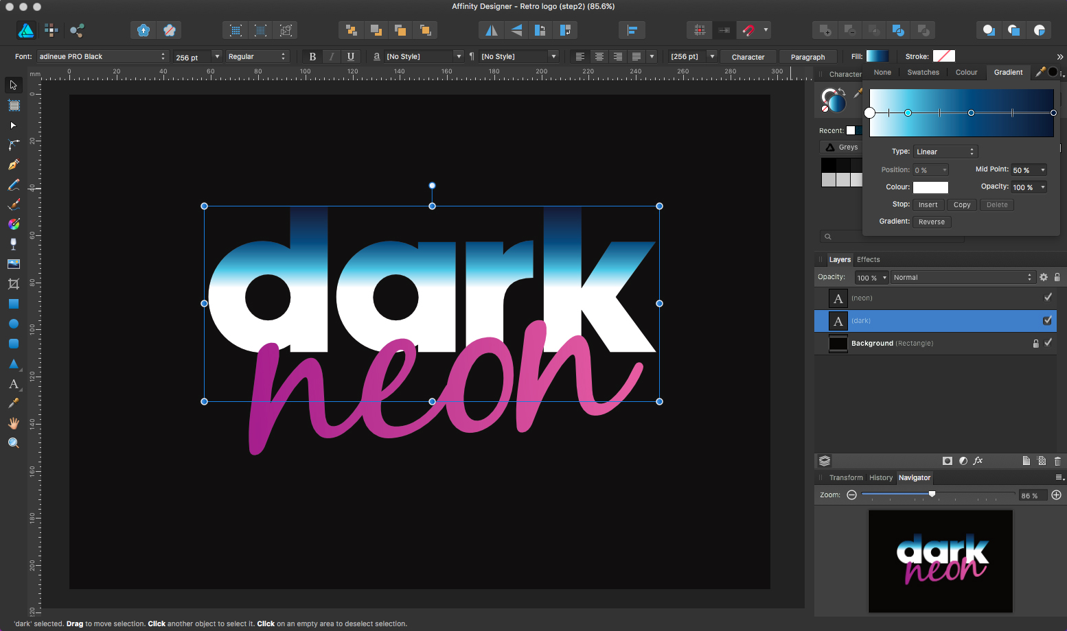
To get this 80s look, the majority of the design is put together with gradients. In this case, I've used: one for the sky, one for the horizon, one for the outline, and one for the neon copy. To create gradients in Designer, it's easy. Simply select your object and click the Fill tool, and a window will appear below, then select the Gradient tab. To add more colours to your gradient just double click along the gradient line.
03. Customise the gradient
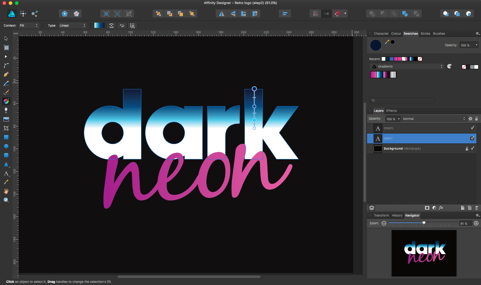
To save your gradient, click the Swatch tab below the gradient window. Next to the drop-down colour menu there's a small palette icon. Click this. To change the direction of your gradient, select the Fill tool (G), this will bring up a guide that'll allow you to move it around.
04. Draw in some shapes
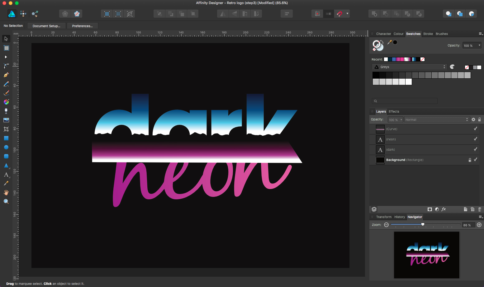
For the horizon, select the Pen tool (p) and draw a ragged line across the middle of the text. Create a shape that fills the bottom half of the type, then add your purple gradient. Next, simply cut (Cmd+X), make sure your Text has been selected, then paste inside (Cmd+Alt+V). If you need to move this shape inside the type, click the arrow next to the layer in the layer window, and the shape to select and move should open below.
05. Add a sheen
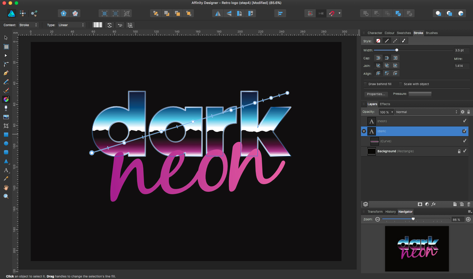
To add a gradient to the stroke of the type, click the Stroke tool, in the top right of the interface, then add the alternating black and white outline gradient. To change the direction of the outline gradient, select the fill tool (G), to get to the outline. In the top-left there's a Context drop-down menu, change this from Fill to Stroke. For the effect, we need to go from corner to corner to give the look of a sheen.
Sign up to Creative Bloq's daily newsletter, which brings you the latest news and inspiration from the worlds of art, design and technology.
06. Make the neon glow
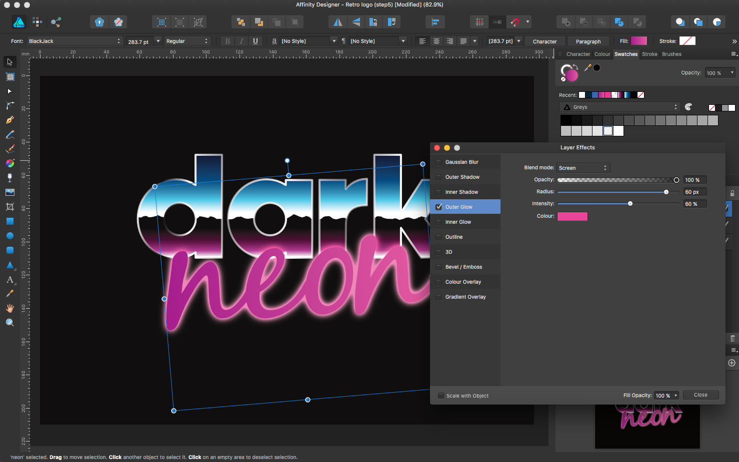
For the neon part, add a dark pink to a light pink gradient, then select the FX icon at the bottom of the Layers palette. This will bring up your layer effects window. Here's where we're gong to add an outer glow and the bevel/emboss effect. For the outer glow, keep the blend mode on screen and alter the 'radius and intensity' to get the desired effect. Giving it a mid pink colour will help finish off the effect.
07. Adjust the colours
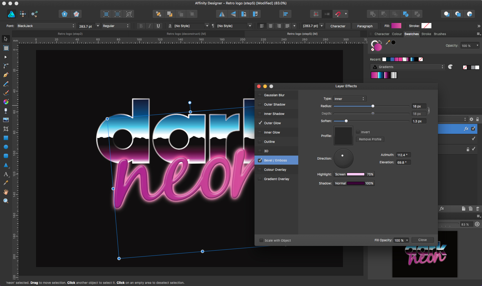
Once you've ticked the bevel/emboss box, make sure the bevel type is set to 'inner'. Altering the 'radius and soften' will give you the edge while tweaking the light direction, and 'highlight and show colour' should add the details. I've given the highlight an off pink/white tone, and the shadow a deep purple.
08. Decorate with flares
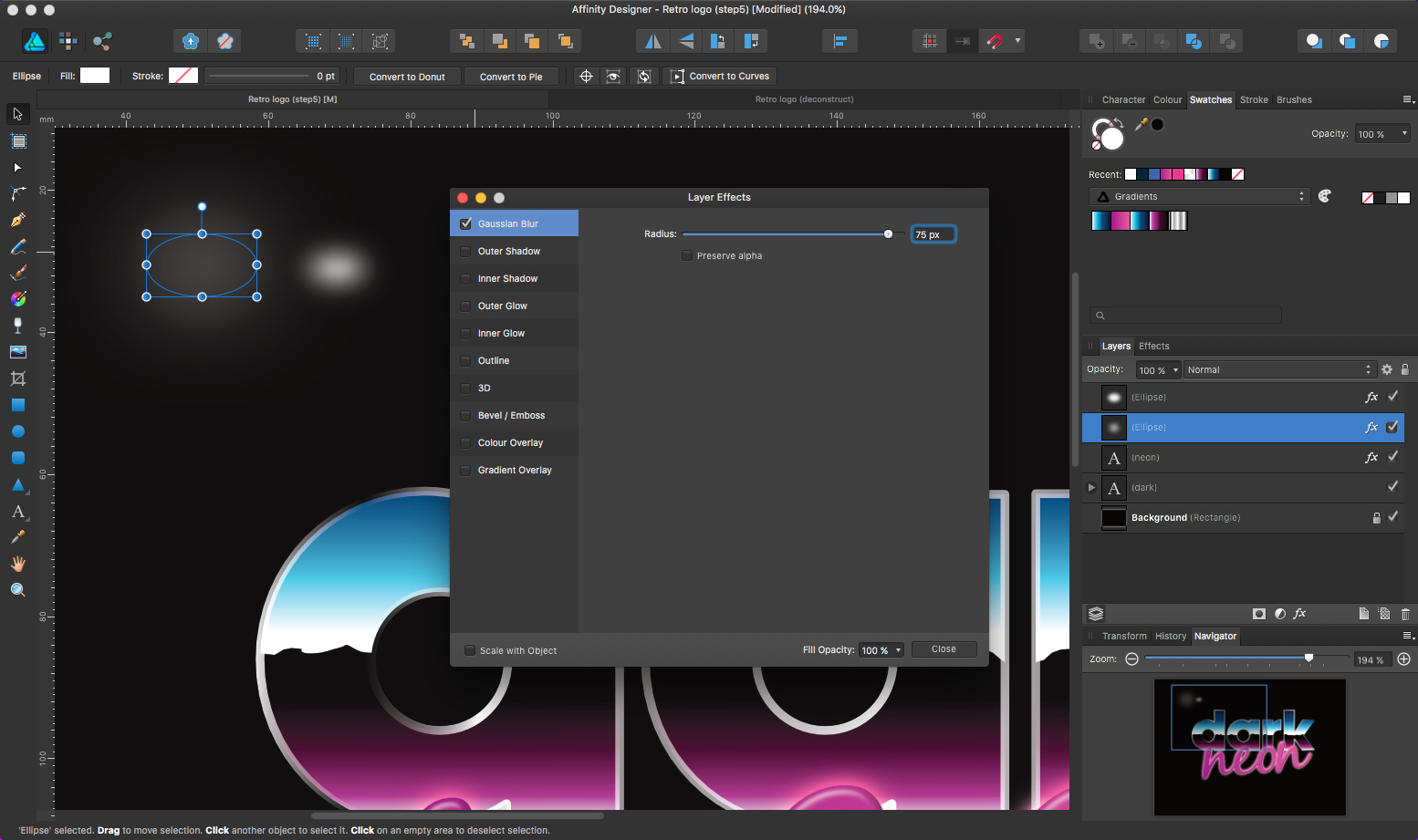
For the flares, draw two ellipses with the Ellipses tool (M), one bigger than the other. Next add a Gaussian blur layer effect with the FX icon, making the bigger one more blurred that the smaller one. Using the Shift key, select them both and place them on top of each other. It's a good idea to group (Cmd+G) them at this point. Copy (Cmd+C) as many as you need and move them to the white parts of the outline to give the sheen effect.
09. Create a shape to accompany the text
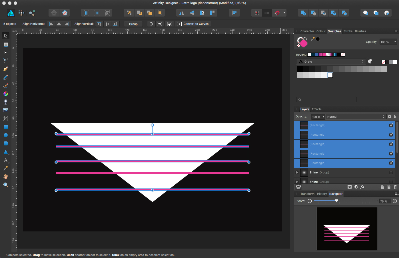
Selecting the Triangle tool, draw a triangle and use middle anchor point to rotate it 180 degrees. Once done, draw five rectangles (M) evenly spacing them apart and combine them together with the Add icon, a blue circle and square together in the top right corner of the interface. Then selecting both the triangle and the rectangle, subtract them using the icon next to the Add icon. Once filled with a dark blue, you might need to move the shape behind the main logo. You can do this using (CmD+[) and (Cmd+]) to move it a layer back and forth.
10. Overlay some noise
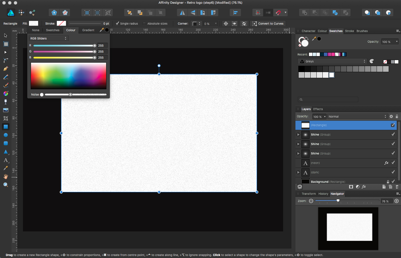
To add the finishing touches, we'll apply some noise. The easiest way of doing this is to draw a rectangle over the whole logo and fill with white. When you click the fill tool (in this case to the left), select the Colour tab. At the bottom, there's an opacity slider, if you click the small circle next to it, it'll change to a noise slider. Slide this to add as much noise as you want. All you need to do now it change the layer blend mode from normal to Multiply. Job done.
Related articles:
