
Being asked to paint a bad-ass Fairy Queen by none other than my favourite magazine, ImagineFX, got me very excited, and slightly nervous. Because this was my first magazine cover I wanted to be as prepared as possible before beginning to paint. Good reference can spark a whole bunch of ideas, so I started my hunt by looking up different films and art books, as well as old paintings of real queens. I draw bits and pieces from my gathered references when painting my thumbnails, but also make sure not to get too reliant on it, because this can limit my creativity.
I’ve painted many fantasy females before, so I felt comfortable tackling this theme. I also consciously didn’t stray too far from my comfort zone: I wanted to avoid the risk of struggling while being under a very tight deadline, while also having a full-time job and thus little free time. That said, I hope that you find this workshop and Photoshop tutorial helpful.
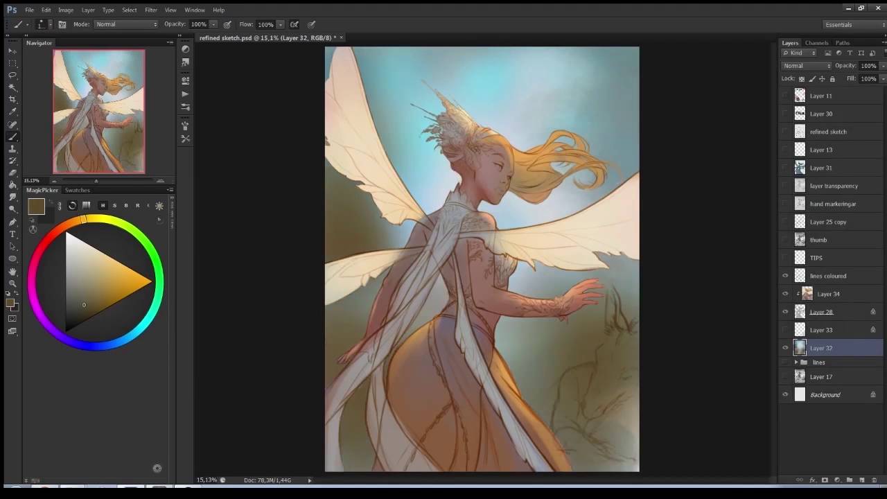
01. Sketching quick ideas

I start by fleshing out some quick and dirty ideas. I’m not being too precious about keeping things neat and pretty. At this stage it’s more important for me to capture the general feel and look of the character, as well as figuring out the composition. I’m thinking about the pose and the best viewing angles to present Titania, to make her look as regal and powerful as possible, yet still have a definite feminine look to her.
02. Deciding how to progress

I would normally go in with colour and produce a rough colour thumbnail now. However, I feel that it would be easier to have a more refined sketch to work underneath, during the later painting stages. I set the thumbnail layer to 30 per cent Opacity, and on a layer above I start outlining with a slightly oval, Soft brush with Opacity and Size set to Pen Pressure so that I can easily control the thickness and value of my lines.
03. Keeping it simple

I don’t want to get too hung up on the line art, because most of it isn’t going to be in the final painting. I try to keep the lines rough and don’t worry about line variation. This is all about me having a good, strong guide to work under later on. I use this stage to figure out the anatomy and the design of the character and try to get that as close as possible to the final design.
04. Almost time to colour

Having the finished sketch on a separate layer, I block in Titania’s silhouette on a layer underneath with an opaque brush in a simple grey tone. I then lock the grey layer (by pressing /). This is a very useful shortcut to quickly lock the pixels on a layer so you can’t paint outside of them. Using a Soft Round brush, I can now finally start blocking in the colours.
05. Colour thumbnails

I now have two layers: the background layer and the silhouette of Titania. I start colouring them in with a Soft Round brush, alternating between the two. One of the best things you can do when going into the colour stage is to decide what mood you want to convey. This will in turn help you with your colour choices. ImagineFX asks for an autumnal colour scheme.
06. First steps of rendering

I start on Titania’s face. First, however, I need to decide what lighting I’m going for. I want the image to be brightly lit, with few shadows, so that the colours are vibrant. I begin by laying down a basic coating of shadow and gradually build up the skin tones on top, building form with shadow. I make good use of layer blending modes such as Overlay and Multiply at this stage.
07. Painting hair

I think in terms of shape when painting hair. I always start by putting down the big shape of the body of hair in a flat colour, then sculpt into that using smaller shapes, remembering the design principles of large-medium-small. My way of painting hair is pretty stylised, so I’m not fussed about making it look realistic, so long as it has enough detail to resemble hair.
08. Rendering fabric

The fabric in this painting is free flowing and moving (mostly) in one direction. There are only two points where it attaches to Titania: her hips and necklace. Those points are where the fabric will bunch up into folds. I paint in the folds using a semi-Soft, fuzzy brush that’s easy to blend with, using subtle shadows so that the vibrancy of colour remains.
09. Adding gold details

I refine different elements like the wings, dress folds and Titania’s hair under the straps. I’m not completely sold on the crown and hair accessory design, however. The flowers in her hair and crown feel like something Titania would wear at spring, not autumn, so I rearrange the straps that support her updo, and then revamp the crown to fit the autumn theme.
10. Foreground elements

Looking at the image after having established the bulk of it, things are feeling a bit flat. I want to push the depth of the image further, adding something to it to better invite the viewer into the image. I play with a bunch of different ideas before finally settling on having fabric flowing into the image from the foreground. I then go to Filter>Blur>Gaussian Blur and quickly blur the foreground fabric. This helps push the depth even further.
11. The magic of a Multiply layer

To push the depth of the image even further, I create a clipping mask on top of Titania. I set the layer blending mode to Multiply and then use my semi-Soft brush to paint in a leafy cast shadow on her skirt and flowing back fabric. Then I go in with a Color Dodge and an Overlay layer to add glow on the lit parts around the cast shadow.
12. Extreme colour makeover

The ImagineFX team asks me to revamp the background colours. I really like their suggestion of using purples instead of autumny green-orange for the background, so I quickly change the colour scheme by using the Hue/Saturation and Selective Color features in Photoshop. I also add a much brighter light behind Titania, which sets her off against the background.
13. Apply Iris Blur

Iris Blur is an awesome tool you can use to quickly give more depth to an image. You can find this under Filter>Blur>Iris Blur. This tool enables you to control the strength of the blur and to shape the area of the blur by playing with the different points. I use this tool on only the background layer and add a slight blur effect to it to further push Titania from the background.
14. Final touches

To better tie in Titania with the new background colours, I add a touch of pinks and purples in a few areas. I also feel that adding in blowing leaves helps create more depth and movement. I finish off Titania’s hair by breaking up the big shapes with strands of hair, and keep refining and adding a few more details, like bracelets and sparkles blowing in the wind.
For a more in depth look at how I created this image, see the video below. You can also download the brushes and tools I used to make this image in the ImagineFX resource page.
This article was originally published in ImagineFX magazine issue 138. Buy it here.
