Prototype a floating action button in Pixate
Use Google’s interaction design tool to build a floating action button with a Material Design look and feel.
Pixate allows you to quickly prototype interactive mobile mockups that can be previewed on Android and iOS devices. In this tutorial, we're going to use it to build a floating action button (FAB) including sub-options. We'll explore different techniques and settings in Pixate, such as transitions and conditions.
FABs are used to promote action and attract a user's attention. Generally an application's main functions are accessed through a FAB. Our FAB is going to be in a Material Design style, which lends itself to beautiful, natural-feeling interfaces. Implementing Material Design elements is simple if you use Google's guidelines for reference.
Before diving in, it's important to understand that Pixate only uses images, so you'll want to have the assets for your individual project ready and exported to the necessary screen density. The images used in this tutorial are pulled directly from the Material Design sticker sheet. This ensures the lighting, shadows, size and overall feel of the elements align with the guidelines. You can change the device you're prototyping for by selecting the appropriate option from the flyout menu at the centre of the canvas menu bar.
Article continues belowYou'll also need the Pixate mobile app for Android or iOS. It doesn't matter what device you're previewing on, as the app will automatically scale the prototype to fit your device's screen.
Find all the files you'll need for this tutorial here.
01. Get started
Open Pixate, and from the Welcome screen click on 'Create a new prototype'. Select your desired save location when prompted, and name your file.
Once you click Save, you'll be asked to pick the device you're prototyping for. This doesn't need to be the device you're previewing on – for this example, we're choosing the Nexus 5. You should now be looking at a blank canvas.
Sign up to Creative Bloq's daily newsletter, which brings you the latest news and inspiration from the worlds of art, design and technology.
02. Import your images
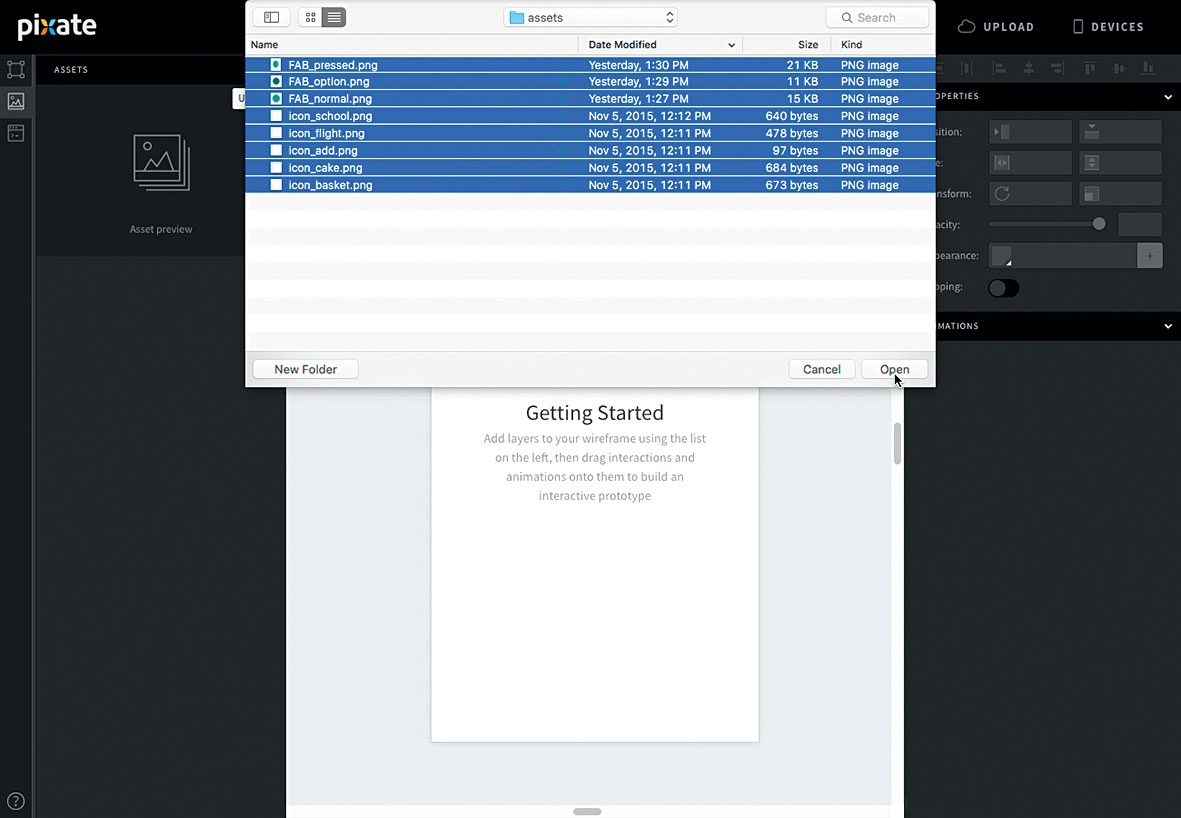
To start, we want to import the images for this tutorial. You'll find all the assets I've used here (these are all for a 3X prototype). In the upper left-hand corner of the screen, click on the middle tab and then click the '+' button. Navigate to the folder where your assets are, select all of them and click Open.
03. Add and position
Now we want to add and position the FAB and icon images. In Pixate, when you drag assets to the canvas, they'll be created as a layer and that layer's name will be the file name of the image you uploaded. This is how I'll refer to the layers throughout this tutorial.
Drag 'FAB_normal' to the canvas and position the layer where you want the FAB to sit. Also drag the 'icon_add' asset and centre it on the FAB. When you import 'icon_add' and try to snap it to the FAB, it will snap lower than the centre point. To correct this, hit the up arrow on your keyboard three times. This will nudge it to the visual centre.
04. Add your FAB instances
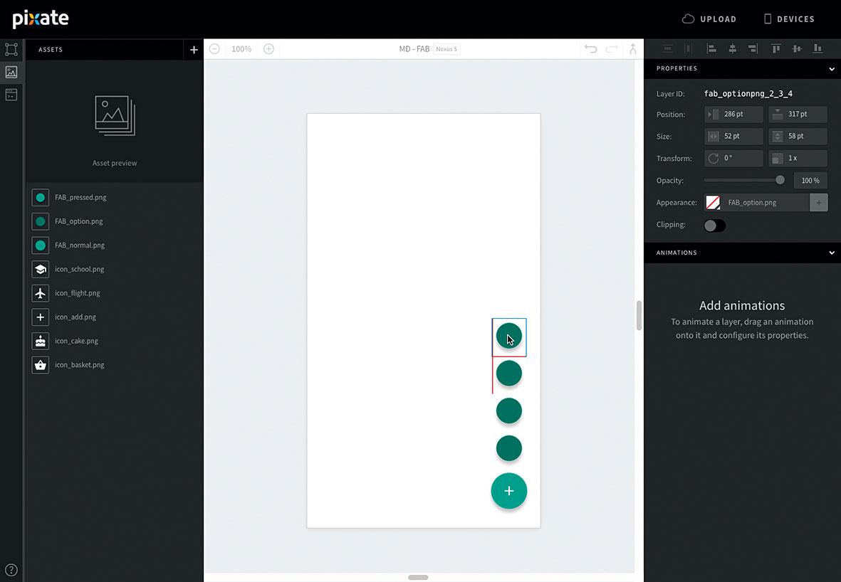
Now add four instances of 'FAB_option' to the canvas. Drag the first so the bottom border snaps to the top of 'FAB_normal', and is vertically centre-aligned.
Align the remaining three 'FAB_option' layers so they're vertically centre-aligned and sitting on top of one another. This is how the FAB menu will appear when it's expanded.
05. Add the option icons
Add all the option icons ('icon_school', 'icon_flight', 'icon_cake' and 'icon_basket') to the canvas and align each of them with an instance of the 'FAB_option' button. Again, because the shadow is included in the image file, the centre of the circle is not the centre of the layer. You'll need to bump up each of the icons about three points so they appear centred.
06. Add the pressed FAB
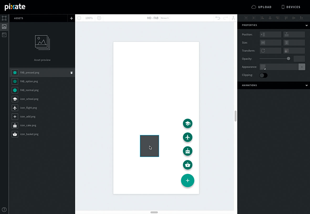
Finally, add 'FAB_pressed' to the canvas and place it on top of 'FAB_normal'. Nudge 'FAB_pressed' so the edges of the circle match 'FAB_normal'. This is about three points down from centre-snapped alignment.
07. Nesting layers
Nesting layers inside one another creates a parent/child relationship. This allows you to apply animations to a group of layers and have them animate as one unit. It is achieved by dragging and dropping a layer onto another in the layer list (in the upper left-hand corner of the screen).
08. Nest option icon layers
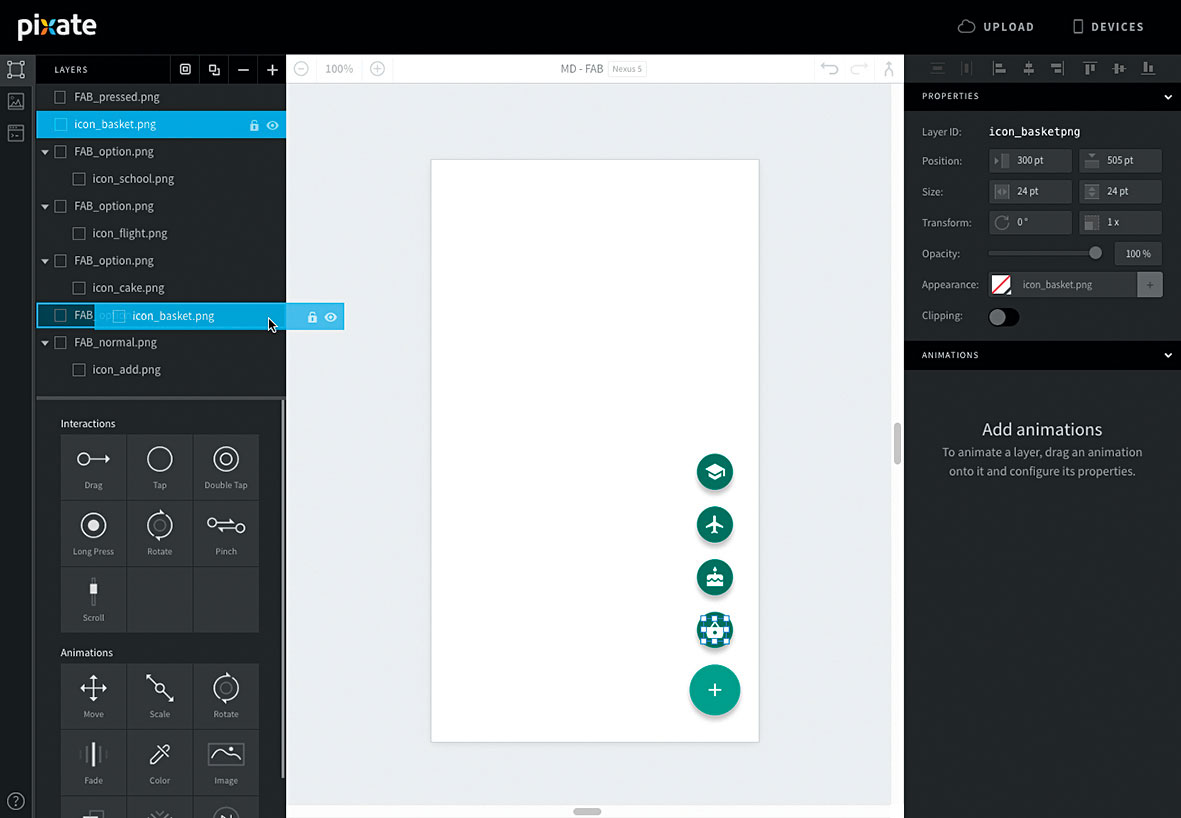
Nest the option icon layers into their respective button layers. For example, nest 'icon_school' into its corresponding 'FAB_option' by dragging the 'icon_school' layer listing onto the option's layer listing.
09. Rinse and repear
Repeat this for all the menu options, making sure you're nesting the icons under the correct button option. Feel free to collapse all of the option layers to simplify the layer list view.
10. Adjust properties
Reorder 'FAB_pressed' so it sits below 'icon_add' but above 'FAB_normal'. Now select 'icon_add' and click the '+' at the top of the layer list. In the layer Properties panel (in the upper-right hand corner of the screen) change the width and height values to match 'FAB_pressed' (80 x 92). This will ensure the interactive area encompasses the whole FAB.
11. Add a Tap interaction
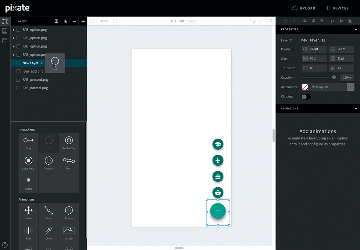
While in the Properties panel, set the colour swatch to transparent and place the layer so it's centre-aligned with 'FAB_pressed'. Then drag a Tap interaction on to the layer in the list. Hold down cmd and select all the 'FAB_option' layers as well as 'FAB_pressed', then set Opacity to 0. Don't change the opacity of the icon layers! Since you're adjusting the parent layers, the icon layers' opacity is inherited from them.
12. Rotate the icon
Let's make our FAB icon rotate on tap. In Pixate, animations can refer to the state of another layer. This lets you set an animation to play once a condition is met. We want to rotate 'icon_add' so we can base other animations' conditions on it. Drag a Rotate animation onto 'icon_add' and set the following options. Based On: Tap layer and Tap, IF: icon_addpng.rotation == 0, Rotate to: -225, Easing Curve: ease out and cubic, Duration: 0.3.
13. Reverse condition
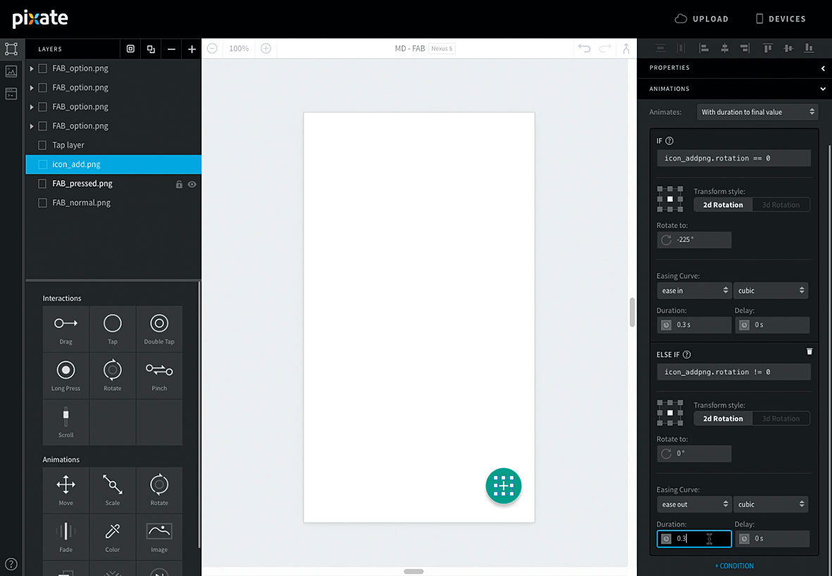
Click on the '+CONDITION' link at the bottom of the animation and set the following: ELSE IF: icon_addpng.rotation != 0, Rotate to: 0, Easing Curve: ease out and cubic, Duration: 0.3.
14. Add a fade-in
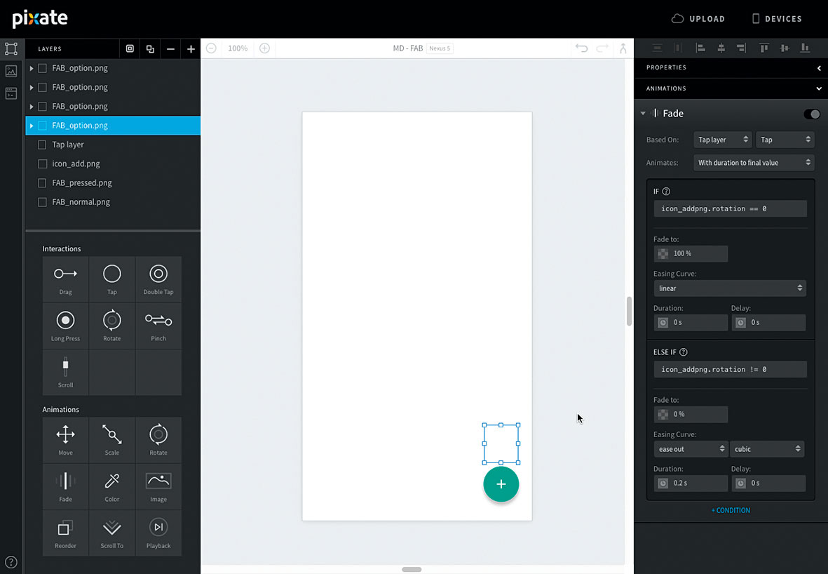
We want the FAB options to fade in on tap. So we can see what we're doing, we'll add the fade in on the option buttons first. Drag a Fade animation to an option button and set the following.
Based On: Tap layer and Tap, IF: icon_addpng.rotation == 0, Fade to: 100, Duration: 0. Then '+CONDITION' and ELSE IF: icon_addpng.rotation != 0 , Fade to: 0, Easing Curve: ease out and cubic. Do this for each option button.
15. Scale things down
In the Material Design guidelines, options scale up when the FAB is tapped. Since our options start at full scale, we want to scale them down when the prototype loads.
Drag a Scale animation onto an option button and set the following options. Based On: *SCREEN* and Loaded, Scale X and Scale Y:0, and Duration: 0. Select the bottom-middle anchor in the anchor grid. Do this for each option button.
16. Animation options
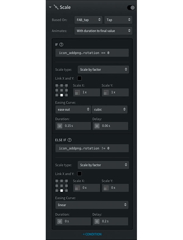
Now let's set the options to expand when the FAB is tapped. Drag a Scale animation onto the topmost button and set the options as shown in the screenshot above.
17. Delay the scales
When adding this animation to the rest of the option buttons, subtract 0.02 from IF's Delay property. The second option from the top should have a delay of 0.04, the third will have a delay of 0.02, and the last 0.0. Now the options will scale one after another.
18. More animation options
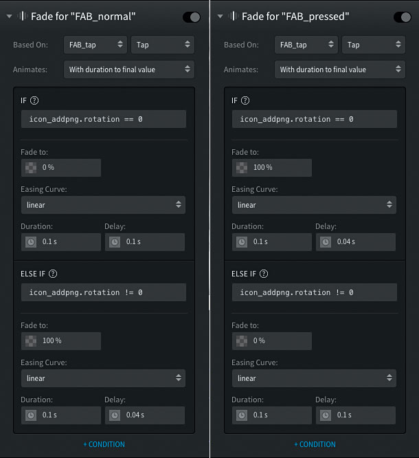
Finally, we need to emulate the FAB being pressed. In Material Design, the shadow of the FAB is shifted down and blurred to give the effect of the button moving towards the user when tapped. This is a bit tricky to initially figure out, since it requires us to crossfade two separate layers.
Drag a Fade animation onto 'FAB_normal' and 'FAB_pressed' and apply the settings shown in the screenshot.
19. Ready to use
You can now use this file for any of your prototypes. By clicking the button at the top right of the canvas, you can select a Pixate file to merge into the one that is currently open. This lets you add components like this FAB to prototypes that you are already working on.
20. Customise!
Import your own icons and alter the colours as you see fit. With the steps here you can add additional FAB options and even hook up subsequent taps and animations to the option buttons.
Keep an eye out for more Pixate Material Design components from Google, and design away!
This article originally appeared in net magazine issue 281; buy it here.
