12 HTML5 tricks for mobile
Unknown to many web designers and developers, there are several hacks to improve the mobile experience. Maximiliano Firtman talks through his top tips.
The mobile web is a strange world: dozens of browsers, versions, screen sizes, undocumented features, bugs and new problems. That is why, in some situations, we need to break some limits to accomplish our objectives. If you learn at least three new tricks while reading this article, my goal will be accomplished. To test these tricks on your mobile device just open this test suite.
01. Creating a fullscreen experience
On Android Browser – the default browser on Android up to 4.3, and different to Chrome – the only solution is to have a document with a height at least equal to the device's height, and to use the following snippet to hide the URL bar.
window.addEventListener("load", function() { window. scrollTo(0, 0); });Google Maps uses this trick to emulate a fullscreen experience on this browser. When used carefully, you can also reduce the possibility of a URL bar reappearance by preventing the browser from managing the touch scroll:
Article continues belowdocument.addEventListener("touchmove", function(e) { e.preventDefault() });In Google Chrome, Firefox OS, Firefox for Android, BlackBerry OS 10 and Amazon Silk (the browser developed for Kindle Fire) we can use the standard Fullscreen API from the W3C.
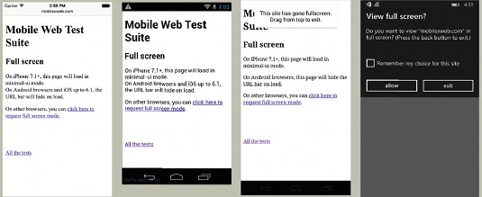
As you should already know, some browsers still work with prefixes, so for this we need a multivendor code:
var body = document.documentElement;
if (body.requestFullscreen) {
  body.requestFullscreen();
} else if (body.webkitrequestFullscreen) {
  body.webkitrequestFullscreen();
} else if (body.mozrequestFullscreen) {
  body.mozrequestFullscreen();
} else if (body.msrequestFullscreen) {
  body.msrequestFullscreen();
}
The only important restriction to remember when requesting fullscreen mode is that we should do it only after a user's interaction – for example, activated by a touch operation.
Apple offers a solution for iPhone since iOS 7.1, using a special attribute of the viewport meta tag requesting a minimal UI from Safari on portrait and no UI at all on landscape. This mode is not available on iPad.
Sign up to Creative Bloq's daily newsletter, which brings you the latest news and inspiration from the worlds of art, design and technology.
To enable the minimal UI mode, just use:
<meta name="viewport" content="width=devicewidth, minimal-ui">When this mode is enabled, you need to take some special care around touchable areas near the edges.
To detect if the minimal UI mode is enabled:
@media (device-height: 568px) and (height: 529px),
(device-height: 480px) and (height: 441px) {
/* minimal-ui is active */
}
02. Creating a web app on the home screen
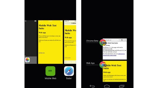
On iOS – for both iPhones and iPads – and Chrome on Android we can have a fullscreen experience after the user has installed an icon on the home screen. The web app will run outside of the browser, even from a multitasking point of view. To enable this we need to add some meta tags:
<!-- for ios 7 style, multi-resolution icon of 152x152 -->
<meta name="apple-mobile-web-app-capable" content="yes">
<meta name="apple-mobile-web-app-status-barstyle" content="black-translucent">
<link rel="apple-touch-icon" href="icon-152.png">
<!-- for Chrome on Android, multi-resolution icon of 196x196 -->
<meta name="mobile-web-app-capable" content="yes">
<link rel="shortcut icon" sizes="196x196" href="icon-196.png">
On Firefox OS and Firefox for Android we can also create home screen web apps by creating a JSON manifest and using a JavaScript API. See the official documentation for examples.
03. High resolution Canvas
The Canvas API is a bitmap-based drawing interface that works as an image loaded from a file. Therefore, if you create a canvas with width=200 it will create a 200 real pixel image. On the document it will be drawn at a 200 CSS-pixel width, independent of the resolution.
That means that on an iPhone 5S, the 200 pixel image will be resized to 400 device pixels, and on a Nexus 5 device it will be resized to 600 device pixels – in both cases losing some of the resolution of your image. If you want to create a highresolution image, let's say double of the original, medium-resolution device, it's possible to use the following trick:
<canvas width="400" height="400" style="width: 200px; height: 200px"></canvas>
<script>
document.queryselector("canvas").getContext("2d").scale(2, 2);
</script>
Be aware that increasing the size of your canvas will also increase the memory used and the CPU required to create the drawings, so we should do it only when we are sure that we are dealing with a high-resolution device.
04. Truly numeric text field
I'm pretty sure you already know all the new HTML5 types for the input element, such as type=email , that trigger different virtual keyboards on touch devices. While on Android and Windows Phone you will get a fully numeric keypad when using type=number, you might not realise that on iOS you don't get exactly that.
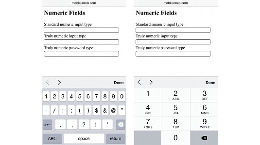
If you add a pattern="[0-9]*" attribute then you will get a truly numeric keypad in iOS as in other operating systems:
<input type="number" pattern="[0-9]*">You can also use this trick with type="password" to get a numeric keypad for a PIN text field.
<input type="password" pattern="[0-9]*">05. Responsive web design and Windows 8
If you are working with responsive websites, you might think that defining a mobile viewport meta tag and different breakpoints with CSS media queries is enough. However, there is one particular situation that needs a little more work: Windows 8.x with Internet Explorer that works in fullscreen mode (previously known as Metro mode).
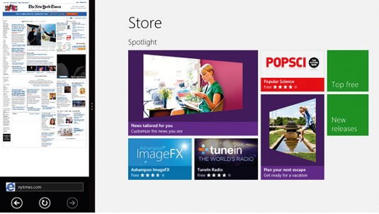
In Windows 8 and 8.1 a website opened in this browser can share the screen with other fullscreen mode apps, including the classic desktop. In that case, and when the available width is less than 1024 pixels, IE will apply a mobile behaviour that zooms out the website and does not apply your responsive code.
To solve this issue, we can use the CSS Viewport declaration on a media query, such as:
@media only screen and (max-width: 400px) {
  @-ms-viewport { width: 320px; }
}
06. Where is my date and time picker?
You were told that by using <input type=datetime> you get a date and time picker on most browsers. And it was true on mobile devices until iOS 7 and Chrome 26 for Android. Since those versions, that kind of form control renders as just the default text fields.
However, you may not be aware that the date and time picker is still available on those browsers using type=datetime-local, as this change was not properly announced or documented by the browser's vendors.
<input type="datetime-local">07. Rich editor
On HTML5 there is a new Boolean attribute for HTML elements: ContentEditable. We can use this attribute on any HTML element, including a <div>, a <table> or a <ul>.
When the user taps on those elements, the virtual keyboard will appear and the user will be able to edit it, even if it includes rich HTML – such as adding new list's items using the Enter Virtual key. To save updates, you should check on the innerHTML attribute of the element.
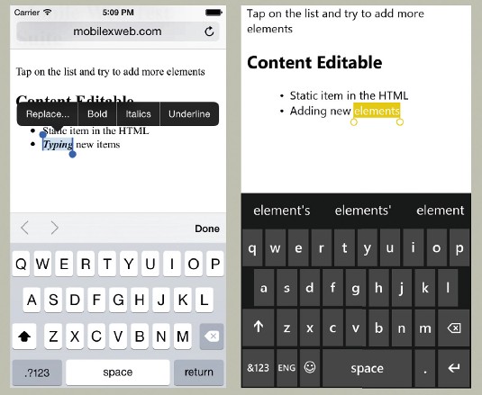
On iOS the user will be able to apply bold, italics and underline on a selection's contextual menu.
<ul contenteditable>
  <li>static item in the hTML
</ul>
08. Safari's tint
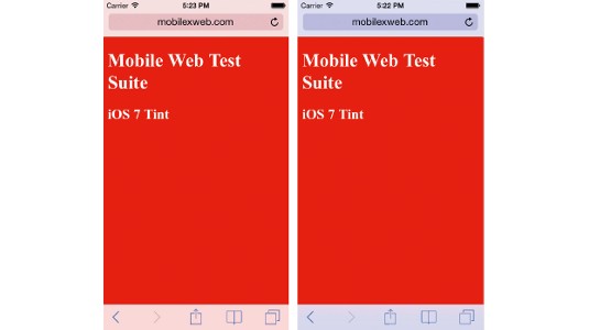
Since iOS 7, Safari for iPhone and iPod touch includes a tint colour that goes behind a semi-transparent Safari UI. When your page loads, Safari looks at the background colour of your website to define that tint. There is no way to define that tint programmatically or through a meta tag, but I have a trick to enable you to chose a different colour for the tint and your background.
body {
  /* for safari's tint */
  background-color: blue;
  /* for the document's body background color */
  background-image: linear-gradient(to bottom, red 0%, red 100%);
} 
09. Home screen icon name
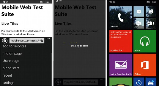
When you add a website to the home screen on iOS, Chrome on Android or pin a website to a tile on Windows Phone, your HTML's <title> content will be used for the icon's name. Because of SEO techniques, we know that our title is not exactly friendly for the home screen on our mobiles.
An undocumented meta tag on Safari on iOS exists that helps us a lot with defining the name of an icon:
<meta name="apple-mobile-web-app-title" content="Myname">On Windows Phone and Windows 8.x tablets we can define the tile's title using:
<meta name="application-name" content="Myname">Unfortunately, there is no way to define the icon's name on Chrome on Android programmatically.
10. Live tiles for Windows Phone
The user can pin websites from IE to the Windows 8.x start screen, and this feature has been added to the lastest Windows Phones. You can convert that tile on the home screen to a Live Tile, updating info and keeping the icon alive even when your website is not open anymore.
To do this we need to define some meta tags. Let's see first what else we need to define the tile icon:
<meta name="msapplication-TileImage" content="tile-background.png">
<meta name="msapplication-TileColor" content="#FF0000"> 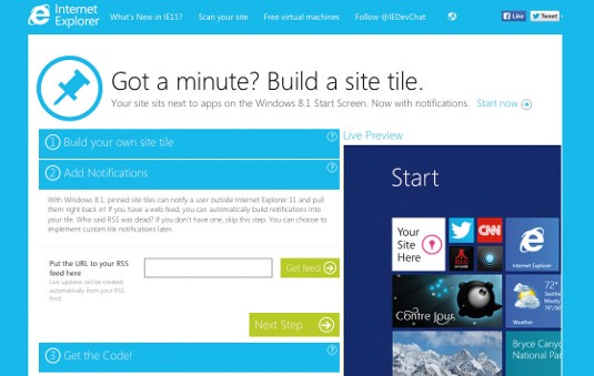
For the liveness of the tile, we can define a Badge Polling URI (compatible since IE10) and/ or a Notification Polling URI (compatible since IE11). The first one can update the icon and unread elements on the tile and the latter can bring news and information that will be rendered on the Live Tile's animation. In both cases, we can also define the frequency of the polling operation.
<meta name="msapplication-badge"
  content="frequency=60;polling-uri=http://host/ badge.xml">
<meta name="msapplication-notification"
content="frequency=30;polling-uri=http://host/ live.xml">
There is a nice Live Tile creator available on the Windows site, and a WordPress plugin available that will do the work for you.
11. Zombie tab for iOS
Browsers on mobile devices may look like their cousins on desktop but their behaviour is far from the same. Consider Safari for iPad: it has tabs. However, if you open three tabs with Facebook, Twitter and Gmail, you will only receive updates from the active tab. Every inactive tab is frozen. That means no JavaScript execution, and no way to receive updates as we are used to on desktop.
With this trick, we can take an inactive tab or window and make it come to life. Why? Well, we can receive updates from the server, and if there is something really important we can change the tab's title to alert the user (only for iPad), or we can just use an alert dialog to interrupt the user while they are on a different tab or window.
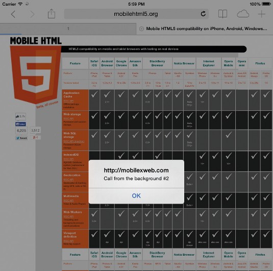
The hack requires the usage of the classic refresh meta tag that triggers a page's reload operation. When the page is frozen, Safari will still honour that meta tag and will revive that window. But we also need to pause the reload operation while we are in the active window. To do this we shift the refresh meta tag every x seconds (a code that won't fire when frozen).
<meta http-equiv="refresh" content="2">
<script>
var mr = document.queryselector("meta"); setInterval(function() { mr.content=mr.content; }, 1000);
</script>
Be careful only to use this when you really need it. I won't be held responsible for websites in the background annoying you while you are peacefully reading an article.
12. Handle with care
In this article, I gave you examples, hacks and undocumented features that we can use today on mobile devices. You should be aware that you are working on the edge of the known world, and the hacks that work for you now might not work properly on future browsers.
You should always remember that performance and multi-platform are key features of your web app or web content. Even when hacks are a necessary evil today, you need to ensure that your content is still compatible if the trick doesn't work.
Words: Maximiliano Firtman Illustration: Ben Fearnley
This article originally appeared in net magazine issue 256.

The Creative Bloq team is made up of a group of art and design enthusiasts, and has changed and evolved since Creative Bloq began back in 2012. The current website team consists of eight full-time members of staff: Editor Georgia Coggan, Deputy Editor Rosie Hilder, Ecommerce Editor Beren Neale, Senior News Editor Daniel Piper, Editor, Digital Art and 3D Ian Dean, Tech Reviews Editor Erlingur Einarsson, Ecommerce Writer Beth Nicholls and Staff Writer Natalie Fear, as well as a roster of freelancers from around the world. The ImagineFX magazine team also pitch in, ensuring that content from leading digital art publication ImagineFX is represented on Creative Bloq.
