5 ways to use images more effectively in editorial design
Improve your editorial design work with these expert tips.
Editorial design is a highly visual medium by definition. The best magazines and newspapers use imagery in creative ways to grab attention, help tell stories, and achieve interest and pace within a layout.
Whether you choose photography or illustration as the lead visuals for your design - and there are strong pros and cons for both - there are some sure-fire tips and tricks for making images work harder for you.
So without further ado, read on for five ways to use images more effectively in your editorial design work...
Article continues below01. Let the content lead the design
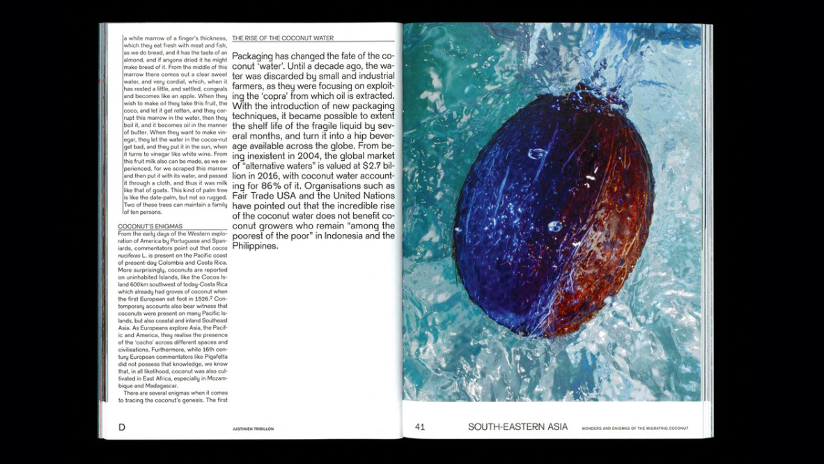
Design and editorial make wonderful bedfellows, and when both are firing on all cylinders, the effect can be stunning: a picture speaking a thousand words, alongside a thousand words telling a story.
It may sound obvious, but one of the most important things to do first as an editorial designer is read the content. Not only can it spark off specific ideas for what images to use, but the style and tone of the writing can also inform the look and feel of the piece.

It will also help you decide whether photography or illustration (or a combination of both) is the best choice to make. Illustration is great for communicating more abstract concepts, as well as adding colour, personality and character to an editorial design.
While photography is much more effective at depicting a specific subject referenced in the piece – whether a person, an object or a place – it can also achieve powerful impact, and control tone and mood. Either way, choose what's appropriate for the content.
Sign up to Creative Bloq's daily newsletter, which brings you the latest news and inspiration from the worlds of art, design and technology.
02. Use photography more creatively

Sometimes, photography in editorial design is all about being literal, and representative of a subject. A portrait of an interviewee, for instance, or a shot of a particular location discussed in the copy, is sometimes the only logical choice to make.
This often requires a bespoke shoot, and this is an ideal opportunity to art direct to suit the specific layout, style and tone of the piece. Create a rough layout first and consider how and where the photography will be used, and shoot to fit the space – taking into account where typography and other page elements will be placed.
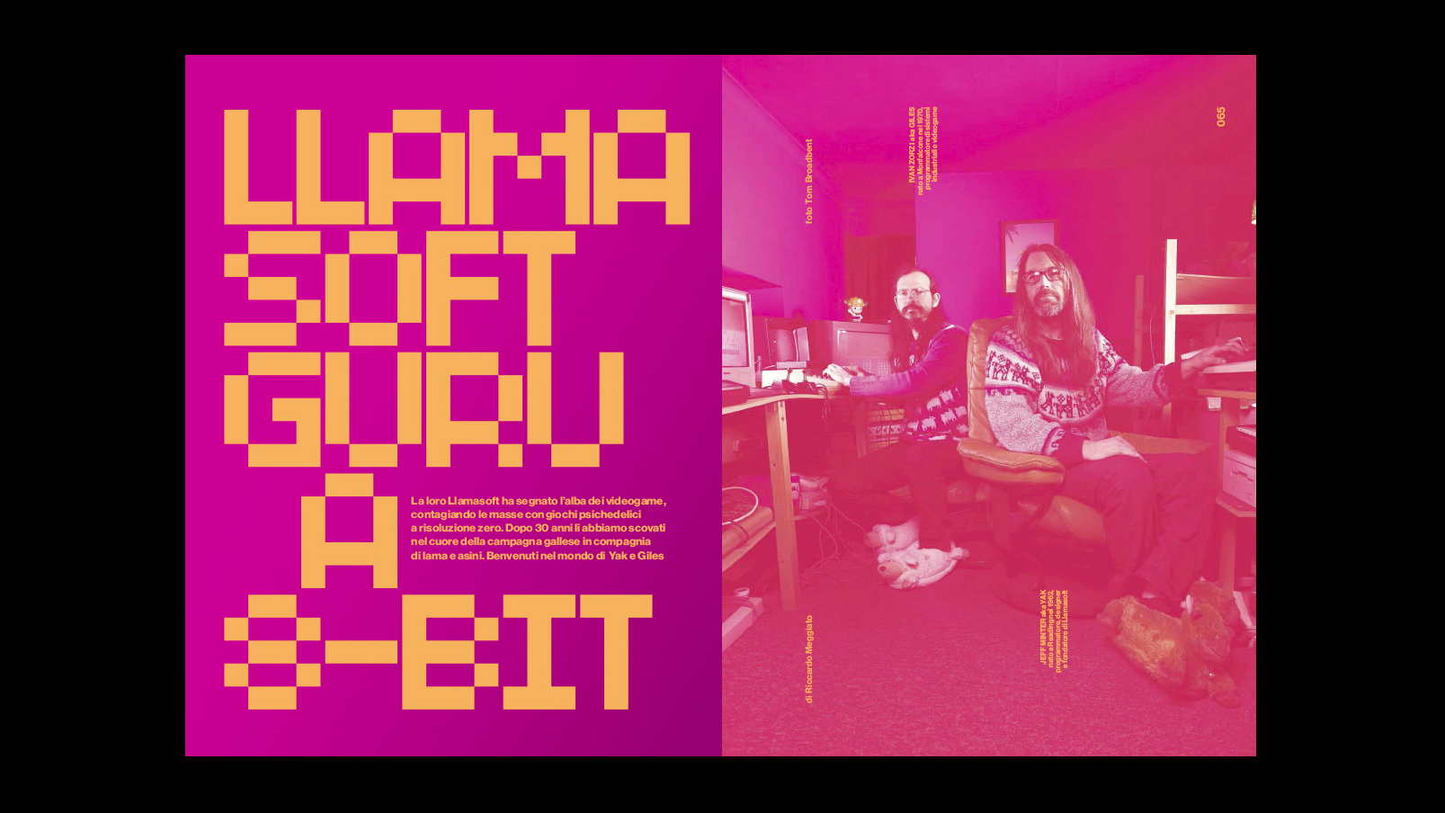
But if time and budget is an issue, sometimes stock imagery is the best course of action, particularly for famous subjects where photoshoot access isn't possible, for locations that are too far-flung to afford to shoot yourself, or for news-based editorial where time is of the essence.
If you do choose the stock route, however, don't plump for the default option: take the time to search a little deeper. Find an unusual angle on a well-known subject, or add some more specific search terms or filters to 'art direct' the results to suit your layout.
03. Tell stories with illustration

There are many different types of editorial article that illustration can bring to life. For relatively dry, business-focused articles it can add a playful, more lighthearted edge, as well as communicating relatively convoluted ideas through visual metaphor.
Illustration can also bring an article to life when photography is impossible or inconvenient, and explore themes and topics that photography could struggle with, such as fantastical or otherworldly environments, or fictional characters and scenarios.
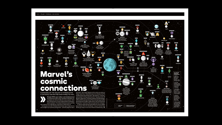
Commissioning illustration, like art directing photography, is a skill that takes practice. Finding the right illustrator for the task is half the battle: read the article, and find the right look and feel of illustration to suit its tone. Then pick out particular visual cues and stories, and make them part of the brief.
If budget and time constraints rule out commissioned illustration, consider stock assets. These are particularly useful for smaller spot illustrations, or articles that require relatively well-established visual metaphors – again, take the time to search for the right look and feel for the job in question, and try to avoid clichés.
04. Don't be afraid to go big
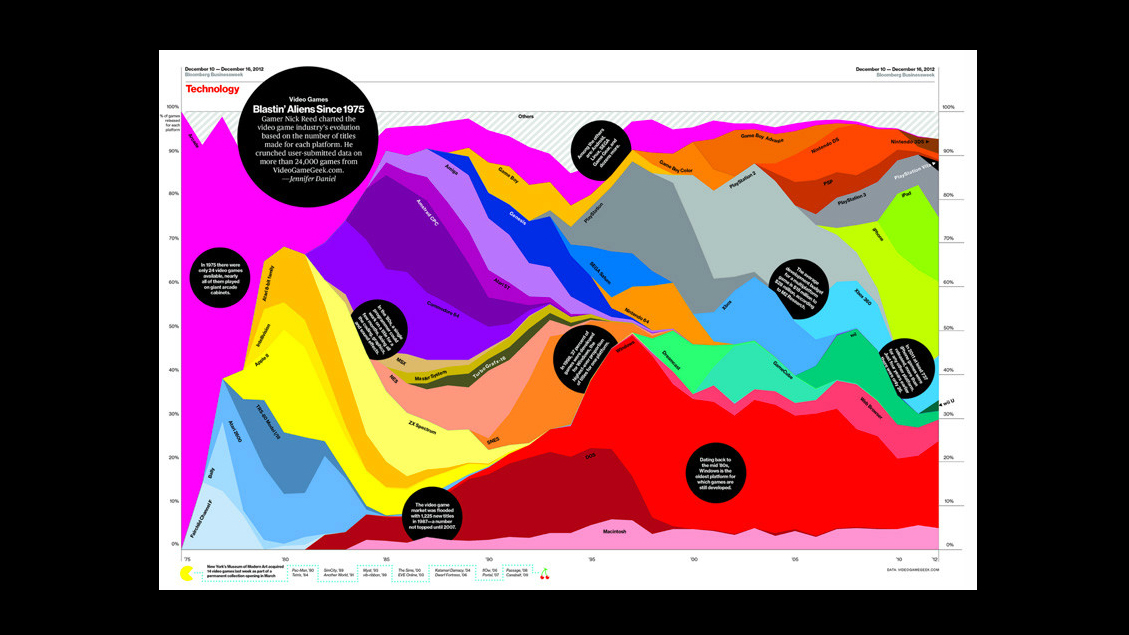
In print, never underestimate the sheer drama and impact of running a stunning full-bleed image, either filling one page or even a full double-spread. Sometimes you need to give visual assets the space they deserve, whether it's a breathtaking photo of a landscape, or an intricate, complex infographic that demands to be shown large.
This may require some rethinking of a layout, or even a reallocation of pages to make room to expand the particular feature you're working on. But it's absolutely worth it, particularly if you have some killer assets at your disposal.
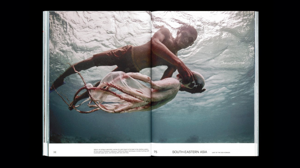
Don't squander a beautiful image by squeezing it into a corner of a spread packed with text, or dilute the impact of the best single asset by trying to use too many others around it.
Sometimes, having the confidence to pick the most eye-catching, dramatic image and blow it up large can transform a piece of editorial design.
05. Crop images in a dynamic way
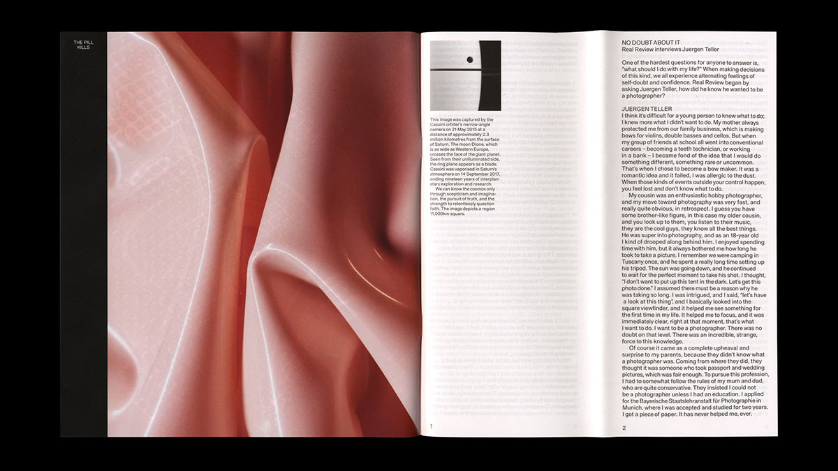
Impact can be achieved by being unconventional and surprising, too. After all, two magazines or newspapers using the same image – whether stock, or licensed directly from a photographer – can achieve a very different effect depending on how, and where, they choose to use it.
Full-spread images can work wonders. But so can close, macro crops and unexpected, dynamic interactions between type and image – editorial design is all about finding that perfect balance, after all. If the content suits it, don't be afraid to zoom in, crop, distort, integrate graphic elements, and generally be playful with your editorial imagery.
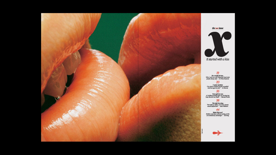
This is a particularly effective way of putting a unique twist on stock imagery, to give your design a fresh twist, compared to the efforts of any other editorial designer with access to the same assets as you.
Thanks to Computer Arts magazine's art editor Mark Wynne for his assistance sourcing best-practice examples.
Related articles:

Nick has worked with world-class agencies including Wolff Olins, Taxi Studio and Vault49 on brand storytelling, tone of voice and verbal strategy for global brands such as Virgin, TikTok, and Bite Back 2030. Nick launched the Brand Impact Awards in 2013 while editor of Computer Arts, and remains chair of judges. He's written for Creative Bloq on design and branding matters since the site's launch.
