4 tasks that stock imagery makes easier
Make your stock assets work harder, and your life easier.
Leave your preconceptions at the door: when you don't have the time or the budget to commission bespoke photography or illustration for your design project, quality stock assets can be the perfect solution.
Success depends on being smart with how, when and why you choose to use stock. It's not always the right solution: complete control can sometimes be crucial, as can guaranteeing originality and standout from competitors who could, after all, purchase the same asset for themselves.
But pick the right scenario, and use it wisely, and stock can save you time and money that you can then spend on other aspects of the project. Here we've got advice for four such scenarios, and how to get the most from each of them...
Article continues belowFirst, there are three simple best-practice guidelines to follow whatever the task: To start, if originality is key – and it really should be – then it can be wise to avoid the most popular downloads, as by definition they'll crop up more regularly elsewhere.
Secondly, make sure you download the image at a suitably high resolution for your purposes. Don't be tempted to cut corners, as it'll limit your options and risk undermining the rest of the project.
And thirdly, steer away from well-trodden, obvious visual territory. That goes for pure cliches like hand-shaking businessmen or beaming call-centre glamour models, but also almost any unnaturally 'posed' shots, or subjects staring down the camera lens. Context and relevance is everything.
Now those are out of the way, let's get more specific...
Sign up to Creative Bloq's daily newsletter, which brings you the latest news and inspiration from the worlds of art, design and technology.
01. Sourcing supplementary photography for a brochure

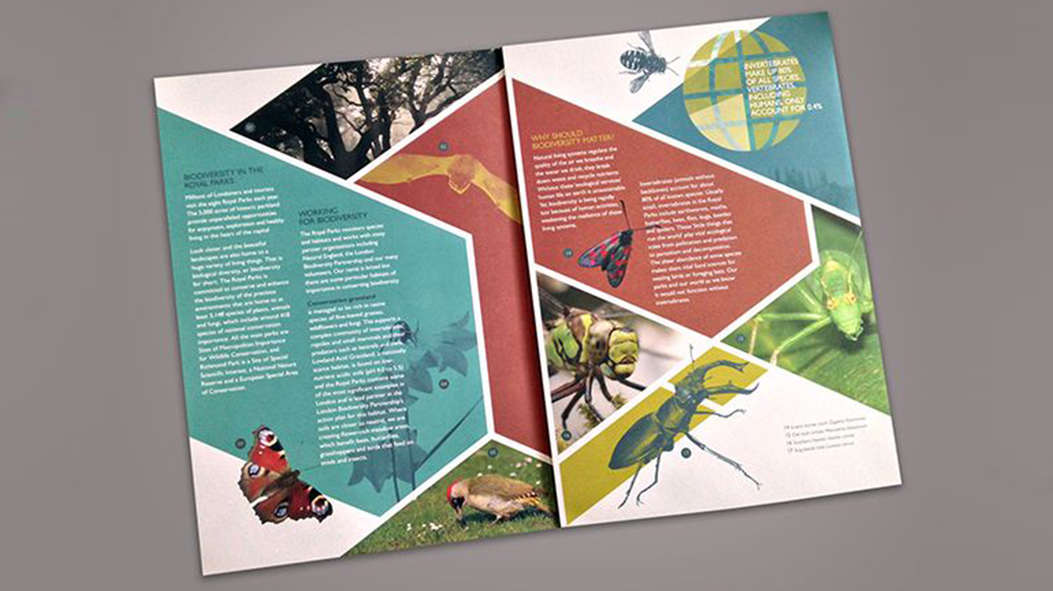
If you're working on a brochure design or other print design for a client, sometimes bespoke brand imagery is the only course of action – especially if they have the budget to art direct a full shoot. This is true where specific products or people are required, but also where a unique and consistent brand voice is key.
Stock assets can be incredibly useful for supplementary photography, however. Not necessarily the hero images that grace the cover or lead a section, but when it comes to backgrounds, general mood shots or more abstract representational imagery they can help convey a mood or feeling for a fraction of the cost.
Consider the context and relevance of the photo you're using. Don't just use supplementary photography for the sake of it, to fill space or jazz up a spread for aesthetic reasons alone. Ensure it fits with the look and feel of any commissioned material you may have – after all, the beauty of stock is you can manipulate and treat it however you like.
For instance, a brochure for a running shoe brand that embodies a carefree, aspirational attitude might have use for an open road cutting through breathtaking mountain scenery, while an adventure travel company might need grittier, more elemental location shots.
An organic artisan cafe would be better suited to arty, macro images of all-natural ingredients, while a bank could benefit from visual metaphors for security or trust that are less painfully obvious than a locked safe – or it could be a brand that bucks the trend in search of a more emotional connection with its customers.
Take the time to search for less obvious stock options; it really is worth it. Check out our articles on 5 ways to use imagery to create better branding and Where to find unusual images for your design projects for more ideas.
02. Adding depth and texture to your artwork

Stock assets don't have to be front and centre: they can make life easier for you behind the scenes as well. While the ever-growing trend for authenticity means some designers favour hand-made textures – and they can add a beautifully artisanal twist to your work – the brutal reality is that sometimes there just isn't time to indulge in scanning your mark-making experiments into Photoshop.
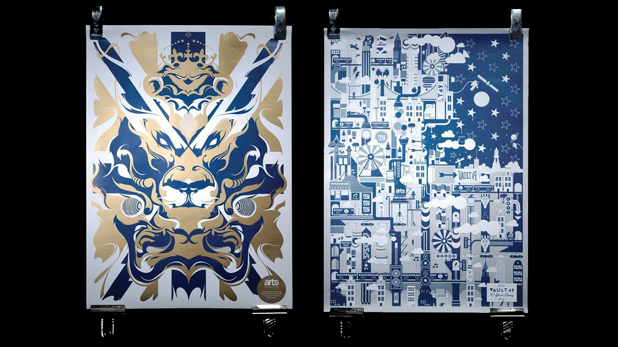
Stock textures and patterns can give flat digital artwork extra depth and character quickly, cheaply and easily – without the same concerns about uniqueness or originality you might have with stock photography. By the time they're worked into the artwork and combined with other textures, it's much less of an issue if another designer has downloaded the same files.
Consider versatility and resolution – vectors will always give you the most flexibility, although bitmap textures are more realistic – and test the construction of the pattern. If it's a texture that you're using over a large area, does it feel suitably 'random' and natural when stitched together and repeated?
Value is another consideration: in some cases it may be quicker to create a simple pattern or texture yourself, rather than searching through stock options. Pick your battles, and invest wisely.
03. Incorporating graphic elements into a campaign

Painstaking creation of smaller assets and design elements for a project is unlikely to be the best use of your time, particularly if you're a freelancer without a team of eager juniors to whom you can outsource such tasks while you focus on the big stuff.
When it comes to collage work, using stock assets is well-trodden territory – nobody has the time or money to shoot every element of a complex photomontage composition from scratch. But when it comes to vector elements, some designers may be more reticent. Don't be.
Say you're tasked with designing a series of banner ads for a campaign in a graphic, vector style, but you don't have the budget to commission an illustrator. You need the look and feel to be unique, and have created various assets already – but the task as a whole seems insurmountable. Stock can be a great way to supplement your own creations.
Once you start trawling stock libraries, choice can be difficult as the range of subject matter is enormous: unlike photography, after all, it's limited only by the imagination of the contributors. Again, pick your battles and source stock vectors that match the look and feel of the rest of your project. That could include stylistic features such as quality of linework, level of realism or use of colour, or more abstract qualities such as wit or whimsy.
Remember, as with stock textures and patterns you can break stock illustration apart into its component parts. Consider how assets can be used in different ways in the design – layered files make this simpler – to ensure you get the best value possible from your investment.
04. Developing UI elements for your digital designs

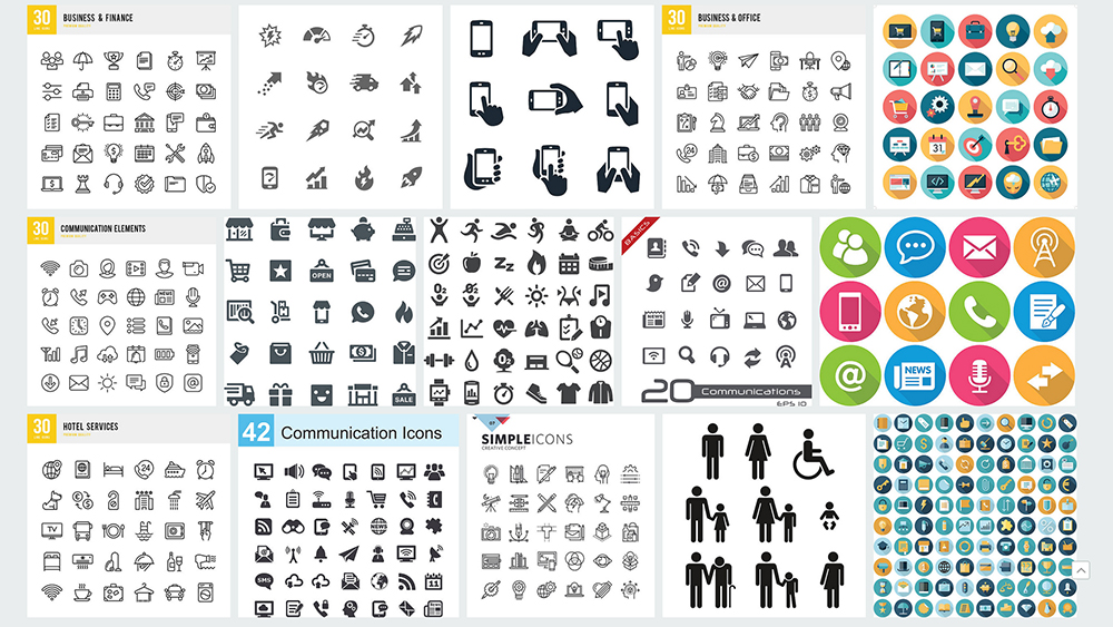
Over and above textures and illustrative elements, a third category of vector stock asset can prove invaluable for frontend web and app designers working on smaller details such as buttons, icons, widgets and UI elements – whether it's for early mockups and beta versions, or the final design.
Vector elements can often be downloaded as a ready-made package to make life as easy as possible for all involved, but customisation is important to avoid giving your app or website a stagnant, identikit look and feel. If your stock UI elements have a pared-back, flat design feel, this may be as simple as tweaking the colour palette to match the look and feel of your project. Resist the temptation to do it the other way around, and design around the stock assets.
If your assets are more stylised and characterful, be wary of using them as they are as they may end up feeling bolted on. Keep an eye on distinguishing features such as shapes, edges, shadows or gradients, which may be consistent within the asset pack you've downloaded, but could stand out for all the wrong reasons if they jar with the look of your project as a whole.
As with all of the other scenarios above, setting the time aside to search carefully for the perfect assets will still likely be quicker than creating everything from scratch yourself.
You might like these related articles:

Nick has worked with world-class agencies including Wolff Olins, Taxi Studio and Vault49 on brand storytelling, tone of voice and verbal strategy for global brands such as Virgin, TikTok, and Bite Back 2030. Nick launched the Brand Impact Awards in 2013 while editor of Computer Arts, and remains chair of judges. He's written for Creative Bloq on design and branding matters since the site's launch.
