How to use images more effectively in web design
Pick the perfect visual assets for any frontend design task.
Sign up to Creative Bloq's daily newsletter, which brings you the latest news and inspiration from the worlds of art, design and technology.
You are now subscribed
Your newsletter sign-up was successful
Want to add more newsletters?
Web designers know the importance of using great images alongside strong layouts and design elements to engage users, but how can you make sure you choose the right images for each project, and where should these gorgeous images go?
While the backend developers get to grips with making websites and apps work, the frontend designers are crafting the UI, testing the UX and developing the overall colour scheme, look and feel. So when it comes to images, why settle for one of those hideous placeholders of two grinning businessmen shaking hands, or threadbare visual metaphors to represent 'focus' or 'success'?
Think outside of the (wireframe) box, and read on to discover five top tips for choosing the perfect images for your next web design project...
Article continues below01. Source the perfect hero image
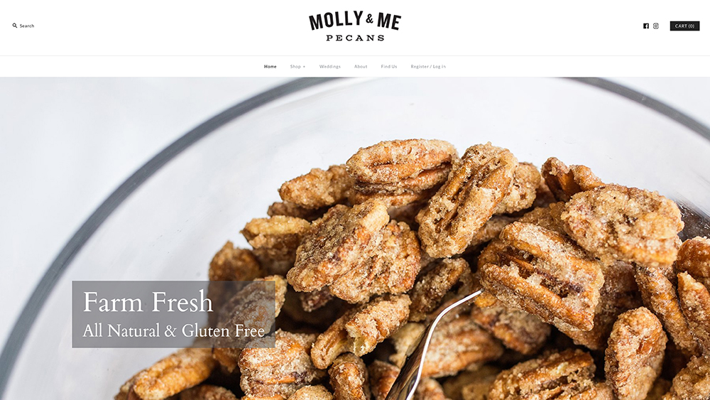
As monitor displays get sharper and more high-res and broadband accelerates, the impact of a stunning large-format hero image at the heart of a landing page can't be underestimated.
Selection of this all-important asset is absolutely crucial, as it can make or break a user's emotional connection with the brand. Make sure it bears strong relevance to the actual subject matter wherever possible. If you don't have the time or budget to art direct something bespoke, fear not – provided the brief is suitable, quality stock imagery can actually be ideal for this purpose.
Avoid clichés like the plague, however. You need to build an association with the individual brand in question, and an image that feels too generic or 'bought in' will detach users from the experience and undermine the site's authenticity.
Consider the example we've shown here: Molly & Me Pecans. The hero image fills the homepage with a mouth-watering extreme close-up of the nuts in question. Sure, it looks like a commissioned shoot, but a carefully sourced, quality stock image could be just as effective for a similar purpose.
Sign up to Creative Bloq's daily newsletter, which brings you the latest news and inspiration from the worlds of art, design and technology.
02. Consider different crop sizes and ratios
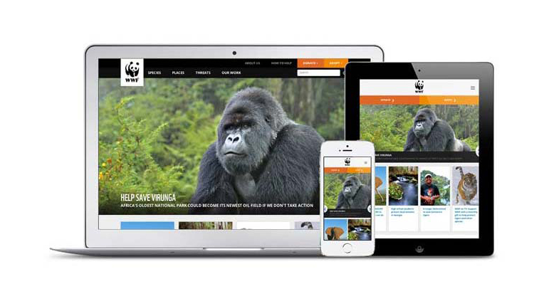
Once you've selected the right images, cropping them is a design skill in itself. Care should be taken to draw the user's attention to the main focus of the image, without leaving too much unnecessary dead space.
It's a careful balancing act, however. Fully-responsive websites can play havoc with images if they're not properly planned to cater to different screen formats and aspect ratios, shifting that focus in unexpected ways when viewed on mobile or tablet, for instance.
A great example of a responsive website that nails its image selection is the World Wildlife Fund (WWF), which takes care to allow sufficient background scenery around the main animal subject so it can crop in on smaller screens, without leaving so much dead space that the subject is dwarfed and impact is lost.
03. Curate assets to populate an online shop
While the first two examples could easily make use of stock imagery, when it comes to ecommerce sites, assets will often need to be bespoke – and usually supplied by the client, although any chance you can get to input into the art direction is worthwhile.
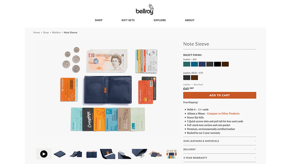
The very best storefronts feature studio-shot photography, where lighting, size and angle can be kept consistent, and products can be shown from multiple angles, as well as zoomed-in with macro detail shots where appropriate. Avoid inflated file-sizes for each image, however, to keep the page's load-time down.
Wallet brand Bellroy is a great example, using a selection of eight shots of the product from different angles, showing off particular details, with a final 'hero' shot demonstrating at a glance what you can fit inside it.
All of this presumes the website you're building is selling the client's own range, of course. If the online shop you're building is populated with third-party items, you'll need to source the best imagery you can with the above criteria in mind.
04. Choose images for UI elements and icons
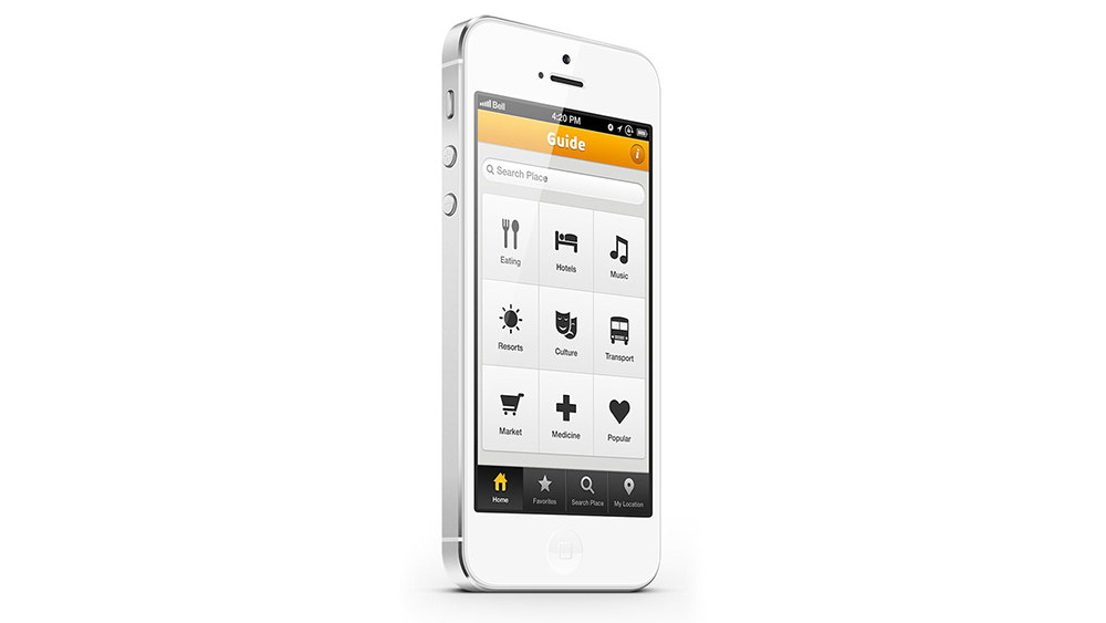
Stock vector graphics can make excellent sources of UI elements and icons for app and website design, especially if you tweak and customise them in Adobe Illustrator to suit the look and feel of the individual site.
While using stock photography is all about striving for originality and unique relevance to the brand you're designing for – avoiding cliches – icons are to some extent the polar opposite. In order to keep the user experience smooth, inbuilt visual associations with particular symbols can be used to your advantage.
If the function communicated by the icon is immediately clear, you can keep the UI clean and simple without the need for text labels. These are known as universal icons and include, for instance, a house for the 'home' button, a magnifying glass to search, and a shopping cart.
Relatively few universal icons exist, unfortunately. Some familiar images have different meanings depending on the context, such as a the widely-used heart and star symbols – and are therefore known as conflicting icons. Choose carefully, and add text labels where necessary for smoother UX.
05. Find contextual editorial images for pages
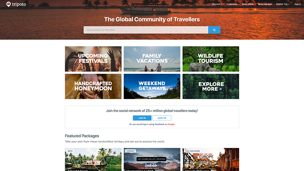
Depending on the website you're creating, images may be required to illustrate particular sub-pages, or stories, or blog posts – although the latter will likely be the client's responsibility once you've handed them the keys to the CMS.
Again, selecting the right visuals for the job is all about context. Bespoke imagery, when you have it in the right quantity and quality, is ideal – but again stock images may be necessary. As with your hero image, however, always consider their appropriateness for the subject matter.
A classic example where shooting bespoke imagery would be prohibitively expensive and time-consuming is a website that uses travel images of particular locations, such as social travel platform Tripoto.
Popular travel destinations will have been captured countless times in stock image libraries, but if you need a whole batch of them, take the time to research a selection with a similar mood or style of art direction to ensure as much consistency as possible in the design.
Related articles:

Nick has worked with world-class agencies including Wolff Olins, Taxi Studio and Vault49 on brand storytelling, tone of voice and verbal strategy for global brands such as Virgin, TikTok, and Bite Back 2030. Nick launched the Brand Impact Awards in 2013 while editor of Computer Arts, and remains chair of judges. He's written for Creative Bloq on design and branding matters since the site's launch.
