8 minimal UI designs and why they work
Stripped-down doesn’t have to mean simple, as these examples show.
Sign up to Creative Bloq's daily newsletter, which brings you the latest news and inspiration from the worlds of art, design and technology.
You are now subscribed
Your newsletter sign-up was successful
Want to add more newsletters?
There’s a lot of talk about minimalism in UI, but what exactly does it mean? It’s important to understand minimalism is not the same as simplicity. In fact, a minimal interface can actually contain quite a lot of complexity.
The key to minimalism isn’t making the interface simple per se. It’s about making it as simple as it needs to be. In other words, it means stripping back unnecessary elements, and only keeping what’s strictly necessary for the functioning of the website or app.
In this post, we’ll show you examples of how this principle is put into action by some very well known apps.
01. Google Calendar
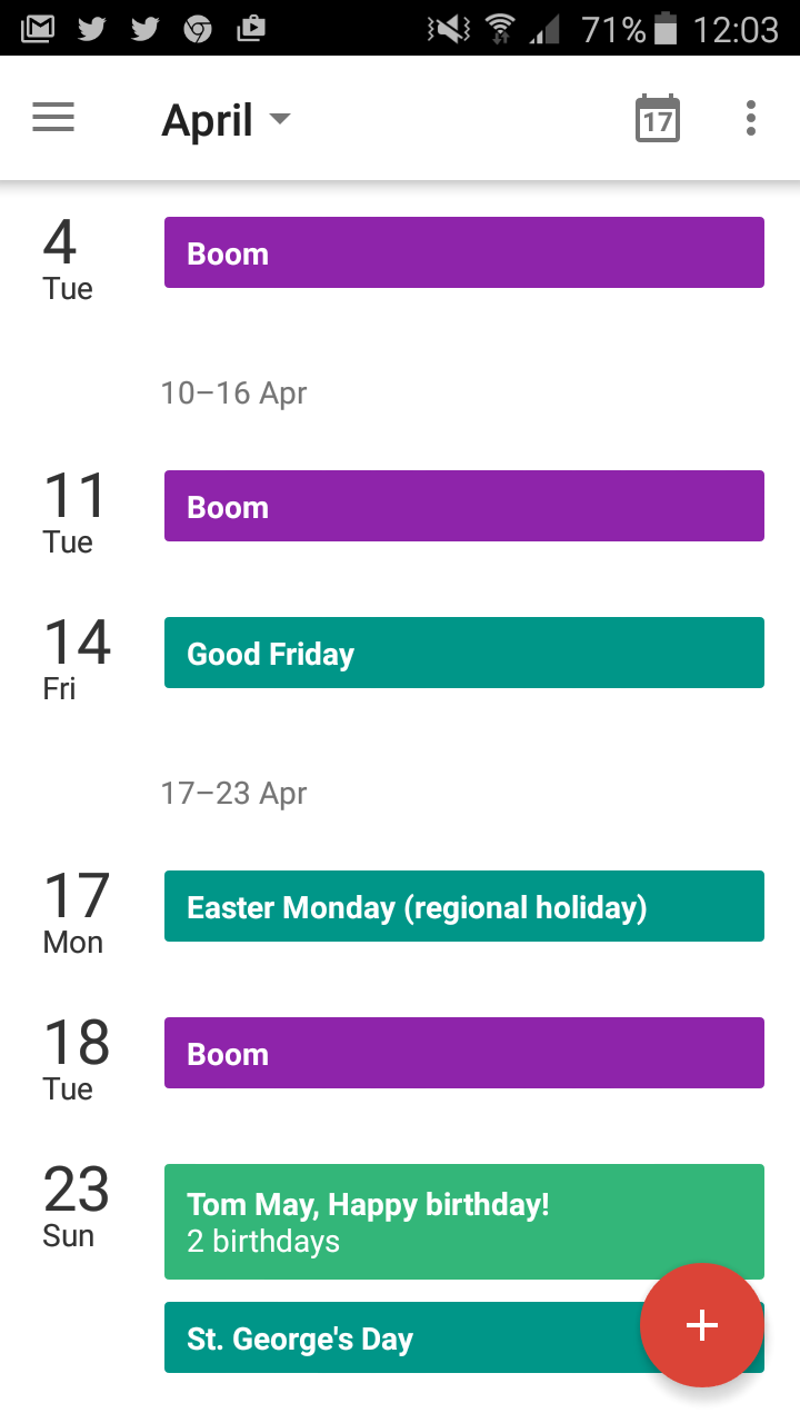
There are a huge number of calendar apps on the market nowadays. But Google’s free app still beats most of them hands down, due to the clarity and simplicity of its presentation.
Rather than section off each piece of information using dividing lines, for example, it makes elegant use of white space, contrasting colours and different type sizes to construct a subtle hierarchy. This way it succeeds in conveying quite a lot of detail clearly and quickly, without ever overwhelming you with clutter.
02. Instagram

When Instagram underwent a big redesign last year, most of the design community’s attention focused on its change of logo. But more subtle changes to the interface (a process digital agency Swarm NY has dubbed constructive reductionism) were arguably more significant in making the user experience smoother and easier on the eyes.
In short, Instagram has removed a whole heap of colour and clutter in order to focus full attention on the user-uploaded content. It has done this so successfully, it’s difficult to remember what was there before that isn’t now. And surely that is the very essence of minimalist UI?
Sign up to Creative Bloq's daily newsletter, which brings you the latest news and inspiration from the worlds of art, design and technology.
03. Airbnb
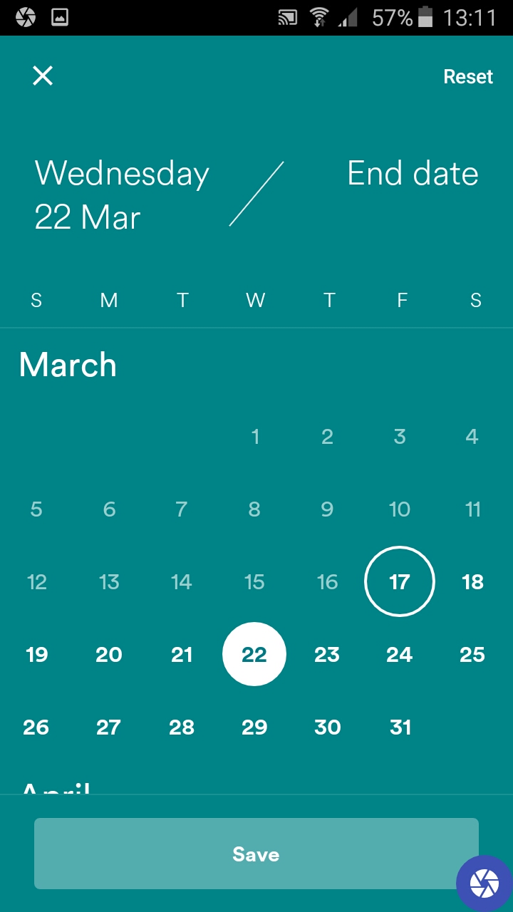
Short-term lodgings service Airbnb is another popular app that got the redesign treatment recently. And much like Instagram, it benefited from a more stripped-down, easy to use interface.
With more than 60,000 properties to search through on the app, it’s essential to make the user journey fuss-free. But at the same time, customers want to know a lot of information about where they’ll be staying. So the app has to perform a balancing act: keeping people interested without making them feel like they’re making an uniformed decision.
Airbnb pulls off this trick by making each stage of the process as simple as possible. For instance, you can set your start and end date just by tapping the two relevant dates, then pressing Save (as shown above).
Throughout the app, the visuals have also been honed to create a feeling of calm, compared with the visual cacophony of the previous version. There’s now just one image for each property, while a clear system of typographical hierarchy and lots of white space are used to divide up all the myriad details into manageable, bite-size pieces.
04. BBC iPlayer Radio
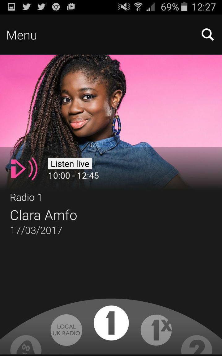
When creating the radio version of the BBC iPlayer, the designers needed to appeal to an older demographic, many of whom would be less tech savvy than the average licence-payer. So the interface had to be as intuitive as possible, at the same time as providing access to a huge number of programs across 19 different radio stations.
A solution was found in the form of a responsive scrolling dial, which mimics that of a traditional analogue radio and allows you to browse the entire schedule. This has the added benefits of letting listeners discover new content they might not have otherwise encountered, and enabling them to easily share content through their social channels.
05. Twitter
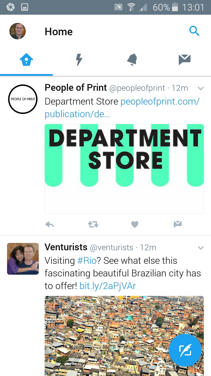
Twitter’s mobile app is a great example of the principle that minimalism doesn’t always mean simplicity. It actually offers a huge amount of complex functionality, from catching up on the latest news and sports stories to generating your own QR codes, along all the usual liking, tweeting, searching and following you’d expect.
Even if you only use the app to do one or two things, the rest of the features won’t bother you, because on-screen clutter is kept to a minimum using a series of well-crafted and carefully considered icons.
For example, whether you want to search Twitter or check out trending topics, you just need to tap the magnifying glass icon in the top-right corner. When it comes to your actual stream, different types of info are nicely demarcated using colour and type size, and screengrabs of included URLs break up what would otherwise be a blizzard of text. Consequently, even a chaotic Twitterstorm is easy to follow; well, easy on your eyes at least...
06. Google Drive
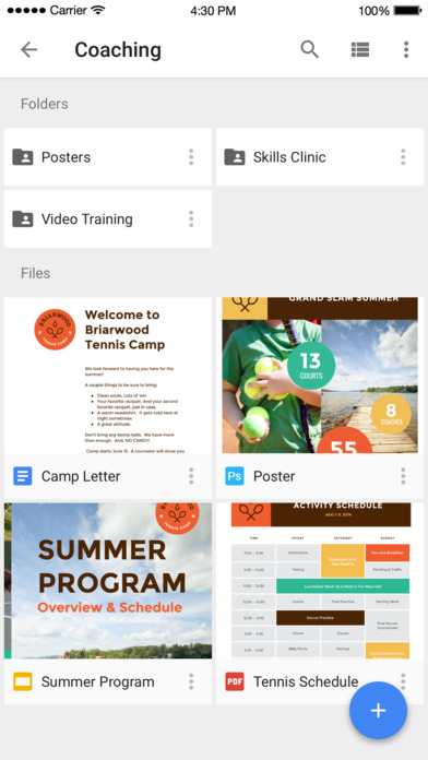
Remember when running your own business, or even just keeping track of your personal affairs, meant spending a lot of money on software and storage? Now there’s Google Drive, a free service from Google that allows you to create documents and spreadsheets, as well as storing photos and videos.
It’s able to deal with a stunning range of file formats, and where it can’t, it’s almost always able to point you towards a handy third-party plugin to fill the gap. Most usefully, it’s an easy way to share large files and folders with collaborators: you don’t have to send the whole thing, just a link.
In short, Google Drive is so useful and feature-rich that it’s surprising how minimal its mobile app interface is. It all points to how carefully organised and thought-through the system behind it is, with the focus clearly on the end user.
Finding what you’re looking for on your phone is easy: you can either scroll through the entire list, sorting it by a number of criteria, or just use the search bar. The hamburger menu brings up a wider range of functionality, and the monochrome, fuss-free design of the whole app makes working on your files a breeze.
07. Medium
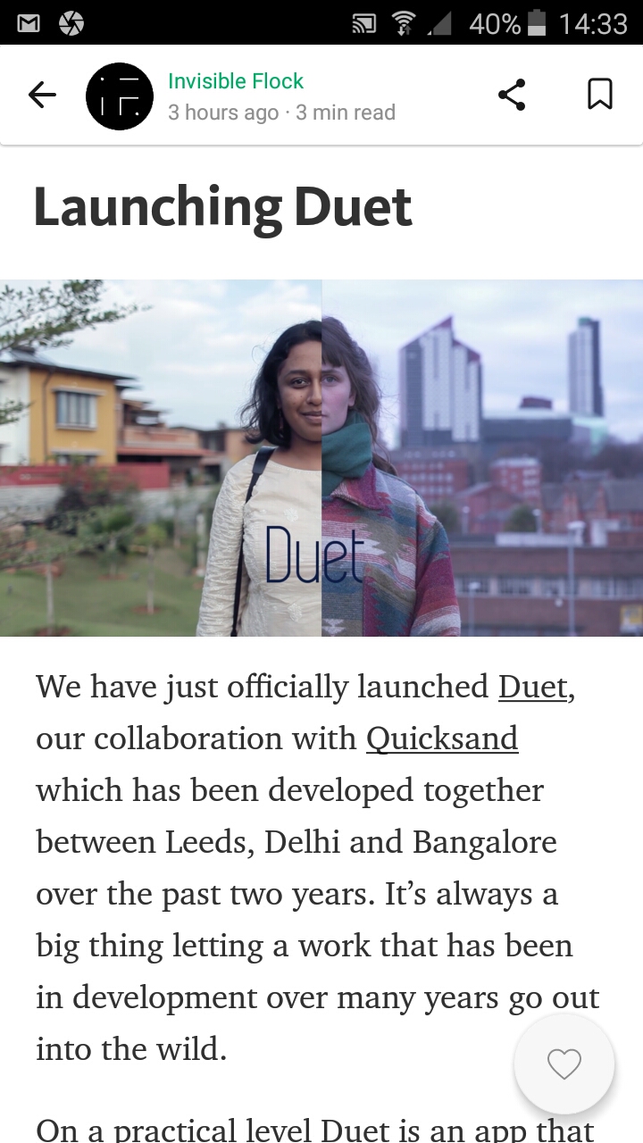
By 2012, what the internet didn’t need was another blogging platform. But what it did need was one with beautiful design. So Twitter co-founder Ev Williams obliged, launching Medium and using a ton of venture capital over the years to develop it into a superlative visual experience for both readers and writers.
Most recently redesigned last October, the Medium app lets you personalise what kind of blog posts you receive in your feed, and offers a selection of ‘Top Stories’ and 'Editors’ picks' on its homepage. But where it really comes into its own is in the reading experience, which is elegantly and artfully designed for relaxed and enjoyable reading.
Of course, without serving any ads, or indeed having any clear business model at all, it’s not clear how long Medium can continue to operate this kind of service. But for now, at least, it stands as a shining example of how user-friendly a minimally designed reading experience can be.
08. Shazam
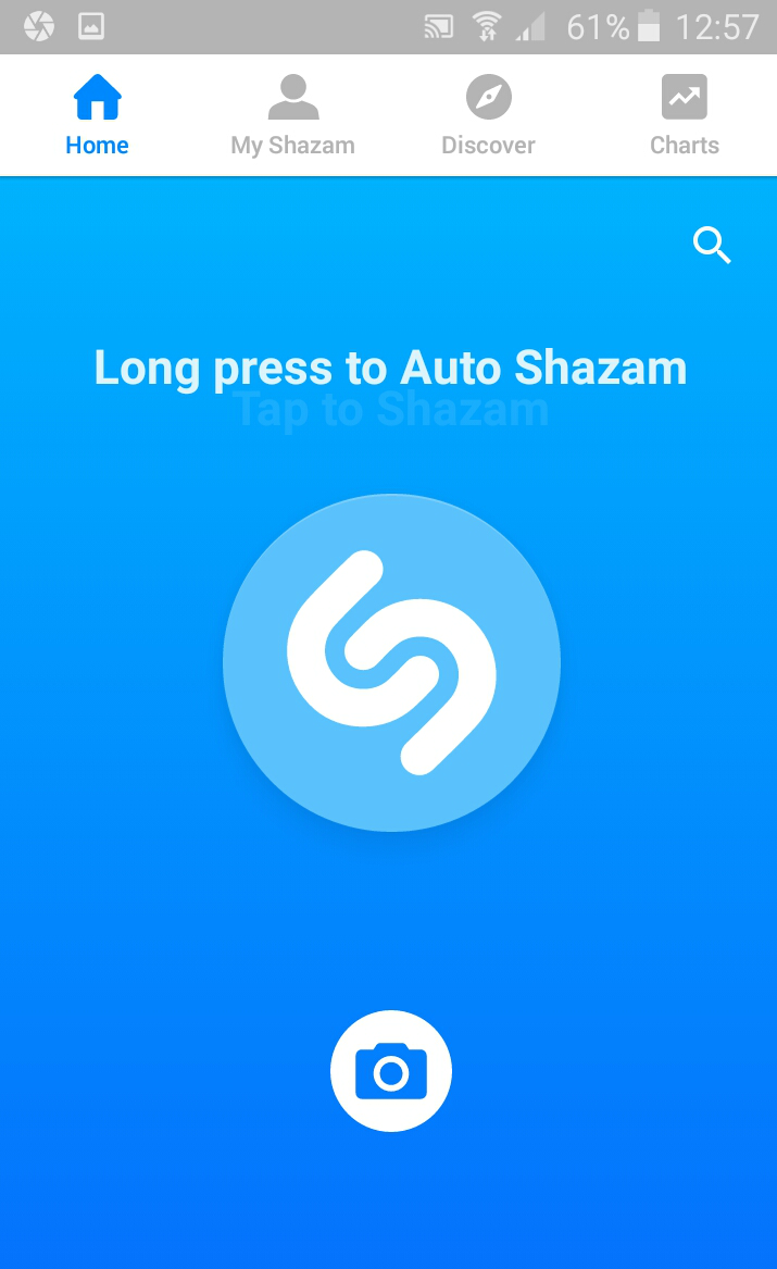
Shazam is does one thing, and does it well: it lets you hold up your phone to music you don’t recognise, and it tells you want the track is. And the simplicity of the service is nicely matched by the simplicity of its design.
Even the most technophobic smartphone owner can use this app. The opening screen not only has a simple instruction (‘Tap to Shazam’) and a nice big button to tap, but the button in question gently pulsates, making it clear that it wants to be pressed.
There’s another secondary use for Shazam, in bringing up information, QR-code style, on printed material containing the Shazam logo. This is done using the smaller camera icon below the main button.
You might feel that not including any text for this button is potentially confusing for the user. But the converse argument could also be made; that if you have a Shazam logo to scan, the explanation of how to do so will be included in that printed material; so repeating it on the app’s screen would be needless duplication.

Tom May is an award-winning journalist specialising in art, design, photography and technology. His latest book, The 50 Greatest Designers (Arcturus Publishing), was published this June. He's also author of Great TED Talks: Creativity (Pavilion Books). Tom was previously editor of Professional Photography magazine, associate editor at Creative Bloq, and deputy editor at net magazine.
