How to design websites that stand out
How can bad design, storytelling and comedy help create better websites?
Sign up to Creative Bloq's daily newsletter, which brings you the latest news and inspiration from the worlds of art, design and technology.
You are now subscribed
Your newsletter sign-up was successful
Want to add more newsletters?
It has never been easier to make a website, and our digital toolbox has never been greater. At the same time, we seem more concerned with automating our process and systemising design than with creative thinking and generating ideas.
Where does this leave expression and storytelling? We talked to Espen Brunborg, co-founder of small Edinburgh-based web agency Primate, to find out.
Why do so many websites look alike these days?
EB: Creating something different – be it a website, a car, a building, or a kettle – is difficult. We have a tendency to mimic what we like, and stepping outside of the mainstream comes with real risk attached.
Prevailing aesthetic preferences affect not only us, but also our clients and their audiences, which makes it challenging to sell anything that looks too different from what's currently out there. What's more, bucking UI trends and established patterns requires more brain power from our users, which can affect conversion or engagement.
That said, there is ample opportunity to stand out without upsetting the general balance of things. Consider books, for example. Their overall shape and function won't change any time soon, but the stories within them are infinitely diverse. Maybe we shouldn't be so hung up on how our websites look, but focus more on the stories we tell on them.
It’s easy to build a great-looking site that’s fast and has a great user experience, so why design something that’s the opposite?
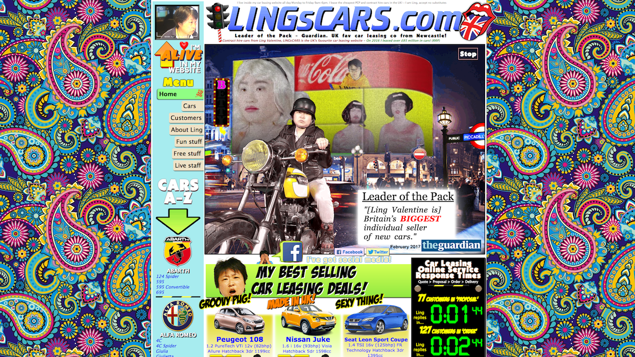
EB: The long answer to this question is the wonderful story of how lingscars.com – a beacon of bad design – became an international phenomenon.
The short answer is that of course we shouldn't – designing for the opposite of best practice is a really bad idea.
Sign up to Creative Bloq's daily newsletter, which brings you the latest news and inspiration from the worlds of art, design and technology.
Then again, perhaps we should be asking ourselves a different question. Why design something that’s only fast and good looking? If usability and aesthetics are our only concern, why do we need more than one font? Why paint cars in more than one colour? Why not wear uniforms to work?
The answer is individual expression. What we should get better at is designing fast, user-friendly websites that are also personable, emotional and expressive. If all other factors are equal, memorability wins.
How can storytelling (and comedy specifically) help create better websites?
EB: Whenever we put words to a page we’re telling stories, meaning storytelling is intrinsic to design – whether we like it or not. The key to good design, therefore, is to learn how to tell our stories well and to create meaningful, emotional connections with our readers and visitors.
Comedy – meaning anything that pushes our imagination beyond the mere efficiency of any given interface – is a key part of that. For example, if Bill Bryson had only focused on efficiency in his Short History of Nearly Everything, we’d be left with a pile of bullet points instead of a best-selling tale of popular science.
What aspects of web design annoy you the most when you're browsing?
EB: Apart from clickbait and dark patterns? Delay. Delay is infuriating at times. I don’t really mind waiting for a video, game, or otherwise interesting piece of internet to load (though they'd better be worth the wait).
But I genuinely want to smash my phone in the face of adverts that force me to wait until I can locate the tiniest ‘x’, pop-ups that appear just as I’m about to click something, or gratuitous effects that result in me requiring several attempts at a simple action because the interface doesn’t respond the way I expect.
What can designers do to stand out on the web, and how difficult is selling 'different' to the client?
EB: The easiest thing that anyone can do to stand out on the web is to look at their own content, and it’s a shame that too few of us are willing to invest in it.
When we talk about being different, we often think about unnecessary animation, cumbersome layouts and over the top effects. But there’s a lot to be said for just daring to have a personality and making low-risk decisions that set us a part.
Of course, it takes a skilled designer to convince a client that a single, beautifully typeset, well written statement can replace their imagined full screen carousel of corporate messaging.
What are some of your favourite sites you have seen lately? What do they do well?
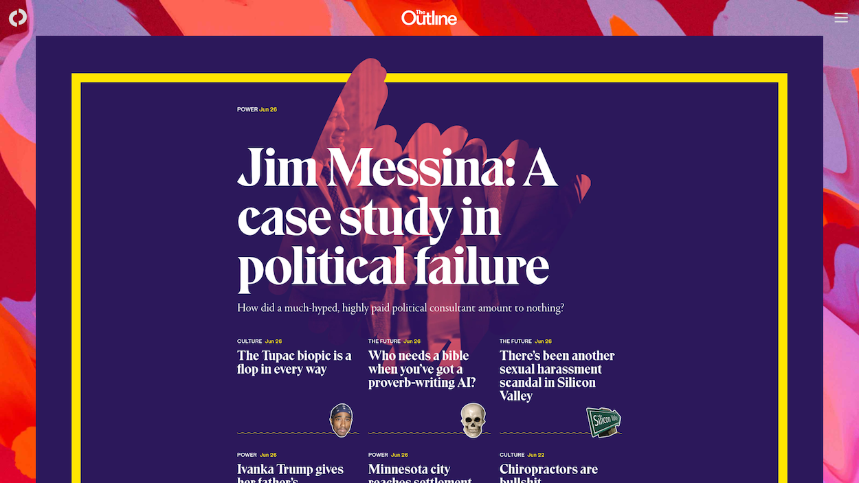
EB: The Outline has caught my attention from both a content and design perspective. In a way, it's pioneering the online magazine experience, but with very light touches. Nothing feels radically different or novel for the sake of novelty, yet the design and writing combine in a distinct voice that is now a staple in my reading diet.
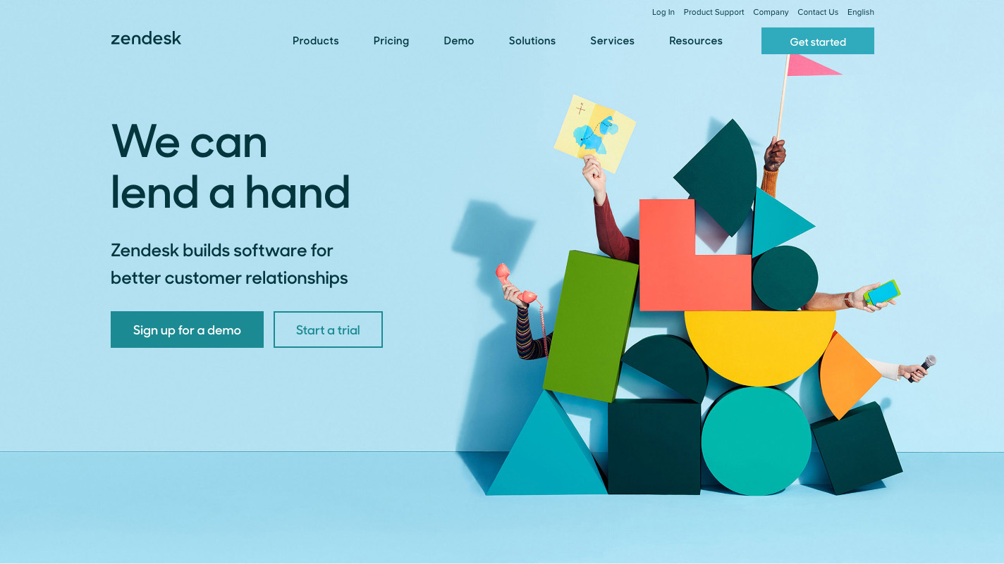
Zendesk also made ripples with its new corporate identity, and it’s obvious it had digital media in mind when it designed it. The logo elements really come to life in the icons and illustrations on the website, which retains the playful personality of the old Zendesk while heading down a completely different visual direction.
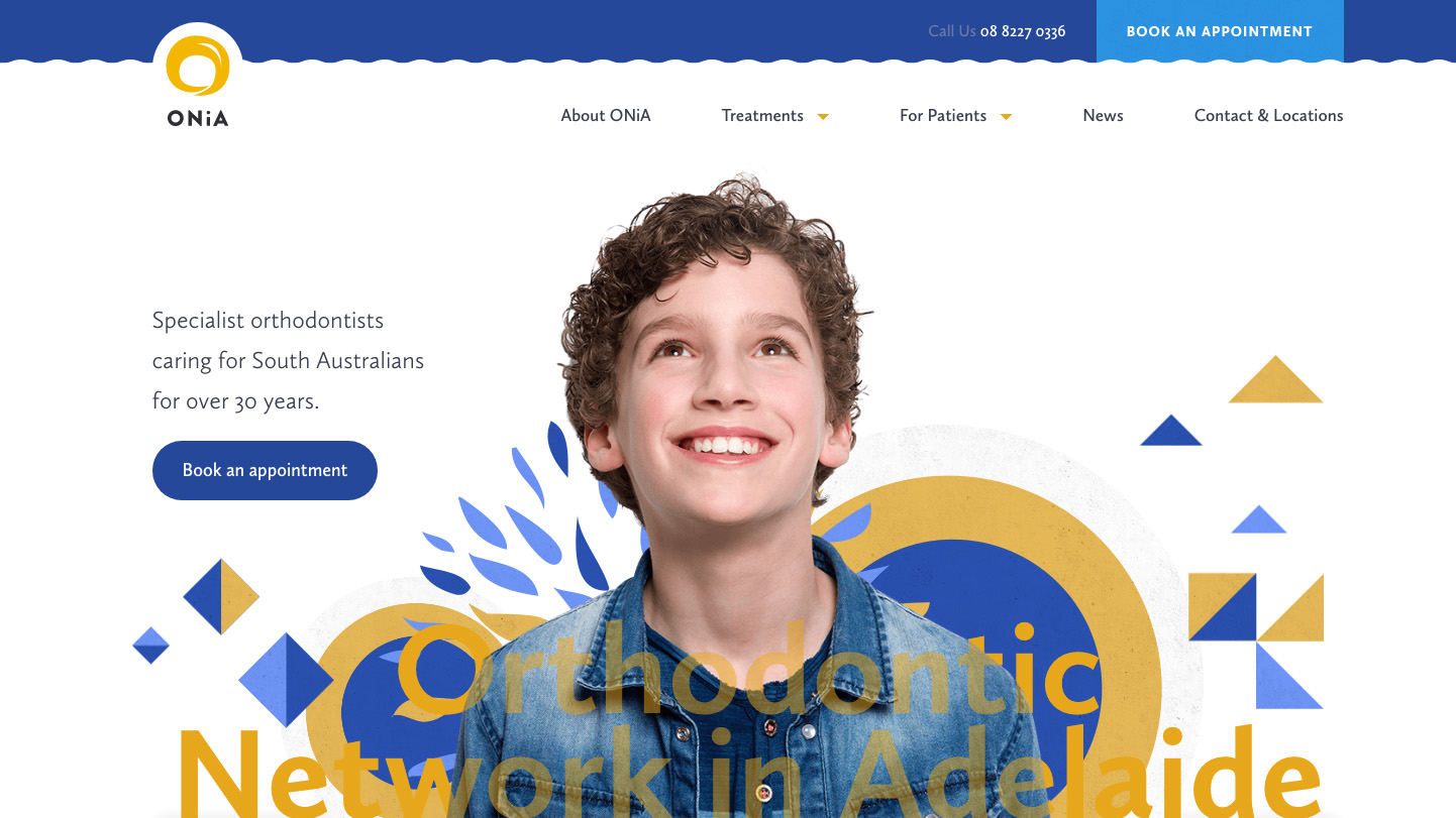
If those are too old for ‘lately’ (as both launched in 2016), Australian designer Kylie Timpani of Humaan just shared her latest work for ONiA orthodontists that, in its own small way, redefines the image of orthodontics with a very well considered and consistent implementation of a friendly brand. Never has repositioning of teeth looked so inviting!

Oliver is an independent editor, content consultant and founder of Pixel Pioneers. Formerly the editor of net magazine, he has been involved with the web design and development industry for more than a decade and helps businesses across the world create content that connects with their customers. He is passionate about content, user experience, accessibility and designing for social good.
