Create a custom theme in jQuery Mobile
We present an exclusive excerpt from jQuery Mobile Web Development Essentials, on the basics of theming and building and using a custom theme for your app.
- Knowledge needed: HTML, some CSS and JavaScript
- Requires: Nothing more than your favourite HTML editor and a browser
- Project Time: Two hours
- Support file
This is an edited excerpt from Chapter 11 of jQuery Mobile Web Development Essentials, published by Packt Publishing.
Theming in jQuery Mobile is straightforward and simple to use for the developer, but is pretty elaborate behind the scenes. Luckily there will rarely be a time when you need to know everything that's being done for you. However, it's worth a little bit of our time to understand how it works.
Out of the box jQuery Mobile comes with a theme set comprised of five color swatches, each associated with a letter from A-E. The theme contains a series of base CSS classes which can be applied at will to nearly any element and they contain global settings for width, height, border radius, shadows. The individual swatches contain specific information about color, fonts, and so on.
Article continues belowAdditional swatches can be added to the five original swatches from F-Z, or the original swatches can be replaced or overridden at will. This system allows for a total of 26 distinct swatches, allowing for millions of possible combinations of theme colors, styles, and patterns. You apply a jQuery Mobile theme to the selected element by adding a data-theme attribute with the letter of the desired theme:
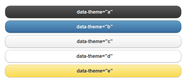
Developers will generally choose to use the data-theme attribute method when applying styles, but it's also possible to attach the CSS class names directly to your page elements for more granular control. There are a handful of primary prefixes which allow for this flexibility.
01. Bars (.ui-bar-?)
The bar prefix is generally applied to headers, footers, and other areas with high importance:

02. Content blocks (.ui-body-?)
Content blocks are generally applied to areas where paragraph text is expected to occur. Its color helps to ensure maximum readability with the text color placed against it:
Sign up to Creative Bloq's daily newsletter, which brings you the latest news and inspiration from the worlds of art, design and technology.

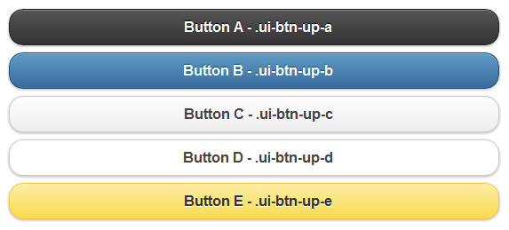
03. Buttons and listviews (.ui-btn-?)
Buttons and listviews are two of the most important elements in the jQuery Mobile library and you can rest assured that the team took their time getting them right. The .ui-btn prefix also includes styles for up, down, hover, and active states:
04. Mixing and matching swatches
One of the nice things about theming in jQuery Mobile is that child elements inherit from their parent unless otherwise specified. This means that if you put a button without its own data-theme attribute inside a header or footer bar, that button will use the same theme as its parent. Wicked eh?
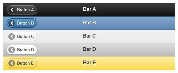
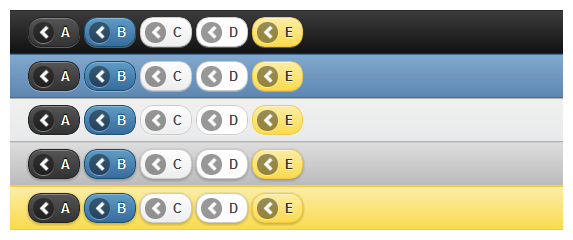
It's also perfectly acceptable, and even encouraged, to place an element using one swatch and the child of an element using another swatch. This can help the element stand out more, or match a different part of the app, or whatever reasoning the developer chooses. It's possible, and what's more it's easy. Simply place a button (or other element) inside a header bar, and assign it its own data-theme attribute:
05. Site-wide active state
jQuery Mobile also applies a global active state for all elements. This active state is used for buttons, form elements, navigation, and anywhere there's a need to indicate that something is currently selected. The only way to change this color value is to set (or override) it via CSS. The CSS class for the active state is, appropriately named, .ui-btn-active:

06. Default icons
Included in the jQuery Mobile set are 18 icons which cover a wide array of needs for developers. The icon set is white on transparent which jQuery Mobile overlays over a semi-transparent black circle to provide contrast against all of the swatches. To add an icon, specify the data-icon attribute with the name of the desired icon:

jQuery Mobile also provides the ability to place icons on the top, right, bottom, or left side of a button using the data-iconpos="[top, right, bottom, left]" attribute, with left being the default placement. Developers are also able to display an icon alone, without text, by specifying data-iconpos="notext":

Deploying custom icons is also possible and will be covered later in this chapter.
07. Creating and using a custom theme
We've already discussed how powerful theming is in jQuery Mobile. It makes it trivial to develop a rich mobile website with simple and elegant style. Even more powerful is the ability to create your own library of swatches which can be used to make your application or website truly unique. Developing your own theme can be approached in one of the following two ways:
- Download and open the existing jQuery Mobile CSS file and edit to your heart's content.
- Point your web browser to ThemeRoller for jQuery Mobile.
We'll be focusing solely on option two because let's be honest, why wade through all of that CSS when you can point, click, and drag your way to a new theme, full of swatches in 10 minutes? Let's find out what ThemeRoller is all about.
08. What's ThemeRoller?
ThemeRoller for jQuery Mobile is an extension of a web-based app that was written for the jQuery UI project. It allows users to quickly assemble a theme full of swatches in minutes using drag-and-drop color management. It features an interactive preview so that you can immediately see how your changes affect your theme. It also has a built-in inspector tool which helps you dig into the minute details (should you want them). It also integrates with Adobe® Kuler®, a color management tool. You can download your theme after you're done, you can share it with others via a custom URL, and you can re-import past themes for last-minute tweaking. It's a powerful tool and is a perfect complement to jQuery Mobile.
One of the hallmarks of the five default swatches is that the jQuery Mobile team spent quite a bit of time working on readability and usability. The swatches range from highest contrast (A), to lowest contrast (E). Within a single theme the areas which have most contrast are the areas most prominent on the page. This includes the header (and listview headers), and buttons. When creating your own theme it's a good idea to keep this in mind. We always want to focus on usability within our app right? What good is a slick app if no one can read it because of poor color choices?
09. Using ThemeRoller
The first thing you'll see when you load up ThemeRoller is a slick looking splash screen, followed by a helpful Getting Started screen:
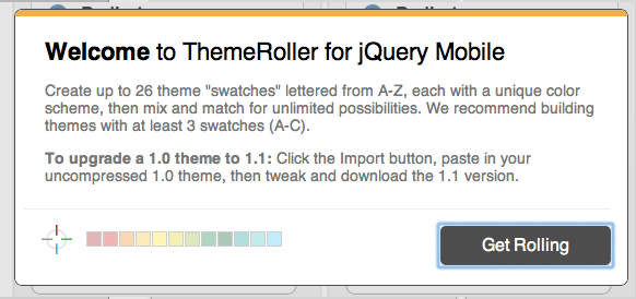
The Getting Started screen has some helpful tips so make sure to glance at it before clicking the Get Rolling button:
After all of the splash screens are out of the way you'll be presented with the primary interface:
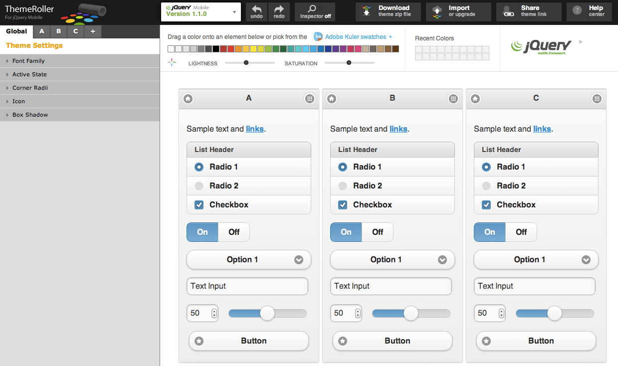
ThemeRoller is broken into four main areas: Preview, Color, Inspector and Tools. Each of these contains important functionality that we need to review. We'll start with the Preview section.
10. Preview
Unless you're loading an existing theme, the preview area will present three complete, identical and interactive jQuery Mobile pages packed with widgets of all sorts:
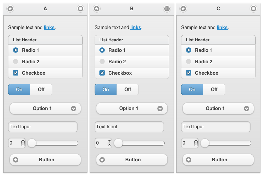
Move your mouse over them and you'll see that each page is functional. The header on each page contains a letter indicating which swatch controls its appearance.
11. Colours
At the top of the page you'll see a series of colour chips, along with two slider controls and a toggle button. Further to the right, you'll see another ten colour chips which should be blank. These are dedicated to recently used colours and will be empty until you've selected a colour:

Below the colour chips are two sliders labelled Lightness and Saturation. The lightness slider adjusts the light and dark tones of the series of color swatches, while the saturation makes the colours more, or less, vibrant. Taken together, a user should be able to approximate nearly any colour they choose. To use colours from Kuler, click the text link marked Adobe Kuler swatches.
Each of the colour chips can be dragged onto any element within the preview area. This makes development of a swatch set extremely easy. Note that many of the jQuery Mobile styles overlap, for example, the header bar at the top of the page receives the same style as the header of the listview. Adjust the colours as desired then drag each chip onto an element on the page. Remember that each individual page is its own swatch so be careful about how you choose to mix colours.
12. Inspector
On the far left of the interface is the inspector panel, split into two parts. The top part contains buttons allowing developers to download their theme, import an existing theme, and share a link to their theme. There's also a Help link for people who didn't buy this book:
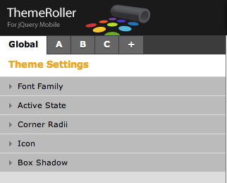
The bottom section contains a series of tabs labelled Global, A, B, C, and +. Each of these tabs holds an accordion panel which contains all of the values for an individual swatch, except for the Global tab which applies to all of the swatches.
Select the Global tab, then click Active State, and the accordion panel will expand to show settings for the active state for your entire theme. Options include text color, text-shadow, background, and border. Changing a value in the global causes every current (and future) swatch to reflect the new setting.
Additional swatches can be added to your theme in two ways. Clicking the + tab at the top of the inspector adds a new swatch at the last place in your theme. You can also add a new swatch by clicking the Add Swatch button located at the bottom of the preview area. Swatches can be deleted by selecting the tab with the swatch you want to remove, then clicking the Delete link located to the right of the swatch name. Note that deleting a swatch from the top of the stack will cause the remaining swatches to be renamed.
13. Tools
At the very top of the page there are a series of buttons. These buttons allow you to perform a variety of tasks which we'll cover in a moment, but first, take a closer look at the buttons themselves:

You'll notice the following buttons: a switch allowing you to change between the 1.1 (current) Version and the 1.0.1 Version, undo/redo, and a toggle button for the inspector. Setting this toggle to on allows you to inspect any widget in the preview area. Hovering over a widget highlights that element with a blue box. Clicking the element will cause the accordion menu in the Inspector area to expand to display settings specific to that element.
There are four additional buttons which allow you to download your theme, import or upgrade a previously created theme, share your theme with others, and a help button.
14. Creating a theme for Notekeeper
Now that we're familiar with the ThemeRoller interface, how about we go ahead and create our first theme? Rather than build one in abstract, let's create one that we'll actually use for the Notekeeper app we built earlier. Let's start simply by modifying one of the existing themes that is shipped with jQuery Mobile. The team was kind enough to let users import the default themes as a starting place for new themes, so that's where we'll head first. Click the Import button at the top left of the window and you'll get a box allowing you to paste in the contents of an existing theme:
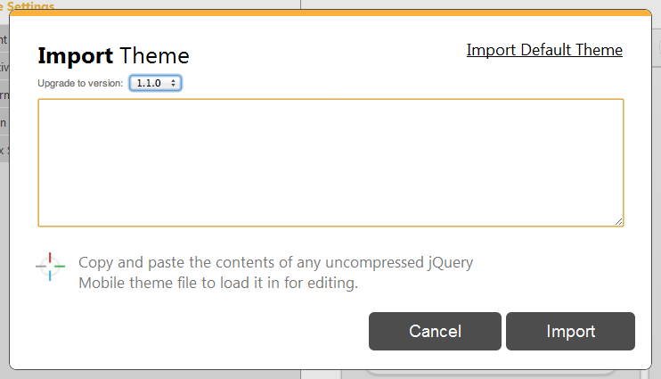
Import the default theme by clicking the link in the top-right corner, appropriately titled Import Default Theme. After the textarea fills with CSS, click Import. The preview area will reload and display swatches from A to E.
We'll focus our efforts on changing up the white swatch, D, as it's the closest to what our end goal is. Since we'd rather use swatch A as the name, let's delete the other swatches so that only D is left. Remember that ThemeRoller renames swatches as others are deleted. That means when you delete swatch A, B becomes A, C becomes D, and so on.
Keep going until the swatch that was D is now in the A position. Finally, delete swatch B (which was formerly swatch E) so that all we have left is swatch A:

This swatch is nice looking but it's a little bland. Let's inject a little color by changing the header to a nice green. The simplest way to determine what values should be changed for any element is to use the inspector. Toggle the inspector to On at the top, then click anywhere on the header of theme A. You'll know if you got it right if the A tab is selected on the left, and the Header/Footer Bar panel expands:
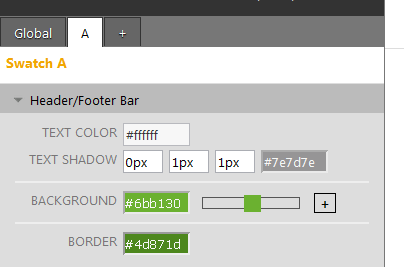
You can change the color in one of a few ways. You can drag a color chip from the top directly onto the background. You can also drag a color chip onto an input field. Finally you can manually input the value. Notice that when you click into a field containing a color value you're provided with a slick color picker. Go ahead and change the values in the input fields in this panel to the values shown in the previous screenshot.
Looking good, but now the blue from the theme's active state clashes with our green. Using the inspector tool, click once on the On section of the On/Off toggle bar. This should cause the Active State panel within the Global tab to expand. We'll change the blue to a nice warm grey. The Global panel should now look similar to the following screenshot:
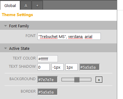
There's only one thing that's keeping our new theme from looking its hottest, the blue text link in the paragraph at the top. Going back to our trusty inspector, let's click directly on the link which will expand the Content Body panel within the A tab. Now, for those already familiar with CSS you know that you can't simply change the link color without changing the hover also, visited:hover, and active states. The problem is that there are no options to make those changes, but ThemeRoller has you covered. Click the + to the right of the Link Color input field to display the rest of the options, then change the colors, as shown in the following screenshot:
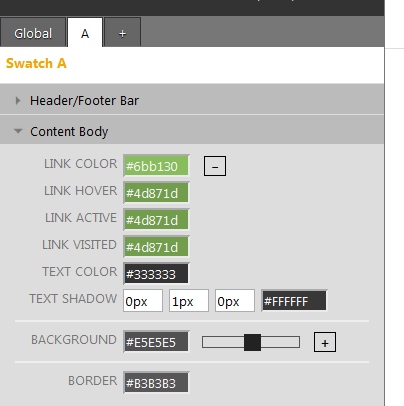
And that's that. Feel free to make additional changes to your theme as you explore the inspector area. Change whatever you like, it's just bits and bytes right now. Keep in mind though that there's no undo option at the time. If you really like something, consider writing down the values so that you don't lose them or exporting it as it is. Speaking of...
15. Exporting your theme
Before we actually export our theme there's one thing that must be noted. Remember the splash page with the "helpful" information? It turns out that there's one piece that's not a recommendation, but a requirement.
We recommend building themes with at least 3 swatches (A-C).
For our theme to apply to our Notekeeper app properly we'll need to duplicate our single swatch (letter A) to swatches B and C. Luckily this is an easy thing to do. Select the A tab at the top of the inspector, then click the + tab twice. What you should see is three identical swatches, and now we're done.
Now that we've finished our theme we're going to export it for use in our Notekeeper application. This is a straightforward process which begins by clicking the Download Theme button located in the middle of the page, at the top of the interface. You'll be presented with a box allowing you to name your theme, some information about how to apply your theme, and a button labelled Download Zip. After naming our theme Notekeeper, click the Download Zip button and you'll receive a tasty little morsel in your downloads folder.
Extract the contents of the ZIP file and you'll see the following directory structure:
- index.html
- themes/Notekeeper.css (The uncompressed version of your theme)Notekeeper.min.css (The compressed version. Use this in production)images/ ajax-loader.gif icons-18-black.png icons-18-white.png icons-36-black.png icons-36-white.png
The HTML file at the top of the tree contains information on how to implement your theme, as well as a few widgets to confirm that the theme works. All of the links are relative in the example file, so you should be able to drag it into any browser window and see the results.
A few notes about the download and implementation of themes:
1. The jQuery team provides the icons for buttons to you in this ZIP file for a reason. The theme requires those images to be relative to the CSS file. This means that unless you're already using the default themes you need to also include the images folder when you upload your theme to your website or the icons won't show up.
2. Hang on to the uncompressed version of your theme. While you don't want to use it in production because of the size, you will need it should you ever wish to edit it within ThemeRoller. ThemeRoller cannot, at the time of this writing, import the minified CSS file.
Andy Matthews has been an application developer for over 16 years and has skills in UI/UX, graphic design, and programming. He's a speaker, open source developer, and he lives in Nashville, TN with his family. He is @commadelimited on Twitter.
Raymond Camden is a senior developer evangelist for Adobe. His work focuses on web standards, mobile development and ColdFusion. He's a published author and presents at conferences and user groups on a variety of topics. Follow him at @cfjedimaster.

The Creative Bloq team is made up of a group of art and design enthusiasts, and has changed and evolved since Creative Bloq began back in 2012. The current website team consists of eight full-time members of staff: Editor Georgia Coggan, Deputy Editor Rosie Hilder, Ecommerce Editor Beren Neale, Senior News Editor Daniel Piper, Editor, Digital Art and 3D Ian Dean, Tech Reviews Editor Erlingur Einarsson, Ecommerce Writer Beth Nicholls and Staff Writer Natalie Fear, as well as a roster of freelancers from around the world. The ImagineFX magazine team also pitch in, ensuring that content from leading digital art publication ImagineFX is represented on Creative Bloq.
