Explore data visualisation with p5.js
Learn how to use audio data to create dynamic animation and visualisations in the browser.

p5.js is the most recent JavaScript implementation of the famous desktop creative coding environment Processing. It takes much of the power and ease of use of Processing and puts it into your browser. It helps you draw in canvas but also integrates with your web page, allowing your 'sketch' to respond to and manipulate the DOM.
p5.js takes away a lot of the headaches of animation and data visualisation on the web and makes it super-simple to get up and running with animation using two simple functions: setup() and draw().
But don't assume this simplicity is limiting, as you can take Processing a long way by creating your own functions and extend it with many of the community-created libraries.
Article continues belowFor more web design tools and advice, see our list of brilliant web hosting providers and be sure to choose the perfect website builder and cloud storage.
Why use data to drive animation?
Creating design and animation 'systems' means defining a set of rules, parameters and variable ranges into which you can feed different data. The ability to play with the parameters of a system and input different data means you can create limitless output variations with the consistency of a systematic approach.
Different data can create totally diverse visual outputs and a great source of fast moving, richly textured data is audio. That is exactly what we are going to use in our animation.
Data-driven vs data visualisation

Is a data-driven animation a data visualisation? Yes and no. Your animation will be a visual representation of the data just like a visualisation but the purpose is different to that of a traditional visualisation. Data visualisation is used to give the viewer an insight into the data, so the graphic is at the service of the communication of the data.
Sign up to Creative Bloq's daily newsletter, which brings you the latest news and inspiration from the worlds of art, design and technology.
However, we will be using data as a creative seed to enable us to generate interesting and textural graphical variations, therefore the data is at the service of the graphic. Of course, one discipline is interconnected and cross-pollinates with the other but it is good to recognise your own intent when using data.
What are we going to make?

p5.js gives us quick and easy access to the data that comes from analysing a sound file (like an MP3). We'll be using p5.fft to analyse different frequencies (bass and treble) within the audio as it plays back and visualise the 'energy' or amplitude of that frequency.
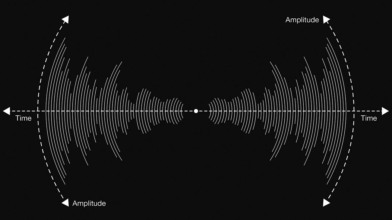
In order for us to be able to see the 'shape' of the sound as it plays, we don't just want to show the current amplitude of the sound but capture a 'buffer' of data points. This will enable us to show a moving history of values.
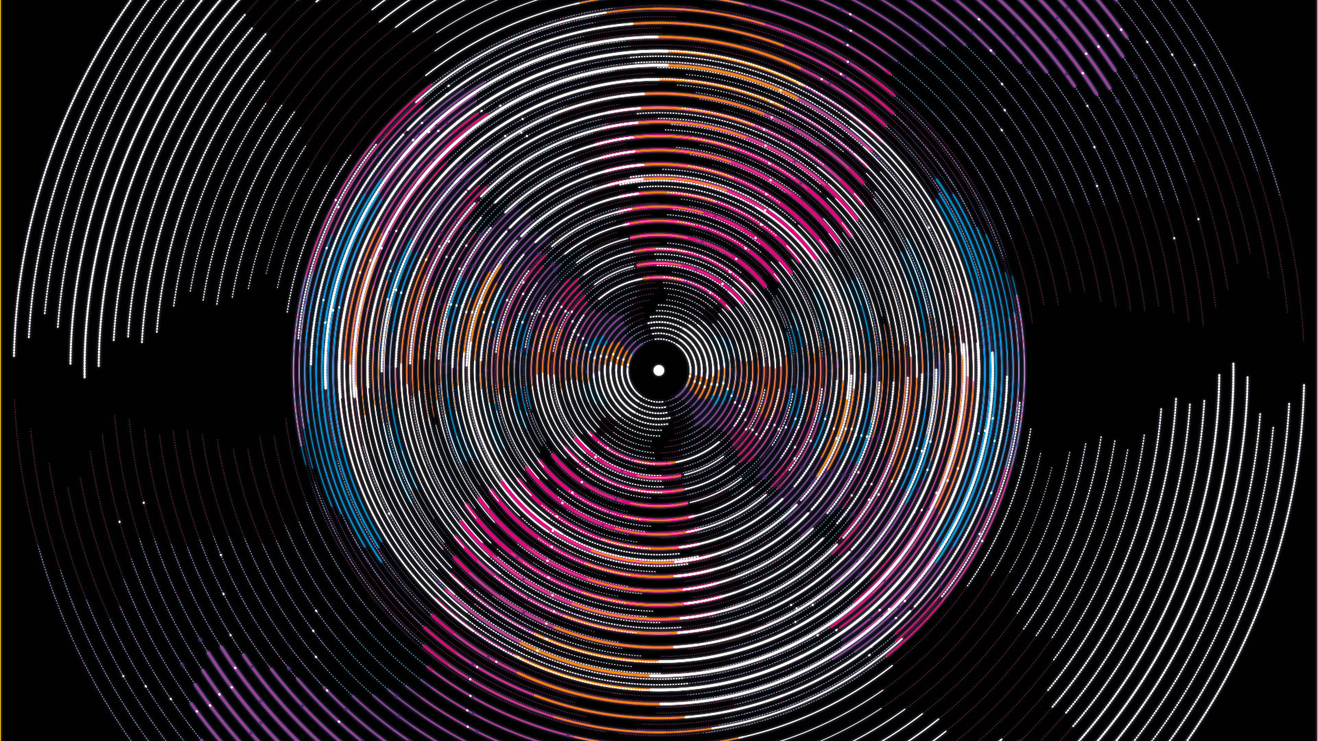
To show our data points, we'll create a series of concentric arcs from the centre to the outer edge of the screen. The length of the arc will represent the amplitude of the data. We'll also use other visual encodings for our data, such as line weight and colour.
What will we learn?
Working through the code, we'll cover:
- Setting up a new p5 sketch
- Loading and analysing sound
- Mapping data values to visual elements like size, shape and colour
- Using classes to draw, maintain the state of our animation and data and make our code reusable.
Where are the files?
The files for the animation are hosted on OpenProcessing, a great platform for sharing, discovering and forking other people's sketches. It's a great place for you to code, too.
As we'll be using audio data, you'll need an MP3 file to drag into the sketch. We'll set up a new sketch on OpenProcessing; this is how your sketch will look once we've loaded audio, got the data and drawn a simple 'data shape':
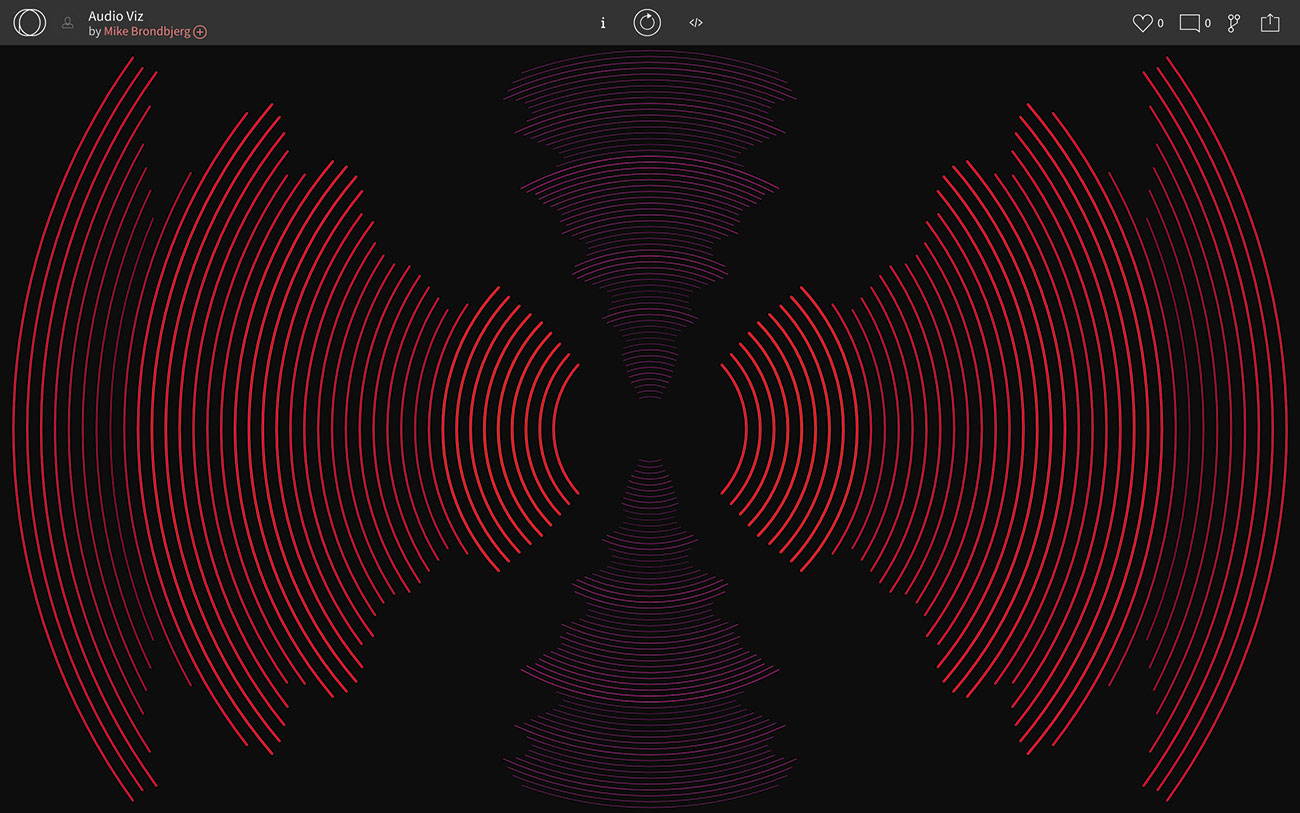
And this is how the completed sketch will look:
Alternatively, you could also use the p5.js online editor or just include the library in your own project via download or CDN.
01. Start a new sketch

Get a free OpenProcessing account and, from your profile page, click Create A Sketch. This will then create the most basic of sketches containing two of p5.js's built-in functions:
- setup() – This runs only once, and is used to set up a new canvas
- draw() – Here is where you put code that you want to run every frame
You'll notice that background() is only called once in the set up. This clears the screen, so if you want to clear the screen every frame, include this at the start of the draw() function too.
Have a play with some code here, using a few of the examples you can find on the p5.js site.

02. Create first sketch using audio data

Go to my example starter sketch.
Hit the play button and you'll see some text asking you to drop an MP3 file onto the canvas. Wait a few seconds for it to finish the upload and then click the canvas to begin the playback. You should see an ellipse, following your mouse, which is scaling and changing colour along with the bass amplitude in the music that you uploaded.
Much of the code is commented but let's look at a few key elements:
Right at the beginning of the sketch, ahead of setup(), we have created some global variables.
Within setup() we have a couple of important lines:
colorMode(HSB,360,100,100);colorMode() enables you to set p5.js to work within different colour spaces like RGB and HSB, as well as configure the scale you use to navigate the channels. Here we've set HSB ranges to values you may be more familiar with from Photoshop rather than the default setting (0 to 255).
canvas.drop(gotFile);This super helpful p5.js function enables us to listen for any file drop events on our canvas. When we get a file drop event, we call gotFile() to check if it's the correct type and start analysing the sound.
soundFile = new p5.SoundFile(file.data);Here we are turning our dropped file data into a SoundFile. When we have the sound file, we use the following code:
- initSound() to set up a new FFT instance (to analyse the sound)
- analyseSound() to analyse the current block of sound every frame
- getNewSoundDataValue() to use fft.getEnergy() every frame to give us the current amplitude of the sound. This is converted from its default range of 0 to 255 to 0 to 1.
Tip: It's helpful to convert your data to a range of 0 to 1 because you can use it more easily when mapping the data to visual parameters such as scale, speed and colour.
Let's look in the draw() function. This line requests the current amplitude (between 0 and 1) of the bass frequency and assigns it the variable myDataVal.
var myDataVal = getNewSoundDataValue(“bass”) 
We call our custom getDataHSBColor() function that maps our data value separately to the Hue, Saturation and Brightness and returns us a colour. The higher the data, the further the colour moves across the hue spectrum and the brighter and more saturated the colour.
var myDataColor = getDataHSBColor(myDataVal);Before we can draw our ellipse we need to give it a size, by multiplying 200 (px) by our data value. So the higher the value, the bigger the ellipse.
var myEllipseSize = 200 * myDataVal;03. Use audio data as a paintbrush

For a bit of fun, comment out the background() call in the draw() function and you can use your sound reactive ellipse to paint with!
05. Complete your sketch

Drawing one data ellipse for one frequency is great but now we'll create a series of data arcs for both bass and treble. We'll also draw a buffer of previous values to help us better see the shape of the sound.
Visit this finished version of the sketch, run it and then drop an MP3 on it.
You'll now see a series of arcs emerging out from the centre of the screen. The horizontal arcs are visualisations of the bass and the vertical ones pick out the treble of the MP3.
Looking at the code, you'll see much of the set up, loading, analysing and getting the data is the same as the last sketch, so we can ignore that. There's quite a bit of code here so, as before, let's just pick out a few key points.
Instead of drawing the arcs directly in draw(), we are actually creating some custom classes:
- class RadialArc{} holds the individual arc's data value and draws the arc
- class RadialArcs{} manages our collection of 'RadialArc' instances
Each class definition has a constructor in which we are setting some key values and also passing in parameters that enable us change the class's behaviour. Let's have a closer look at them now.
The RadialArc{} class:
This is the class that holds a single data value and draws a pair of symmetrical arcs.
setValue() and getValue() enable us to get the data in and out of an arc and push the data through our arc's array as the data updates. redrawFromData() is called to recalculate and redraw the arc.
drawArc() is where we call the handy p5.js function arc(). Arc() is quicker than doing the trigonometry ourselves but we do need to pass it a few values like position, size and, crucially, a start and end angle for our arc.
That angle is measured in 'radians' rather than degrees. Radians are like degrees but on a different scale: 360° is the same as 2 x pi radians. P5.js has useful built-in constants for PI, HALF_PI and QUARTER_PI etc.
The RadialArcs{} class:
This is a management class that creates an array of our RadialArc{} classes and keeps them up to date by moving the data in and out of each and calling the arc's redrawFromData() function.
To initialise the RadialArcs() classes for treble and bass, have a look in setup(). You can see that we are creating two RadialArcs() instances and also passing in our custom parameters.
Those parameters are: number of arcs, sizes of the inner and outermost arcs, the starting angle, the max line weight and the hue range of the colour. By creating these custom classes, it enables us to reuse our code but also make each instance individual by passing them these parameters.
Once the arc objects are initialised, every frame will call updateRadialArcs() and drawRadialArcs() within the main p5 draw() function, which is how the animation updates and moves.
06. Take it further

We've covered a lot of code here but fundamentally I hope you can see how we are taking data and applying it to visual elements like size, position, length, weight and colour.
To go further, play around with the number of arcs, groups and angles. Change the colour ranges and create new classes to draw different shapes.
In this example we used data that is constantly flowing and, coupled with a fast frame rate, it creates the illusion of animation. However, not all data is like that and can update more slowly. For slower data, you can still create smooth animation by 'tweening' the animation of your shapes between their current and their target dimensions.
Good luck with your next data-driven animation!
This article was originally published in issue 320 of net, the world's best-selling magazine for web designers and developers. Buy issue 320 here or subscribe here.
Related articles:
