Create an interactive street view with jQuery
Severin Klaus explains how Hinderling Volkart created an innovative method of scrolling through video for its 360° Langstrasse website, and how you can use it on your site.
Sign up to Creative Bloq's daily newsletter, which brings you the latest news and inspiration from the worlds of art, design and technology.
You are now subscribed
Your newsletter sign-up was successful
Want to add more newsletters?
- Knowledge needed: Intermediate JavaScript, basic HTML and CSS
- Requires: jQuery, modern Browser (for Demo 1 to 3)
- Project Time: Around four weeks
Earlier this year we were asked to create a website for a Swiss TV documentary about the famous “Langstrasse” in Zurich and its inhabitants. We came up with the idea of giving the user the ability to move through the street and see interesting hotspots connected with the documentary. Visit the 360° Langstrasse website so see how it works (watch out, it’s in German!).
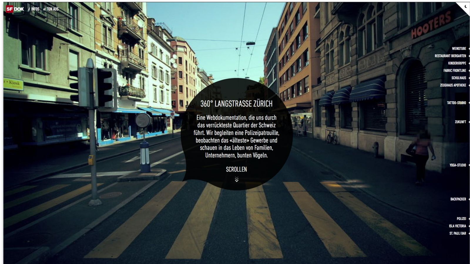
Our plan was to take a common user experience and use it in a refreshing way. Everybody knows how to scroll through a document, whether by dragging the scrollbar, using a mouse wheel or sliding with your fingers. You expect the page content to move up and down, but it’s kind of surprising to move through a street that way.
In this tutorial, we’ll show you some of the thoughts and techniques behind that project.
Article continues belowBasic approach
In its simplest form, all you need is a series of photos (commonly known as video) that shows the movement through the street, and a page listing the hotspots. In HTML that might look like this:
<div id="main" style="height: 2500px;">
<div class="header">
<h1>Scroll Tutorial - #1</h1>
</div>
<div class="street-view">
<video autobuffer poster="../shared/street/vid-0001.jpg">
<source src="../shared/street.mp4" type="video/mp4">
<source src="../shared/street.webm" type="video/webm">
</video>
</div>
<div class="hotspot" style="top:100px; left: 130px;">
#1
</div>
<div class="hotspot" style="top: 800px; right: 130px;">
#2
</div>
<div class="hotspot" style="top: 1000px; left: 130px;">
#3
</div>
<div class="hotspot" style="top: 1500px; left: 130px;">
#4
</div>
<div class="hotspot" style="top: 2100px; right: 130px;">
#5
</div>
</div>
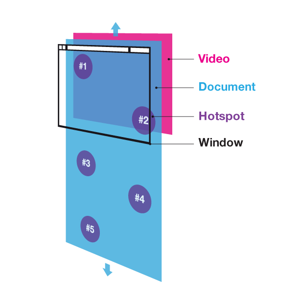
The hotspots are absolutely positioned within a container that has a fixed height (we’re going to need that later). Now it’s fairly simple to get our first demo up and running:
- Add our beloved jQuery library
- Listen to resize events to measure and store the dimensions of the window and the maximum scrolling height, and resize the video so it always fills the window
- Listen to scroll events to move to the according time in the video

Here’s how this is achieved:
We store the document and window in variables, so we don’t have to create jQuery objects every time:
Sign up to Creative Bloq's daily newsletter, which brings you the latest news and inspiration from the worlds of art, design and technology.
var $doc = $(document);
var $win = $(window);
var $videoContainer = $('.street-view');
var video = $('.street-view > video')[0];
Define variables to cache window width and height, document height and scroll height (see later calculateDimensions()).
var windowHeight, windowWidth;
var fullHeight, scrollHeight;
We’d better have the image proportions stored in constants (otherwise we’ll have to wait until the image or video is loaded before we can actually resize the container).
var streetImgWidth = 1024, streetImgHeight = 640;
We want to keep the current scroll position (between 0 and 1) in a variable.
var currentPosition = 0;
Every time the window is resized we need to recalculate the dimensions (which we’ll keep cached in variables), resize the background image/video and call the scroll handler (because while resizing, the scroll might change without dispatching an event).
function calculateDimensions() {
windowWidth = $win.width();
windowHeight = $win.height();
fullHeight = $('#main').height();
scrollHeight = fullHeight - windowHeight;
}
function handleResize() {
calculateDimensions();
resizeBackgroundImage();
handleScroll();
}
function resizeBackgroundImage(){
// get image container size
var scale = Math.max( windowHeight/streetImgHeight , windowWidth/streetImgWidth );
var width = scale * streetImgWidth , height = scale * streetImgHeight;
var left = (windowWidth-width)/2, top = (windowHeight-height)/2;
$videoContainer
.width(width).height(height)
.css('position','fixed')
.css('left',left+'px')
.css('top',top+'px');
}
Now all that is left is to make sure that every time the document is scrolled, we’ll move to the according position within the video (and hope that this position is already loaded):
function handleScroll() {
currentPosition = $win.scrollTop() / scrollHeight;
render( currentPosition );
}
function render( position ) {
if ( video.duration ) {
video.currentTime = position * video.duration;
}
}
Now that everything’s set up and ready, let’s listen to the events and call “handleResize()” to make sure everything is layouted at its correct size.
$win.resize( handleResize );
$win.scroll( handleScroll );
handleResize();
See Demo 1.
Take scroll control
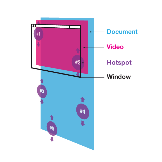
Instead of absolutely positioning the hotspots by static inline styles, we’re going to put the necessary information into data-attributes. Once the user scrolls, we just loop through the hotspot elements and position them in our render function.
The HTML needs a few changes to our hotspot definition:
<div class="hotspot" data-position="0" data-speed="1" style="left: 130px;">
#1
</div>
<div class="hotspot" data-position="0.3" data-speed="2" style="right: 130px;">
#2
</div>
<div class="hotspot" data-position="0.4" data-speed="1.5" style="left: 130px;">
#3
</div>
<div class="hotspot" data-position="0.7" data-speed="0.7" style="left: 130px;">
#4
</div>
<div class="hotspot" data-position="1" data-speed="3" style="right: 130px;">
#5
</div>
The necessary positioning code is added to the render routine:
function render( position ) {
var minY = -windowHeight, maxY = windowHeight;
$.each($hotspotElements,function(index,element){
var $hotspot = $(element);
var elemPosition = Number( $hotspot.attr('data-position') );
var elemSpeed = Number( $hotspot.attr('data-speed') );
var elemY = windowHeight/2 + elemSpeed * (elemPosition-position) * scrollHeight;
if ( elemY < minY || elemY > maxY ) {
$hotspot.css({'visiblity':'none', top: '-1000px','webkitTransform':'none'});
} else {
$hotspot.css({'visiblity':'visible', top: elemY, position: 'fixed'});
}
});
renderVideo( position );
}
See Demo 2.
You might wonder what the benefit of this, as it seems to add unnecessary complexity without actually changing the game. Well, there are good reasons to take over control:
- We’re free to adapt this app to browsers that don’t support position: fixed (there’s just one browser apart from IE6, and we love the devices it runs on: Safari on iOS)
- We can add some additional motion behaviour. In the demo we want the hotspot to move with different speeds, so they’re able to adapt to the speed of the video (it’s analogue and therefore not linear). In our project 360° Langstrasse you might see that the Twitter balloons move in a wave and that the hotspots move horizontally to the borders when they leave the screen. On top of that they must be able to adapt to day and night movies, having different positions within each.
Make things smooth
When we talk about scrolling, the user experience varies a lot from browser to browser and OS to OS. On some systems we’ll have a smoothened scroll motion whereas on others – especially when using the mouse’s scroll wheel – it’s more of the choppy climb of a ladder than taking a continuous slide. To guarantee the same smoothness for all users, we’re going to have to streamline the general motion. And guess what: the way we prepared our example, it’s only a matter of a few lines:
// set the target position to the relative (0..1) scroll position
function handleScroll() {
targetPosition = $win.scrollTop() / scrollHeight;
}
// on every loop: approximate current to target position
function animloop(){
if ( Math.floor(currentPosition*5000) != Math.floor(targetPosition*5000) ) {
currentPosition += (targetPosition - currentPosition) / 5;
render(currentPosition);
}
}
// start the render loop
setInterval( animloop , 1000/60 );
setInterval now calls animloop() at about 60fps. That’s fine, but we like modern optimisations, so we’re going to make use of the requestAnimationFrame function provided by most modern browsers. There are two benefits with this:
- We might get a more fluent animation, really syncing with the display’s frequency (this depends on the browser though – right now we only see that kind of behaviour in Chrome if we’re lucky.
- The loop is only called if our site is actually in a visible tab. Now that’s quite cool, especially for endless rendering loops – we don’t waste the user’s CPU. In our case, of course, it’s not really that big of a deal, but hey, it’s good to get used to it anyway
// main render loop
window.requestAnimFrame = (function(){
return window.requestAnimationFrame ||
window.webkitRequestAnimationFrame ||
window.mozRequestAnimationFrame ||
window.oRequestAnimationFrame ||
window.msRequestAnimationFrame ||
function(/* function */ callback, /* DOMElement */ element){
window.setTimeout(callback, 1000 / 60);
};
})();
// on every loop: approximate current to target position
function animloop(){
if ( Math.floor(currentPosition*5000) != Math.floor(targetPosition*5000) ) {
currentPosition += (targetPosition - currentPosition) / 5;
render(currentPosition);
}
requestAnimFrame(animloop);
}
animloop();
As you can see, we use a wrapper function to ensure browser compatibility.
To see the result of our efforts, click here for Demo 3 (quite nice already, isn’t it?).
Interfaced looping
Right now everything is so compact, nice and HTML5-ish – and guess what, we’re going to bloat it up a bit and do something real old school. We’re going to get rid of our sweet video and replace it with an image. Yes, a simple image that we’re going to swap for every video frame. You might think we’ve gone mad, but relax: we’re doing this in the name of a better user experience.
While using video is really nice and simple (and at least with H.264, which is hardware accelerated, also performant), it’s got some disadvantages for our application:
- We need a preloaded video to render any frame instantly (you can scroll real fast after all). Now that’s fine with video once it is actually loaded. Until then all we can access are the loaded frames – videos load linearly, so that means that to jump to the end of our street we’d have to wait until the entire videon is loaded. And with a video that has every frame keyframed (needed for performance), that can take a while. To have the user wait that long is not cool. (You know those Flash websites that have real cool preloaders to dulcify the fact that you have to wait like forever to get to two bits of information. We think it’s much cooler to have no preloader at all, if that’s possible.)
- Compatibility. Right. Not just for IE8-, also for not so updated modern browsers like Firefox and certainly for our iOS playground. What?! iOS totally supports the HTML5 video tag! Well ... to a certain limit, yes. But this limit is a no-go here: You won’t be able to start/access a video by script. The user actually has to click this nicely centered play button before we can do anything at all. No video.play(), really. On top of that, in iPhones videos only play full-screen: no combination with your user interface. (Not that we’d really want to have this run on iPhones, but you know..)
To overcome these restrictions we’ll go with simple, single images instead of a video. First about image swapping: we made a few performance tests for the following methods:
- Keeping all images into DOM, and swap by display: none/block
- Keeping all images into DOM, and swap by visibility: hidden/visible
- Keeping all images in a logical collection and replacing the src of only one image in DOM
function renderVideo(position) {
var index = Math.round( currentPosition * (imageSeqLoader.length-1) );
var img = imageSeqLoader.getNearest( index );
var nearestIndex = imageSeqLoader.nearestIndex;
if ( nearestIndex < 0 ) nearestIndex = 0;
var $img = $(img);
var src;
if ( !!img ) {
src = img.src;
if ( src != currentSrc ) {
video.src = src;
currentSrc = src;
}
}
}
As it turned out, all methods perform quite the same. Astonishing. So we went with the third, as it seemed to have the smallest impact on memory footprint. And we also like to keep the DOM as clean as possible (if not for DOM selecting). By this we achieve browser compatibilty down to Firefox 3 and IE7 and the possibility to do our own loading algorithm.
Let’s get to that now. Instead of loading the first image, then the second and so on, we wanted something a bit more clever. At first we load a very rough step through (like every 16th frame) and with every round we tighten the gaps until there’s no gap left. This has the advantage that we can start to move through the street while the images are still loading.
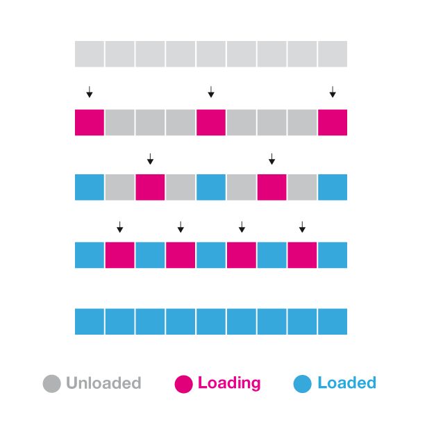
In our demo we just have 100 images, so let’s start by loading the first image, then the 1st,16th, 32th, 48th, 64th, 80th, 96th, and now the gaps: 8th, 24th, 40th ... on the next round indices 4, 12, 20, 28, ... with every round we will have a better resolution. Let’s assume now that we scroll to 25% after only the first round was loaded. That would be frame 25. Now it’s not loaded, right? Let’s just pick the closest loaded frame, then, which would be 32, and show that one. Sure, it’s not 25, but hey, wouldn’t you prefer to see the street only accurate to a few metres instead of waiting another minute until you see the street at all? We would.
The progressive, interlaced loading is handled by a class we called “ProgressiveImageSequence”. Have a look at our demo download to see the class in its entire glory. Instead of showing you some code, let’s rather have a look at how the loading actually works.
See Demo 4.
A few note about browsers: For IE7 we’re only going to load like every fourth image. It’s too slow swapping images anyway. And on top of that, people using a browser from the last century usually have a computer from last century with an internet connection as slow as a frog without legs – so it’s really okay to cut a few things. Firefox seems to have a network stack that keeps the processor quite busy. So we give it a little break between the loading cycles to not slow the user experience too much while things are still loading in the background.
works as lead interaction developer for Hinderling Volkart, a Swiss agency. He's got a huge experience with ActionScript but nowadays WebKit is his playground of choice. He loves his iPad, the Alps and challenging simplicity. And cows.

The Creative Bloq team is made up of a group of art and design enthusiasts, and has changed and evolved since Creative Bloq began back in 2012. The current website team consists of eight full-time members of staff: Editor Georgia Coggan, Deputy Editor Rosie Hilder, Ecommerce Editor Beren Neale, Senior News Editor Daniel Piper, Editor, Digital Art and 3D Ian Dean, Tech Reviews Editor Erlingur Einarsson, Ecommerce Writer Beth Nicholls and Staff Writer Natalie Fear, as well as a roster of freelancers from around the world. The ImagineFX magazine team also pitch in, ensuring that content from leading digital art publication ImagineFX is represented on Creative Bloq.
