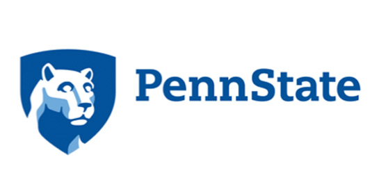
Designers react to the new Penn State Uni logo
Pennsylvania State University has updated its 1980s mark to work in the digital age.
Universities are just like any other company or business in that they need a strong online presence and brand. With a logo that dates back to the 1980s, Penn State University decided it was time to modernise its mark for digital platforms.
While the 80's design has been popular with students and reflects the spirit of the university, it failed to translate well with social media and videos. This left the prestigous establishment with an inconsistent image.

At the start of August, Pennsylvania State University unveiled their new logo. Incorporating the campus' famous Nittany Lion Shrine, it aims to communicate a sense of heritage while looking to the future.

Complete with a new typeface and an expanded colour scheme, the new design is more clear and distinctive. However, the redesign has received a huge backlash from designers online, especially after it was revealed that it cost $128,000.
Dear Penn State: I don’t know how much you paid for that new logo, but your designer needs lessons in kerning. #fontsnobAugust 5, 2015
I think the problem with the new @penn_state logo isn't its design as much as why we spent $128k on changing a logo that didn't look bad.August 8, 2015
Even though it's said to be created by a team of professionals, Penn State's new academic mark is remarkably awful. http://t.co/uD0rm9ssJCAugust 7, 2015
Penn State unveils awkward shield logo http://t.co/eIxtVNDAn2 via @phillydotcomAugust 7, 2015
this new penn state logo is just gross #disappointed #whobesidesAppleusesmyriad?! #uglyPSUlogo http://t.co/5pNlcvPWiiAugust 7, 2015
Although not everyone is up in arms.
I really don't see a problem with the new @penn_state logo! It's a modern take on an adaptable school. https://t.co/TD4RFnXHJ1August 6, 2015
What do you think? Is the new lion a roaring success? Let us know in the comments!
Liked this? Read these?
Sign up to Creative Bloq's daily newsletter, which brings you the latest news and inspiration from the worlds of art, design and technology.

Dom Carter is a freelance writer who specialises in art and design. Formerly a staff writer for Creative Bloq, his work has also appeared on Creative Boom and in the pages of ImagineFX, Computer Arts, 3D World, and .net. He has been a D&AD New Blood judge, and has a particular interest in picture books.
