Add cutting-edge visual effects
The list of cutting-edge CSS3 techniques is ever-expanding. Trent Walton and Dave Rupert from Paravel explore how these new properties can be implemented right now
Sign up to Creative Bloq's daily newsletter, which brings you the latest news and inspiration from the worlds of art, design and technology.
You are now subscribed
Your newsletter sign-up was successful
Want to add more newsletters?
In the last year, browsers’ CSS capabilities have advanced so much that we’re now able to do things with CSS that, previously, were only possible with plug-in-dependent, code-heavy methods such as Flash or JavaScript. CSS visual effects can be as simple as transitioning a link colour on :hover or as complex as creating a full-blown keyframe animation.
Currently, WebKit browsers such as Google Chrome and Safari support the latest CSS3 visual effects, with Firefox and Opera approaching full support. As browser support grows, now is the ideal time to begin experimenting with these new properties.
At Paravel, we’ve implemented these visual effects on every site we’ve built in the past 12 months without degrading user experience or spending a great deal of time in development – usually with a single line of code.
Article continues belowIn this tutorial, we’ll take a look at CSS properties that you, too, can experiment with right now. We’ll start with a simple transition, move on to a more complex animation, and finally, we’ll look into best practices regarding browser compatibility, user experience and performance.
Transition a link ‘color’
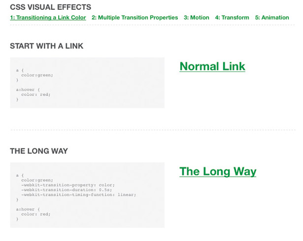
The best way to start learning about CSS transitions is to transform a simple link. We’ll assume you’re familiar with changing a link’s colour when you :hover over it. The colour change is instantaneous, and is a good example of a usability hint that says, “Yes, you can click on me.” Here’s how you’d do it:

a { color:green; } a:hover { color: red; }Makes sense? Right, now let’s build a transition. We’ll go the long way round first for maximum comprehension.
In plain English, the following code sets three properties:
Sign up to Creative Bloq's daily newsletter, which brings you the latest news and inspiration from the worlds of art, design and technology.
l -webkit-transition-property: the CSS property to transitionl -webkit-transition-duration: how long you want it to takel -webkit-transition-timing-function: the easing methodThe transition-timing-function is the easing of the effect over time. We’ve chosen the built-in linear timing to start off with, but you could change it to ease-in or ease-out if that suits your needs.
Note that we’re using the -webkit prefix to target WebKit browsers for simplicity’s sake.
Other browser vendors have their own prefixes – -moz and -o, and use essentially the same syntax.
a { color:green; -webkit-transition-property: color; -webkit-transition-duration: 0.5s; -webkit-transition-timing-function: linear; } a:hover { color: red; }We’ve now created an amazing visual effect that will make your visitors “Ooh” and “Ahh”.

The short way: It’s just too bothersome to write three whole lines of code to do this. That’s why WebKit has created a shorthand version to achieve the same effect:
a { color:green; -webkit-transition: color 0.5s linear; } a:hover { color: red; }Let’s take what we just learned and go a micro-step further by transitioning more than one property at the same time.
Transition all
The long way: In this example we’ll transition two properties: color and background-color. We’re taking our same link code from the previous example and adding some style to make it look like a button using padding, no text-decoration, border-radius and a background colour.
a { /* button styling */ text-decoration:none; background-color:green; color:white; padding:10px 30px; -webkit-border-radius: 12px; /* transitions */ -webkit-transition-property: color, background-color; -webkit-transition-duration: 0.3s, 0.3s; -webkit-transition-timing-function: linear; } a { background-color:black; color: red; }The transition properties are comma-separated, and you can control the duration and timing-function of each property individually or set a single default for all properties, as done with the timing-function in the example above. If you want transitions on an element to happen at different speeds and with different easing methods, then this is the route to take.
The short way: Using all for the transition-property does exactly what you’d expect and will transition all the CSS properties simultaneously.
a { /* button styling */ ... /* transitions */ -webkit-transition: all 0.3s linear; } a:hover { background-color:black; color: red; }By now you might be considering the limitless possibilities of the many CSS properties that can be transitioned. Next, we’ll attempt to create motion by transitioning an image’s position.
Move a robot with transition
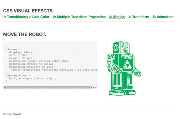
Transition can also be applied to an element’s position or even background-position. We’re going to simply move a robot from left to right on :hover.

Note that we’re using :hover to trigger our transitions – purely and simply because it’s the easiest way to show a difference in state. Effects could take place when an element loads or even using a mixture of CSS and JavaScript to add/remove classes.
a#mover { display: block; width:100%; height: 298px; background-image: url(img/robot.jpg); background-repeat:no-repeat; background-position-x: left; -webkit-transition: background-position 0.6s ease-out; } a#mover:hover { background-position-x: right; }Scale, skew and rotate
We now have the power to transform elements with CSS. These are similar to Photoshop tools that let you Scale, Skew, and Rotate elements – except now it’s all right in the browser. As I’m about to demonstrate, these can be applied to the element or even be part of a transition.
A popular example floating around the internet is a photo gallery with CSS rotated photos that straighten when you mouseover. We’ll cover each of these properties briefly. Some may be a little impractical for client use, but we want to encourage you to play with them and experiment. Heck, you may come up the next ‘wet floor’ technique.

Scale
To scale an image, simply specify the ratio from the original size (1) that you want it to be transformed to (1.2):
#scaler img { -webkit-transition: all 1s linear; -webkit-transform: scale(1); } #scaler img:hover { -webkit-transform: scale(1.2); }Rotate
Rotating is easy. Specify the number of degrees you’d like an element to spin: positive numbers for clockwise (90deg); negative for counterclockwise (-90deg).
#rotator { -webkit-transition: all 1s linear; } #rotator:hover { -webkit-transform: rotate(90deg); }Skew
It’s equally straightforward to skew an element with CSS, as the following code block demonstrates.
Simply list the number of degrees for the angle along the x and y axis in that order.
#skewer img { -webkit-transition: all 1s linear; -webkit-transform: skew(0deg); } #skewer img:hover { -webkit-transform: skew(10deg, 20deg); }Translate
To achieve this 2D transform visual effect, indicate the value (percentage or length) you’d like to translate along the x and y axis in that order.
#translator img { -webkit-transition: all 1s linear; -webkit-transform: translate(0px); } #translator img:hover { -webkit-transform: translate(50px,-20%); }Animation
To take full control of all these new CSS properties, let’s give keyframe animation a try. It helps to think of animations as collections of transitions or transforms with a start and an end keyframe. It can be a simple as a few lines of code:
@-webkit-keyframes appear { from { opacity:0; } to { opacity:1; } }If you prefer more granular control, you can specify keyframes in numbers or percentage, similar to keyframes in Flash.

Keyframe animation
In our animation, we’re changing our image opacity from 0 to 1 but we want it to flicker in, almost as if it were struggling to appear.
We’ll be using six keyframes and our animation will have a duration of four seconds.
The first block of code sets up the animation: the animation we’ll use, the duration, number of iterations and the easing.
The second block is the hello-robot group of animation keyframes that we referenced above with animation-name.
#robot img { opacity:1; -webkit-animation-name: hello-robot; -webkit-animation-duration: 4s; -webkit-animation-iteration-count: 1; -webkit-animation-timing-function: ease-in; } @-webkit-keyframes hello-robot { 0% { opacity:0; } 20% { opacity:.4; } 40% { opacity:.1; } 60% { opacity:.6; } 80% { opacity:.4; } 100% { opacity:1; }}Making the robot fade out is relatively easy. Just create a separate animation with the keyframes and oscillations reversed going from opacity:1 to opacity:0. The example is set up to fire this animation on :hover.
@-webkit-keyframes goodbye-robot { 0% { opacity:1; } 20% { opacity:.6; } 40% { opacity:.9; } 60% { opacity:.4; } 80% { opacity:.6; } 100% { opacity:0; } }
The Creative Bloq team is made up of a group of art and design enthusiasts, and has changed and evolved since Creative Bloq began back in 2012. The current website team consists of eight full-time members of staff: Editor Georgia Coggan, Deputy Editor Rosie Hilder, Ecommerce Editor Beren Neale, Senior News Editor Daniel Piper, Editor, Digital Art and 3D Ian Dean, Tech Reviews Editor Erlingur Einarsson, Ecommerce Writer Beth Nicholls and Staff Writer Natalie Fear, as well as a roster of freelancers from around the world. The ImagineFX magazine team also pitch in, ensuring that content from leading digital art publication ImagineFX is represented on Creative Bloq.
