Code smarter CSS with Sass
Sass is a style sheet language that makes your style sheet as beautiful to read as your web page. Core contributor to Sass Christopher Eppstein explains how to use it and maintain style sheets with Sass
Sign up to Creative Bloq's daily newsletter, which brings you the latest news and inspiration from the worlds of art, design and technology.
You are now subscribed
Your newsletter sign-up was successful
Want to add more newsletters?
This article first appeared in issue 211 of .net magazine - the world's best-selling magazine for web designers and developers.
If you’ve ever been tasked with the job of writing and maintaining the style sheets of a medium-to-large website, you know that it is no small feat. CSS has a very simple syntax. Too simple.
The simplicity of the syntax and lack of indirection were intended to make CSS more accessible to non-programmers. It was a nice idea in theory, but in practice it is a failure of monumental proportions.
Article continues belowBy limiting the expressive power of style sheets, the opposite effect than was desired has been achieved – there is a tremendous amount of knowledge and learning required before you can style a web page to a point where it looks acceptable. At the other end of the spectrum, professional CSS developers find their hands tied by the good intentions of the CSS specification.
Frameworks
About four years ago, many common CSS patterns started to be codified as CSS frameworks such as YUI, Blueprint, and 960.gs.
These quickly became popular among beginning and intermediate level CSS developers because they took a lot of drudgery and knowledge requirements out of building web pages.
Unfortunately, these frameworks were built using the only mechanism of abstraction that CSS affords us – the class attribute.
Sign up to Creative Bloq's daily newsletter, which brings you the latest news and inspiration from the worlds of art, design and technology.
This encouraged the mixing of content and presentation in markup, contrary to years of well-founded best practices. Many CSS developers responded by picking up their pitchforks.
They argued against CSS frameworks as fundamentally flawed – but they were missing the point. It wasn’t the frameworks that were fundamentally flawed, it was the syntax they were built on.
Sass is an evolution of the CSS syntax that has been enhanced to provide sophisticated tools for intermediate and advanced CSS developers. These tools make it easier to create and maintain style sheets over time by giving greater expressiveness to the style sheet itself.
Example
So what are these tools? let’s get started with an example.
@import "compass/css3"; $background-color: #446688;$foreground-color: lighten(complement($background-color), 20%); $widget-width: 250px;#container { background-color: $background-color; .widget { @include box-shadow(darken($background-color, 20%)); background-color: $foreground-color; width: $widget-width;} .bordered-widget { $border-width: 2px; @extend .widget; // Fix for the broken box model width: $widget-width - $border-width; border: $border-width solid lighten($background-color, 20%); }}I’ll explain what’s going on here in a second, but first let’s see what we get after processing this Sass file into CSS that we can send to the browser:
#container { background-color: #446688;} #container .widget, #container .bordered-widget { -moz-box-shadow: #223344 1px 1px 5px; -webkit-box-shadow: #223344 1px 1px 5px; -o-box-shadow: #223344 1px 1px 5px; box-shadow: #223344 1px 1px 5px; background-color: #bb9977; width: 250px;} #container .bordered-widget { width: 248px; border: 2px solid #7799bb;}In the CSS we have redundancy everywhere. We would have typed #container four times, in the Sass file just once. We would have typed box-shadow and the corresponding value four times, in the Sass file just once. In our CSS file we have four colours; in our Sass file we have one colour that has been transformed three times. In our CSS file, when we change the border width or the .widget width, we have to remember to change the width of the .bordered- widget correspondingly; in our Sass file we don’t have to remember this relationship, it is explicit. In our CSS file, if we add a new selector that describes how a .widget should look or behave, we have to remember to apply the same properties with the same specificity for .bordered-widget; in our Sass file we don’t have to remember to do this, it is explicit. Welcome to the future of style sheets. let’s go over how this all works now.
Variables
Sass allows you to store a value into a variable for later use. If you need to change that value, there’s no need to go through an error-prone search and replace. Instead, you just change the value and the Sass processor does the hard work for you.
A variable is any CSS identifier (such as a class name or id) that starts with $. You set a variable just like you would a property:
$background-color: #446688;Variables are scoped to their enclosing block. Global variables are declared at the top level of the file (not within any curly braces).
In our example, $border-width is a variable that can only be used within the .bordered-widget block. You can use a variable just like you would use a static value when setting a property:
background: $background-color;Nested rules
Nested rules enable you to remove the duplication that results from creating scoped selectors. The following example shows some nested selectors and the CSS that they become:
#container { .widget { ... } .child { ... } .sidebar & { ... } &:hover { ... } }#container .widget { ... }#container .child { ... } .sidebar #container { ... } #container:hover { ... }As you can see, & is a reference to your current scope and enables you to create a range of selectors in a scoped context.
Mixins
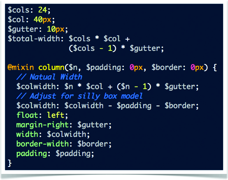
Mixins enable us to create reusable chunks of style. There are two sides to a mixin. First the definition:
@mixin clearfix { &:after { content : "\0020"; display : block; height : 0; clear : both; overflow : hidden; visibility : hidden; } *zoom: 1;}Here we’ve defined a mixin that implements a common clearfix strategy. Now we can include that mixin in any selector.
.widget { @include clearfix; }And this will become:
.widget { *zoom: 1;}.widget:after { content: "\0020"; display: block; height: 0; clear: both; overflow: hidden; visibility: hidden;}Mixins can also accept arguments, allowing us to isolate common styling patterns and reuse them:
@mixin border-radius($radius) { -moz-border-radius: $radius; -ms-border-radius: $radius;-webkit-border-radius: $radius; -o-border-radius: $radius; border-radius: $radius;}Of course, one of the downsides of mixins is that it gets very easy to create very large style sheets. To address this, Sass provides another form of abstraction called selector inheritance.

Selector inheritance is an idea that finds its roots in Nicole Sullivan’s OOCSS (see issue 208). In Sass, the idea is expanded to include more than just classes: a selector can inherit attributes from any simple selector such as an element, class or ID. The @extend directive is used to indicate which selector to inherit from.
.rounded { border-radius: 5px; border: 1px solid #ccc;}.widget { @extend .rounded; border-color: blue;}.bright-widget { @extend .widget; border-color: #9999ff;}.rounded, .widget, .bright-widget {border-radius: 5px;border: 1px solid #ccc;}.widget, .bright-widget {border-color: blue;}.bright-widget {border-color: #9999ff;}As you can see, unlike mixins that apply contents into a selector, inheritance applies selectors to other selectors.
This allows your style sheet to be kept smaller with many of the same advantages that mixins provide.
Another one of the major advantages of selector inheritance is that it removes the need for error-prone duplication of classes in the inheritance hierarchy from needing to be applied to your markup.
Colour support
Sass understands all the CSS3 standard colour representations – even named colours. In particular, Sass understands the HSl and HSlA colour representations introduced in CSS3.
The reason that HSl colour space is preferable to RGB is that transformations in the HSl colour space are based on how humans perceive colour.
This means that you can copy and paste an HSl colour and tweak it to a new colour without needing to use a colour wheel to convert back and forth to RGB or hex. But once you have variables, this copy-and-paste approach is undesired, so Sass provides transformation functions for transforming colours created with any representation into a new colour.
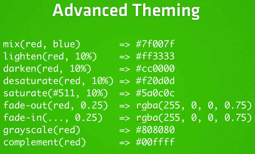
These colour functions make it a snap to build complex colour themes based on just a few colours. For instance, you can ‘adjust-hue’, ‘lighten’ or ‘darken’, ‘saturate’ or ‘desaturate’, and get the corresponding ‘grayscale’ or ‘complement’ colours.
In addition to these HSl transformations, Sass provides a number of other useful functions for working with colours. For instance, you can ‘mix’ two colours and adjust the alpha layer of a colour with ‘opacify’ and ‘transparentize’.

Numbers and maths
Numbers in CSS may have an associated unit; Sass has unit-aware mathematical expressions. For instance, in the following example, the width would be assigned a value of 33.333em:
$em-ratio: 1em / 12px; .column { width: 400px * $em-ratio; }Sass can also add and subtract numbers of different units as long as they’re comparable to each other. For instance, 2in + 3cm + 1pc is converted to 3.348in.
Developer tools
Having to process your Sass files into CSS is certainly an inconvenience but there are some great advantages of having this step in your development process. It means that we don’t have to make difficult tradeoffs between how we think about our files and how we deliver them to the browser:
- We can write comments that the user won’t see. In Sass, comments starting with // and continuing to the end of the line won’t be found in the CSS file.
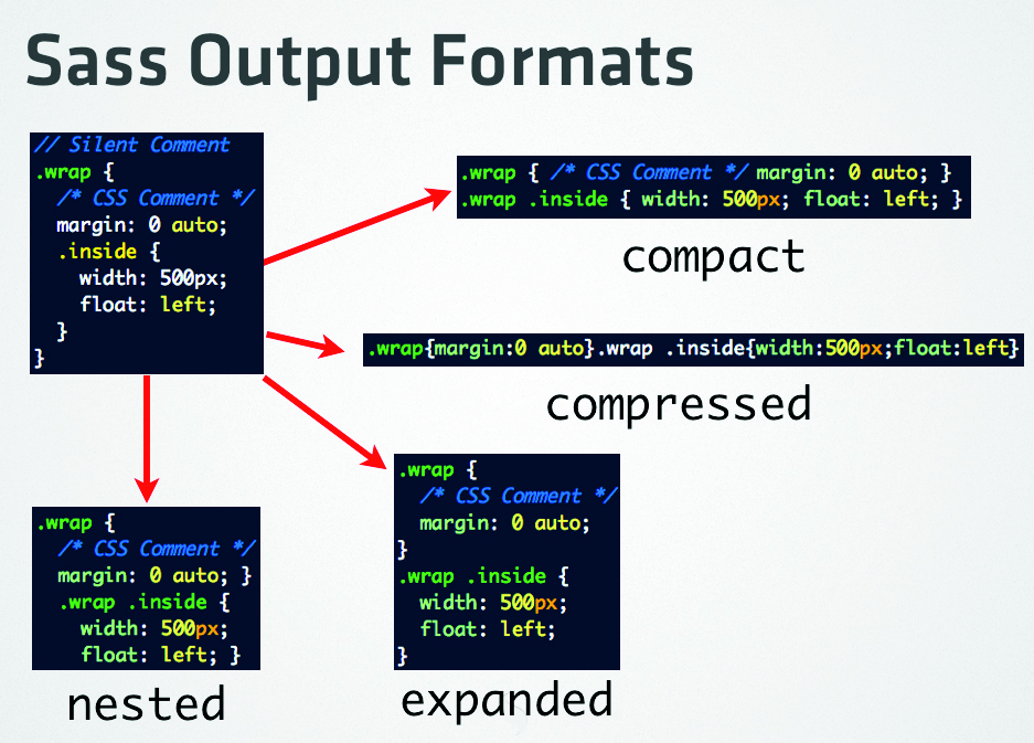
- We can compress the output or select one of several pretty-printed output formats.
- We can organise our source files into several small Sass files and import them into another Sass file. Sass will not create a CSS file for any Sass file that has a filename that starts with an underscore – such files are called partials.
- We can debug our Sass file output by enabling line number comments or using the FireSass extension for Firebug.
- For those who dislike curly braces and semi-colons, Sass provides an alternate syntax that uses lines breaks and indentation instead.

Conclusion
This article has only briefly touched on the power and features that are available to you by using Sass. If you have to build and maintain designs across browsers, I think you’ll find that Sass is an indispensable tool. Please visit our website sass-lang.com for more information.
Compass
Stop reinventing the wheel!
Sass gives new power and expressiveness to our style sheets. The ability to create rich concepts with little-to-no need to adjust our markup means that you can share style sheet libraries across projects. Enter Compass.
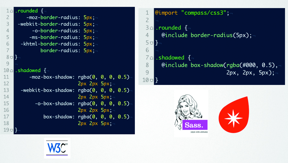
Compass is a style sheet authoring framework powered by Sass that provides a wealth of tools for you to use when managing your design projects. It integrates with any application framework and can also be used stand alone.
Compass provides:
- The complete Blueprint Framework as mixins instead of ugly class names.
- Dozens of plug-ins you can use, including plug-ins for popular frameworks such as 960.gs, Susy, OOCSS, and HTML5 Boilerplate.
- Project templates to get you up and running quickly with the framework of your choice.
- Battle-tested cross browser utilities.
- CSS3 library – forget about vendor prefixes!
- Helper functions that make advanced techniques such as image embedding and using asset hosts a snap.
- Ability to create your own personal framework to share across projects.
- Mix and match CSS Frameworks with relative ease.
- Only use the parts of frameworks that you need.
- Sprites – generated from simple images, with your style sheets dictating how they are constructed.

With a firm understanding of Compass, you’ll find you spend much less time thinking about cross-browser issues, meaning you can spend more time making a better design, bill clients more per hour, or just take that extra time and go outside and play.

The Creative Bloq team is made up of a group of art and design enthusiasts, and has changed and evolved since Creative Bloq began back in 2012. The current website team consists of eight full-time members of staff: Editor Georgia Coggan, Deputy Editor Rosie Hilder, Ecommerce Editor Beren Neale, Senior News Editor Daniel Piper, Editor, Digital Art and 3D Ian Dean, Tech Reviews Editor Erlingur Einarsson, Ecommerce Writer Beth Nicholls and Staff Writer Natalie Fear, as well as a roster of freelancers from around the world. The ImagineFX magazine team also pitch in, ensuring that content from leading digital art publication ImagineFX is represented on Creative Bloq.
